Neumorphism is a trendy UI style nowadays. So let's create a neumorphic form using few simple steps

THREAD🧵

Neumorphic design is another UI design that has become popular these days.

Making neumorphic effect is actually pretty easy using only just CSS box-shadow

We'll be creating a neumorphic form in steps👇🏼

2.
STEP 1:

Place a light source(virtually) on screen. In this example I'm considering that my light source is placed top left corner of the screen

3.
STEP 2:

Create a container div and set background color slightly darker than white. I picked #ecf0f3

* Make sure that the color of body and container should be same

CONTINUE...

4.
As we placed our light source on top-left corner, make sure left and top border of container should be brighter than right and bottom border.

This will make the element looks like it has the light source illuminating from the top left corner of the screen.

5.
STEP 3:

Create a brand logo using same technique. Since brand going to protrude from the container, use same color i.e, #ecf0f3

Add bright color shadow at the top left side and dark color shadow at the bottom right side

6.
STEP 4:

The input fields going to have a sunken effect. And to achieve this we will use inset box-shadow

CONTINUE...

7.
As light is coming from top-left corner, hence right and bottom border will be bright in this case because input fields have sunken effect.

8.
STEP 5:

Create a button preferably of same color as logo because this will give you a more fascinating look to your design

Add hover selector and apply box-shadow none when you mouse over it

9.
Wasn't it easy?

Neumorphic design is all based on box-shadow property.
You just need to remember two things👇🏼

- Protrude effect in outer element (normal box-shadow)
- Sunken effect in inner elements (Inset box-shadow)

10.
Source code: @CodePen

11.
https://t.co/HEiFRU3abH

More from Pratham 👨‍💻🚀

5 great background websites for every web developer and designer

🧵👇


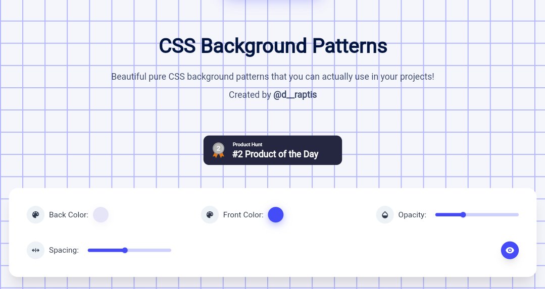
1. Magic pattern

Beautiful pure CSS background patterns that you can actually use in your projects. They are highly customizable as well.

🖇️
https://t.co/ZqczrPfkdZ


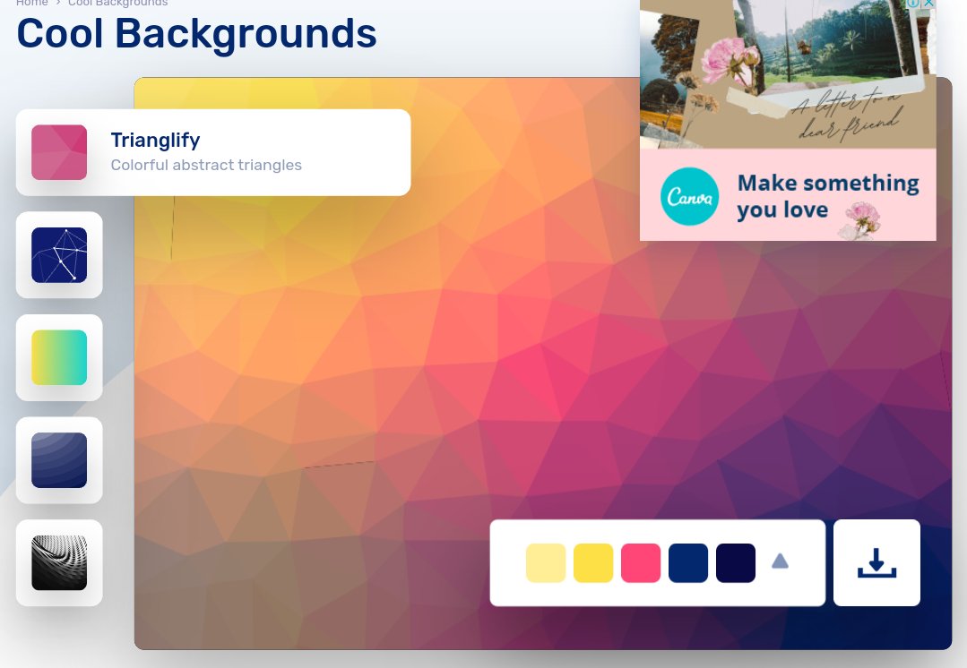
2. Cool backgrounds

Collection of cool backgrounds that you can add to blogs, websites, or as desktop and phone wallpapers

🖇️ https://t.co/df7VSb9t8H


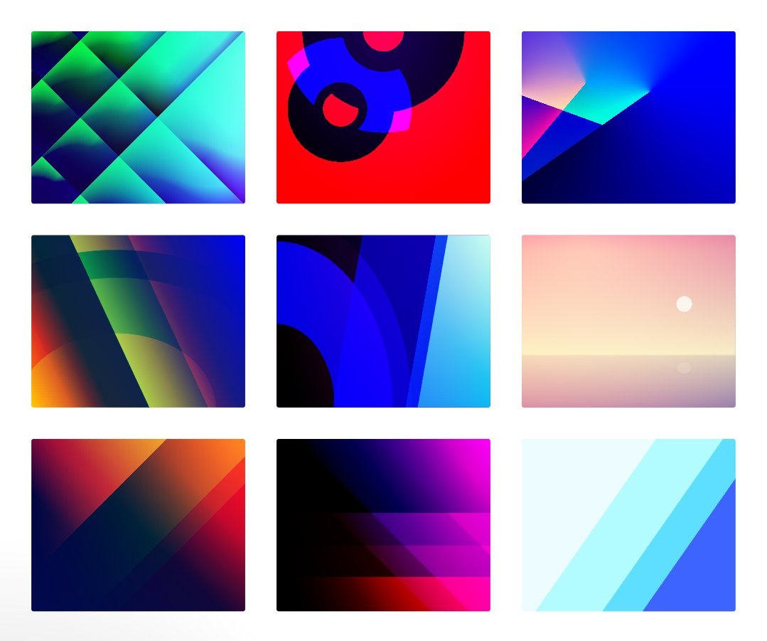
3. Gradienta

Use pure CSS gradient backgrounds for your next website or app, as a JPG image or CSS code, no attribute required

🖇️ https://t.co/R58zrwpZCH


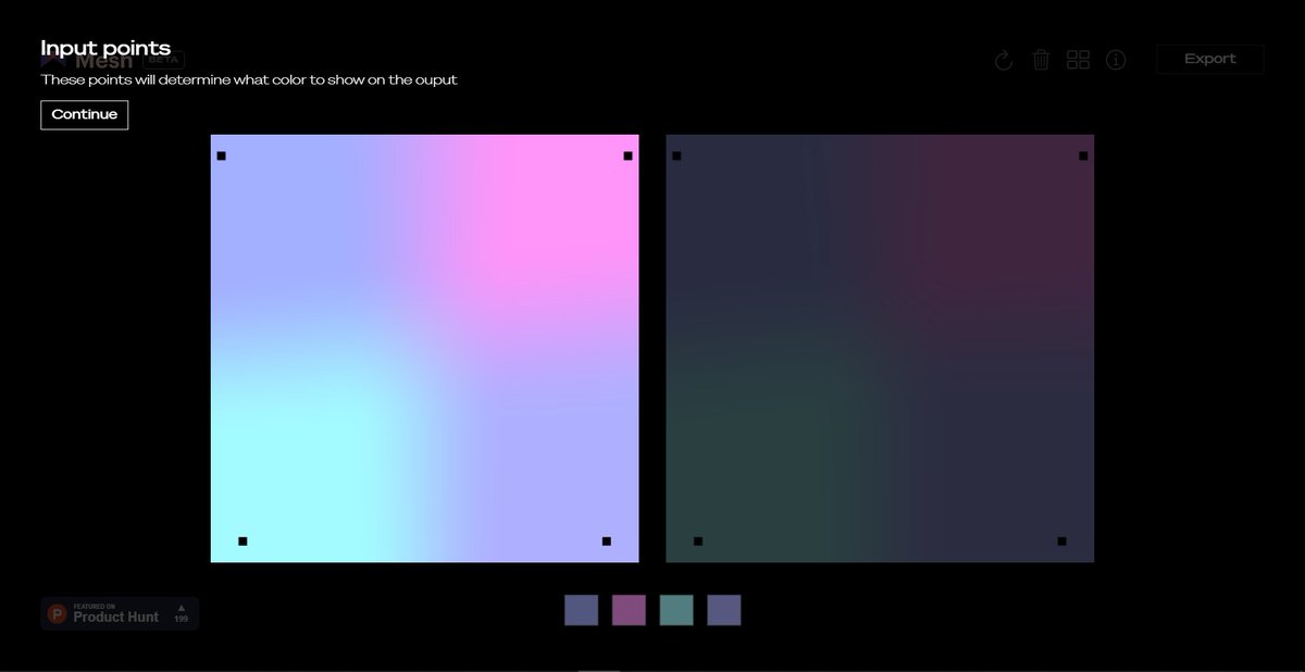
4 Mesh gradient

Creat aurora UI like gradients using few simple clicks

🖇️ https://t.co/vOHHDASr1V
JavaScript is powerful.

But sometimes, you can do great things using CSS.

A long thread of CSS tips and tricks:

1. Smooth


2. Change marker styling


3. Add styling to video


4. Change input caret

More from Design

You May Also Like