Catch me if you can @Mitesh_Engr
Time for a🧵
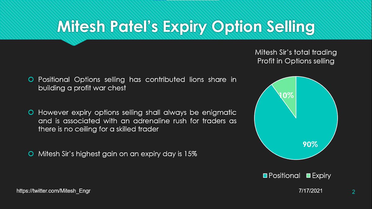
Mitesh Sir's EXPIRY Option Selling 101:
• What to look for?
• Strike Selection & Ratios
• SL mgmt
• Avoiding freezes
• Monthy Expiry
• Event days
• How he would have traded last expiry?
In collaboration with @AdityaTodmal
Edward de Bono says intelligence is like a🚗 Automobile
“A powerful car may be driven badly. A less powerful car may be driven well. The skill of the car driver determines how the power of the car is used.”
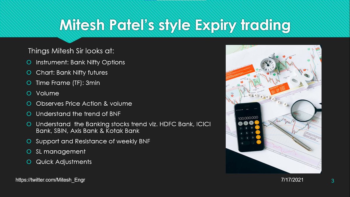
What @Mitesh_Engr Sir looks at for Expiry Trading:
• Technicals of BNF
• Individual Heavyweight stocks of BNF
• Support/Resistance of BNF on weekly TF
• Also has Superb SL management
• When it comes to adjustments, he is always on toes
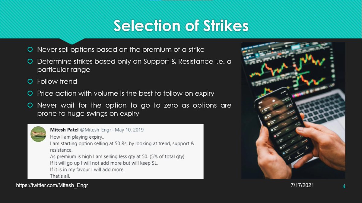
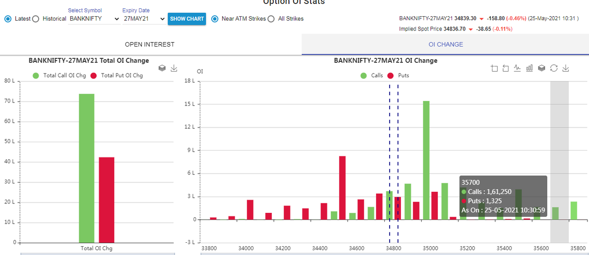
How to Select Strikes to Sell?
• You can't sell based on premium
• Follow only trend
• Price action is best to sell on expiry day
• Never wait for the options to go to zero
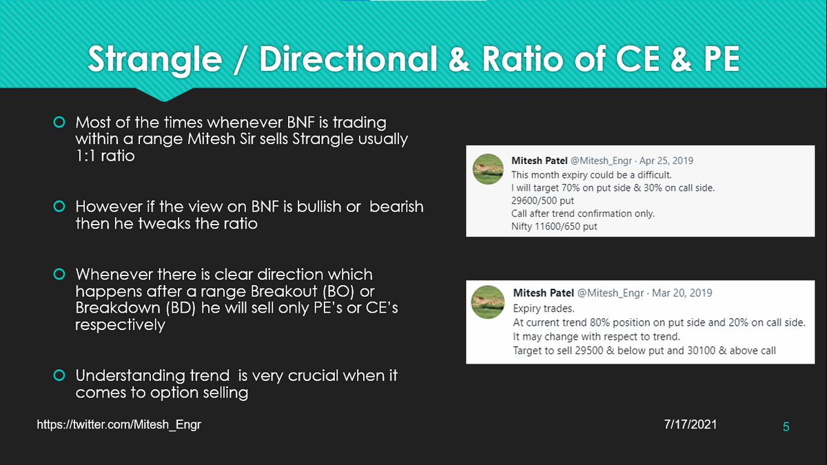
Using Ratios to Sell:
• If BNF is in a range then strangles
• If breakout/ breakdown from a range then directional
• Selling 70/30 or 80/20 ratios
• 2 examples on how he used ratios