Carp can switch over to an anaerobic metabolism and quietly exhale booze until the situation gets better.
An interesting thing about carp is that they can go into anoxic hibernation and switch to an anaerobic metabolism based on converting glycogen to ethanol.
The waste ethanol is diffused out the gills
Carp can switch over to an anaerobic metabolism and quietly exhale booze until the situation gets better.
In theory, if you spent a few thousand years breeding carp for it, you could use them to make booze.
They'd be enormous, almost entirely glycogen deposits with a fish added as an afterthought.
You, a human, have only about 100 grams of glycogen in your liver, about 400 more grams in your skeletal muscles. Call it 500 grams total.
Carp can be 12% glycogen by weight.
A 75kg human would need to have 9kg of glycogen to match their carp friend.
https://t.co/Bt29kS7pO5
Call it 18 days worth. You'd need a lot more if you wanted to beat your carp friend at holding your breaths.
You currently do this in the liver, by further metabolizing ethanol into acetaldehyde.
You do this completely differently depending on whether you're a fetus or not.
https://t.co/gsnliVwr3G
You're gonna need a bigger liver or a better way
You're gonna scare your carp friends by pissing vinegar at them.
More from Anosognosiogenesis
Look at some historical examples of mass psychogenic illnesses: dancing plagues, laughing plagues, meowing nuns,
Here's a video on them:
They are interesting, but what is more interesting to me is Culture Bound Syndrome. https://t.co/hMKaApUMZn
Basically: mass psychogenic illness, and presentation of various mental illnesses, do not occur in a vacuum. Cultures shape them.
For instance, Koro.
There have been several mass outbreaks of men completely convinced their penises are shrinking, anchoring them with string at night so they don't get sucked back inside.
Almost all in Southeast
Here's a description of one outbreak in Hainan in 1984:
So you want to generate interesting melodies.
1. Make a file called 1235.txt containing, one per line, all 24 unique permutations of the elements 1 2 3 5.
2. Cp 1235.txt to D.txt
3. Use sed to convert the numbers in D.txt to notes. Now you have 24 permutations of the major tetrachord in D.
4. Play them each. If it sounds like it increases tension, mark the beginning of that cell in 1235.txt with a +. If it sounds like it decreases tension, mark with a -.
Now those 24 melodic cells are divided into two groups: tension increasers and resolvers.
5. Rinse and repeat for all 12 keys.
You now have 13 plaintext files, filled with stuff like + 1 2 5 3 and - D E F# A
6. Figuratively roll dice to decide, given a +/- cell, what the next cell should be.
33% chance a + follows a +, etc.
Now you're outputting a stream of dynamic tensions: ++-+++-+-+---+ etc
1. Make a file called 1235.txt containing, one per line, all 24 unique permutations of the elements 1 2 3 5.
Claude Shannon made this machine to play the hex board game.
— Anosognosiogenesis (@pookleblinky) January 21, 2021
It is literally just a mesh of resistors and some light bulbs. No logic gates, no programming, nothing at all resembling AI.
Check it out: https://t.co/Zoyc9TmBcN pic.twitter.com/EANeMosPhT
2. Cp 1235.txt to D.txt
3. Use sed to convert the numbers in D.txt to notes. Now you have 24 permutations of the major tetrachord in D.
4. Play them each. If it sounds like it increases tension, mark the beginning of that cell in 1235.txt with a +. If it sounds like it decreases tension, mark with a -.
Now those 24 melodic cells are divided into two groups: tension increasers and resolvers.
5. Rinse and repeat for all 12 keys.
You now have 13 plaintext files, filled with stuff like + 1 2 5 3 and - D E F# A
6. Figuratively roll dice to decide, given a +/- cell, what the next cell should be.
33% chance a + follows a +, etc.
Now you're outputting a stream of dynamic tensions: ++-+++-+-+---+ etc
So I've mentioned the sharpie test and the tueller drill.
Another reason you are dead within 1.5 seconds of encountering your first fast zombie, is adrenaline.
Most people who get attacked with a knife and survive to talk about it, say they never even knew a knife was there.
Or that they'd been stabbed, until after the fact.
In many cases, they think they'd just been punched, and are completely surprised
One reason the adage is "the winner is the one who dies in the ambulance, not the gutter," is because it's entirely possible to receive a fatal wound, not realize it, and then inflict a fatal wound on the other guy without *him* realizing it.
A dozen times within 30 seconds.
The marker drill teaches how you *will* get cut, fatally, without realizing it.
In full adrenaline freakout, this is even more pronounced.
Another reason you are dead within 1.5 seconds of encountering your first fast zombie, is adrenaline.
The Tueller Drill is interesting.https://t.co/D6p3zRRV52
— Anosognosiogenesis (@pookleblinky) December 20, 2020
Most people who get attacked with a knife and survive to talk about it, say they never even knew a knife was there.
Or that they'd been stabbed, until after the fact.
In many cases, they think they'd just been punched, and are completely surprised
One reason the adage is "the winner is the one who dies in the ambulance, not the gutter," is because it's entirely possible to receive a fatal wound, not realize it, and then inflict a fatal wound on the other guy without *him* realizing it.
A dozen times within 30 seconds.
The marker drill teaches how you *will* get cut, fatally, without realizing it.
In full adrenaline freakout, this is even more pronounced.
The US immigration act of 1907 signed by Teddy Roosevelt: ableist as hell. https://t.co/ficeXOImo5

One theory for why the Spanish flu was so unusually lethal for young people:
They hadn't lived through the previous flu pandemic of 1889-1890 (https://t.co/OiDZYtdbWx) that killed about 1 million people. And thus had no carryover immunity.
It's suspected that the 1889 pandemic was not influenza, but a coronavirus.
The 1889 virus spread rapidly, killing mostly the elderly.
The 1889 virus was the first truly modern pandemic: people knew about germs, it spread via trains, it spread at the speed of modern transportation and commerce
Today's covid denialists are tomorrow's openly eugenicist "these disabled people are a drain on society"
— Anosognosiogenesis (@pookleblinky) November 29, 2020
Literally. 13 years after the Spanish flu, the very first people the nazis targeted were disabled people.
What caused a lot of those disabilities, you think?
One theory for why the Spanish flu was so unusually lethal for young people:
They hadn't lived through the previous flu pandemic of 1889-1890 (https://t.co/OiDZYtdbWx) that killed about 1 million people. And thus had no carryover immunity.
It's suspected that the 1889 pandemic was not influenza, but a coronavirus.
The 1889 virus spread rapidly, killing mostly the elderly.
The 1889 virus was the first truly modern pandemic: people knew about germs, it spread via trains, it spread at the speed of modern transportation and commerce
More from Science


https://t.co/a6yrWK5dqg

https://t.co/Xe5xFdtDfO

https://t.co/e3RBxj0ly3
https://t.co/cJlCMqyP2v
https://t.co/5n5TK67iKB

https://t.co/Xe5xFdtDfO
https://t.co/e3RBxj0ly3
1. Monkey Outrage!
— Billy Bostickson \U0001f3f4\U0001f441&\U0001f441 \U0001f193 (@BillyBostickson) August 17, 2020
The worst treatment was kept for the monkeys. The macaques breed of monkeys are small, relatively light primates, which are often used for animal experiments at LPT. \u2018They are kept in cramped conditions in small cages. https://t.co/6D0yisjd9B
https://t.co/cJlCMqyP2v
11. Max Planck Monkey Photos (2) pic.twitter.com/0yE9D6iswp
— Billy Bostickson \U0001f3f4\U0001f441&\U0001f441 \U0001f193 (@BillyBostickson) August 17, 2020
https://t.co/5n5TK67iKB


It's another stunning Malagasy #dartfrog/#poisonfrog for today's #FrogOfTheDay, #42 Mantella cowani Boulenger, 1882! A highly threatened, actively conserved and managed frog from the highlands of central #Madagascar
#MadagascarFrogs
📸D.Edmonds/CalPhotos
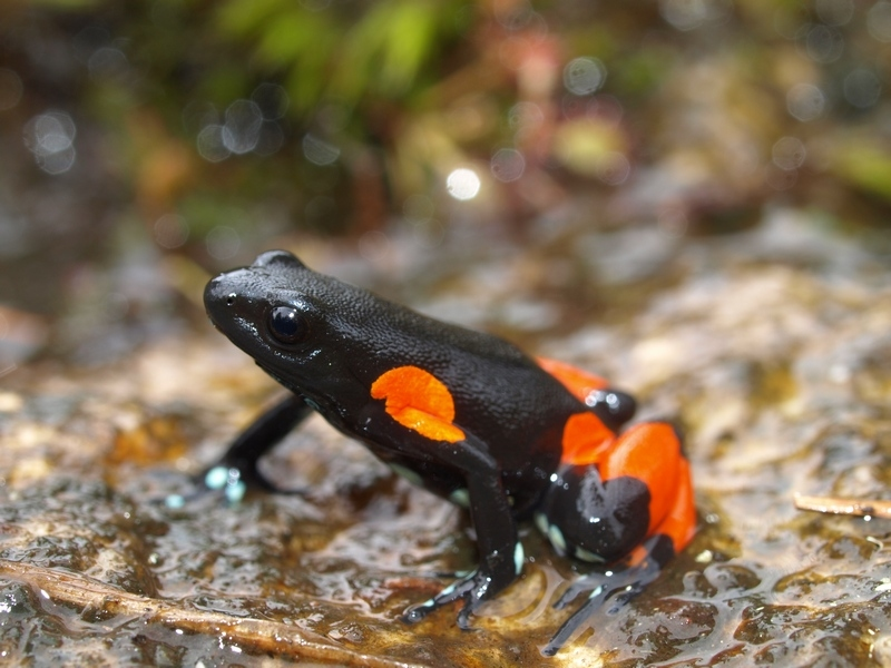
This thread will cover only a tiny fraction of the work on Mantella cowanii because, being so charismatic and threatened, it has received quite a bit of attention.
#MadagascarFrogs
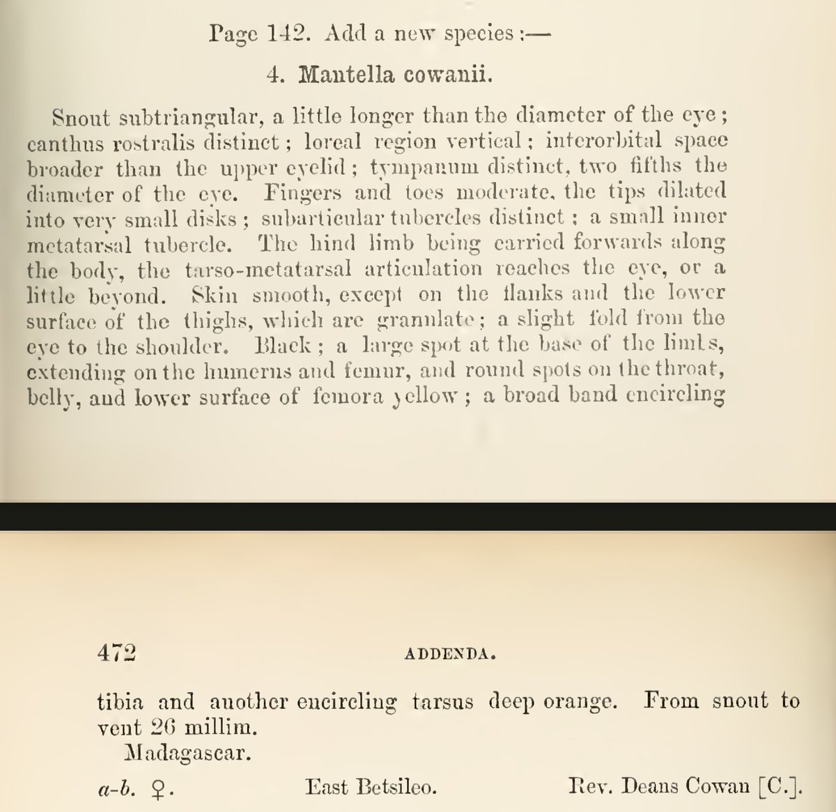
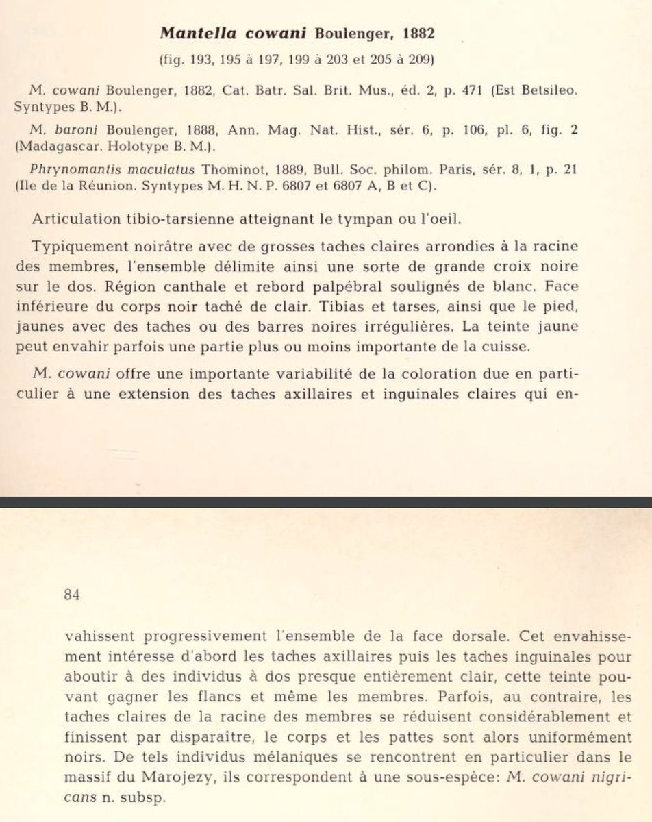
We start at the very beginning: the first specimens, two females, were collected by Reverend Deans Cowan in East Betsileo, Madagascar, and sent to London, where George Albert Boulenger described the species in 1882.
#MadagascarFrogs
Boulenger placed the species in his new genus, Mantella, along with ebenaui, betsileo, and madagascariensis. He recognised that the other Malagasy poison frogs were distinct from the Dendrobates of the Americas, although he did keep them in the Dendrobatidae.
#MadagascarFrogs
As more specimens were collected, it became clear that the species was highly variable. In 1978, Jean Guibé wrote with interest about this variability, describing a new subspecies, M. cowani nigricans—today a full species. #MadagascarFrogs
https://t.co/dwaHMbrYbj
#MadagascarFrogs
📸D.Edmonds/CalPhotos
This thread will cover only a tiny fraction of the work on Mantella cowanii because, being so charismatic and threatened, it has received quite a bit of attention.
#MadagascarFrogs
We start at the very beginning: the first specimens, two females, were collected by Reverend Deans Cowan in East Betsileo, Madagascar, and sent to London, where George Albert Boulenger described the species in 1882.
#MadagascarFrogs
Boulenger placed the species in his new genus, Mantella, along with ebenaui, betsileo, and madagascariensis. He recognised that the other Malagasy poison frogs were distinct from the Dendrobates of the Americas, although he did keep them in the Dendrobatidae.
#MadagascarFrogs
As more specimens were collected, it became clear that the species was highly variable. In 1978, Jean Guibé wrote with interest about this variability, describing a new subspecies, M. cowani nigricans—today a full species. #MadagascarFrogs
https://t.co/dwaHMbrYbj

You May Also Like


https://t.co/6cRR2B3jBE
Viruses and other pathogens are often studied as stand-alone entities, despite that, in nature, they mostly live in multispecies associations called biofilms—both externally and within the host.
https://t.co/FBfXhUrH5d

Microorganisms in biofilms are enclosed by an extracellular matrix that confers protection and improves survival. Previous studies have shown that viruses can secondarily colonize preexisting biofilms, and viral biofilms have also been described.

...we raise the perspective that CoVs can persistently infect bats due to their association with biofilm structures. This phenomenon potentially provides an optimal environment for nonpathogenic & well-adapted viruses to interact with the host, as well as for viral recombination.

Biofilms can also enhance virion viability in extracellular environments, such as on fomites and in aquatic sediments, allowing viral persistence and dissemination.

Viruses and other pathogens are often studied as stand-alone entities, despite that, in nature, they mostly live in multispecies associations called biofilms—both externally and within the host.
https://t.co/FBfXhUrH5d
Microorganisms in biofilms are enclosed by an extracellular matrix that confers protection and improves survival. Previous studies have shown that viruses can secondarily colonize preexisting biofilms, and viral biofilms have also been described.
...we raise the perspective that CoVs can persistently infect bats due to their association with biofilm structures. This phenomenon potentially provides an optimal environment for nonpathogenic & well-adapted viruses to interact with the host, as well as for viral recombination.
Biofilms can also enhance virion viability in extracellular environments, such as on fomites and in aquatic sediments, allowing viral persistence and dissemination.