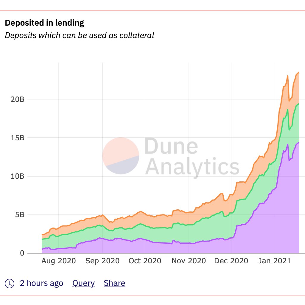
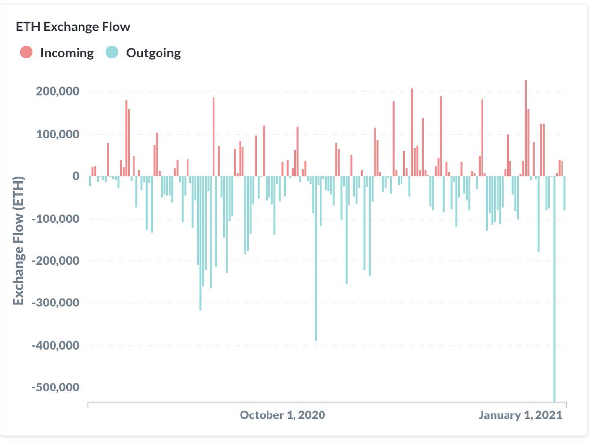
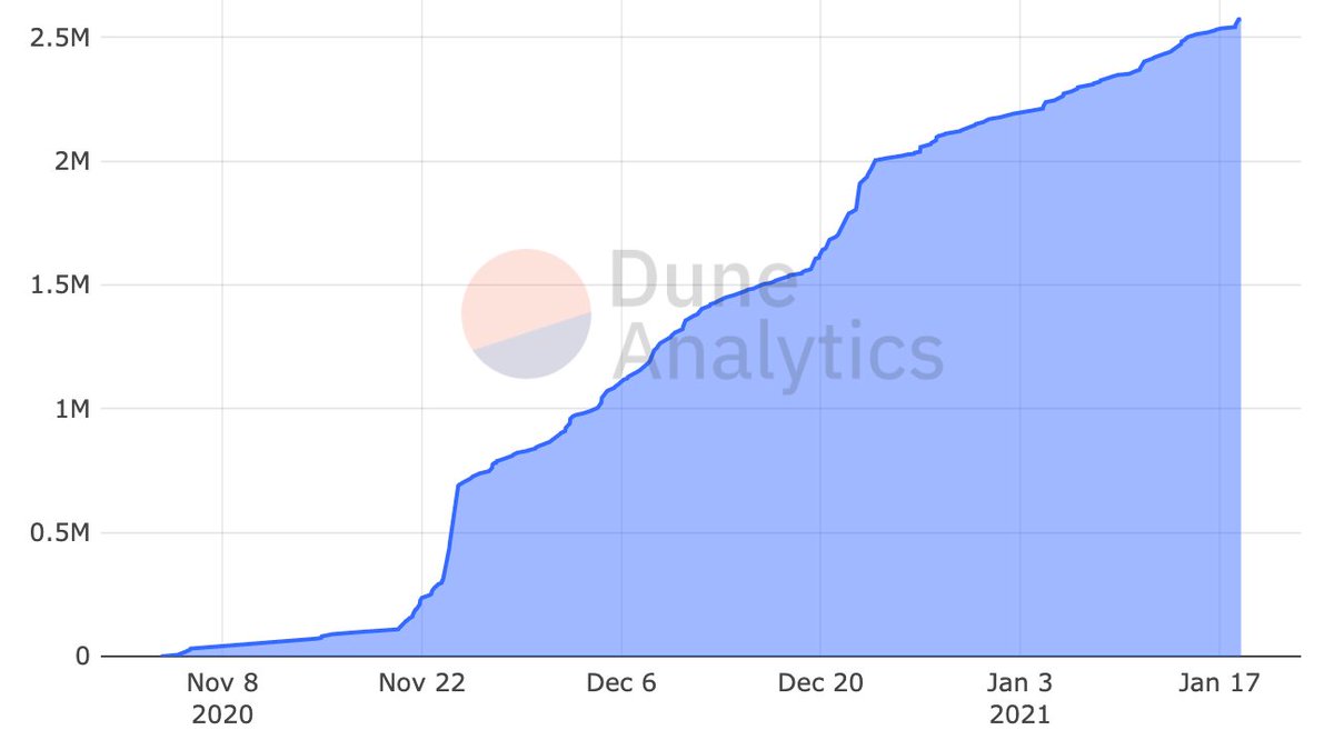
11 signs $ETH is going to blow past its all-time high 👇🏼
More from Crypto


We are actively working to launch on @binance Smart Chain #BSC .
To make this transition easy & understandable for everyone, we are answering most frequently asked questions here.
Ready? Go! 🔥
1/24
#DeFi #YieldFarming
Q1 - What are the benefits of holding the $VALUE token on the Ethereum Mainnet network? Give me reasons not to sell. Some are assuming that the VALUE token will be abandoned now that vBSWAP is being created. Can you clarify the use case for VALUE?
👉 $VALUE will always be a governance & profit receiving token of the whole ecosystem if staked in #vGov. With the new farming token on #BSC , gvVALUE holders will get extra rewards at BSC if they choose to bridge their gvVALUE to BSC & stake in gvVALUE-B/BUSD 98/2 pool.
Q2 - What do I need to do with my VALUE tokens that are staked in vGov? Is it OK to leave them in the vGov?
👉If you have VALUE but aren't staking in the vGov & you would like to participate in the BSC expansion, you will need to stake your VALUE in the vGov to receive gvVALUE.
If you are staking in vGov but don't see the correct gvVALUE amount in your wallet, go to vGov (https://t.co/udXn5IJtVx) to unlock your gvVALUE from the old contract. There will be a bridge from ETH to BSC to move gvVALUE and vUSD over.