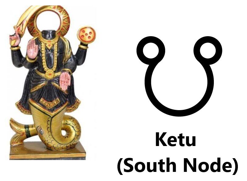
NESARA / GESARA explained for all who are not aware.
"The End of Poverty, The End of Debt, The Beginning of a New Golden Age!"
No Poverty, No Hunger, No Debt, Only Global Prosperity and Peace for ALL
NESARA will merge with GESARA
N = National (US)
G = Global

More from Crypto
1/ @MIT discussing the need for blockchain gateways to achieve interoperability across different blockchain networks, and to support the cross-blockchain mobility of virtual assets
https://t.co/PbjQkSlTT3
@quant_network are collaborating with MIT in the creation of ODAP
$QNT
2/ "In order for blockchain-based services to scale globally, blockchain networks must be able to interoperate with one another following a standardized protocol and interfaces (APIs)"
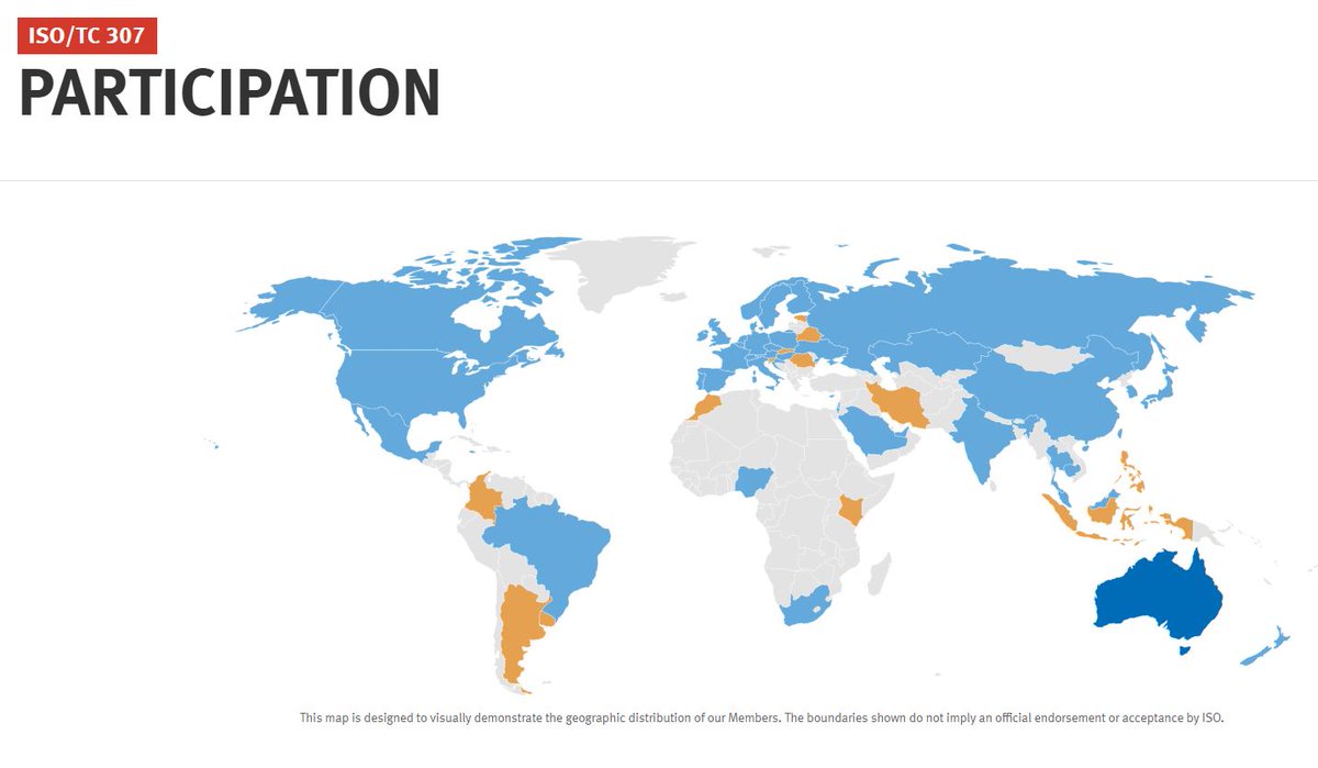
Gilbert founded ISO TC307 which 60 countries are working towards standardizing the interfaces
3/ "We believe that a blockchain gateway is needed for blockchain networks to interoperate in a manner similar
to border gateway routers in IP networks. Just as border gateway routers use the BGPv4 protocol to interact with one another in a peered fashion we believe that a...
4/ blockchain gateway protocol will be needed to permit the movement of virtual assets and related information across blockchain networks in a secure and privacy-preserving manner"
You can read more about the gateway protocol ODAP in this 21 tweet
5/
"We motivate the need for blockchain gateways and blockchain gateway protocols in the following summary:
✅Enables blockchain interoperability:
Blockchain gateways provide an interface for the interoperability between blockchain/DLT systems that operate distinct consensus...
https://t.co/PbjQkSlTT3
@quant_network are collaborating with MIT in the creation of ODAP
$QNT
2/ "In order for blockchain-based services to scale globally, blockchain networks must be able to interoperate with one another following a standardized protocol and interfaces (APIs)"
Gilbert founded ISO TC307 which 60 countries are working towards standardizing the interfaces

3/ "We believe that a blockchain gateway is needed for blockchain networks to interoperate in a manner similar
to border gateway routers in IP networks. Just as border gateway routers use the BGPv4 protocol to interact with one another in a peered fashion we believe that a...
4/ blockchain gateway protocol will be needed to permit the movement of virtual assets and related information across blockchain networks in a secure and privacy-preserving manner"
You can read more about the gateway protocol ODAP in this 21 tweet
See this 21-tweet thread about the creation of an Internet scale protocol to move digital assets involving Quant, MIT, US Government, Intel, Juniper, Payment and Telecom companies \U0001f447https://t.co/n7VGIIlAvq pic.twitter.com/mTUEmCMFZM
— Seq (@CryptoSeq) December 22, 2020
5/
"We motivate the need for blockchain gateways and blockchain gateway protocols in the following summary:
✅Enables blockchain interoperability:
Blockchain gateways provide an interface for the interoperability between blockchain/DLT systems that operate distinct consensus...
You May Also Like
THREAD PART 1.
On Sunday 21st June, 14 year old Noah Donohoe left his home to meet his friends at Cave Hill Belfast to study for school. #RememberMyNoah💙

He was on his black Apollo mountain bike, fully dressed, wearing a helmet and carrying a backpack containing his laptop and 2 books with his name on them. He also had his mobile phone with him.
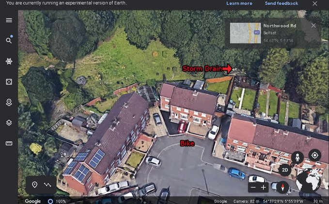
On the 27th of June. Noah's naked body was sadly discovered 950m inside a storm drain, between access points. This storm drain was accessible through an area completely unfamiliar to him, behind houses at Northwood Road. https://t.co/bpz3Rmc0wq
"Noah's body was found by specially trained police officers between two drain access points within a section of the tunnel running under the Translink access road," said Mr McCrisken."
Noah's bike was also found near a house, behind a car, in the same area. It had been there for more than 24 hours before a member of public who lived in the street said she read reports of a missing child and checked the bike and phoned the police.
On Sunday 21st June, 14 year old Noah Donohoe left his home to meet his friends at Cave Hill Belfast to study for school. #RememberMyNoah💙

He was on his black Apollo mountain bike, fully dressed, wearing a helmet and carrying a backpack containing his laptop and 2 books with his name on them. He also had his mobile phone with him.
On the 27th of June. Noah's naked body was sadly discovered 950m inside a storm drain, between access points. This storm drain was accessible through an area completely unfamiliar to him, behind houses at Northwood Road. https://t.co/bpz3Rmc0wq

"Noah's body was found by specially trained police officers between two drain access points within a section of the tunnel running under the Translink access road," said Mr McCrisken."
Noah's bike was also found near a house, behind a car, in the same area. It had been there for more than 24 hours before a member of public who lived in the street said she read reports of a missing child and checked the bike and phoned the police.


