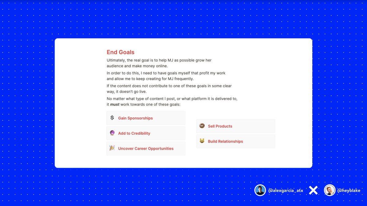
Your homepage should have a good balance of explaining WHO you are, WHY you exist, and WHAT you sell.
If someone doesn't go further, they should walk away with an understanding of all 3.
With digital advertising getting tougher and too many choices for consumers, it's important to have a website that is:
— Nik Sharma (@mrsharma) February 8, 2022
\u2022 story-first
\u2022 easy-to-navigate
\u2022 made to convert
If your grandma can't use it, you've already lost.
Here are 11 tips to build a high-converting site \U0001f447
10 Marketing Lessons From Steve Jobs That Every Marketer Must Know \U0001f9f5
— Alex Garcia \U0001f50d (@alexgarcia_atx) March 18, 2021
Volkswagen's "Think Small\u201d campaign quickly went from a head-scratcher to one that would change advertising forever.
— Alex Garcia \U0001f50d (@alexgarcia_atx) March 19, 2021
It took a small foreign object, crafted by Hitler, to America\u2019s most popular automobile.
By 1972, the VW Beetle became the best-selling car.
Here's the story \U0001f9f5 pic.twitter.com/Hu2s7zAJ3m
Absolut Vodka launched a print ad campaign in 1981 that was so successful, they ran it for the next 25 years.
— Alex Garcia \U0001f50d (@alexgarcia_atx) March 20, 2021
By the end of it, Absolut Vodka went from a 2.5% market share to over 50%.
These 5 reasons made Absolute Vodka a global phenomenon \U0001f9f5 pic.twitter.com/vPblbvtNsx
Amazon wasn't always Amazon.
— Alex Garcia \U0001f50d (@alexgarcia_atx) March 22, 2021
Jeff Bezos originally had trouble finding the right word to name the now trillion-dollar empire.
A few registered domains, a dictionary, and an interesting comparison made Amazon the perfect name.
Here's the quick backstory behind it \U0001f9f5 pic.twitter.com/trTKUMGQCR

Meet Yang Ruifu, CCP's biological weapons expert https://t.co/JjB9TLEO95 via @Gnews202064
— Billy Bostickson \U0001f3f4\U0001f441&\U0001f441 \U0001f193 (@BillyBostickson) October 11, 2020
Interesting expose of China's top bioweapons expert who oversaw fake pangolin research
Paper 1: https://t.co/TrXESKLYmJ
Paper 2:https://t.co/9LSJTNCn3l
Pangolinhttps://t.co/2FUAzWyOcv pic.twitter.com/I2QMXgnkBJ