Using Flex you can make only 1D layout but Grid gives you full power of creating 2D layout
Let's start
{ 2 / 21 }


Well all that we have covered so far we can do that using flexbox also.
— Pratham \U0001f468\u200d\U0001f4bb\U0001f680 (@Prathkum) March 24, 2021
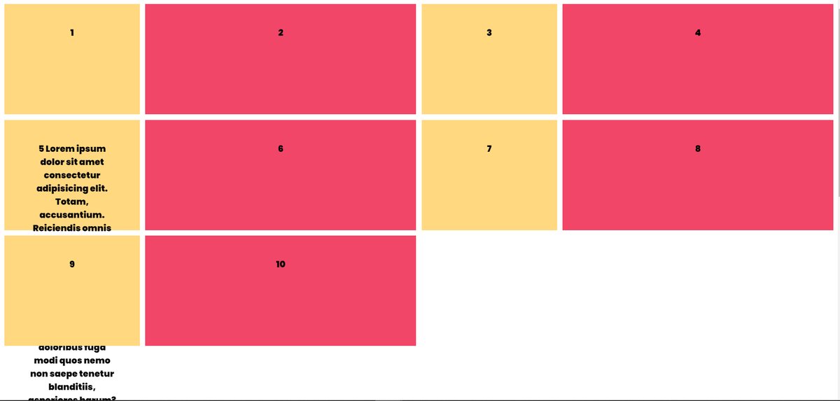
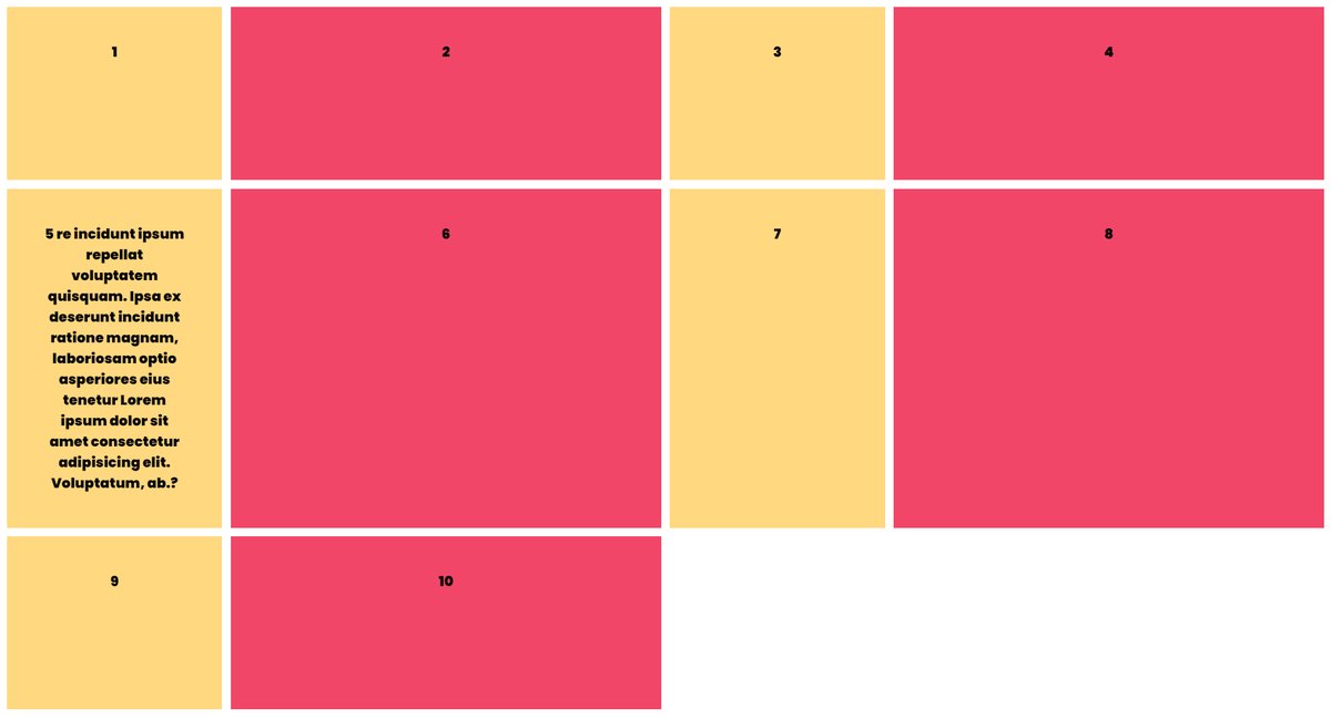
Let's understand the 2 dimensions of grid layout
{ 14 / 21 } pic.twitter.com/9TEEUlnH58
A Complete Guide to Getting Started with CSS
— Pratham (@Prathkum) April 2, 2021
Thread \U0001f9f5 \U0001f447\U0001f3fb pic.twitter.com/I2T2HjtL4e
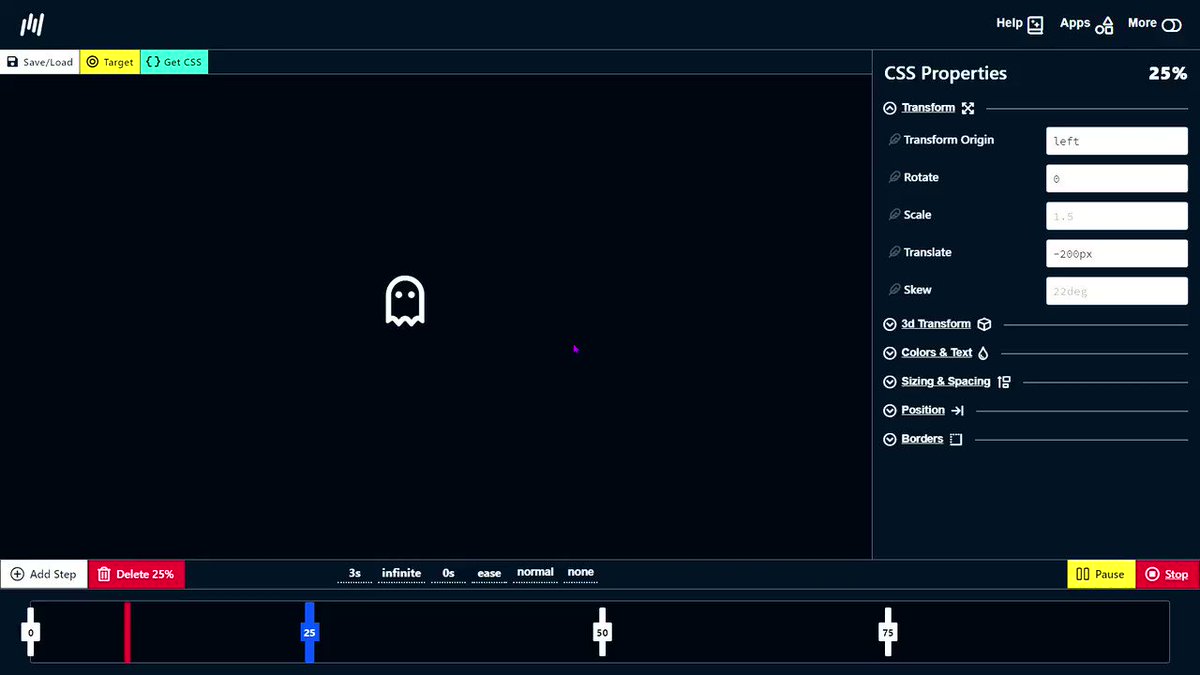
A quick start guide to CSS animations \U0001f447\U0001f3fb
— Pratham (@Prathkum) March 1, 2021
Thread \U0001f9f5 pic.twitter.com/LvGcZr7qsD
The Z-index is a powerful yet confusing concept of CSS
— Pratham (@Prathkum) February 19, 2021
Let's make it easy in this quick thread\U0001f447
\U0001f9f5 pic.twitter.com/aRoGcrUAFt
Everything you need to know about CSS position property
— Pratham (@Prathkum) April 4, 2021
Thread\U0001f9f5\U0001f447 pic.twitter.com/32GErHzU5i