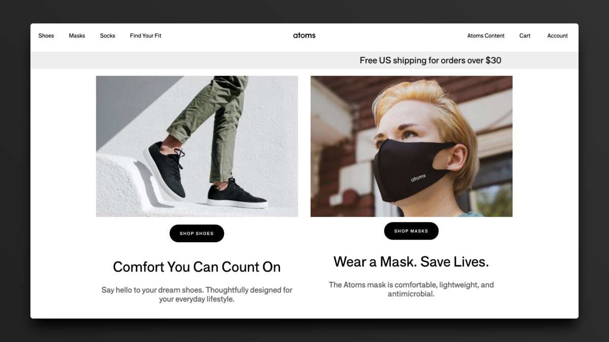
I analyzed 100s of landing pages to give you some inspiration.

Here are 34 of the very best:

Website:
@WearAtoms

1 Great Feature:
Gives us options, but not too many options.

1 Opportunity:
Reduce the speed of the rotating banner.
Website:
@coda_hq

1 Great Feature:
Great copy that informs and relates all at once.

1 Opportunity:
The colors may be a bit too much here. Needs greater contrast of elements.
Website:
@DescriptApp

1 Great Feature:
Eyes point straight to the button on this page.

1 Opportunity:
Needs social proof above the fold.
Website:
@every

1 Great Feature:
Adds a micro-delight under the button to accentuate the call to action.

1 Opportunity:
Show us the newsletter on a device.
Website:
@fast

1 Great Feature:
Shows the product in action instantly.

1 Opportunity:
Update the iPhone mockup to a newer model.
Website:
@useFluent

1 Great Feature:
Gives a demo on page with no effort required.

1 Opportunity:
Could use some empty space at the bottom for social proof.
Website:
@gumroad

1 Great Feature:
Best CTA copy on the internet.

1 Opportunity:
If the focus is on creators, let's show them right off the bat.
Website:
@TZhongg

1 Great Feature:
A little context goes a long way here. Highly focused.

1 Opportunity:
Change the main CTA from Discover to Sign Up.
Website:
@jamesclear

1 Great Feature:
Ultimate lead magnet: an entire chapter of a book.

1 Opportunity:
CTA button is too far down the page and could be moved up.
Website:
@julian

1 Great Feature:
4 high-quality options to choose from. Nothing more, nothing less.

1 Opportunity:
Test moving the subscribe box above the content boxes.

More from All

You May Also Like