Positioning in CSS allows you to display your element wherever you want on the screen

But when I was learning it, I found it little bit confusing😅

So in this thread I'll try to explain it in easiest manner with practical implementation. Let's start

THREAD🧵👇

There are 5 values that you can pass in position property

- static
- relative
- absolute
- fixed
- sticky

In this thread we will be focusing on relative and absolute positioning as both are widely used
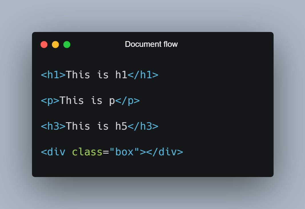
Let's start with understanding what document flow is?

📌 Elements are displayed on the screen as they written in the HTML document

Consider the following piece of code:

H1, P, H3 and div are displayed on the screen in exact order as they written in the HTML file.
As now you know about document flow, let's start with Relative positioning

📌 Relative Position

- Relative positioning do not take an element out of document flow
- Relative positioning is relative to element's original position which can be changed using offset
🔹 Relative position is relative to itself.

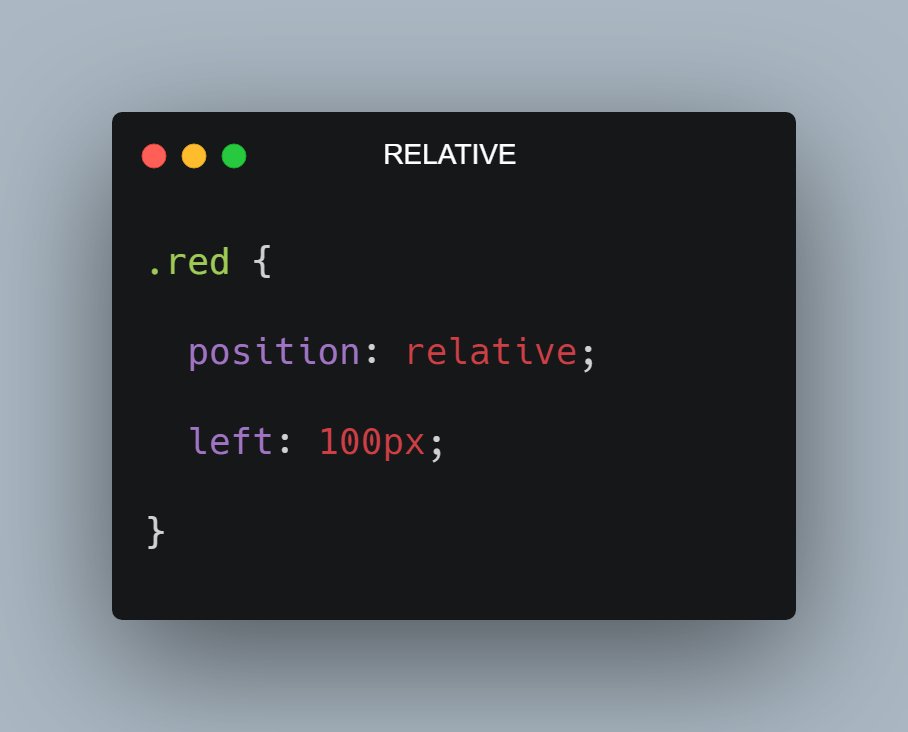
For example: Consider the code and output in the attached image below

As you can see red box is shifted 100px from left because I applied left offset after giving it relative positioning
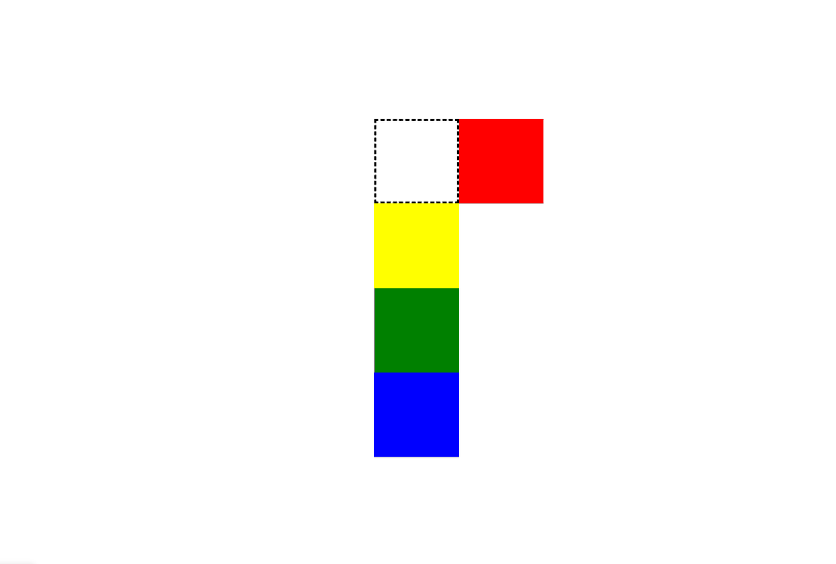
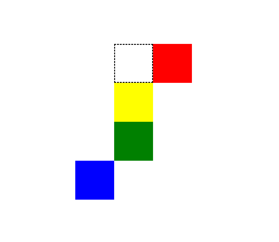
In the attached image below, the black dotted area would be the original position of red box if I don't apply position relative in it.

As you can see it proved that relative position is relative to itself
So now let me shift the blue box 100px towards left. So how can I do that? it's simple

.blue {
position: relative;
right: 100px;
}

Notice here that document flow is as it is. So the relative position does not affect the document flow
📌 Absolute Position

- The element is removed from the normal document flow
- You can consider it as, after applying absolute position the element will no longer in the flow and no space is created for the element in the page layout
For example:

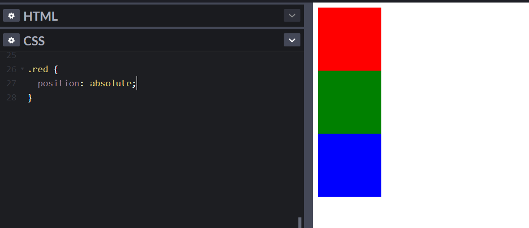
If I apply absolute position in the red box, then the red box will be out of the flow and hence no space will be allocated to it.

See the image below, red box is out of flow and hence yellow box is at top and followed by green and blue

* Yellow box is below red
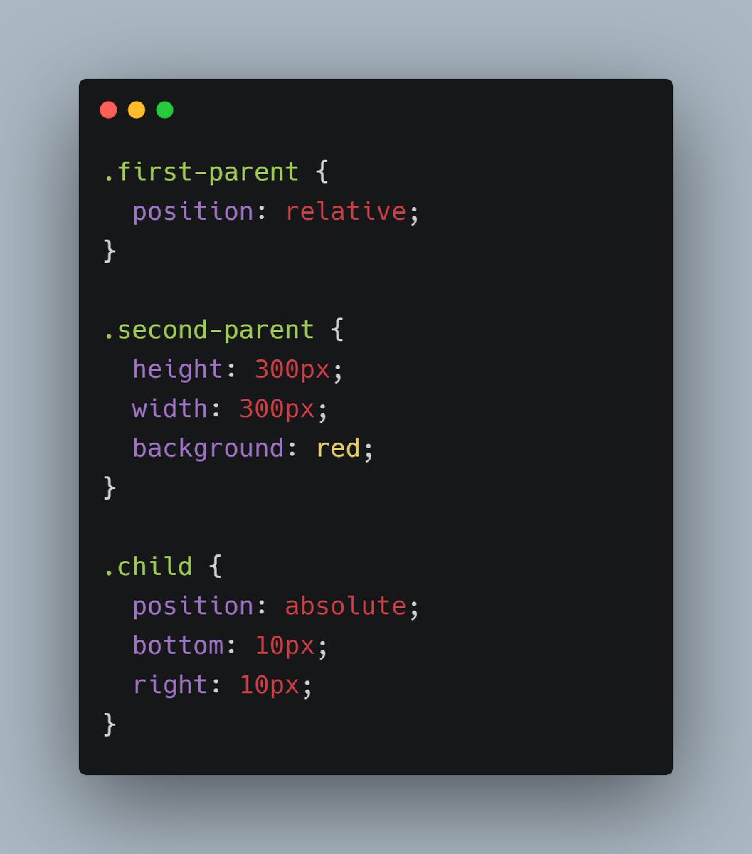
- The absolute position of an element is relative to its closest ancestor, which has some position property.

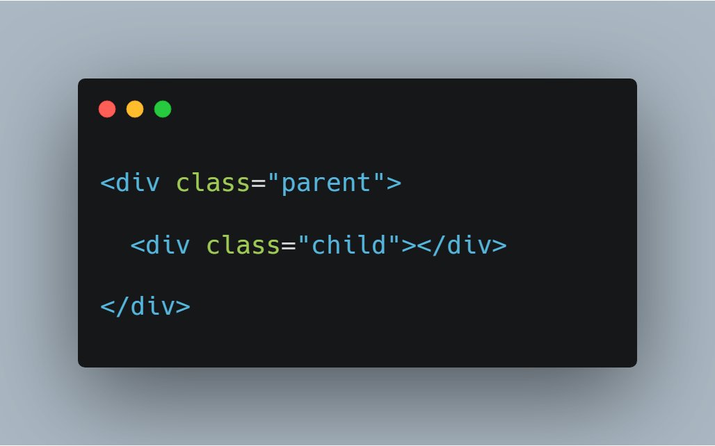
Consider the code below, Red is the parent div and black is the child div. In this particular case, body is the parent of red div
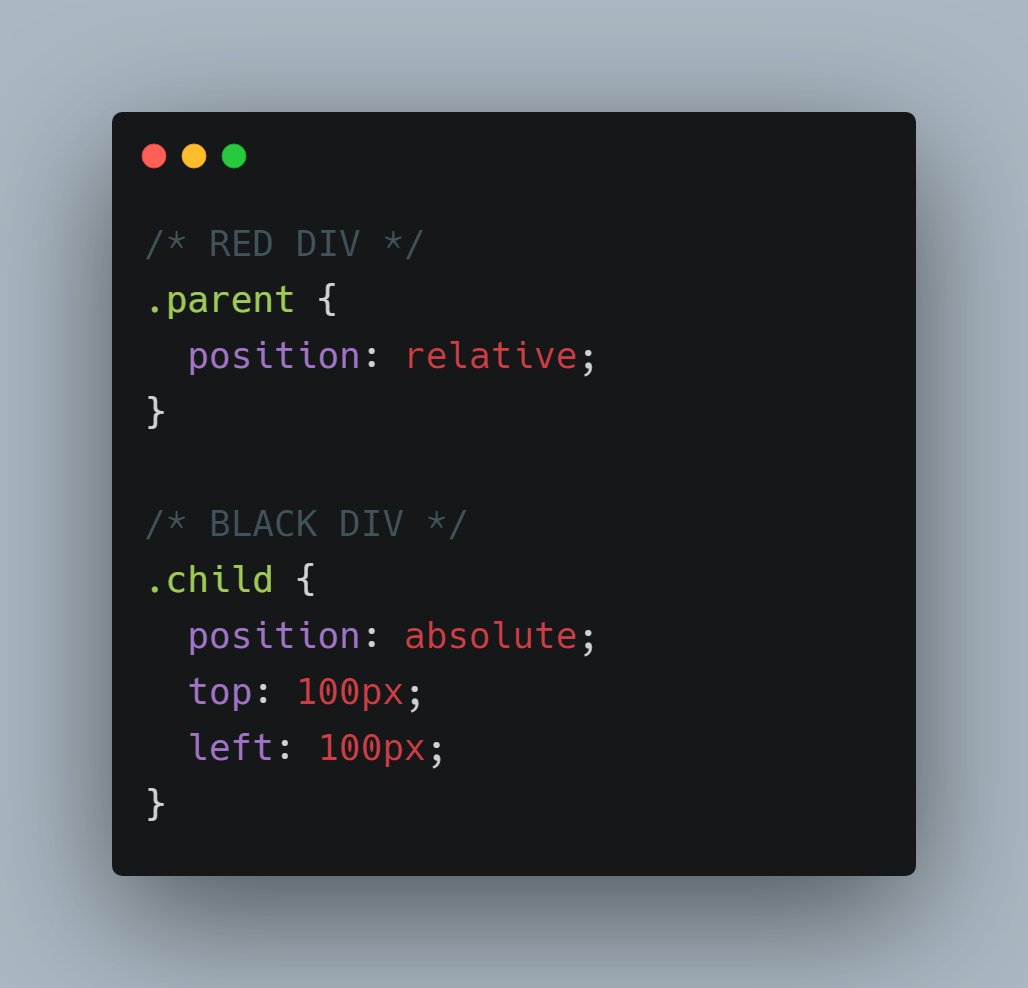
Now let me apply relative position to red(parent) div and absolute position to black(child) div.

As I mentioned absolute position is relative to closest ancestor having some position property
Let's understand it in little more details👇

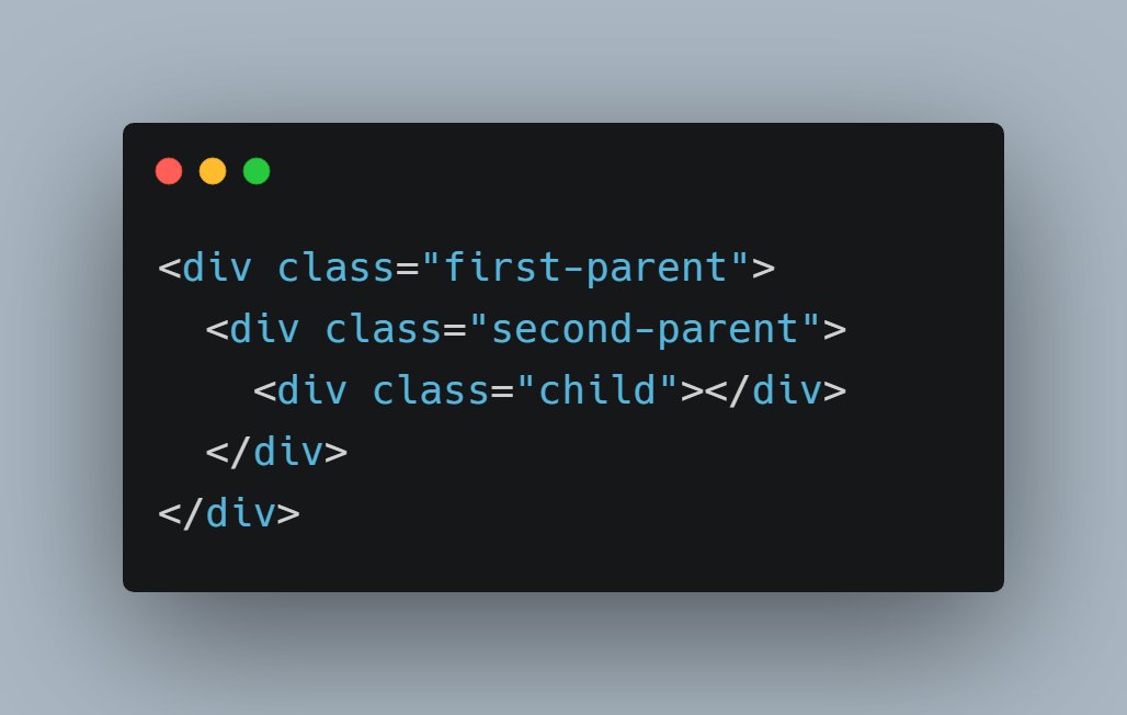
Consider this piece of code.

Here green div is a parent of red and red div is a parent of black
So let me apply position property in green and black. In black div we have absolute position so in that case black div will be relative to green not red

Because here black's closest ancestor is green which has some position property
I think that's pretty much it for this thread. I hope you get a overview of CSS positioning

This may sound a bit confusing but try to play with code. You'll be able to build better understanding😄

Feel free to post your doubts below❤️

More from Pratham 👨‍💻🚀

5 great gradient background sites for every web developer and designer 🎨

🧵👇🏻


1️⃣ uiGradients

- A handpicked collection of beautiful color gradients for designers and developers.

🔗
https://t.co/EainhiePop


2️⃣ Eggradient

- Ready to use gradient background colors. ✓ Cool Gradients are prepared according to the latest design trends

🔗 https://t.co/F0uYVsZbA4


3️⃣ Mesh Gradients

- Create beautiful gradient like aurora UI in few clicks

🔗 https://t.co/MV8PT7q3Kz


4️⃣ CSS Gradient

- Create beatiful gradeint either linear or radial on different angles

🔗 https://t.co/dlCExilHAT
12 websites that will help you learn web development faster (completely free): 🧵

1. How HTTP Works

Everything you need to know about HTTP based system.

🔗
https://t.co/gVZS4RzS1a


2. 30 Days of Node

Learn Node step by step with interactive examples and code snippet in 30 days.

🔗 https://t.co/9nbtMiNB1C


3. How DNS Works

Learn what happens when you type a website address in your browser

🔗 https://t.co/SqMRNnDbc3


4. Git

Check out this excellent free website to learn git visually.

🔗 https://t.co/rQJMISBDfS

More from Tech

On Wednesday, The New York Times published a blockbuster report on the failures of Facebook’s management team during the past three years. It's.... not flattering, to say the least. Here are six follow-up questions that merit more investigation. 1/

1) During the past year, most of the anger at Facebook has been directed at Mark Zuckerberg. The question now is whether Sheryl Sandberg, the executive charged with solving Facebook’s hardest problems, has caused a few too many of her own. 2/
https://t.co/DTsc3g0hQf


2) One of the juiciest sentences in @nytimes’ piece involves a research group called Definers Public Affairs, which Facebook hired to look into the funding of the company’s opposition. What other tech company was paying Definers to smear Apple? 3/ https://t.co/DTsc3g0hQf


3) The leadership of the Democratic Party has, generally, supported Facebook over the years. But as public opinion turns against the company, prominent Democrats have started to turn, too. What will that relationship look like now? 4/

4) According to the @nytimes, Facebook worked to paint its critics as anti-Semitic, while simultaneously working to spread the idea that George Soros was supporting its critics—a classic tactic of anti-Semitic conspiracy theorists. What exactly were they trying to do there? 5/
One of the best decisions I made during a very turbulent 2020 was to leave conventional coding behind and embrace the #nocode movement. @bubble made this a reality. Although my own journey thus far is premature, I’ve learned a lot so here’s a power thread on....


‘How I created @buildcamp sales funnel landing page in under 2hours’.

Preview here 👇

https://t.co/s9P5JodSHe

Power thread here 👇

1. Started with a vanilla bubble app ensuring that all styles and UI elements were removed. Created a new page called funnel and set the page size to 960px as this allows the page to render proportionately on both web and mobile when hitting responsive breakpoints.


2. Began dropping elements onto the page to ‘find the style’. These had to be closely aligned to our @buildcamp branding so included text, buttons and groups - nothing too heavy. Played around with a few fonts, colors and gradients and thus pinned down the following style guide.


3. Started to map out sections using groups as my ‘containers’ to hold the relevant information and imagery needed to pad out the sales pitch. At this point, they were merely blocks of color #ff6600 with reduced opacity set to 5% to ease page flair.

You May Also Like