Hey, who wants to read a story about @Upwork fucking over freelancers in order to upsell their clients on unnecessary services the clients don't want and can't afford? Strap in!
More from Tech

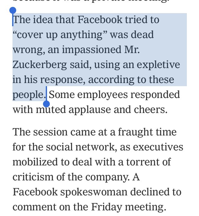
I could create an entire twitter feed of things Facebook has tried to cover up since 2015. Where do you want to start, Mark and Sheryl? https://t.co/1trgupQEH9
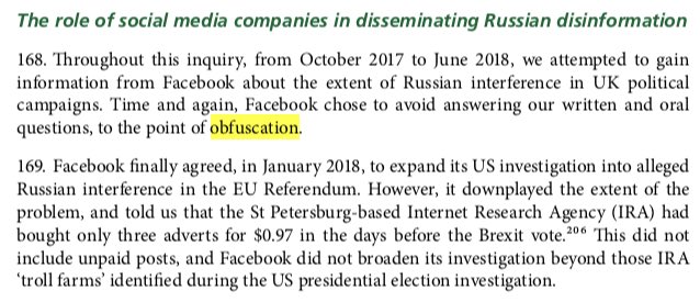
Ok, here. Just one of the 236 mentions of Facebook in the under read but incredibly important interim report from Parliament. ht @CommonsCMS https://t.co/gfhHCrOLeU
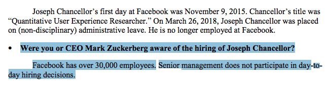
Let’s do another, this one to Senate Intel. Question: “Were you or CEO Mark Zuckerberg aware of the hiring of Joseph Chancellor?"
Answer "Facebook has over 30,000 employees. Senior management does not participate in day-today hiring decisions."
Or to @CommonsCMS: Question: "When did Mark Zuckerberg know about Cambridge Analytica?"
Answer: "He did not become aware of allegations CA may not have deleted data about FB users obtained through Dr. Kogan's app until March of 2018, when
these issues were raised in the media."

If you prefer visuals, watch this short clip after @IanCLucas rightly expresses concern about a Facebook exec failing to disclose info.
Ok, here. Just one of the 236 mentions of Facebook in the under read but incredibly important interim report from Parliament. ht @CommonsCMS https://t.co/gfhHCrOLeU
Let’s do another, this one to Senate Intel. Question: “Were you or CEO Mark Zuckerberg aware of the hiring of Joseph Chancellor?"
Answer "Facebook has over 30,000 employees. Senior management does not participate in day-today hiring decisions."
Or to @CommonsCMS: Question: "When did Mark Zuckerberg know about Cambridge Analytica?"
Answer: "He did not become aware of allegations CA may not have deleted data about FB users obtained through Dr. Kogan's app until March of 2018, when
these issues were raised in the media."
If you prefer visuals, watch this short clip after @IanCLucas rightly expresses concern about a Facebook exec failing to disclose info.
A company as powerful as @facebook should be subject to proper scrutiny. Mike Schroepfer, its CTO, told us that the buck stops with Mark Zuckerberg on the Cambridge Analytica scandal, which is why he should come and answer our questions @DamianCollins @IanCLucas pic.twitter.com/0H4VMhtIFu
— Digital, Culture, Media and Sport Committee (@CommonsCMS) May 23, 2018


On Wednesday, The New York Times published a blockbuster report on the failures of Facebook’s management team during the past three years. It's.... not flattering, to say the least. Here are six follow-up questions that merit more investigation. 1/
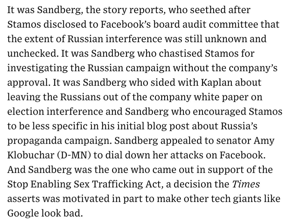
1) During the past year, most of the anger at Facebook has been directed at Mark Zuckerberg. The question now is whether Sheryl Sandberg, the executive charged with solving Facebook’s hardest problems, has caused a few too many of her own. 2/ https://t.co/DTsc3g0hQf
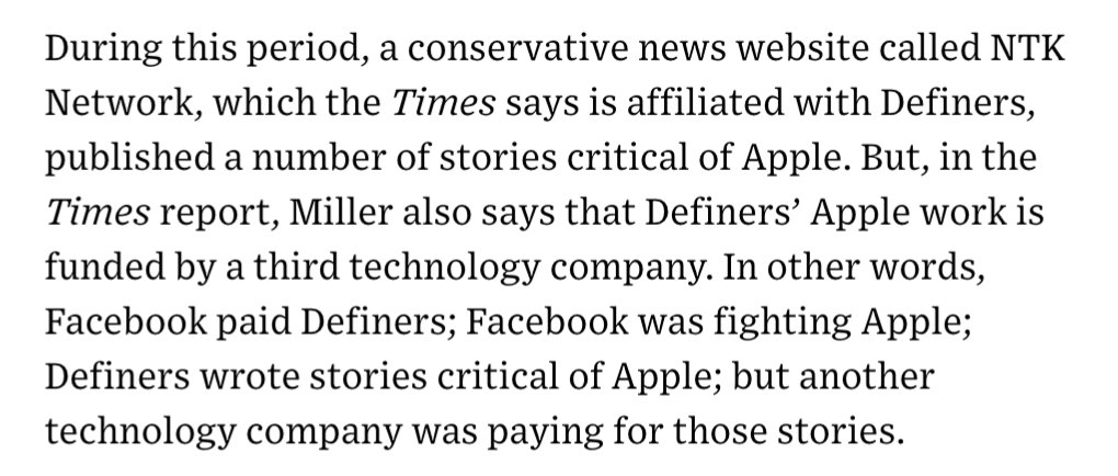
2) One of the juiciest sentences in @nytimes’ piece involves a research group called Definers Public Affairs, which Facebook hired to look into the funding of the company’s opposition. What other tech company was paying Definers to smear Apple? 3/ https://t.co/DTsc3g0hQf
3) The leadership of the Democratic Party has, generally, supported Facebook over the years. But as public opinion turns against the company, prominent Democrats have started to turn, too. What will that relationship look like now? 4/
4) According to the @nytimes, Facebook worked to paint its critics as anti-Semitic, while simultaneously working to spread the idea that George Soros was supporting its critics—a classic tactic of anti-Semitic conspiracy theorists. What exactly were they trying to do there? 5/
1) During the past year, most of the anger at Facebook has been directed at Mark Zuckerberg. The question now is whether Sheryl Sandberg, the executive charged with solving Facebook’s hardest problems, has caused a few too many of her own. 2/ https://t.co/DTsc3g0hQf
2) One of the juiciest sentences in @nytimes’ piece involves a research group called Definers Public Affairs, which Facebook hired to look into the funding of the company’s opposition. What other tech company was paying Definers to smear Apple? 3/ https://t.co/DTsc3g0hQf
3) The leadership of the Democratic Party has, generally, supported Facebook over the years. But as public opinion turns against the company, prominent Democrats have started to turn, too. What will that relationship look like now? 4/
4) According to the @nytimes, Facebook worked to paint its critics as anti-Semitic, while simultaneously working to spread the idea that George Soros was supporting its critics—a classic tactic of anti-Semitic conspiracy theorists. What exactly were they trying to do there? 5/

There has been a lot of discussion about negative emissions technologies (NETs) lately. While we need to be skeptical of assumed planetary-scale engineering and wary of moral hazard, we also need much greater RD&D funding to keep our options open. A quick thread: 1/10
Energy system models love NETs, particularly for very rapid mitigation scenarios like 1.5C (where the alternative is zero global emissions by 2040)! More problematically, they also like tons of NETs in 2C scenarios where NETs are less essential. https://t.co/M3ACyD4cv7 2/10
In model world the math is simple: very rapid mitigation is expensive today, particularly once you get outside the power sector, and technological advancement may make later NETs cheaper than near-term mitigation after a point. 3/10
This is, of course, problematic if the aim is to ensure that particular targets (such as well-below 2C) are met; betting that a "backstop" technology that does not exist today at any meaningful scale will save the day is a hell of a moral hazard. 4/10
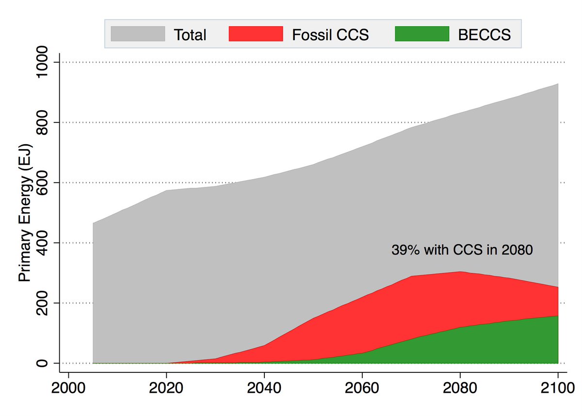
Many models go completely overboard with CCS, seeing a future resurgence of coal and a large part of global primary energy occurring with carbon capture. For example, here is what the MESSAGE SSP2-1.9 scenario shows: 5/10
Energy system models love NETs, particularly for very rapid mitigation scenarios like 1.5C (where the alternative is zero global emissions by 2040)! More problematically, they also like tons of NETs in 2C scenarios where NETs are less essential. https://t.co/M3ACyD4cv7 2/10
There is a lot of confusion about carbon budgets and how quickly emissions need to fall to zero to meet various warming targets. To cut through some of this morass, we can use some very simple emission pathways to explore what various targets would entail. 1/11 pic.twitter.com/Kriedtf0Ec
— Zeke Hausfather (@hausfath) September 24, 2020
In model world the math is simple: very rapid mitigation is expensive today, particularly once you get outside the power sector, and technological advancement may make later NETs cheaper than near-term mitigation after a point. 3/10
This is, of course, problematic if the aim is to ensure that particular targets (such as well-below 2C) are met; betting that a "backstop" technology that does not exist today at any meaningful scale will save the day is a hell of a moral hazard. 4/10
Many models go completely overboard with CCS, seeing a future resurgence of coal and a large part of global primary energy occurring with carbon capture. For example, here is what the MESSAGE SSP2-1.9 scenario shows: 5/10

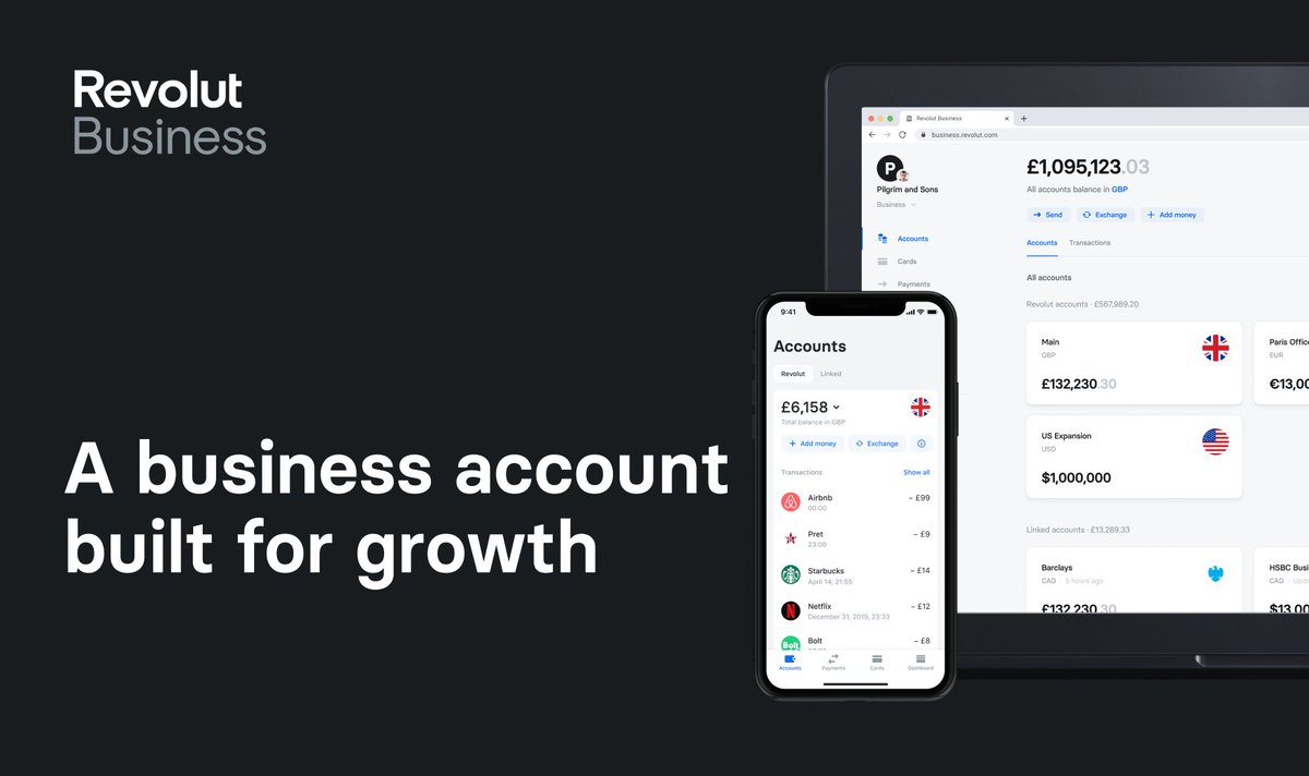
🙂 Hey - have you heard of @RevolutApp Business before?
🌐 Great international transfer and 🏦 foreign #exchange rates, and various tools to manage your #business.
👉 https://t.co/dkuBrYrfMq
#banking #fintech #revolut #growth #startups
1/10
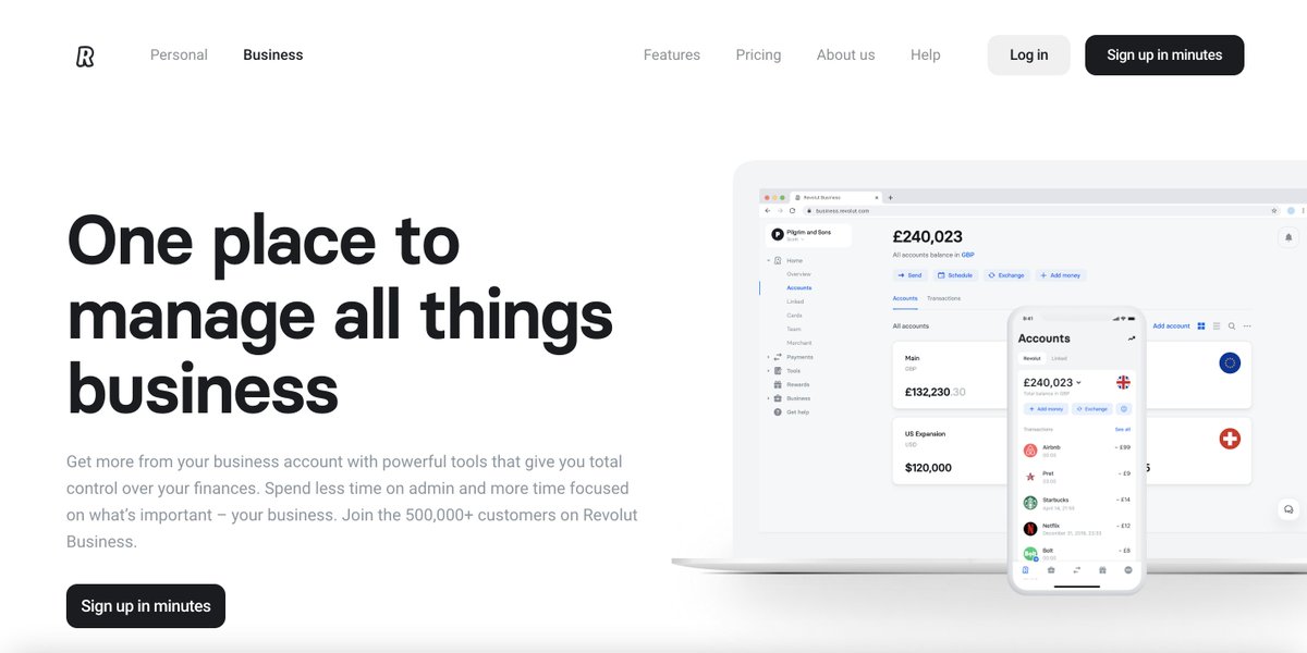
One place to manage all things business
Get more from your business account with powerful tools that give you total control over your finances.
👉 https://t.co/dkuBrYrfMq
2/10
Accept payments
online at great rates
Receive card payments from around the world with low fees and next-day settlement.
👉 https://t.co/dkuBrYrfMq
3/10

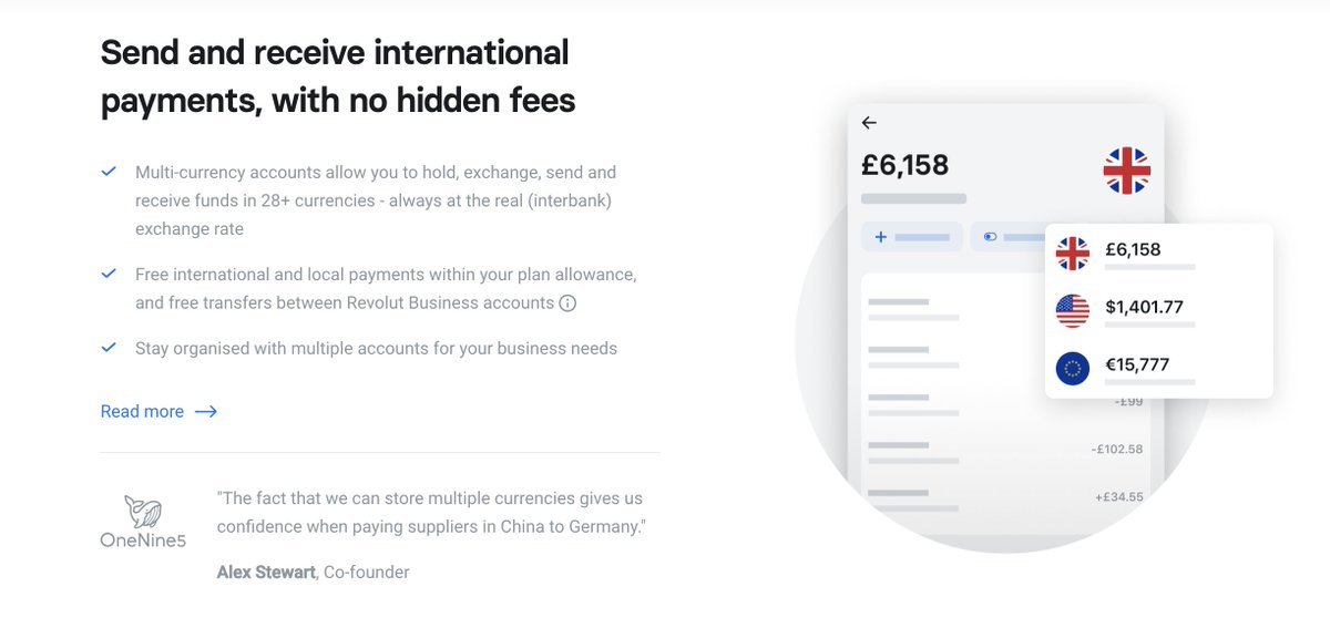
Send and receive international payments, with no hidden fees
Multi-currency accounts allow you to hold, exchange, send and receive funds in 28+ currencies - always at the real (interbank) exchange rate...
👉 https://t.co/dkuBrYrfMq
4/10
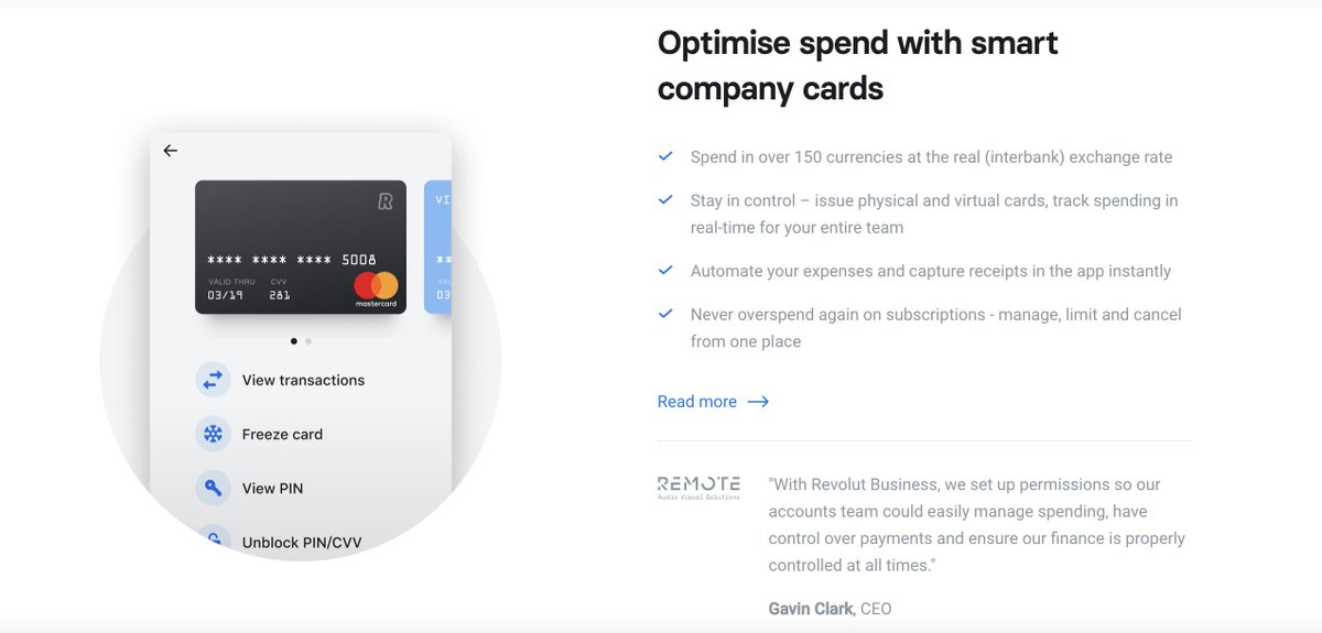
Optimise spend with smart company cards
Spend in over 150 currencies at the real (interbank) exchange rate
Stay in control – issue physical and virtual cards, track spending in real-time for your entire team...
👉 https://t.co/dkuBrYrfMq
5/10
🌐 Great international transfer and 🏦 foreign #exchange rates, and various tools to manage your #business.
👉 https://t.co/dkuBrYrfMq
#banking #fintech #revolut #growth #startups
1/10
One place to manage all things business
Get more from your business account with powerful tools that give you total control over your finances.
👉 https://t.co/dkuBrYrfMq
2/10
Accept payments
online at great rates
Receive card payments from around the world with low fees and next-day settlement.
👉 https://t.co/dkuBrYrfMq
3/10
Send and receive international payments, with no hidden fees
Multi-currency accounts allow you to hold, exchange, send and receive funds in 28+ currencies - always at the real (interbank) exchange rate...
👉 https://t.co/dkuBrYrfMq
4/10
Optimise spend with smart company cards
Spend in over 150 currencies at the real (interbank) exchange rate
Stay in control – issue physical and virtual cards, track spending in real-time for your entire team...
👉 https://t.co/dkuBrYrfMq
5/10