I tried to pick a variety of studies, with as much data in each one as possible, I may add more over time
Omega-3 Research (thread):
I tried to pick a variety of studies, with as much data in each one as possible, I may add more over time
The majority of studies with omega-3 fats and cancer seem to generally show benefit, but this also varies in a few studies
Personally I believe that with this taken into account we will likely see much more benefit to health issues using whole seafood as it's PUFA are less likely to be oxidized
https://t.co/O5vnMDhKlt
https://t.co/88vBXRrpdO
https://t.co/QvvrQ3zXuo
https://t.co/v3JkTU5NgM\
https://t.co/lvXTQjTrhM
https://t.co/ijdAfEhOXF
https://t.co/dYkts7Ieq4
https://t.co/bIxXStNDMZ
https://t.co/0qhUC7uRwb
https://t.co/bacwhTDSGq
https://t.co/JhxpPa1Hz1
More from Science

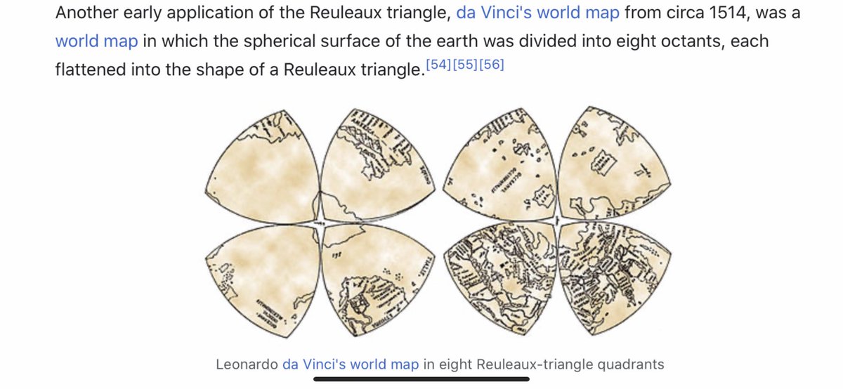
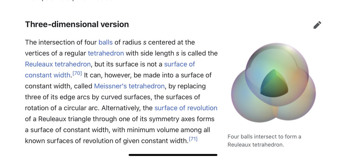
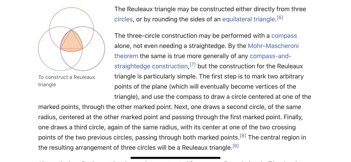
I think we have to expand our thinking about the toroidal sphere even more. When looking at maps, I noticed the da Vinci map, from 1514, which uses the Reuleaux Triangle. This triangle is formed from 3 intersecting circles, and is in the center of a trefoil.
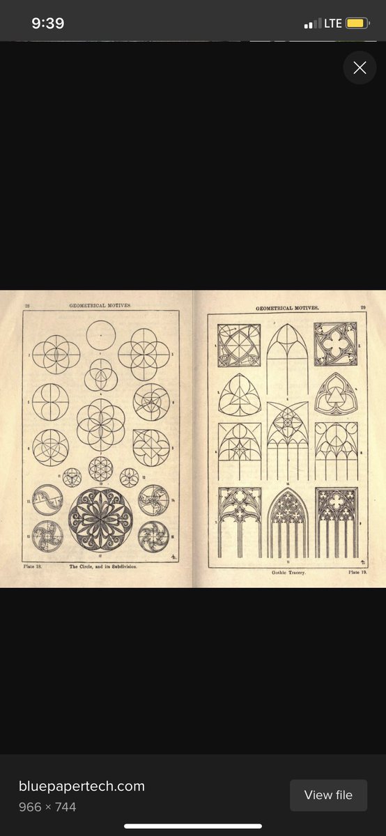
The trefoil is the focal point in many gothic structures, repeatedly and prominently shown. It is represented in many ways. ‘Going down the rabbit hole’ now makes sense, if you understand the center point of the ears is the center of the torus, with the rabbit trefoil.
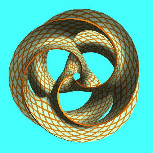
The trefoil can be found within the toroidal field. Here is a fun site, where you can manipulate it yourself. https://t.co/FCMcybuuFC
The wiki page makes it seem like there isn’t much of importance with the Reuleaux Triangle, besides being used for coinage, or some stupid bike. But the Wankel engine is an interesting engine, using this geometric design https://t.co/ayPOgkAqGN
https://t.co/m9EaWwF796
The trefoil is the focal point in many gothic structures, repeatedly and prominently shown. It is represented in many ways. ‘Going down the rabbit hole’ now makes sense, if you understand the center point of the ears is the center of the torus, with the rabbit trefoil.
The trefoil can be found within the toroidal field. Here is a fun site, where you can manipulate it yourself. https://t.co/FCMcybuuFC
The wiki page makes it seem like there isn’t much of importance with the Reuleaux Triangle, besides being used for coinage, or some stupid bike. But the Wankel engine is an interesting engine, using this geometric design https://t.co/ayPOgkAqGN
https://t.co/m9EaWwF796


"The new answer to a 77-year-old problem"
😭
https://t.co/hm9NoaU4nr
https://t.co/8fKDiKjSWc
https://t.co/jkaicC1F2x
https://t.co/PpxWT4Jef4
😭
The new answer to a 77-year-old problem in data analysis, published today in @naturemethods. Instead of significance tests, use estimation graphics. Our software suite DABEST makes it easy for everyone to visualize effect sizes.https://t.co/UzwXJ7EUC5 pic.twitter.com/VtxyY0xaRM
— Adam Claridge-Chang (@adamcchang) June 19, 2019
https://t.co/hm9NoaU4nr
Open letter to journal editors: dynamite plots must die. Dynamite plots, also known as bar and line graphs, hide important information. Editors should require authors to show readers the data and avoid these plots. https://t.co/0GNKEIUCJL pic.twitter.com/OS9ytEFRZN
— Rafael Irizarry (@rafalab) February 22, 2019
https://t.co/8fKDiKjSWc
Couldn't find D3 code for grouped horisontal box plots that show data points so I made this @mbostock @thisisalfie https://t.co/cQjDPhyZdw pic.twitter.com/y6RNmDB2p3
— Ulrik Lyngs (@ulyngs) June 28, 2017
https://t.co/jkaicC1F2x
made a pkg for pirate plots in ggplot: add any of points/means/bars/CIs/violins \u2013 better than ye olde bar/box plotshttps://t.co/Z2m2kW3hsl pic.twitter.com/npAirPQexM
— Mika Braginsky (@mbraginsky) September 28, 2017
https://t.co/PpxWT4Jef4
See the new #PowerBI visual awesomeness for data points & sources, box-&-whisker plots! https://t.co/dOmgoxWfDE pic.twitter.com/HAUOAMJEJW
— Microsoft Power BI (@MSPowerBI) February 1, 2016

The endangered whales must contend with up to 1,000 boats moving daily through an important feeding area in the eastern South Pacific, according to research published in the scientific journal Nature.@WeDontHaveTime
#ForNature @JohnKerry
#ForNature @JohnKerry
Blue whales threatened by ship collisions in busy Patagonia waters
— James Mitchell \u24cb\U0001f42c (@MesMitch) February 1, 2021
Endangered giants face potentially fatal encounters with the 1,000 daily fishing vessels moving through main feeding area off Chile, scientists warn\U0001f43b\u200d\u2744\ufe0f@WeDontHaveTime
#ForNature @JohnKerry