Google Sheets isn't Excel...

But it's more powerful than you think.

8 things Google Sheets can do, you'll wish you knew yesterday. 📊

Translate Text:

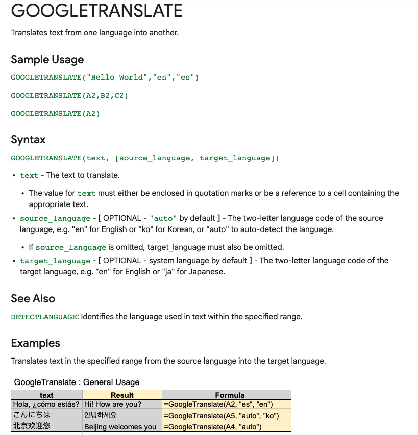
Need to convert data from one language to another?

Enter:
=GOOGLETRANSLATE("A2","en","es")

This will translate the words in cell "A2" from English to Spanish.

Replace "en" with "auto" and Sheets will identify the source language automatically.
Timesavers:

Assuming you're signed in to your Google account, head on up to your browser's address bar:

From there type: "https://t.co/BeKgYV7g31"

Boom! A new Google sheet is created for you on the fly from anywhere on the web.

(Works for docs too)

Pretty cool!
Sparklines:

Easily visualize data trends by adding sparklines to your sheet.

To add a basic "mini-graph" inside a cell, it's as simple as inputting:

=SPARKLINE (A1:F1) – (Where A1:F1 represents your range of data.)

For more detailed options, check this out:👇🏻
Explore:

Need to do some number crunching?

Let Google's AI do the work for you.

•Highlight the range of data.

•Move your cursor to the starburst shaped icon in the bottom right corner.

•Click "Explore" – Complex charts, analytics, & detailed info. generated automatically.
Heat Maps:

With conditional formatting, you can turn your data into a heat map to easily identify trends & patterns.

•Select the data range in the Google Sheet
•Format->Conditional Formatting
•Click "Color Scale"
•Select colors to represent:
––Min, Mid, & Max
Finance:

Monitor stock prices, spot trends, & quickly review historical data using =GOOGLEFINANCE.

Want to see the last 60 days of closing prices for a specific ticker symbol?

Paste the formula below & voila!

=GOOGLEFINANCE("NASDAQ:TSLA","price",TODAY()-60,TODAY())
Auto-email when commenting:

One of my favorite things about Google Sheets is the ease of collaboration within docs.

Need to assign a task to a co-worker?

Want to make sure they actually see it?

Automatically send an email to coworkers using comments within cells.
Make your charts stand out:

First, let's make a chart...

Highlit cells then click:

"Insert -> Chart -> Chart Type -> Pie"

Now, double-click one section of the chart and select the "distance from center" option.

Increase the % to make that section stand out from the rest!
Thanks for reading!

If you're a bit of a nerd & love spreadsheets like me, why not share?

•Retweet the first tweet and help others find this thread!

•Join 56,000 of my friends & follow me: @blakeaburge

•You can find my previous work here:
https://t.co/YokOrX2SzE

More from Blake Burge 💡

You May Also Like

Department List of UCAS-China PROFESSORs for ANSO, CSC and UCAS (fully or partial) Scholarship Acceptance
1) UCAS School of physical sciences Professor
https://t.co/9X8OheIvRw
2) UCAS School of mathematical sciences Professor

3) UCAS School of nuclear sciences and technology
https://t.co/nQH8JnewcJ
4) UCAS School of astronomy and space sciences
https://t.co/7Ikc6CuKHZ
5) UCAS School of engineering

6) Geotechnical Engineering Teaching and Research Office
https://t.co/jBCJW7UKlQ
7) Multi-scale Mechanics Teaching and Research Section
https://t.co/eqfQnX1LEQ
😎 Microgravity Science Teaching and Research

9) High temperature gas dynamics teaching and research section
https://t.co/tVIdKgTPl3
10) Department of Biomechanics and Medical Engineering
https://t.co/ubW4xhZY2R
11) Ocean Engineering Teaching and Research

12) Department of Dynamics and Advanced Manufacturing
https://t.co/42BKXEugGv
13) Refrigeration and Cryogenic Engineering Teaching and Research Office
https://t.co/pZdUXFTvw3
14) Power Machinery and Engineering Teaching and Research