https://t.co/vM2jjA7VZD
The Govt, the Opposition, and the real Opposition. Some thoughts on Govt, Labour and the ERG/CRG.
Thread. 1/16
https://t.co/vM2jjA7VZD
We have not secured an easy trade deal with the UK and are facing a very hard Brexit, deal or no deal.
Both deaths and the economic damage from the virus are world-beating. 3/
See thread on Brexit https://t.co/5dPxYdfPEr 15/
Lots of talk again today about @UKLabour's positioning on Brexit.
— Phil Syrpis (@syrpis) November 24, 2020
I don't think that finding the right path as complicated as many seem to believe. Thread. 1/19 (sorry it is so long!)
More from Government


WOW, Mike Gapes and Joan Ryan are non-Labour JLM conference attendees discussing disciplinary processes with Keir Starmer and Angela Rayner but not a privilege afforded to the people who pay the wages of the party machine. #LabourLeaks #StarmerOut #LFI https://t.co/XZDKR5FmXC

So what should Peter Mandelson talk about at the recent Jewish Labour Movement conference – his worries that an independent process will hamper the party leader Keir Starmer?. #LabourLeaks #StarmerOut #LFI

Mandelson “was there in the 1980s and understands where the power bases of the right are, and how it should be exercised”. Who needs independent processes or oversight when you are in the driving seat?. #LabourLeaks #StarmerOut #LFI
Poale Zion trades as Jewish Labour Movement is a part of the Zionist Federation of the UK and organise within the World Zionist Organisation. You do NOT have to be Jewish or a member of the Labour Party to join. JLM contains CIA asset Ruth Smeeth. #LabourLeaks #StarmerOut #BICOM

Ruth Smeeth, one of the 60 plus anti-Corbyn resignations from the shadow cabinet, formerly held a post with the lobby group, Trevor Chinn's Britain Israel Communications and Research Centre (BICOM). #StarmerOut #BICOM #JLM https://t.co/H2a9vnsnRP

So what should Peter Mandelson talk about at the recent Jewish Labour Movement conference – his worries that an independent process will hamper the party leader Keir Starmer?. #LabourLeaks #StarmerOut #LFI
Mandelson “was there in the 1980s and understands where the power bases of the right are, and how it should be exercised”. Who needs independent processes or oversight when you are in the driving seat?. #LabourLeaks #StarmerOut #LFI
Poale Zion trades as Jewish Labour Movement is a part of the Zionist Federation of the UK and organise within the World Zionist Organisation. You do NOT have to be Jewish or a member of the Labour Party to join. JLM contains CIA asset Ruth Smeeth. #LabourLeaks #StarmerOut #BICOM
Ruth Smeeth, one of the 60 plus anti-Corbyn resignations from the shadow cabinet, formerly held a post with the lobby group, Trevor Chinn's Britain Israel Communications and Research Centre (BICOM). #StarmerOut #BICOM #JLM https://t.co/H2a9vnsnRP
You May Also Like







THREAD: 12 Things Everyone Should Know About IQ
1. IQ is one of the most heritable psychological traits – that is, individual differences in IQ are strongly associated with individual differences in genes (at least in fairly typical modern environments). https://t.co/3XxzW9bxLE
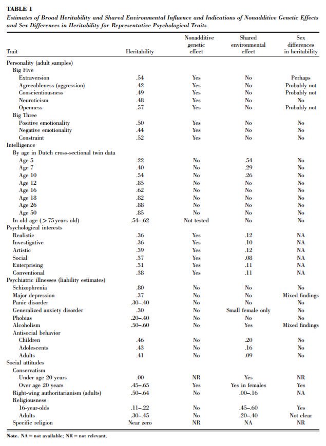
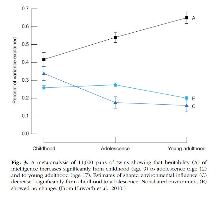
2. The heritability of IQ *increases* from childhood to adulthood. Meanwhile, the effect of the shared environment largely fades away. In other words, when it comes to IQ, nature becomes more important as we get older, nurture less. https://t.co/UqtS1lpw3n
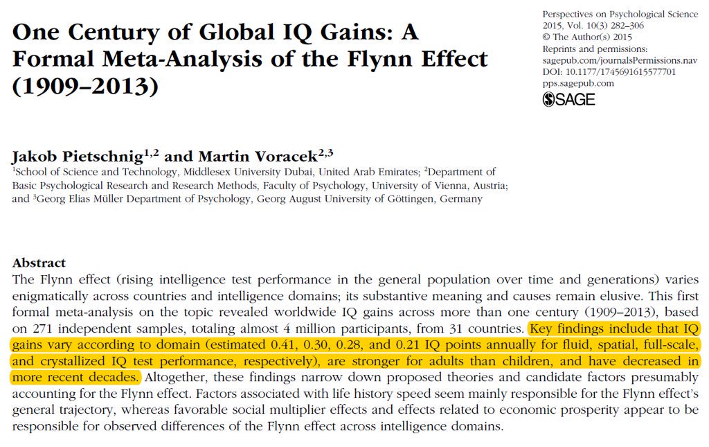
3. IQ scores have been increasing for the last century or so, a phenomenon known as the Flynn effect. https://t.co/sCZvCst3hw (N ≈ 4 million)
(Note that the Flynn effect shows that IQ isn't 100% genetic; it doesn't show that it's 100% environmental.)
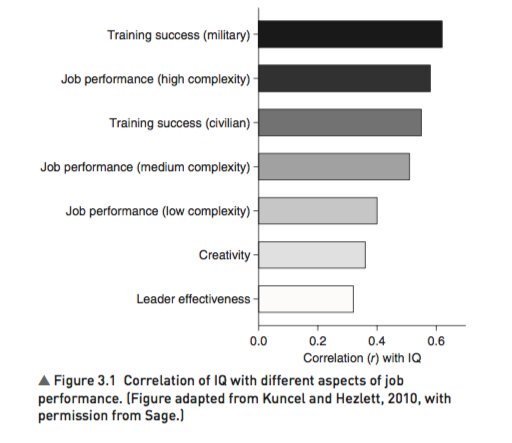
4. IQ predicts many important real world outcomes.
For example, though far from perfect, IQ is the single-best predictor of job performance we have – much better than Emotional Intelligence, the Big Five, Grit, etc. https://t.co/rKUgKDAAVx https://t.co/DWbVI8QSU3
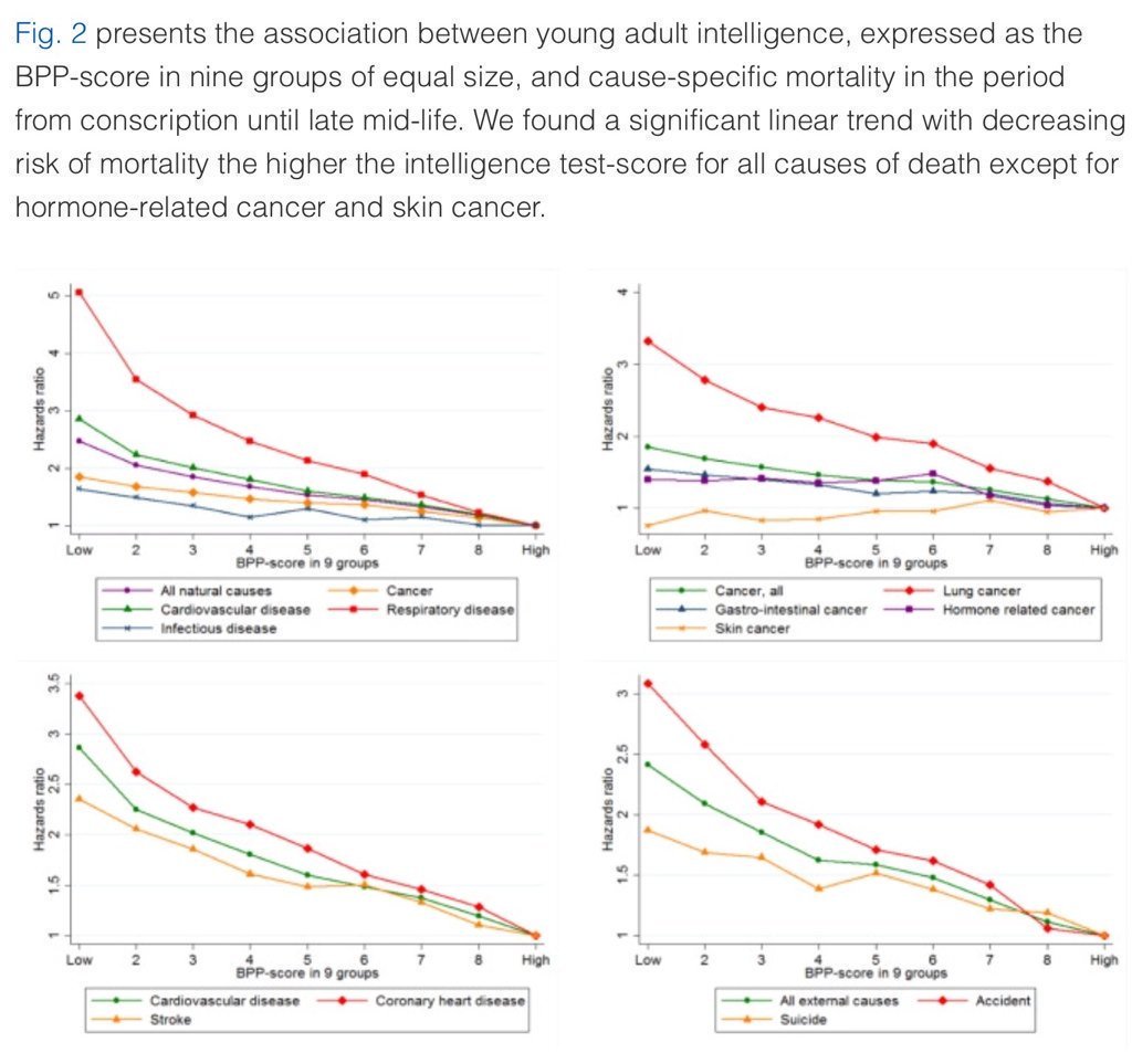
5. Higher IQ is associated with a lower risk of death from most causes, including cardiovascular disease, respiratory disease, most forms of cancer, homicide, suicide, and accident. https://t.co/PJjGNyeQRA (N = 728,160)
1. IQ is one of the most heritable psychological traits – that is, individual differences in IQ are strongly associated with individual differences in genes (at least in fairly typical modern environments). https://t.co/3XxzW9bxLE
2. The heritability of IQ *increases* from childhood to adulthood. Meanwhile, the effect of the shared environment largely fades away. In other words, when it comes to IQ, nature becomes more important as we get older, nurture less. https://t.co/UqtS1lpw3n
3. IQ scores have been increasing for the last century or so, a phenomenon known as the Flynn effect. https://t.co/sCZvCst3hw (N ≈ 4 million)
(Note that the Flynn effect shows that IQ isn't 100% genetic; it doesn't show that it's 100% environmental.)
4. IQ predicts many important real world outcomes.
For example, though far from perfect, IQ is the single-best predictor of job performance we have – much better than Emotional Intelligence, the Big Five, Grit, etc. https://t.co/rKUgKDAAVx https://t.co/DWbVI8QSU3
5. Higher IQ is associated with a lower risk of death from most causes, including cardiovascular disease, respiratory disease, most forms of cancer, homicide, suicide, and accident. https://t.co/PJjGNyeQRA (N = 728,160)