
Insights of a noob:
10 things I've learned from 18 months in the financial services industry.
👇🧵
Negative compounding is a thing, it occurs from the buildup of fees and taxes over time (there is a link to an article which explains this in more detail in point 9).
@MavenAdviser summed it up perfectly in a recent podcast, 'financial success takes place between your ears, not on a computer screen'.
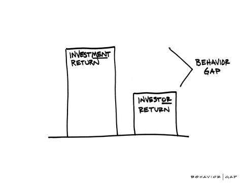
Over the long term markets do not lose money, however investors do.
A study found that over a 20 year period ‘the average investment return was 11.81%. The average investor return was 4.48%.’
You are not god's gift.
You can't predict the future.
Market timing is futile.
Day trading may sound exciting and you may feel like the Wolf of Wall Street - most of the time you are just mugging yourself off.
If you want to have an extra focus on a particular asset/market, dabble in that on the side, do not make it the centre of your portfolio (if you are unsure why, see point 4).
It may be the worst possible decision an investor can ever make, potentially wiping out a huge chunk of their net worth in one go.
Take a breath, step back and THINK.
If you are going to buy back in when the markets start to rise again, then YOU have acknowledged that it is just a TEMPORARY decline!
DON’T DO IT!
Learn the difference between volatility and risk and you will soon realise that the real risk is not being in the market.
This rings especially true for the financial media.
Sensationalist writing sells - unfortunately level headed, evidence based commentary does not. Learn to tune out the noise and crack on.
Spend less than you earn.
Pay yourself first.
Keep a close eye on fees and tax.
It drives home the importance of your savings rate and the impact of negative compounding (touched upon in point 2).
https://t.co/d30XxFjsWu
More from Finance







You May Also Like









1/Politics thread time.
To me, the most important aspect of the 2018 midterms wasn't even about partisan control, but about democracy and voting rights. That's the real battle.
2/The good news: It's now an issue that everyone's talking about, and that everyone cares about.
3/More good news: Florida's proposition to give felons voting rights won. But it didn't just win - it won with substantial support from Republican voters.
That suggests there is still SOME grassroots support for democracy that transcends
4/Yet more good news: Michigan made it easier to vote. Again, by plebiscite, showing broad support for voting rights as an
5/OK, now the bad news.
We seem to have accepted electoral dysfunction in Florida as a permanent thing. The 2000 election has never really
To me, the most important aspect of the 2018 midterms wasn't even about partisan control, but about democracy and voting rights. That's the real battle.
2/The good news: It's now an issue that everyone's talking about, and that everyone cares about.
3/More good news: Florida's proposition to give felons voting rights won. But it didn't just win - it won with substantial support from Republican voters.
That suggests there is still SOME grassroots support for democracy that transcends
4/Yet more good news: Michigan made it easier to vote. Again, by plebiscite, showing broad support for voting rights as an
5/OK, now the bad news.
We seem to have accepted electoral dysfunction in Florida as a permanent thing. The 2000 election has never really
Bad ballot design led to a lot of undervotes for Bill Nelson in Broward Co., possibly even enough to cost him his Senate seat. They do appear to be real undervotes, though, instead of tabulation errors. He doesn't really seem to have a path to victory. https://t.co/utUhY2KTaR
— Nate Silver (@NateSilver538) November 16, 2018