
Story time. There will be a couple crypto wallet addresses at the end of this one.

This is something that will stay up, maybe clear till the midterm election.
And it needs a significant amount of disk space, for unpacking and sorting and such.
0xc6301a7f5a750Aec37280ECabe45956405A4F92C
Nope, can't use any sort of cloud. Bare metal, encrypted drives, all that kinda stuff is required.
Nobody you know can tell you anything more about this. It's not a social media thing. At all.
So there you have it. If you know and approve of my past work, this is opportunity knocking.
More from Crypto




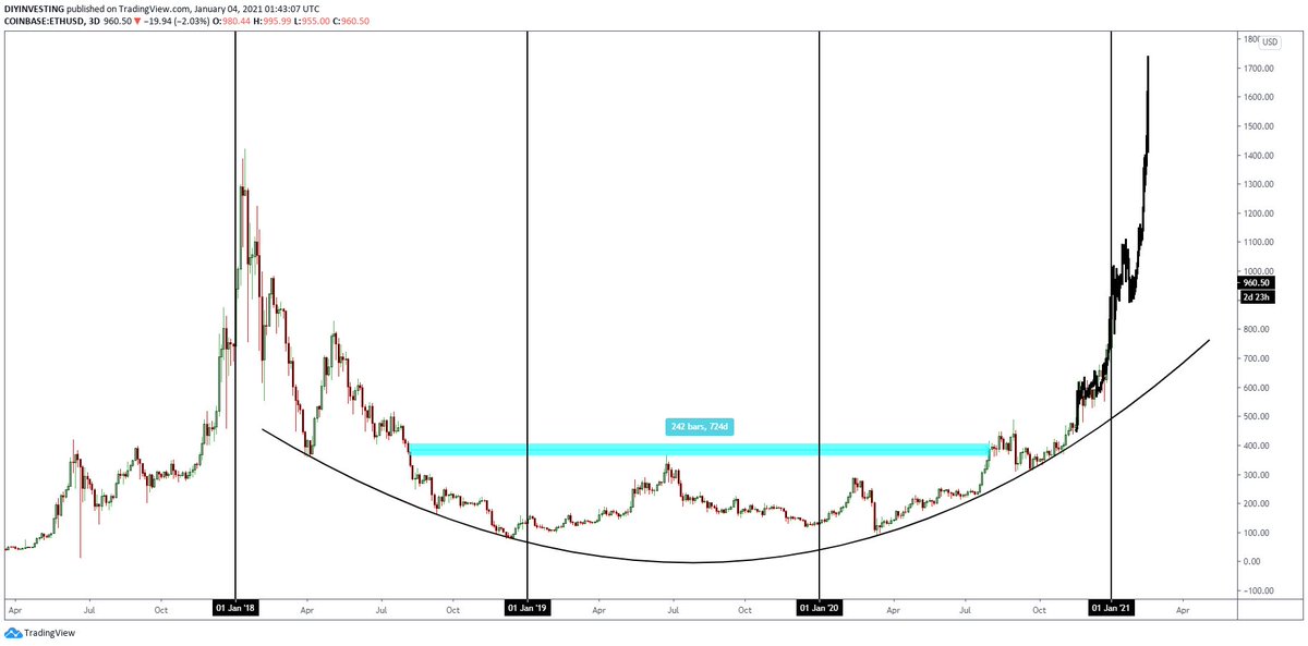

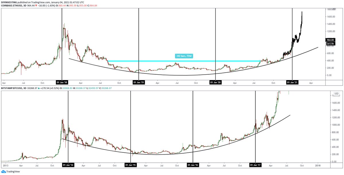
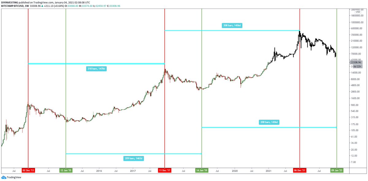
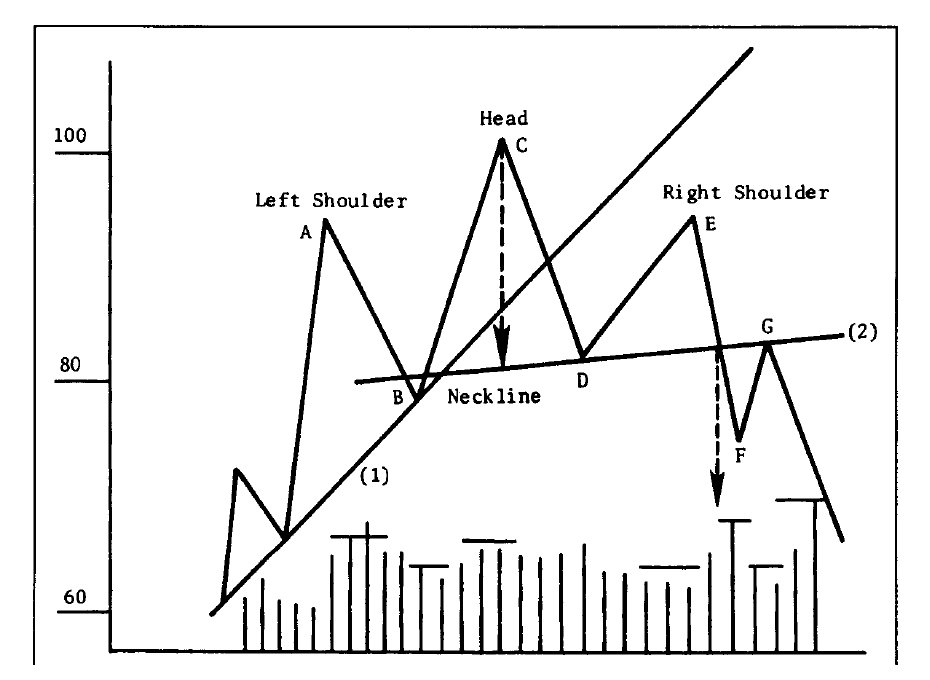


We should be proud about @0xPolygon. But don't invest if you don't understand what they do just like any other asset class.
Should you invest in Polygon (Matic)?
— LearnApp (@LearnApp_co) June 12, 2021
\U0001f4a1 Here's @PrateekLearnapp's take on #Matic, as shared on @CNBCTV18News.
What are your thoughts on #Polygon (Matic)? \U0001f4ac
Read the full article here \U0001f449 https://t.co/rmLTV0WFo2#crypto #cryptocurrencies pic.twitter.com/9k1lclN7oL
You May Also Like








I think a plausible explanation is that whatever Corbyn says or does, his critics will denounce - no matter how much hypocrisy it necessitates.
Corbyn opposes the exploitation of foreign sweatshop-workers - Labour MPs complain he's like Nigel
He speaks up in defence of migrants - Labour MPs whinge that he's not listening to the public's very real concerns about immigration:
He's wrong to prioritise Labour Party members over the public:
He's wrong to prioritise the public over Labour Party
One of the oddest features of the Labour tax row is how raising allowances, which the media allowed the LDs to describe as progressive (in spite of evidence to contrary) through the coalition years, is now seen by everyone as very right wing
— Tom Clark (@prospect_clark) November 2, 2018
Corbyn opposes the exploitation of foreign sweatshop-workers - Labour MPs complain he's like Nigel
He speaks up in defence of migrants - Labour MPs whinge that he's not listening to the public's very real concerns about immigration:
He's wrong to prioritise Labour Party members over the public:
He's wrong to prioritise the public over Labour Party


