
Long back, I read a book “Encyclopedia of Chart Patterns” by Thomas N. Bukowski. It’s a brilliant work (Must read).
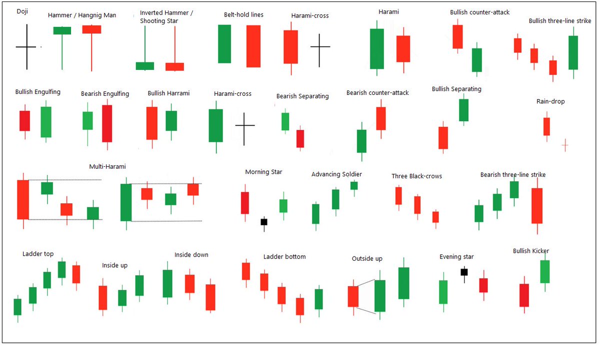
Thread: 5 Important bullish & bearish chart patterns in technical analysis.
Triangles, Broadenings and Rectangles.
#trading #investing
Long back, I read a book “Encyclopedia of Chart Patterns” by Thomas N. Bukowski. It’s a brilliant work (Must read).
I read about those patterns at many other places & in different theories and I realised that most of them are-
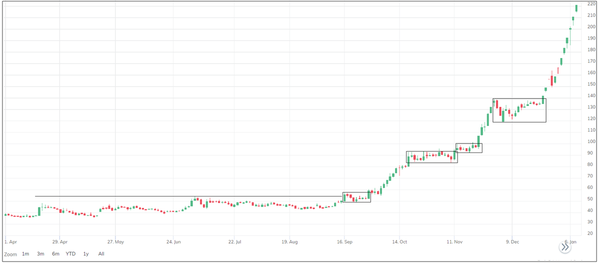
Triangles, Broadenings & Brackets or Rectangle patterns are most common & effective patterns. Below are 5 bullish & bearish proven, time-tested patterns of these categories.
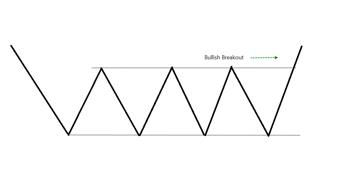
Rectangle Breakout:
Horizontal pattern breakout. Price remains between two horizontal lines before upward brkout. Its a decent continuation breakout pattern when appears in uptrend. Reversal pattern when appear in downtrend (Decent Risk-reward). Tend to pullback
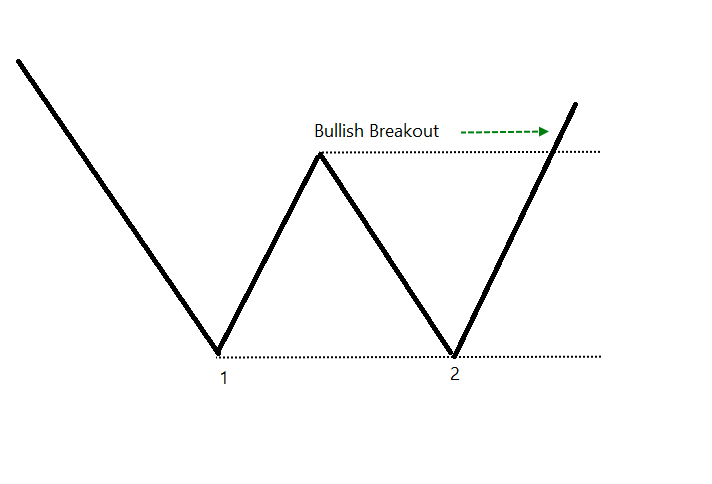
Two-bottoms around same level followed by the breakout. Good reversal patterns when they appear in downtrend. If you don’t wait for the breakout, the failure rate is significantly high. Many call it double bottom even before the breakout, they must know it.
Pattern of convergence followed by upside breakout. Nice continuation pattern if appears in uptrend. Bullish triangles breakouts have got better performance. High volume at breakout would be nice.
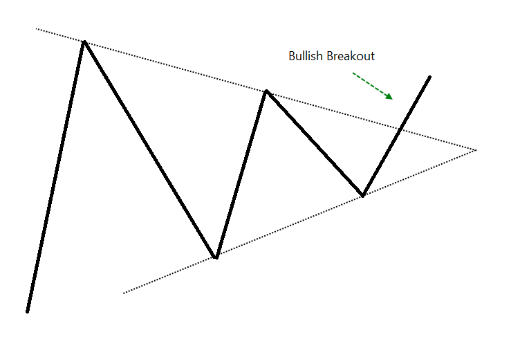
The top is horizontal in the triangle and the bottoms are upsloping. Ascending triangles are bullish in nature. Resistance at top but bottoms are rising. Bullish breakouts have better ratio. The reward to risk ratio in triangle patterns is high.
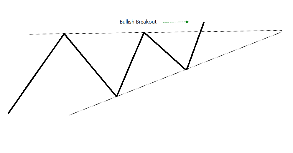
Price remains within the down slopping and converging trendlines followed by upside breakout. I also call it falling triangle. It is a decent bullish trend reversal pattern.
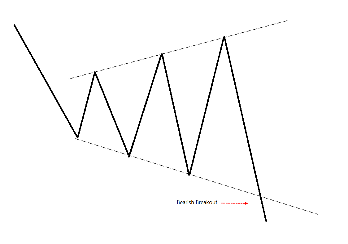
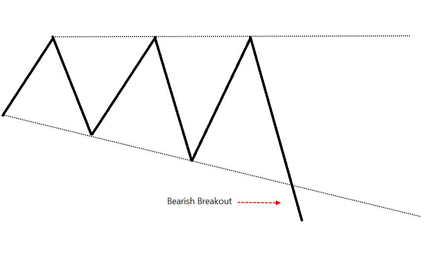
Symmetrical triangle - bearish
Symmetrical triangle appears in the downtrend followed by the bearish breakout. It is a bearish continuation pattern having high risk-reward ratio.
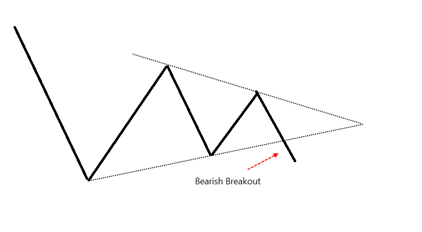
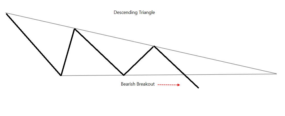
Top is descending and bottom is horizontal in the triangle pattern. Descending tops indicate supply and horizontal bottom is a strong support. The pattern is bearish in nature and downside breakout is a decent trade setup.
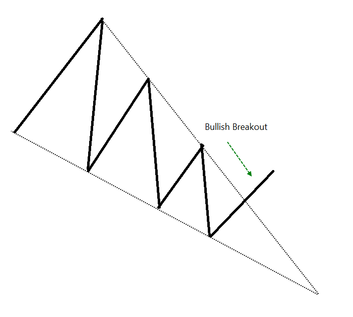
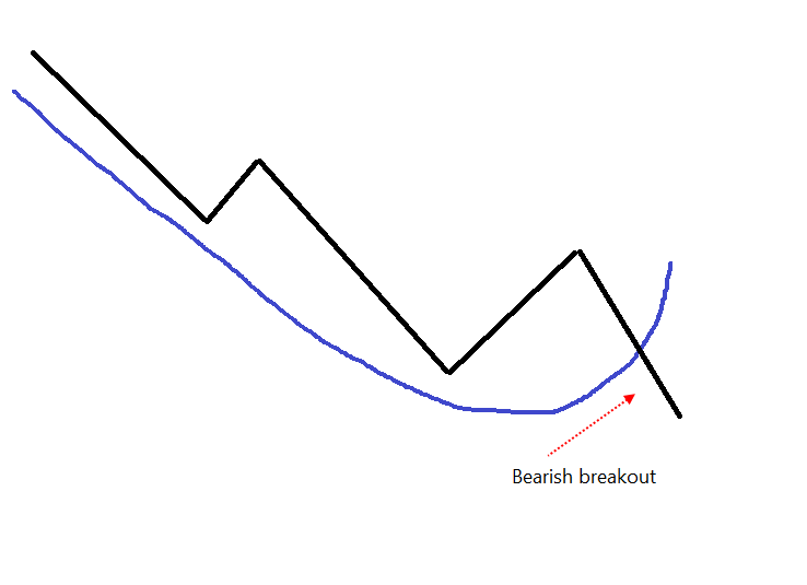
Also known as Megaphone or Expanding triangle. When it appears in downtrend, its more of a continuation pattern (downside breakouts are better) than reversal. When it appears in uptrend, downside breakout would be a better setup.
The top is horizontal in the broadening pattern. The lows are following the down slopping trendline. New lows are being made and there is a strong resistance at top. Downside breakout would be a bearish setup.
The pattern that looks like letter J reversed. It is a bearish continuation pattern. The trend is down and established. The bearish trades are expected to have a better risk-reward.
More from Prashant Shah

More from All


APIs in general are so powerful.
Best 5 public APIs you can use to build your next project:
1. Number Verification API
A RESTful JSON API for national and international phone number validation.
🔗 https://t.co/fzBmCMFdIj

2. OpenAI API
ChatGPT is an outstanding tool. Build your own API applications with OpenAI API.
🔗 https://t.co/TVnTciMpML

3. Currency Data API
Currency Data API provides a simple REST API with real-time and historical exchange rates for 168 world currencies
🔗 https://t.co/TRj35IUUec

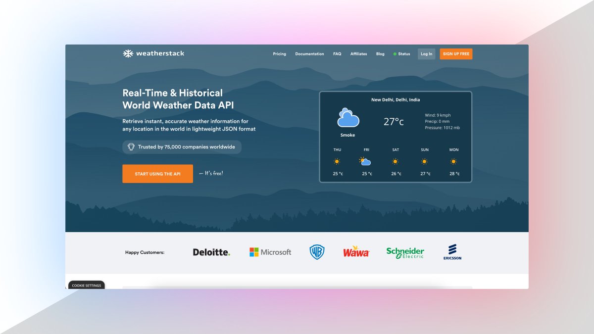
4. Weather API
Real-Time & historical world weather data API.
Retrieve instant, accurate weather information for
any location in the world in lightweight JSON format.
🔗 https://t.co/DCY8kXqVIK
Best 5 public APIs you can use to build your next project:
1. Number Verification API
A RESTful JSON API for national and international phone number validation.
🔗 https://t.co/fzBmCMFdIj
2. OpenAI API
ChatGPT is an outstanding tool. Build your own API applications with OpenAI API.
🔗 https://t.co/TVnTciMpML
3. Currency Data API
Currency Data API provides a simple REST API with real-time and historical exchange rates for 168 world currencies
🔗 https://t.co/TRj35IUUec
4. Weather API
Real-Time & historical world weather data API.
Retrieve instant, accurate weather information for
any location in the world in lightweight JSON format.
🔗 https://t.co/DCY8kXqVIK


You May Also Like


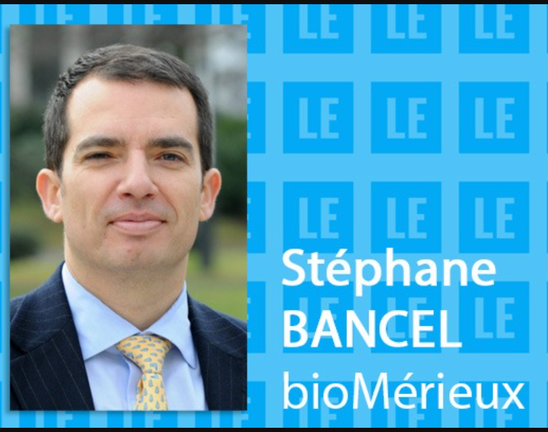
Moderna CEO Stephane Bancel was previously CEO of bioMerieux in France from 07-10.
Alain Merieux, who owns bioMerieux, was instrumental in the creation of the Wuhan Institute of Virology P4 Lab.
The same people who helped create the virus, also helped to create the vaccines...
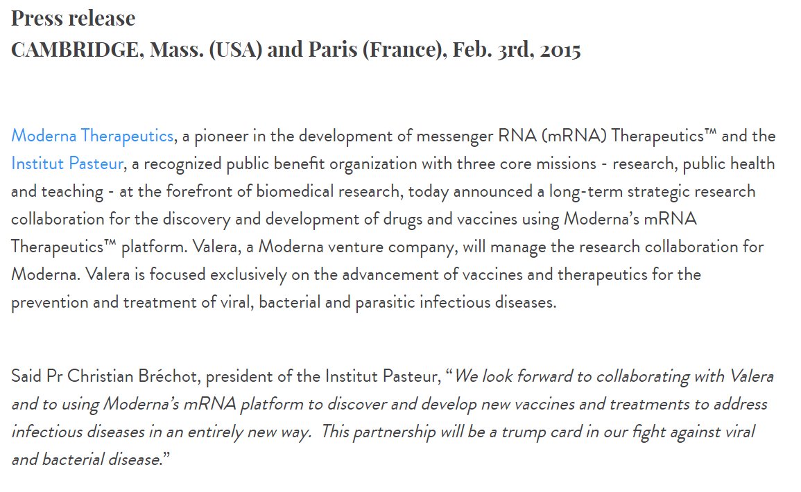
Moderna partnered with French Pasteur Institute in 2015 to develop mRNA vaccine technology.
Pasteur Institute partnered with the Wuhan P4 Laboratory in 2017 along with the Merieux Foundation to study emerging viruses...
https://t.co/yFsHwrNYaK
https://t.co/9M5lydBKhM
Nobel prize winning scientist Luc Montagnier asserts that Sars-Cov-2 is man-made and originated from the Wuhan Institute of Virology.
Montagnier did extensive work with the Pasteur Institute in France which was partnered with the Wuhan P4.
Merieux Foundation & the Chinese government have worked together since 1965, and partnered to study emerging pathogens in Africa in 2015.
Their research included "PATHOGENS CARRIED BY BATS" that provoke respiratory diseases.
🚨🚨🚨
https://t.co/gVwpT0ssqI

Alain Merieux, who owns bioMerieux, was instrumental in the creation of the Wuhan Institute of Virology P4 Lab.
The same people who helped create the virus, also helped to create the vaccines...
Moderna partnered with French Pasteur Institute in 2015 to develop mRNA vaccine technology.
Pasteur Institute partnered with the Wuhan P4 Laboratory in 2017 along with the Merieux Foundation to study emerging viruses...
https://t.co/yFsHwrNYaK
https://t.co/9M5lydBKhM
Nobel prize winning scientist Luc Montagnier asserts that Sars-Cov-2 is man-made and originated from the Wuhan Institute of Virology.
Montagnier did extensive work with the Pasteur Institute in France which was partnered with the Wuhan P4.
Merieux Foundation & the Chinese government have worked together since 1965, and partnered to study emerging pathogens in Africa in 2015.
Their research included "PATHOGENS CARRIED BY BATS" that provoke respiratory diseases.
🚨🚨🚨
https://t.co/gVwpT0ssqI


