
The pre CISION tech is simply an attempt to improve the safety profile... 2/10
AVA6000 approved by MHRA. Superb news. First dosing 'around mid-year'; first data to come within 3-4 months after that.
A summary thread on the significance of AVA6000 - and #AVCT's pre CISION platform as a whole - to both the oncology industry and to AVCT itself. 1/10
The pre CISION tech is simply an attempt to improve the safety profile... 2/10
Most therapeutics going through clinical trials look for an improvement of at least 20% over the existing industry-standard drug. A 50% increase in efficacy would usually be considered an astonishing result.
In pre-clinical mouse models for #AVCT's AVA6000 3/10
What this means is that the pre CISION tech could be used to enable the giving of doses to patients that are multiple times more potent... 4/10
For example, in #AVCT's pre-clinical trials, pro-dox (AVA6000) doses were 6x more potent than the standard dox doses.
The results? The...5/10
#AVCT isn't looking to improve chemotherapies by 25-30%, like most drugs in clinical trials.
Its pre CISION has the potential to improve the safety profile - and thus the... 6/10
https://t.co/XOEE45CBtZ
AVCT holds the global exclusive licence over...8/10
TMAC will produce Affimer Drug Conjugates - a potentially more powerful class of oncology treatment than Antibody Drug Conjugates. 9/10
First though, success for AVA6000 please!
Then hopefully @avacta's first TMAC drug to enter Phase I next year 10/10
More from Society


Two things can be true at once:
1. There is an issue with hostility some academics have faced on some issues
2. Another academic who himself uses threats of legal action to bully colleagues into silence is not a good faith champion of the free speech cause
I have kept quiet about Matthew's recent outpourings on here but as my estwhile co-author has now seen fit to portray me as an enabler of oppression I think I have a right to reply. So I will.
I consider Matthew to be a colleague and a friend, and we had a longstanding agreement not to engage in disputes on twitter. I disagree with much in the article @UOzkirimli wrote on his research in @openDemocracy but I strongly support his right to express such critical views
I therefore find it outrageous that Matthew saw fit to bully @openDemocracy with legal threats, seeking it seems to stifle criticism of his own work. Such behaviour is simply wrong, and completely inconsistent with an academic commitment to free speech.
I am not embroiling myself in the various other cases Matt lists because, unlike him, I think attention to the detail matters and I don't have time to research each of these cases in detail.
1. There is an issue with hostility some academics have faced on some issues
2. Another academic who himself uses threats of legal action to bully colleagues into silence is not a good faith champion of the free speech cause
How about Selina Todd, Kathleen Stock, Jo Phoenix, Rachel Ara, Sarah Honeychurch, Michele Moore, Nina Power, Joanna Williams, Jenny Murray, Julia Gasper ...
— Matt Goodwin (@GoodwinMJ) February 17, 2021
Or is it only Eric you pop at?
Are they all making it up too Rob?
Are they "beyond parody"? https://t.co/drQssTD0OL
I have kept quiet about Matthew's recent outpourings on here but as my estwhile co-author has now seen fit to portray me as an enabler of oppression I think I have a right to reply. So I will.
I consider Matthew to be a colleague and a friend, and we had a longstanding agreement not to engage in disputes on twitter. I disagree with much in the article @UOzkirimli wrote on his research in @openDemocracy but I strongly support his right to express such critical views
I therefore find it outrageous that Matthew saw fit to bully @openDemocracy with legal threats, seeking it seems to stifle criticism of his own work. Such behaviour is simply wrong, and completely inconsistent with an academic commitment to free speech.
I am not embroiling myself in the various other cases Matt lists because, unlike him, I think attention to the detail matters and I don't have time to research each of these cases in detail.
You May Also Like

So the cryptocurrency industry has basically two products, one which is relatively benign and doesn't have product market fit, and one which is malignant and does. The industry has a weird superposition of understanding this fact and (strategically?) not understanding it.
The benign product is sovereign programmable money, which is historically a niche interest of folks with a relatively clustered set of beliefs about the state, the literary merit of Snow Crash, and the utility of gold to the modern economy.
This product has narrow appeal and, accordingly, is worth about as much as everything else on a 486 sitting in someone's basement is worth.
The other product is investment scams, which have approximately the best product market fit of anything produced by humans. In no age, in no country, in no city, at no level of sophistication do people consistently say "Actually I would prefer not to get money for nothing."
This product needs the exchanges like they need oxygen, because the value of it is directly tied to having payment rails to move real currency into the ecosystem and some jurisdictional and regulatory legerdemain to stay one step ahead of the banhammer.
If everyone was holding bitcoin on the old x86 in their parents basement, we would be finding a price bottom. The problem is the risk is all pooled at a few brokerages and a network of rotten exchanges with counter party risk that makes AIG circa 2008 look like a good credit.
— Greg Wester (@gwestr) November 25, 2018
The benign product is sovereign programmable money, which is historically a niche interest of folks with a relatively clustered set of beliefs about the state, the literary merit of Snow Crash, and the utility of gold to the modern economy.
This product has narrow appeal and, accordingly, is worth about as much as everything else on a 486 sitting in someone's basement is worth.
The other product is investment scams, which have approximately the best product market fit of anything produced by humans. In no age, in no country, in no city, at no level of sophistication do people consistently say "Actually I would prefer not to get money for nothing."
This product needs the exchanges like they need oxygen, because the value of it is directly tied to having payment rails to move real currency into the ecosystem and some jurisdictional and regulatory legerdemain to stay one step ahead of the banhammer.


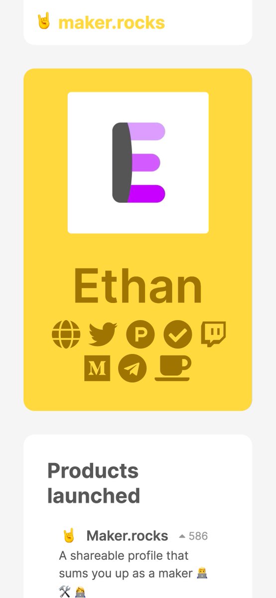
First update to https://t.co/lDdqjtKTZL since the challenge ended – Medium links!! Go add your Medium profile now 👀📝 (thanks @diannamallen for the suggestion 😁)

Just added Telegram links to https://t.co/lDdqjtKTZL too! Now you can provide a nice easy way for people to message you :)

Less than 1 hour since I started adding stuff to https://t.co/lDdqjtKTZL again, and profile pages are now responsive!!! 🥳 Check it out -> https://t.co/fVkEL4fu0L
Accounts page is now also responsive!! 📱✨
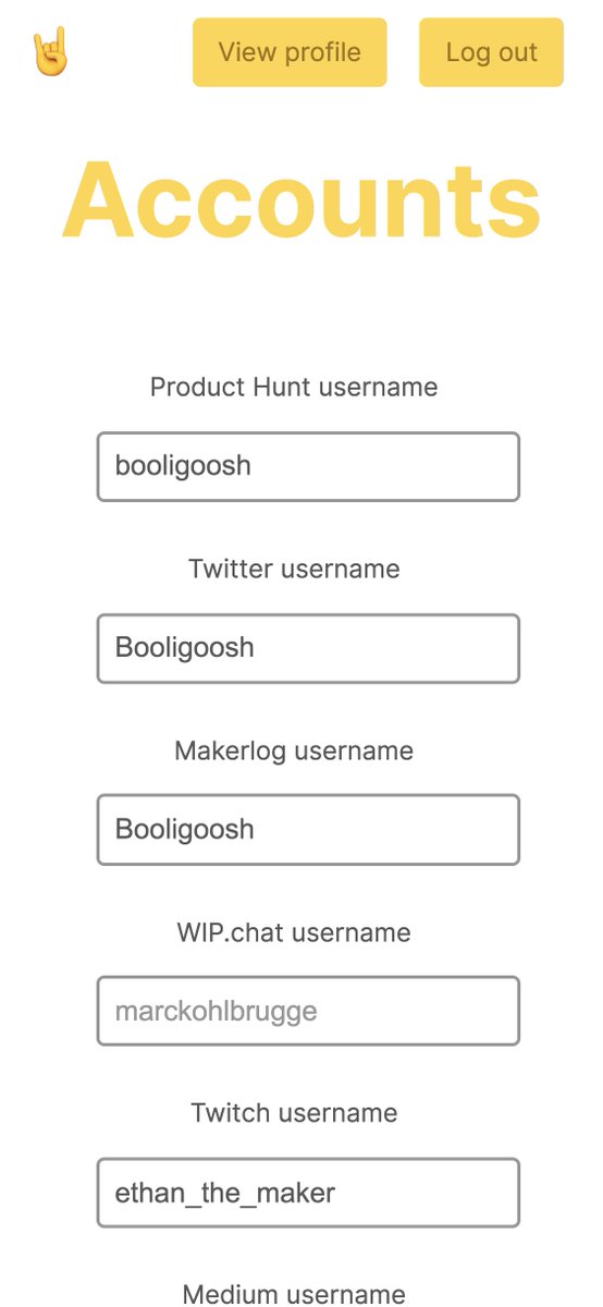
💪 I managed to make the whole site responsive in about an hour. On my roadmap I had it down as 4-5 hours!!! 🤘🤠🤘
Just added Telegram links to https://t.co/lDdqjtKTZL too! Now you can provide a nice easy way for people to message you :)
Less than 1 hour since I started adding stuff to https://t.co/lDdqjtKTZL again, and profile pages are now responsive!!! 🥳 Check it out -> https://t.co/fVkEL4fu0L
Accounts page is now also responsive!! 📱✨
💪 I managed to make the whole site responsive in about an hour. On my roadmap I had it down as 4-5 hours!!! 🤘🤠🤘
