https://t.co/9aItVsUtcP
So, apparently I'm Chair-Elect of the Epidemiology Section of APHA! I'm speechless right now! Thank y'all so much!! pic.twitter.com/SiEHj2OTva
— Dr. Sealy-Jefferson (@Dr_S_Jefferson) October 7, 2019
So, apparently I'm Chair-Elect of the Epidemiology Section of APHA! I'm speechless right now! Thank y'all so much!! pic.twitter.com/SiEHj2OTva
— Dr. Sealy-Jefferson (@Dr_S_Jefferson) October 7, 2019
1st mtg as chair-elect of the Epidemiology section of APHA and I'm *stunned* that I was elected b/c I just joined APHA last yr. & people usually work their way up the ranks for 10+ years before taking this role. And our section has 3k people. I'm HONORED!\u2764 pic.twitter.com/GvXtfaXaHv
— Dr. Sealy-Jefferson (@Dr_S_Jefferson) December 6, 2019


I have *seriously* considered resigning my position as chair-elect of the epidemiology section of @PublicHealth b/c my experience as a new leader & member has been < great. But, when I take the chair in Oct. 2021, my intention is to blaze trails & do my underdog thing, per usual
— Dr. Sealy-Jefferson (@Dr_S_Jefferson) January 22, 2021

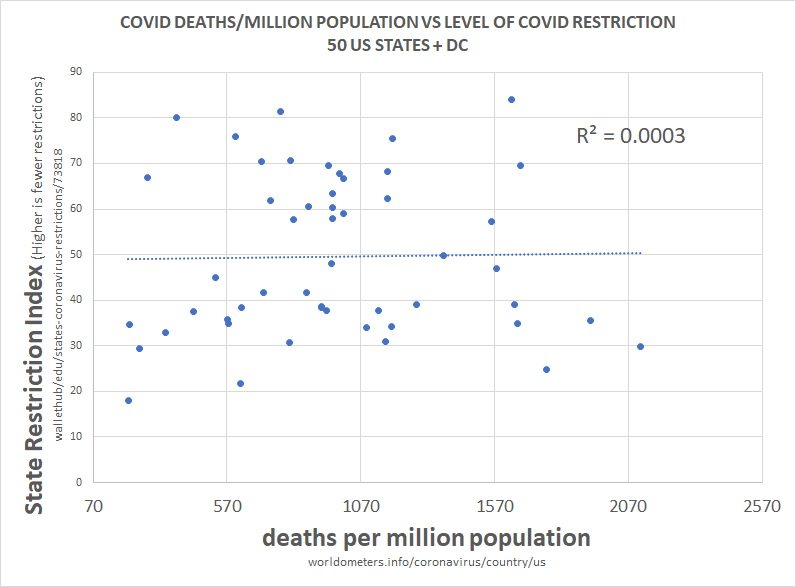
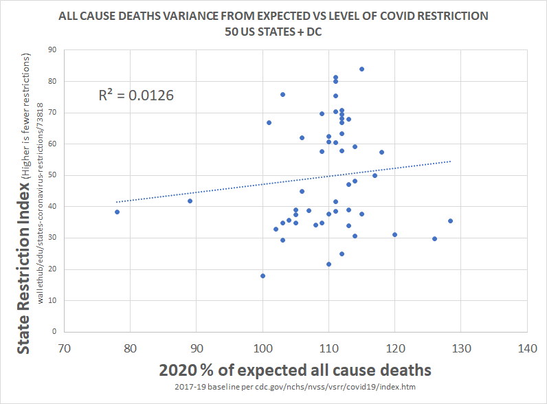
this methodology is a little complex, so let me explain what i did.
— el gato malo (@boriquagato) May 30, 2020
a few EU countries provide real day of death data. this lets us plot meaningful curves to show rate of disease change.
what struck me is how similar all the curves were.
everyone got the same shape. pic.twitter.com/bN0hILzoSl