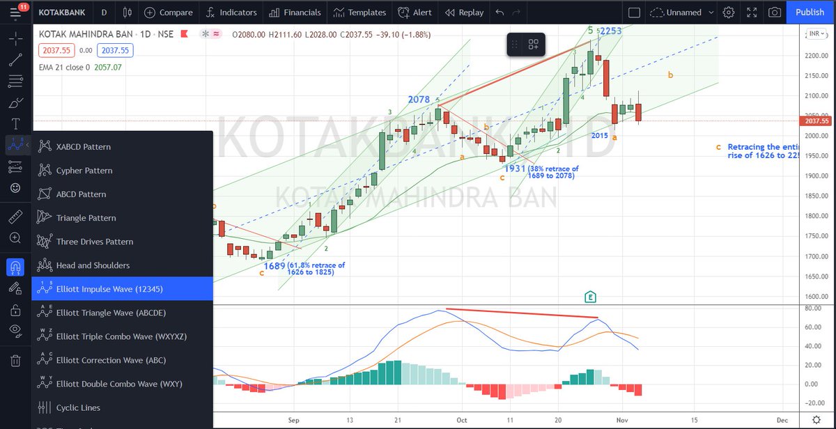
Do you now see how this #Elliottwave labeling tools (12345 or ABC, stc.,) can be accessed in https://t.co/C8fkLCoGfe
My application of #Elliottwave mostly limits to identifying 12345 & ABC and all the rest are left out.
I make money; that's all matters.
Forget the WXYXZ, etc., https://t.co/2RTzJ9CLfC
More from Van Ilango (JustNifty)
@MaverickAmit01
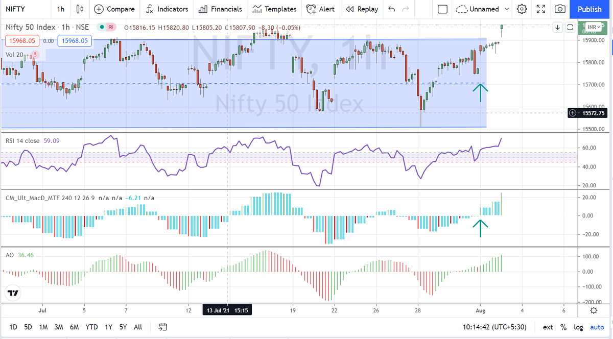
His simple mechanical system of MACD multi t/f with 4 Hour setting seems to remove whipsaws & is producing amazing result with #Nifty
Experience speaks - you listen and adopt
Develop patience to wait for such good set up. Now trail your SL once price has gains https://t.co/jC8tcrZ0Cv
His simple mechanical system of MACD multi t/f with 4 Hour setting seems to remove whipsaws & is producing amazing result with #Nifty
Experience speaks - you listen and adopt
Develop patience to wait for such good set up. Now trail your SL once price has gains https://t.co/jC8tcrZ0Cv
Book mark this and revisit every day or every week till you get it right as a trader. Coming from an experienced trader like @MaverickAmit01 , it's priceless.
— Van Ilango (JustNifty) (@JustNifty) July 31, 2021
Wish we had it when we started out.\U0001f64f https://t.co/0NYKqedy9w
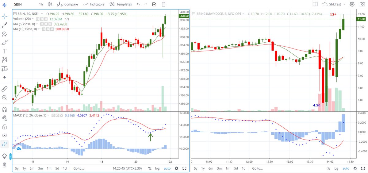
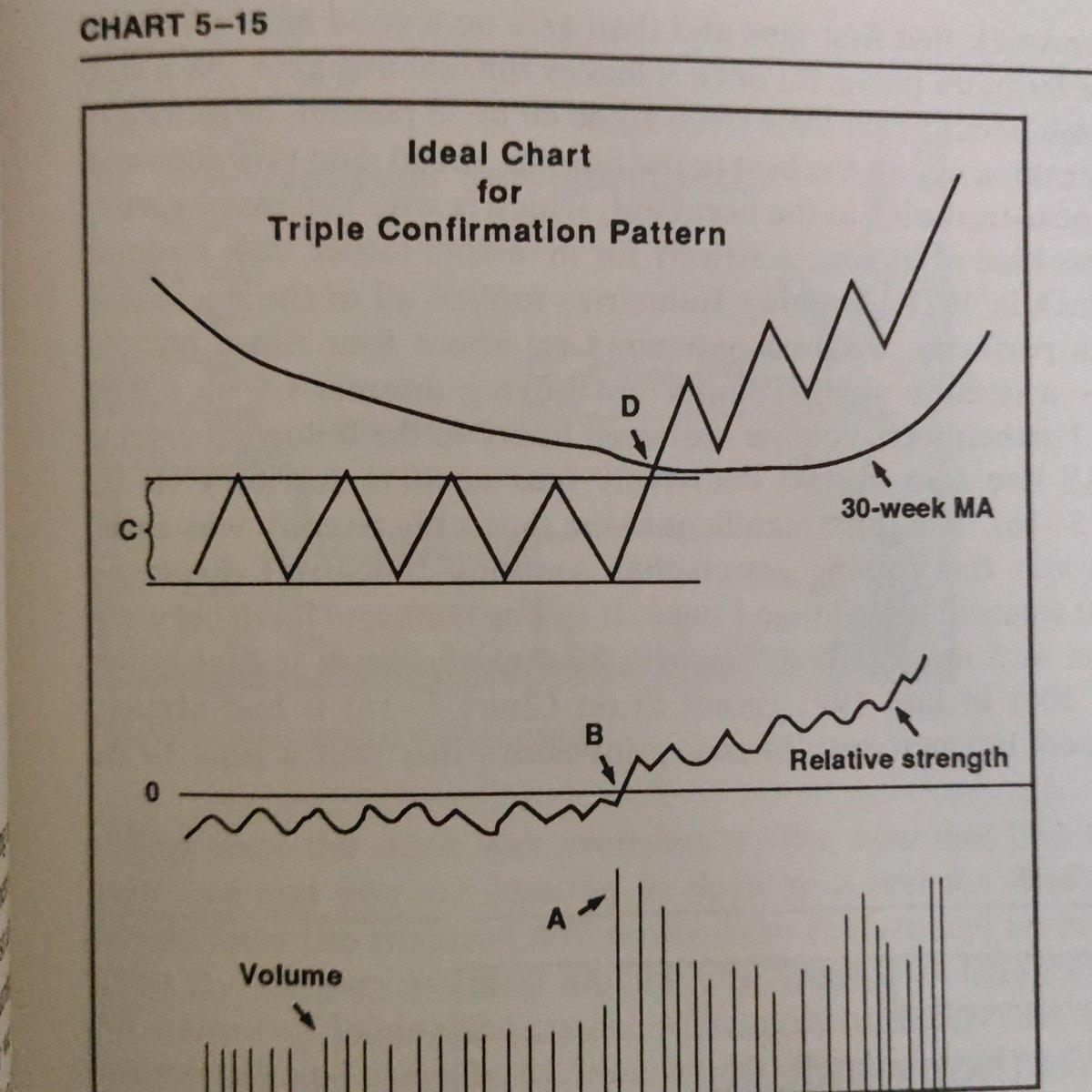
25Sma in "15 min. t/f" is same as 75 Sma in "5 min. t/f" which we use as 1 Day average
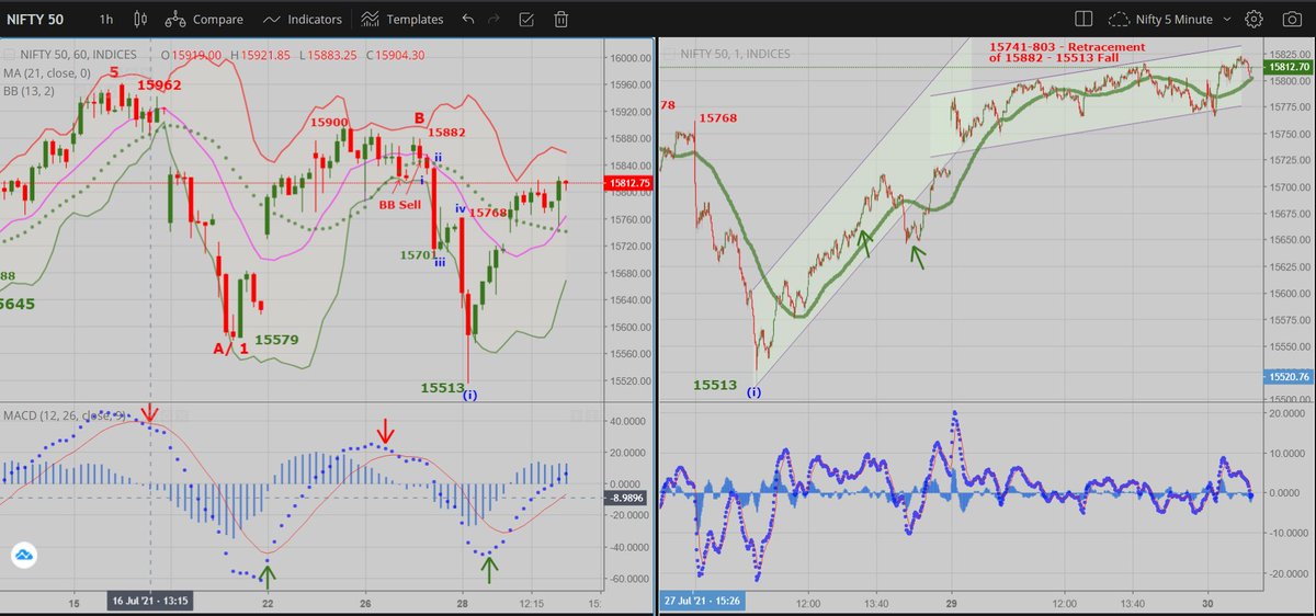
Earlier chart in 5 Min. t/f with 75Sma
Relate oscillator movement to #priceaction & you'll notice price rise as "corrective" based on the feeble rise compared to indicator's rise except once. https://t.co/Tt1kD3iPlY
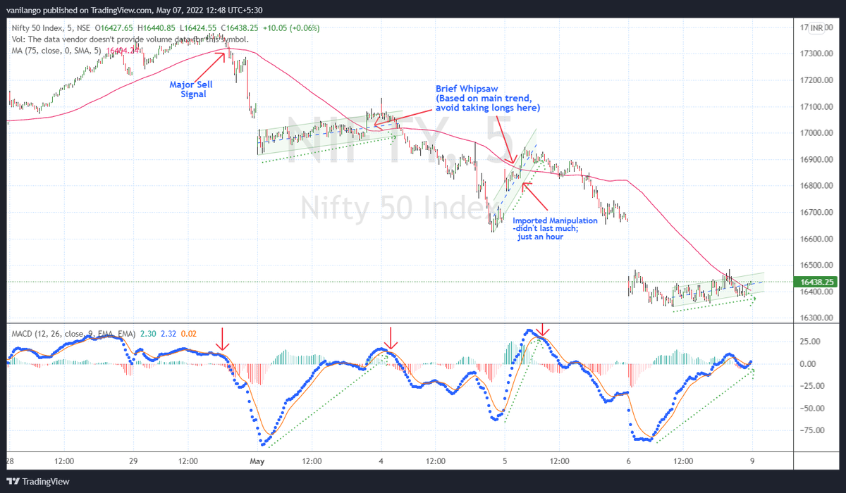
Earlier chart in 5 Min. t/f with 75Sma
Relate oscillator movement to #priceaction & you'll notice price rise as "corrective" based on the feeble rise compared to indicator's rise except once. https://t.co/Tt1kD3iPlY
Good afternoon master,
— Sunny Singh (@SurendraSinghJi) May 7, 2022
What does sma 5 means with 25 ma as seen in this chart.
How to use it with macd master?
Already following systems that i learned from you.
Want to add another learning from this.
Keep blessings master \U0001f64f
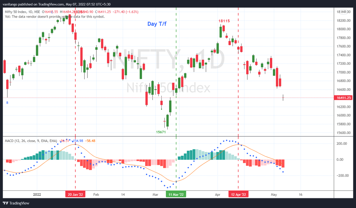
More from Screeners


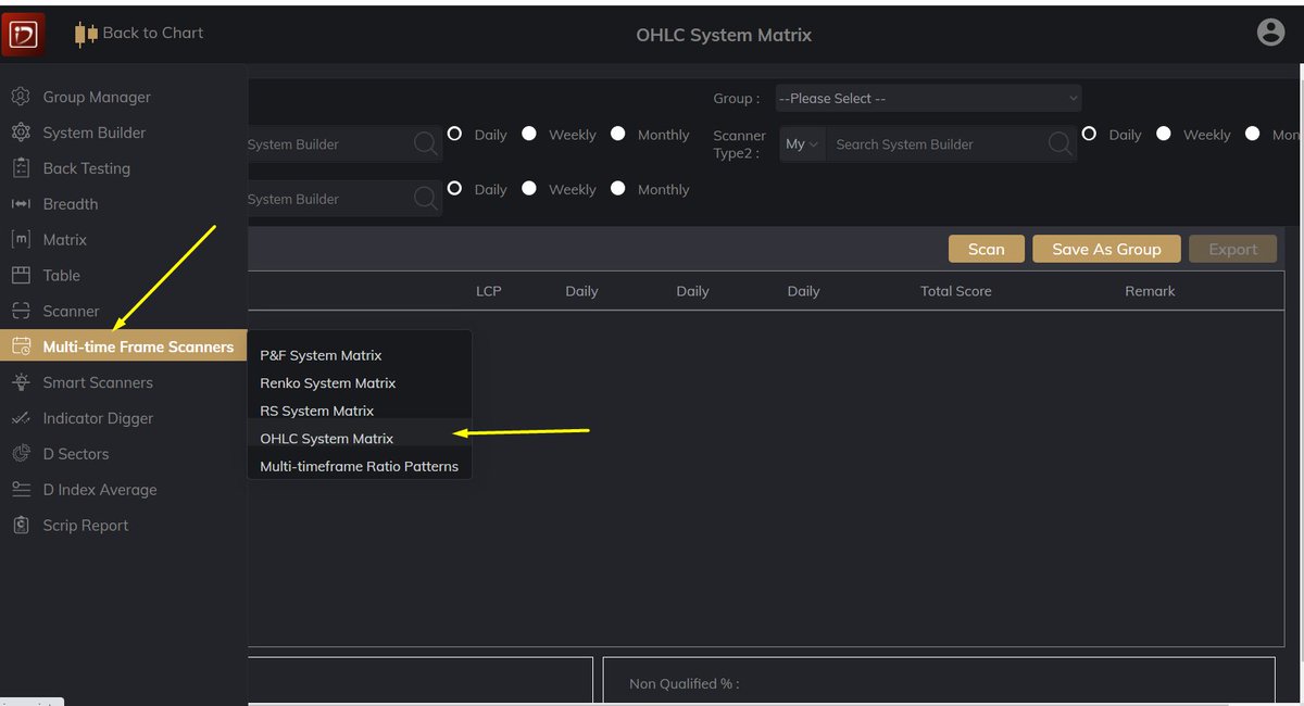
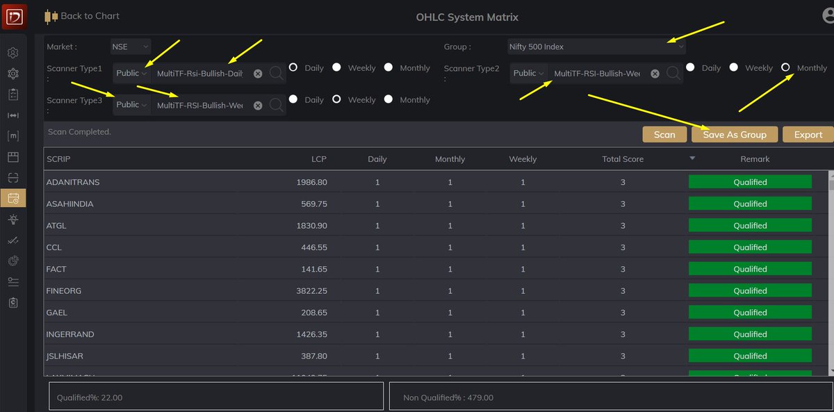


Opposite is happening now. IHNS, double bottom, +ve RSI divergences, etc are failing badly for permanent reversal. Level up your SAR game to stay in the game on both sides.
#bearrun
#BearMarket
#bearrun
#BearMarket
Head & Shoulders pattern, double top and bearish RSI divergences fail more often in bull market and generally gives a very good SAR trade. Vice versa is also true for bear market.#bullrun #BullMarket
— Aakash Gangwar (@akashgngwr823) February 9, 2021

You May Also Like



1/OK, data mystery time.
This New York Times feature shows China with a Gini Index of less than 30, which would make it more equal than Canada, France, or the Netherlands. https://t.co/g3Sv6DZTDE
That's weird. Income inequality in China is legendary.
Let's check this number.
2/The New York Times cites the World Bank's recent report, "Fair Progress? Economic Mobility across Generations Around the World".
The report is available here:
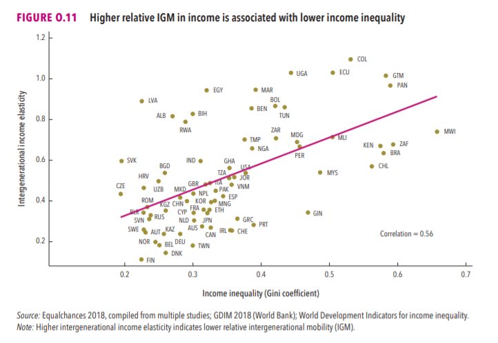
3/The World Bank report has a graph in which it appears to show the same value for China's Gini - under 0.3.
The graph cites the World Development Indicators as its source for the income inequality data.
4/The World Development Indicators are available at the World Bank's website.
Here's the Gini index: https://t.co/MvylQzpX6A
It looks as if the latest estimate for China's Gini is 42.2.
That estimate is from 2012.
5/A Gini of 42.2 would put China in the same neighborhood as the U.S., whose Gini was estimated at 41 in 2013.
I can't find the <30 number anywhere. The only other estimate in the tables for China is from 2008, when it was estimated at 42.8.
This New York Times feature shows China with a Gini Index of less than 30, which would make it more equal than Canada, France, or the Netherlands. https://t.co/g3Sv6DZTDE
That's weird. Income inequality in China is legendary.
Let's check this number.
2/The New York Times cites the World Bank's recent report, "Fair Progress? Economic Mobility across Generations Around the World".
The report is available here:
3/The World Bank report has a graph in which it appears to show the same value for China's Gini - under 0.3.
The graph cites the World Development Indicators as its source for the income inequality data.
4/The World Development Indicators are available at the World Bank's website.
Here's the Gini index: https://t.co/MvylQzpX6A
It looks as if the latest estimate for China's Gini is 42.2.
That estimate is from 2012.
5/A Gini of 42.2 would put China in the same neighborhood as the U.S., whose Gini was estimated at 41 in 2013.
I can't find the <30 number anywhere. The only other estimate in the tables for China is from 2008, when it was estimated at 42.8.