https://t.co/a7M0zwH9YE
Archived:
https://t.co/s1dZlpHu6A










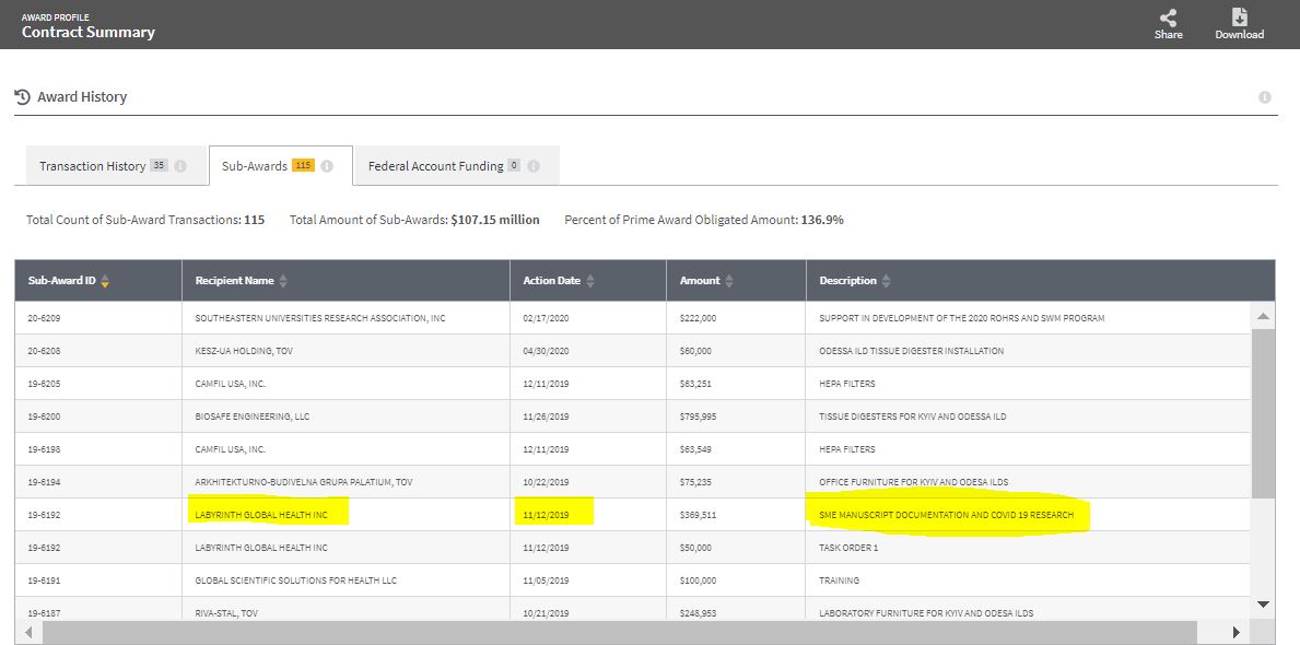
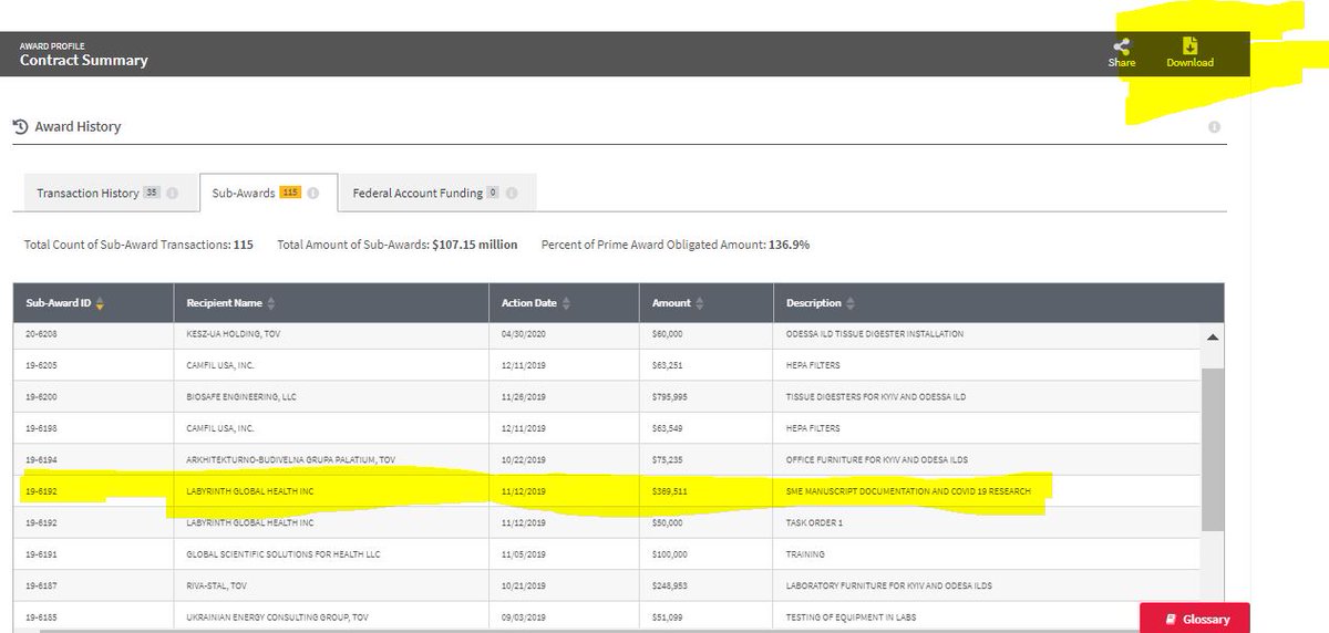
28. Before moving on to DARPA, let's look at DTRA:
— Billy Bostickson \U0001f3f4\U0001f441&\U0001f441 \U0001f193 (@BillyBostickson) July 31, 2020
A must read!
It is astonishing the number of pies they had their dirty little fingers poking into:
Note John Epstein and Kevin Olival from EcoHealth Alliance are key figures in DTRA:https://t.co/O4QwVWrm7m pic.twitter.com/cnNGZ7AApj
24. DTRA Network for Collection of Viruses
— Billy Bostickson \U0001f3f4\U0001f441&\U0001f441 \U0001f193 (@BillyBostickson) January 9, 2021
7. DTRA - Metabiota - One Health - Ecohealth
Bat Research Networks and Viral Surveillance: Gaps and Opportunities in Western Asia pic.twitter.com/SOqSSXF3pa
That is the key question
— Billy Bostickson \U0001f3f4\U0001f441&\U0001f441 \U0001f193 (@BillyBostickson) January 5, 2021
1. DARPA/DTRA use NGOs like Ecohealth or Metabiota to collect new pathogens
2. They are sent to US labs (Mailman, Rocky Mountain, Atlanta CDC, UNC, USAMRIID) for GOF work by Lipkin, Nichols, Rasmussen, Baric, Dension, Munster, etchttps://t.co/wqhHK7uZO6
1. I wonder why Dr. Angela Rasmussen is so so upset & full of almost palpable venom about a Hypothesis and a "What if" question by @nicholsonbaker8 in the @NYMag https://t.co/a6lxtJLpKR
— Billy Bostickson \U0001f3f4\U0001f441&\U0001f441 \U0001f193 (@BillyBostickson) January 5, 2021
Did I hear someone say "DARPA"?
Did I hear someone say "DTRA"?https://t.co/i27mpxJDw2 pic.twitter.com/x4X3QPnTMS




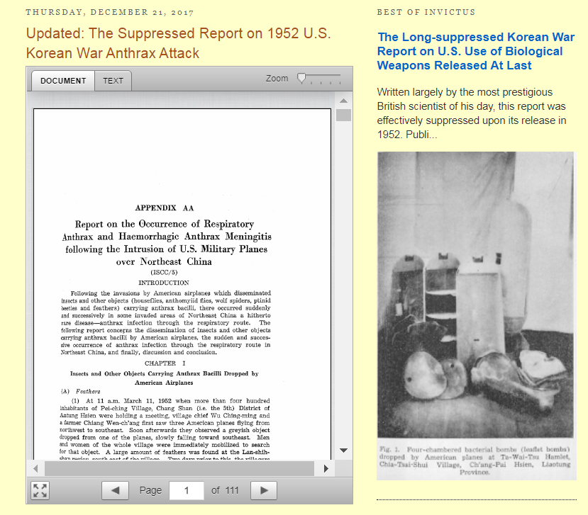
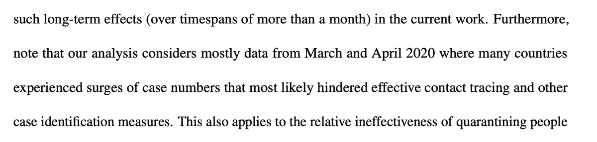
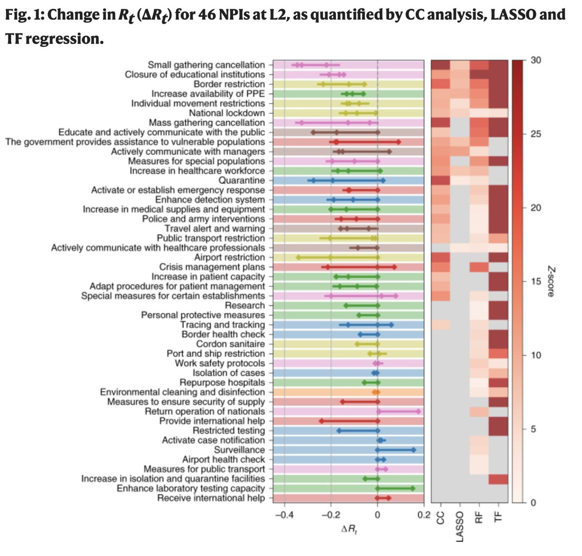
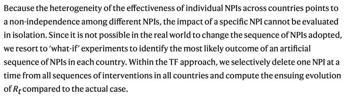
I've recently come across a disinformation around evidence relating to school closures and community transmission that's been platformed prominently. This arises from flawed understanding of the data that underlies this evidence, and the methodologies used in these studies. pic.twitter.com/VM7cVKghgj
— Deepti Gurdasani (@dgurdasani1) February 1, 2021

Not one single team member or guest left. We are all still here, smiling not crying, as we record this event and will get it out to you all very soon :)
— Suzie Dawson (@Suzi3D) January 17, 2021
I'm so proud of everyone, what an amazing crewhttps://t.co/RmE0BicIXF