1) OBSERVATION: The frequencies are changing. I would have to assess stats on the electromagnetic field to see its fluctuations. All I know is, I am highly sensitive to energy/frequencies, and they are changing, because…
More from Science


💥and so it begins..💥
It's time, my friends 🤩🤩
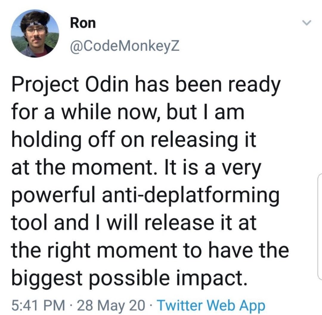
[Thread] #ProjectOdin
https://t.co/fO90N78fta
new quantum-based internet #ElonMusk #QVS #QFS
Political justification ⏬⏬
#ProjectOdin
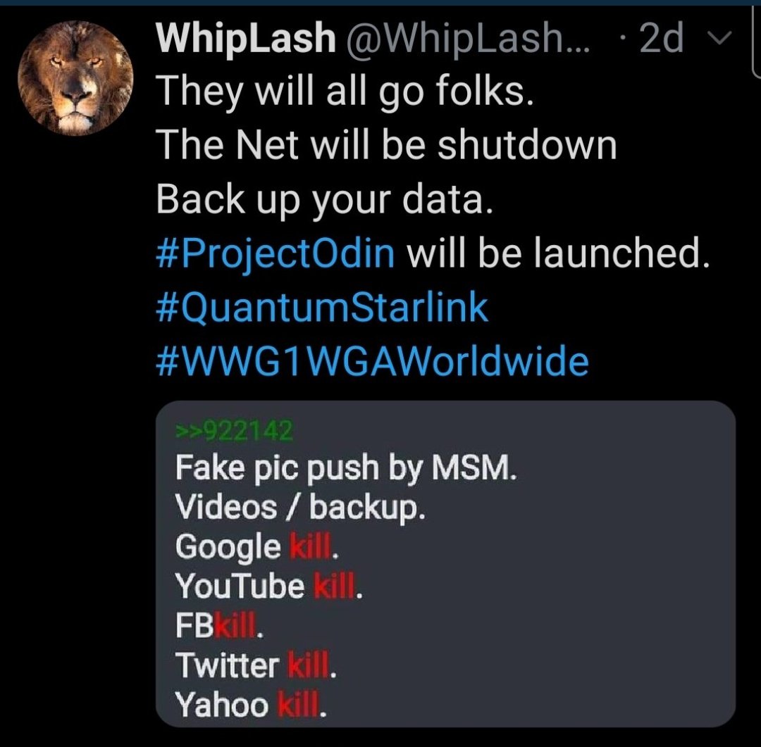
#ProjectOdin #Starlink #ElonMusk #QuantumInternet
It's time, my friends 🤩🤩
[Thread] #ProjectOdin
The Alliance has Project Odin ready to go - the new quantum-based internet. #ElonMusk #QVS #QFS #ProjectOdin
— Der Preu\xdfe Parler: @DerPreusse (@DerPreusse1963) January 12, 2021
https://t.co/fO90N78fta
new quantum-based internet #ElonMusk #QVS #QFS
Political justification ⏬⏬
#ProjectOdin
#ProjectOdin #Starlink #ElonMusk #QuantumInternet