2/
is an excellent scientist and a responsible professional. She likely read the paper more carefully than most. She grasped some of its strengths and weaknesses that are not apparent from a cursory glance. Below, I will mention a few points some may have missed.
1/
I've recently come across a disinformation around evidence relating to school closures and community transmission that's been platformed prominently. This arises from flawed understanding of the data that underlies this evidence, and the methodologies used in these studies. pic.twitter.com/VM7cVKghgj
— Deepti Gurdasani (@dgurdasani1) February 1, 2021
2/
3/
4/
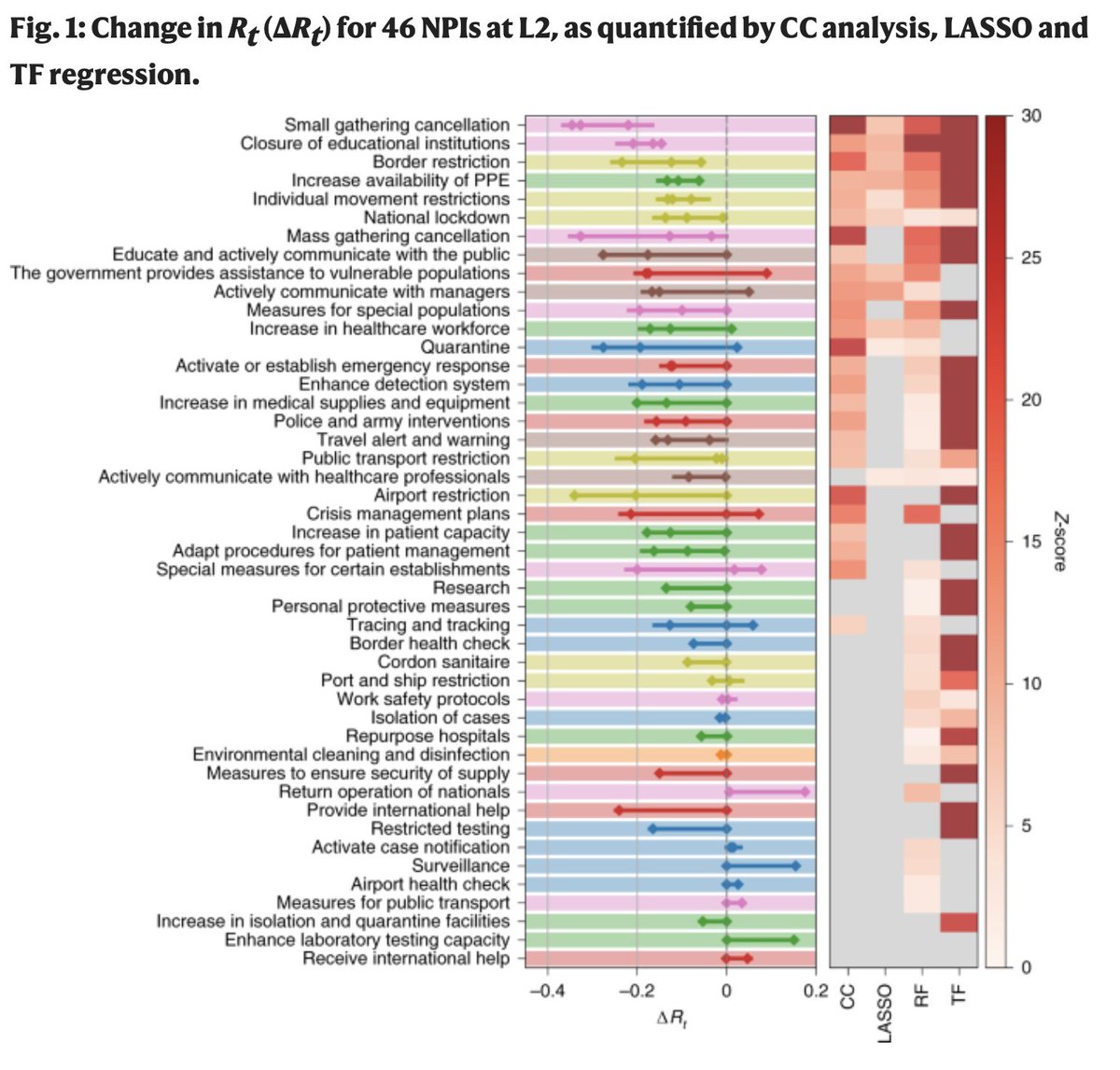
5/
6/
7/
8/
More from Science


Hugh Everett's birthday! Pioneer of the Many-Worlds Interpretation of quantum mechanics. Let us celebrate by thinking about ontological extravagance. I will do so by way of analogy, because I have found that everyone loves analogies and nobody ever willfully misconstrues them.
We look at the night sky and see photons arriving to us, emitted by distant stars. Let's contrast two different theories about how stars emit photons.
One theory says, we know how stars shine, and our equations predict that they emit photons roughly uniformly in all directions. Call this the "Many-Photons Interpretation" (MPI).
But! Others object. That is *so many photons*. Most of which we don't observe, and can't observe, since they're moving away at the speed of light. It's too ontologically extravagant to posit a huge number of unobservable things!
So they suggest a "Photon Collapse Interpretation." According to this theory, the photons emitted toward us actually exist. But photons that would be emitted in directions we will never observe simply collapse into utter non-existence.
The physicist Hugh Everett III was born #OTD in 1930. His \u201crelative state\u201d formulation of quantum mechanics, which we now call the \u201cMany Worlds Interpretation,\u201d was published in 1957. pic.twitter.com/ZqMsZcPJDG
— Robert McNees, the bastegod (@mcnees) November 11, 2020
We look at the night sky and see photons arriving to us, emitted by distant stars. Let's contrast two different theories about how stars emit photons.
One theory says, we know how stars shine, and our equations predict that they emit photons roughly uniformly in all directions. Call this the "Many-Photons Interpretation" (MPI).
But! Others object. That is *so many photons*. Most of which we don't observe, and can't observe, since they're moving away at the speed of light. It's too ontologically extravagant to posit a huge number of unobservable things!
So they suggest a "Photon Collapse Interpretation." According to this theory, the photons emitted toward us actually exist. But photons that would be emitted in directions we will never observe simply collapse into utter non-existence.


All modern research questions frame your mindset and self-frame research paradigm. Broad thinking: how little of everything can a citizen survive on; how cheap can your upkeep be? /1
When an American patient lands in an Austrian hospital for a back problem, a doctor tells him to perform a set of exercises.
- How many?
- Do you have anything else to do? /2
This interchange illustrates two mindsets colliding at bedside. How little can I get away with vs there is no limit to effort when it comes to your wellness. /3
When you were robbed of movement, somebody started selling you exercise. To understand that digging a ditch, to build a house, or to carry a child around, or waking to your grandparents for an hour is not the same as jogging on a treadmill... will reveal what research hides.
/4
When I talk about doing a purposeful activity outdoors, I look at complexity of movement, purpose, meaning, sun, and air, even an opportunity to meet a neighbor... that is now reduced to a calcium pill, vitamin D, an antidepressant, an osteoporosis shot, and an oxygen tank. /5
Is moderate exercise enough to live as long as possible, or should you be doing vigorous exercise? And what proportion is best? This article has the answers. https://t.co/YJqpaaI0UR
— Sebastian Rushworth M.D. (@sebrushworth) January 24, 2021
When an American patient lands in an Austrian hospital for a back problem, a doctor tells him to perform a set of exercises.
- How many?
- Do you have anything else to do? /2
This interchange illustrates two mindsets colliding at bedside. How little can I get away with vs there is no limit to effort when it comes to your wellness. /3
When you were robbed of movement, somebody started selling you exercise. To understand that digging a ditch, to build a house, or to carry a child around, or waking to your grandparents for an hour is not the same as jogging on a treadmill... will reveal what research hides.
/4
When I talk about doing a purposeful activity outdoors, I look at complexity of movement, purpose, meaning, sun, and air, even an opportunity to meet a neighbor... that is now reduced to a calcium pill, vitamin D, an antidepressant, an osteoporosis shot, and an oxygen tank. /5