About 3 weeks ago I contacted some folks in our government and wrote up a 33 pg rough draft outlining what I believed was taking place based on Data driving the narrative. For those that aren't sure how data science works, one takes raw data and attempts to find useful actionable
If I had a vision that outlined how a foreign actor killed over 50 percent of the young men in this Nation and the young girls were sold into slavery and there was only a 1 in 1000 chance I was correct, would it be worth sharing? Even if it meant no one would ever read my tweets
— BobbyPiton (@BobbyPiton3) January 1, 2021
More from BobbyPiton
More from Government





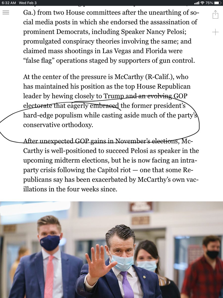
This is a good piece on fissures within the GOP but I think it mischaracterizes the Trump presidency as “populist” & repeats a story about how conservatives & the GOP expelled the far-right in the mid-1960s that is actually far more complicated. /1
I don’t think the sharp opposition between “hard-edge populism” & “conservative orthodoxy” holds. Many of the Trump administration’s achievements were boilerplate conservatism. Its own website trumpets things like “massive deregulation,” tax cuts, etc. /2
https://t.co/N97v85Bb79
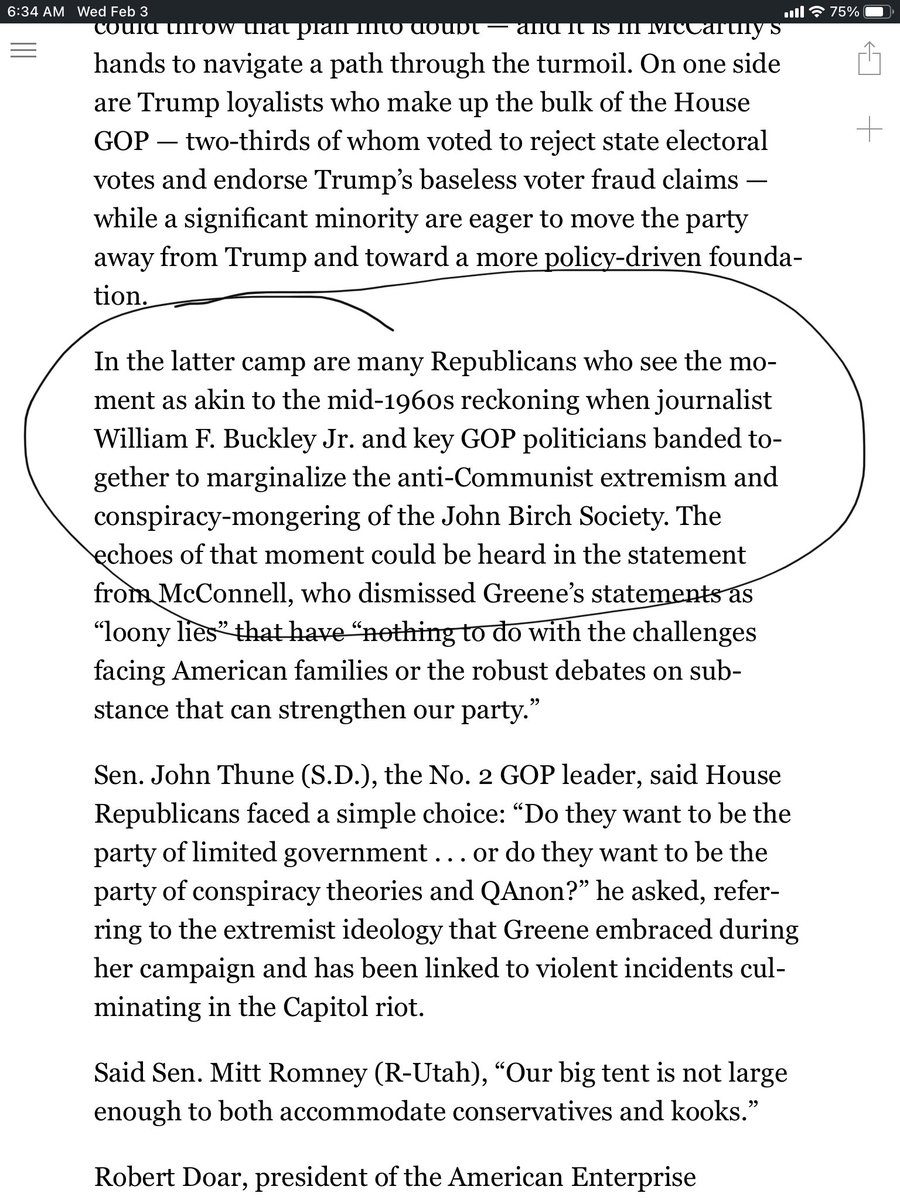
The claim that Buckley and “key GOP politicians banded together to marginalize anti-Communist extremism and conspiracy-mongering” of the JBS has been widely repeated lately but the history is more complicated. /3
This tweet by @ThePlumLineGS citing a paper by @sam_rosenfeld and @daschloz on the "porous" boundary between conservatives, the GOP and the far-right is relevant in this context.
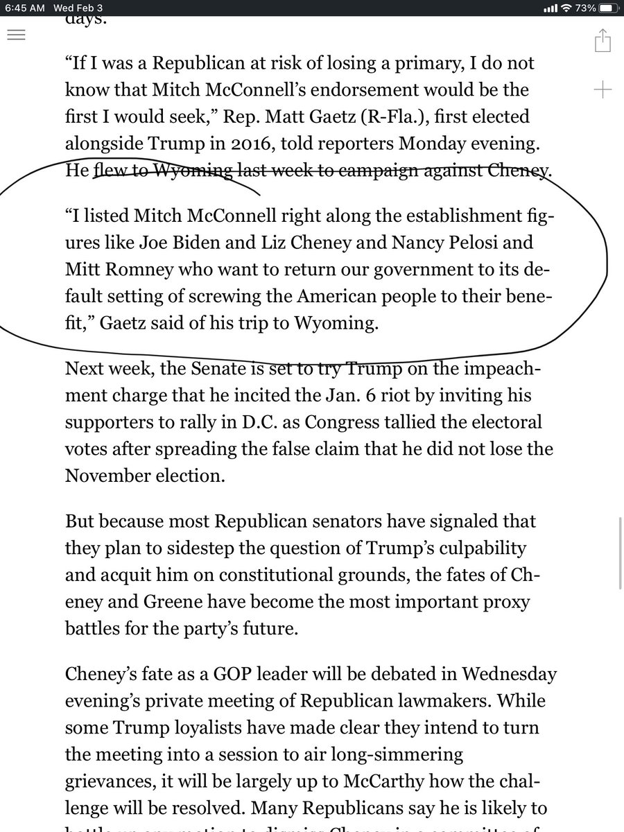
This is a separate point but I find it interesting that Gaetz, like Roy Moore did In his failed Senate campaign, disses McConnell. What are their actual policy differences? MM supported taking health care away from millions, a tax cut for the rich, conservative judges, etc. /5
I don’t think the sharp opposition between “hard-edge populism” & “conservative orthodoxy” holds. Many of the Trump administration’s achievements were boilerplate conservatism. Its own website trumpets things like “massive deregulation,” tax cuts, etc. /2
https://t.co/N97v85Bb79
The claim that Buckley and “key GOP politicians banded together to marginalize anti-Communist extremism and conspiracy-mongering” of the JBS has been widely repeated lately but the history is more complicated. /3
This tweet by @ThePlumLineGS citing a paper by @sam_rosenfeld and @daschloz on the "porous" boundary between conservatives, the GOP and the far-right is relevant in this context.
There's a great paper called "The Long New Right" that tells the story of the GOP/conservative movement's failure to police extremists for the last 50 years.
— Greg Sargent (@ThePlumLineGS) January 28, 2021
It's highly relevant to the insurrection and Marjorie Greene's lunacy.
I summed it up here:https://t.co/DTlzGomy5h pic.twitter.com/Dhc38CDuE2
This is a separate point but I find it interesting that Gaetz, like Roy Moore did In his failed Senate campaign, disses McConnell. What are their actual policy differences? MM supported taking health care away from millions, a tax cut for the rich, conservative judges, etc. /5