To visualize price action, I have used the daily candlestick chart. To quantify the meaning of support and resistance, I have taken below definitions:
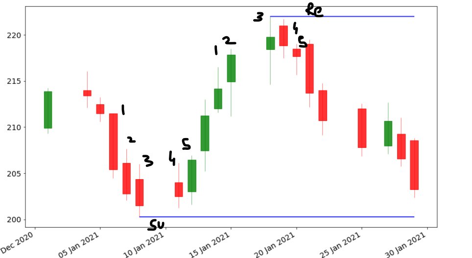
In a series of 5 continuous candles, if the first three candles make increasing high and then 2 decreasing highs, then the
+
high of the third candle is considered resistance. Similarly, if the first 3 candles make lower lows and the next 2 make high lows then the low of the third candle is support.
+
The above explanation is for the sake of quantifying support and resistance at a very basic level. These are called fractals. Now let's get started with the code.
mpl_finance is the new module here. We will use its candlestick_ohlc function.
+
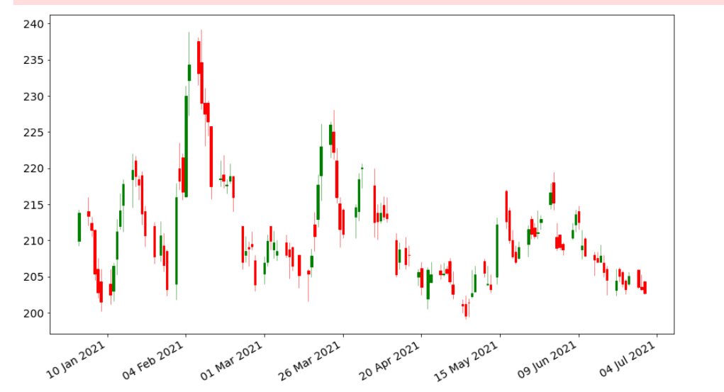
Now, if you remember, you downloaded data for nifty 50 stocks in module 2. We shall use that data. Let's work on ITC data this time.
We will use data from 1 Jan 2021 to 30 June 2021.
+
Let's plot the candlestick chart for this data frame. We are going to use the candlestick_ohlc function from the mpl_finance module. I have defined a function plot_chart() which you can see in the google colab link in the last thread
+
We will iterate over this dataframe and see if the low of the current candle is a support or high is a resistance. For that, we have created an array named levels.
Again remember the definition of fractals, we shall leave the first two candles and the last 2 candles as we
+
need two candles to the right of a candle in order to consider it a fractal. Similarly, we will leave the last two candles. We will iterate over the data frame from index 2 till it is 2 less than its size. We also need to define two functions "isSupport" and "isResistance"
+
determines and returns true/false if a candle low is a support or its high is resistance. In this image below 1-2-3-4-5 is a fractal as explained above, low of the candle on 10 Jan is support and high on 20 Jan is resistance. Repeating this process for the entire data frame.
+
To plot the levels we add it in our plot function (named it plot_all() ) and execute it.
+
But, alas it looks so ugly currently, I don't wanna look at it. There is a way that we can reduce the number of levels marked. What we will do that will first find the average length of a candle and reject all other price levels which are closed then twice this average
+
let's find the average length of a candle i.e. average of high - low
s = 2 * np.mean(df['High'] - df['Low'])
Using this number, we will reject the current price level if there is already another price level within the range +- s. For this, we defined a function isFarFromLevel
Finally, we have reduced the number of price levels and the chart looks like below:
+
If you want to work on the code and tinker with the code, go to Google Colab
https://t.co/G8DuZvWO0g I have shared the entire code on colab and added references for you to look into.
D: these won't help you become profitable but this will teach you how quant traders think &
+
automate their day-to-day tasks and quantify certain ideas. If you have any doubt reach out to me in DM.
+
In Module 4, we will learn about cloud computing and the use of cloud in trading. Until then, happy learning.