2/ Bitcoin's monetary system marches on its continuously-lowering coin emission; meanwhile, other world monetary systems' units inflate, either naturally (like gold & silver ounces), or via monopolistic privilege (like government fiat money "printing").
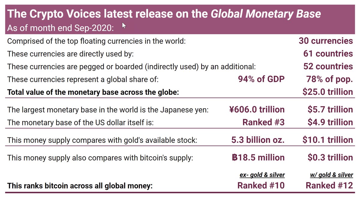
3/ What follows isn't a lesson in stimulus or bailouts, whatever the world faces. It's an attempt at painting the monetary landscape around the globe. The dollars, euros, and yen we're all familiar with, collectively, are worth $25 trillion. This is an exercise in perspective.
4/ As many know, the response from governments worldwide to Covid-19 has been drastic, so expect big moves. Also interestingly, central banks have been much slower to update their data these days.
5/ Gold & silver is base money of the past. Government fiat is base money today. It comprises both physical cash… and a digital cash component. Bitcoin may be base money of the future. Before we get to the charts, it's important to clarify a few common misconceptions in money.
6/ The first is everyone looking to value Bitcoin always jumps to the "narrow" or "broad" money supplies (M1/M2/M3). This is incorrect. The reason is those money supplies represent "claims" on something else. What is that something else? Answer: the base money supply.
7/ Fiat base money today includes both physical (notes & coins) and digital (bank reserves at the central bank) components. Think of the digital part as the "account" each bank holds with its central bank. This & only this money supply compares economically with 21 million BTC.
8/ Another mistake that's often made when comparing bitcoins to the analog monetary world is looking at a simple chart like US M1, or Eurozone M2. Besides again being incorrect on the M1/M2/M3 comparison, this method is inadequate because Bitcoin is global, and those... are not.
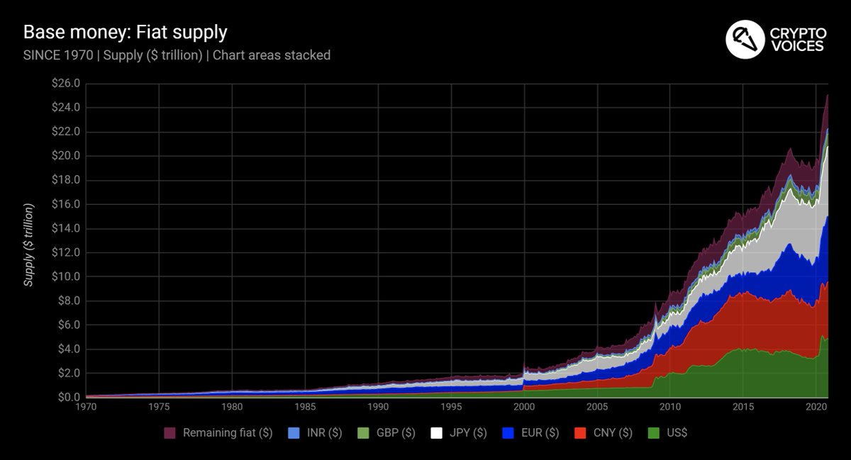
9/ We can't simply look at one or two nation states' base money supplies to gauge any kind of market depth. The sample must be global. We've done that here, tracking the top 30 floating currencies in the world. This is how the real, global fiat base money supply looks since 1970.
10/ This top 30 base money sample in fact covers 95% of global GDP, 113 countries, and 64 currencies. Why? The euro is one reason. The other is these countries/currencies either use one of these floating top 30 directly, or are legally pegged or fixed to one via currency board.
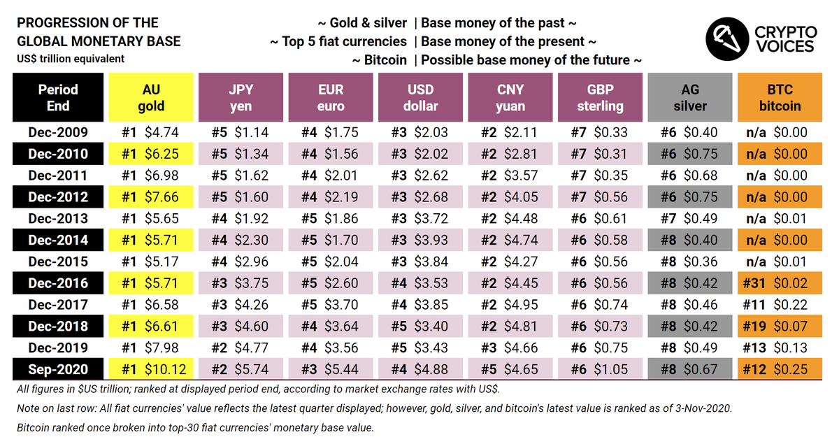
11/ More on the above image. The "ordering" of this graph is by GDP per currency bloc. Two major shifts happened in 2019. The first is that India's GDP is now larger than the UK's; therefore, both the INR and GBP base monies are now listed (even though the pound remains larger).
12/ The 2nd & bigger shift is China. In 2019 China's GDP surpassed that of the Eurozone nations (note China's not larger than the EU in total, just EU countries that use the euro). Therefore, in both GDP and size of its base, China's yuan now is ordered just after the dollar.
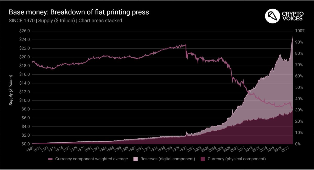
13/ Let's look again at the global base money supply curve since 1970, but this time see how the split shakes out between physical versus digital base money. Note how bank reserves (the digital printing press) drastically increased its overall % from the 2008 financial slide.
14/ Final point on fiat money. The monetary base is in fact a graph of the money monopoly today; meaning, it is the source of the printing press, and only central banks control this. If you're curious where to find it, the answer is simple: the balance sheet of each central bank!
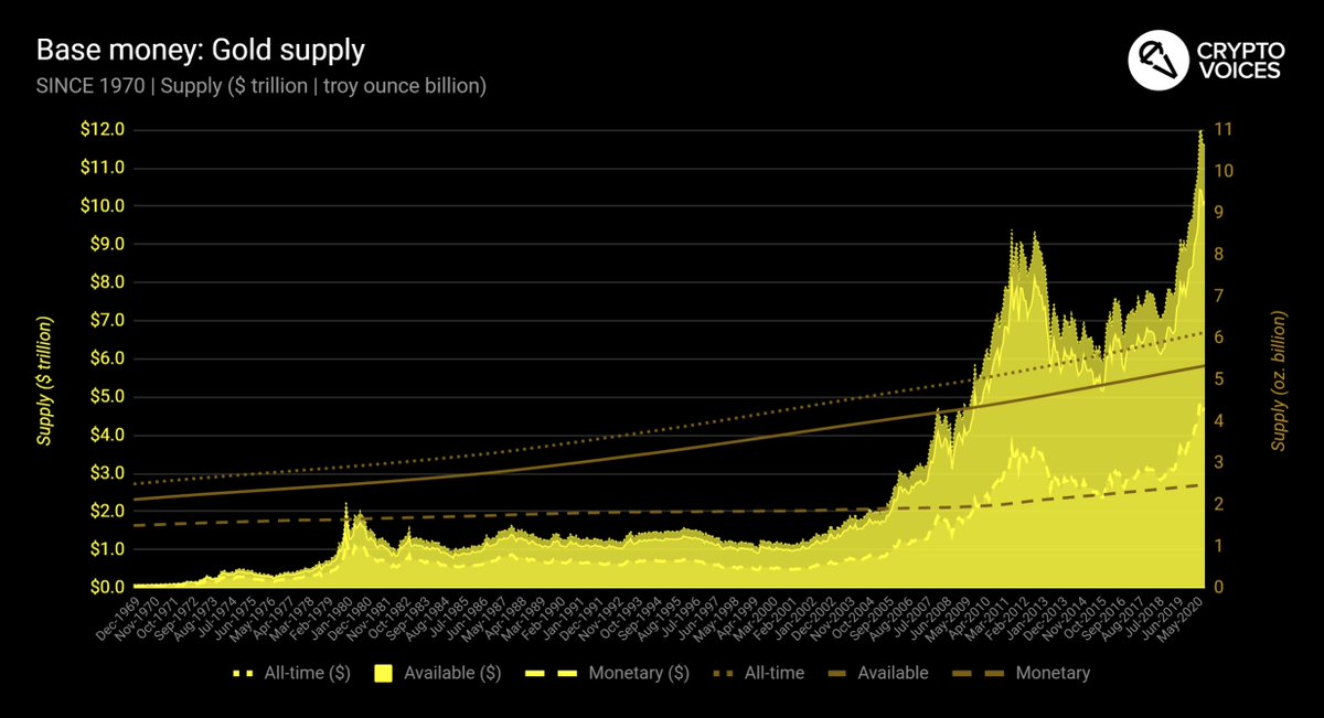
15/ Now let's look at gold. Central banks still hold gold, but it no longer acts as basic money. A few points coming on this, but everyone should still understand the global gold supply in both its native market unit (ounces), and in today's unit of account (US dollars).
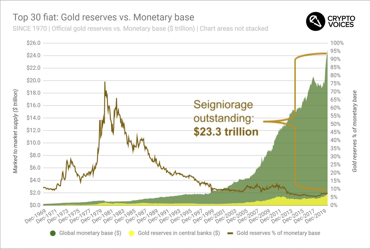
16/ Still on gold, here's a chart you don't see everyday. It's central bank gold holdings vs. their monetary bases. For those that still view gold as a market money, then any fiat money central banks can print above their gold holdings is - by definition - seigniorage.
17/ True, many emerging market central banks are net buyers of gold these days. But actually central banks hold less gold collectively than in 1965. Notice how high the proportion of gold reserves-to-issued base money was in 1980 (both valued in US$). Today, it's only 7%.
18/ In other words, central banks collectively have issued $23.3 trillion in base money *above* the value of their gold holdings (again, both marked to market in USD). This is an important fact that has implications for central bank money printing, for gold, and for bitcoin.
19/ What is that implication? So far, the money monopoly "works" for central banks, and for their governments. It's virtually costless: fiat has proven to be nearly "unconstrained" by the market value of gold. Some claim CBs manipulate the gold price; we won't address that here.
20/ As for #bitcoin, if and when it becomes large enough to be on that chart, and/ or held by central banks, then and only then will we have any idea as to what bitcoin "costs" central banks. For now, bitcoin "costs" central banks nothing in seigniorage; it's a rounding error.
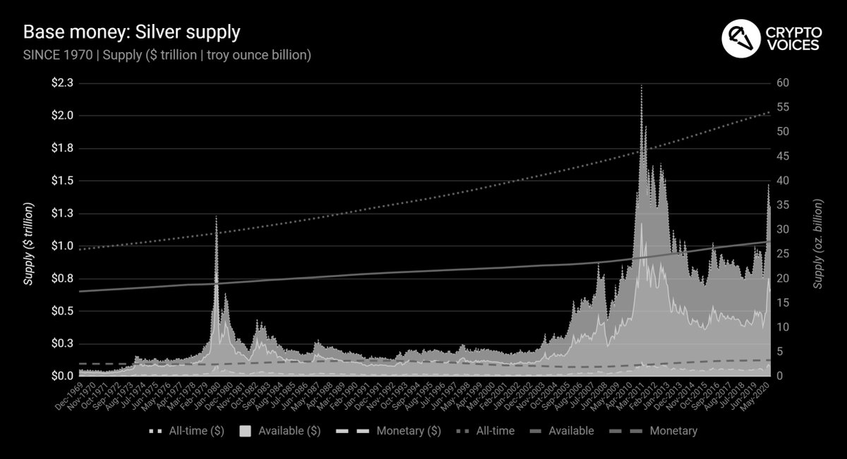
21/ Now silver. 53 billion ounces of the stuff has been mined throughout humanity. Note, we include 3 categories for both gold & silver: "all-time" mine production, "available" estimates (i.e. not lost to industry), and "monetary" estimates (bullion). Since 1970, this is silver.
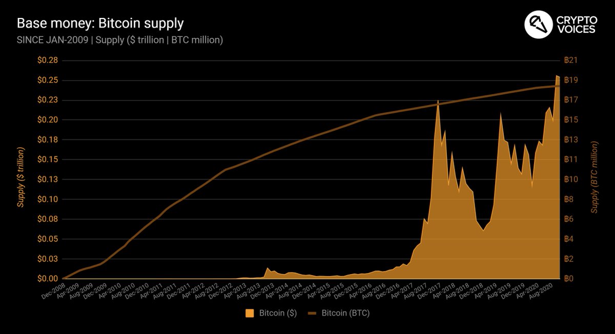
22/ And finally Bitcoin. Bitcoins are limited by the protocol to an eventual 21 million in supply by the year 2141. Bitcoins may circulate as base money of the future. Here is its global supply, both in native units (bitcoins), and in today's unit of account (US dollars).
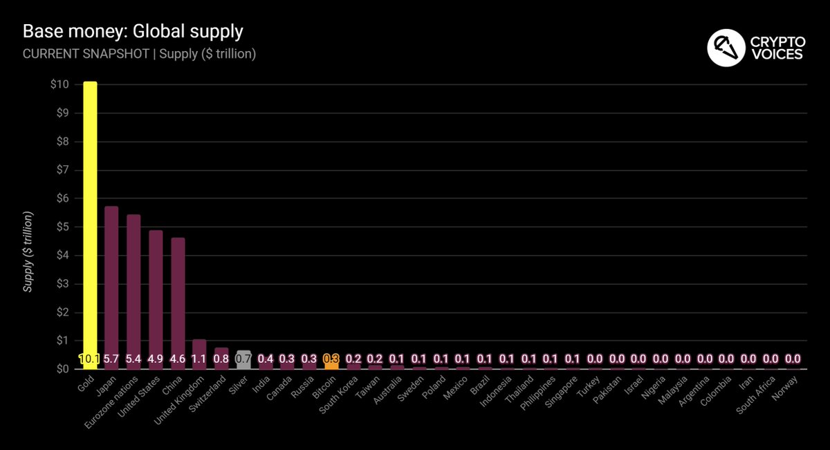
23/ And now we'll put them altogether - global fiat, "available" gold, "available" silver, and bitcoin - today. Without further commentary, note that the Bitcoin system is now the 10th largest money in the world, and the 12th largest money including gold & silver.
24/ And for a broad, historical ranking in table format, a progression of all money for the entirety of #Bitcoin's history since 2009, that information is here.
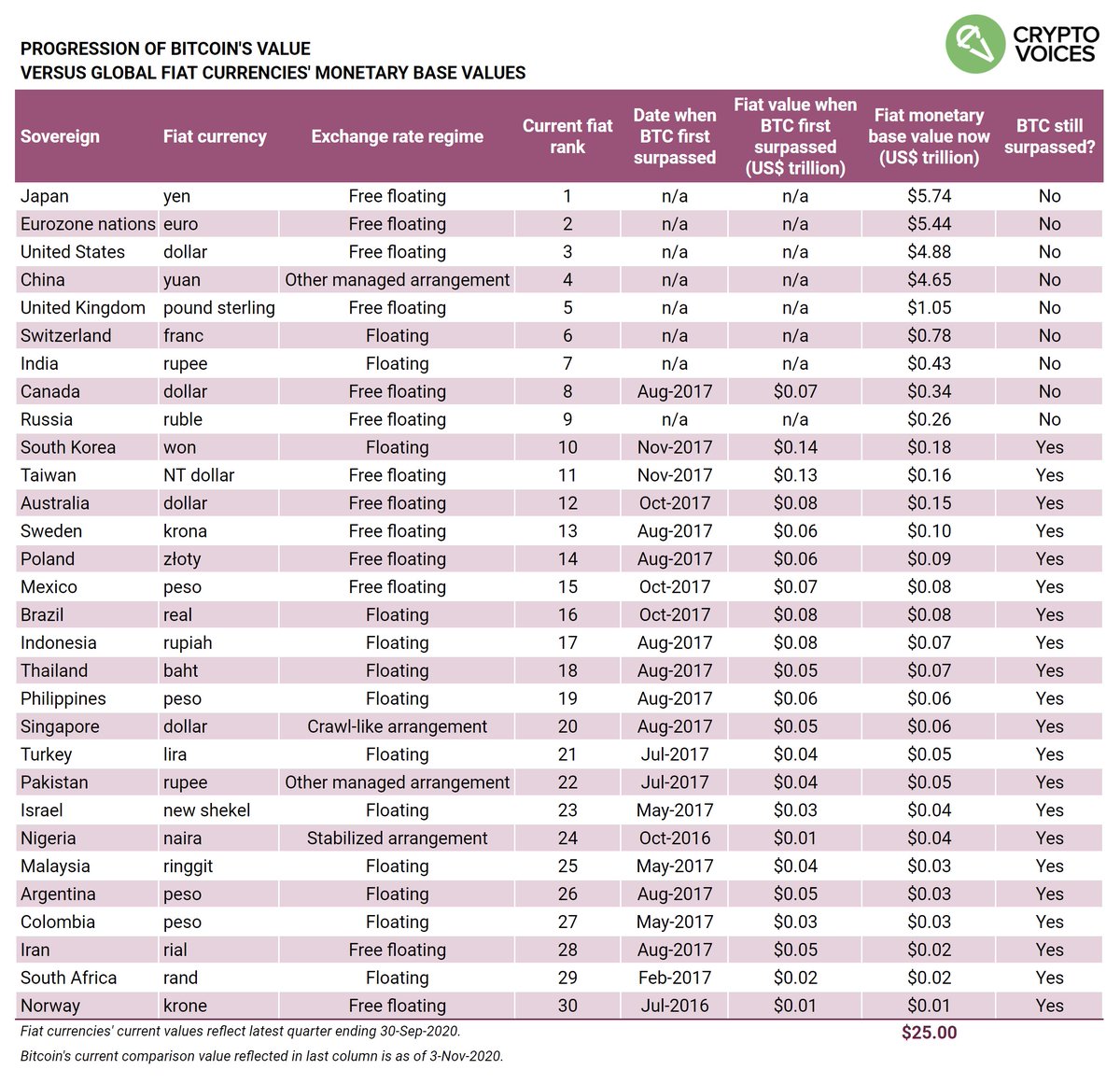
25/ And for those that wish to see that progression against the remaining fiat currencies, and how quickly (if) #Bitcoin passed each one, that chart is here. Note that as of this posting, #Bitcoin is on the cusp of surpassing the Russian ruble for the first time ever.
26/ Now for the main event of this analysis: Inflation. Inflation today means "price increases." It's usually measured by the central bank and usually wrong. There is no way all prices can ever be measured in a simple index. The input variables are changed all the time to boot.
27/ When we analyze inflation, we are using the classical definition, which is "monetary inflation." In other words, "money growth," or "money production." Understanding this rate of increase can be very helpful when trying to understand money.
28/ Inflation is one of the most important things to understand about money, in fact. Money growth inflation reflects scarcity. But to be clear... 🤜 The charts that follow have nothing to do with price growth or prices at all. 🤛
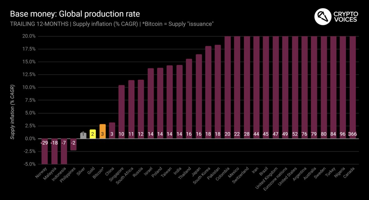
29/ Let's jump to it. This is the last 12 mos. of all base money growth. Remember, this is "unit" growth. % changes in dollars, euros, or yen, ounces of gold, or bitcoins. Big numbers.
30/ But we need to look deeper. It helps to look long-term. Remember the global fiat supply curve? 👆In 1970, the US$ equivalent of global base money was $200 billion. Today: $25 trillion. What does this mean? To understand it, you need to understand compound annual growth.
31/ Compound annual growth is an extremely important metric. It's "stronger" than a simple, annual rate (
https://t.co/iT7h6VhACz). We can use this rate to understand investment returns, or long-term trends like population growth. We can also derive doubling time from this figure.
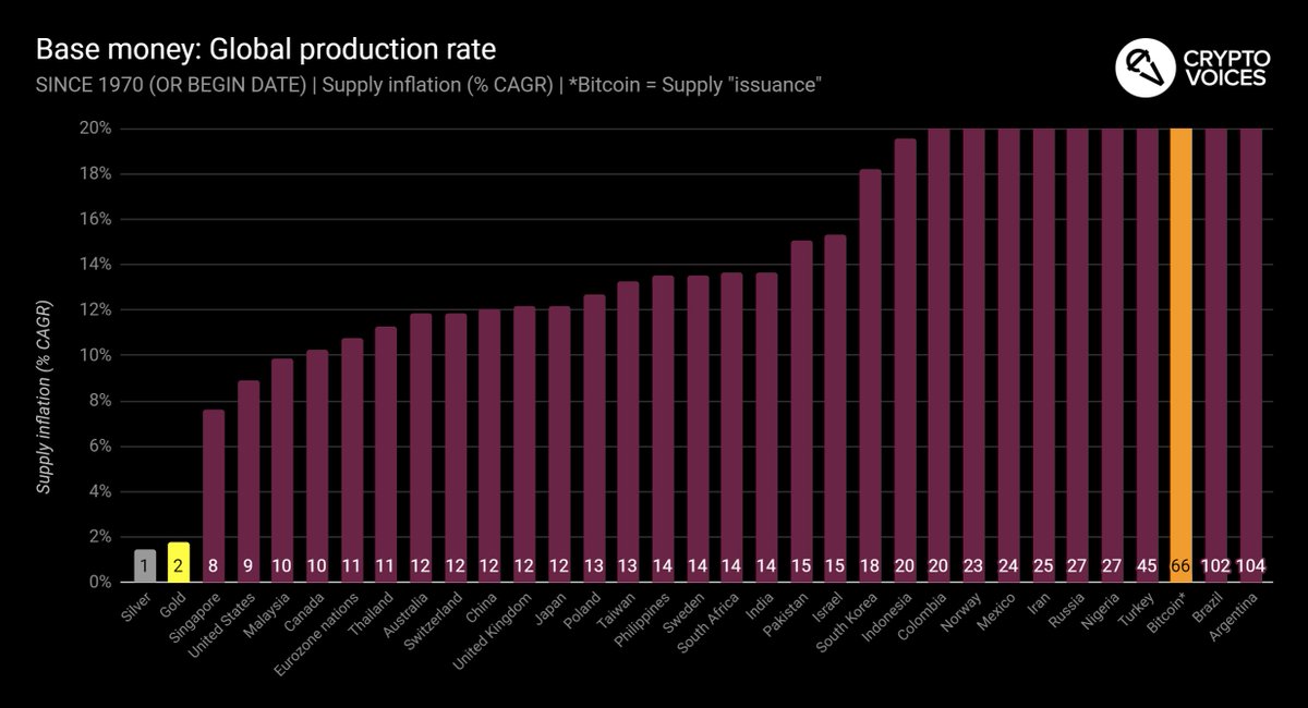
32/ So let's start with the compound annual growth rates for the global monetary base since 1970. 50 years of data. About half the countries' data goes back this far. For the rest, % displayed is since their start date. For bitcoin, the start date is Jan-2009.
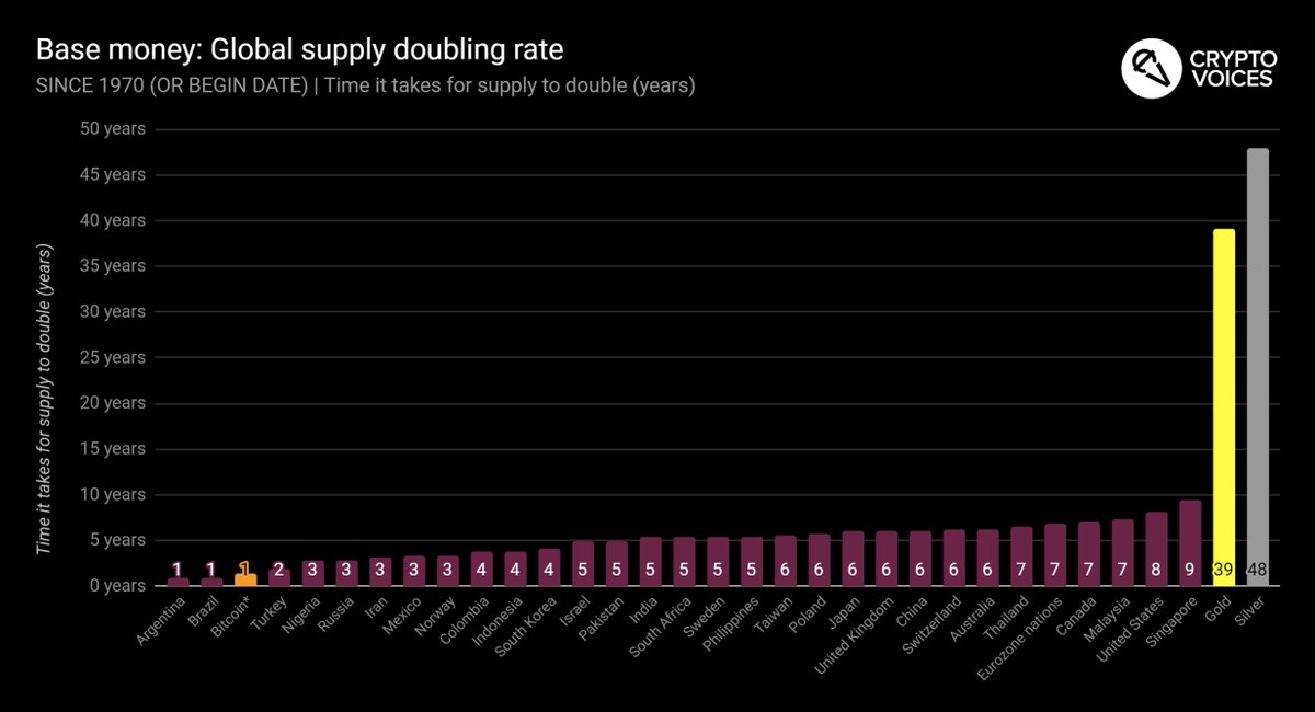
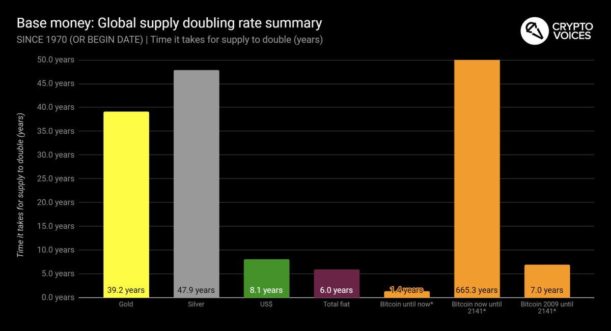
33/ Doubling time also helps. From compound growth %, we can determine exactly how long it takes for an asset's supply to double. Here is the exact same chart as just shown, since 1970 (and since 2009 in Bitcoin's case), but displaying doubling time instead of compound growth.
34/ It should be clear why gold and silver arose as past base money. 'Twas difficult to inflate them, and thus with low inflation rates they had long supply-doubling times (scarcity). Fiat base money has typically been much quicker to double. Bitcoin... needs more explanation.
35/ These next 2 charts will make it easier to understand how Bitcoin's supply works. From 2009 until now, yes, 50 bitcoins grew to 18.5 million. That's a ~65% compound annual growth rate, or doubling every 1.4 years. But, from now until 2141… that's when things get interesting.
36/ Notice how the supply of bitcoins will only grow at 0.1% per year, or double every *665 years*. And it gets even more unique, as the Bitcoin protocol won't allow that doubling to happen, as it's supply will cap at 21 million in 2141. No money in history has worked like this.
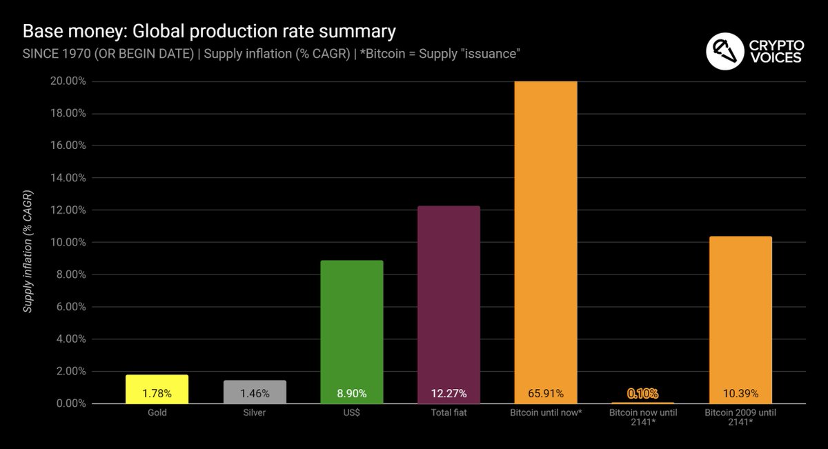
37/ To clarify, this is the long-term compounding of past, present, & possibly future base money, since 1970:
Gold: 1.8% (39 yr-doubling)
Silver: 1.5% (48 yr-doubling)
US$: 8.9% (8 yr-doubling)
Global fiat: 12.3% (6 yr-doubling)
Bitcoin: From now until 2141: 0.1%... compounded.
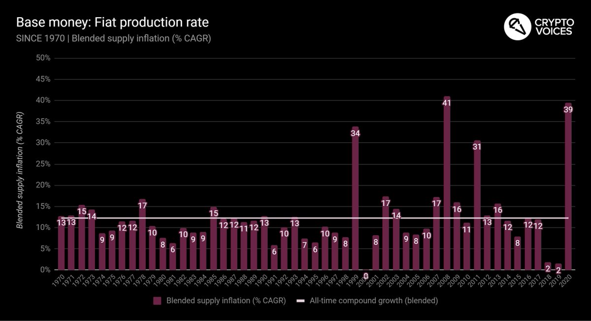
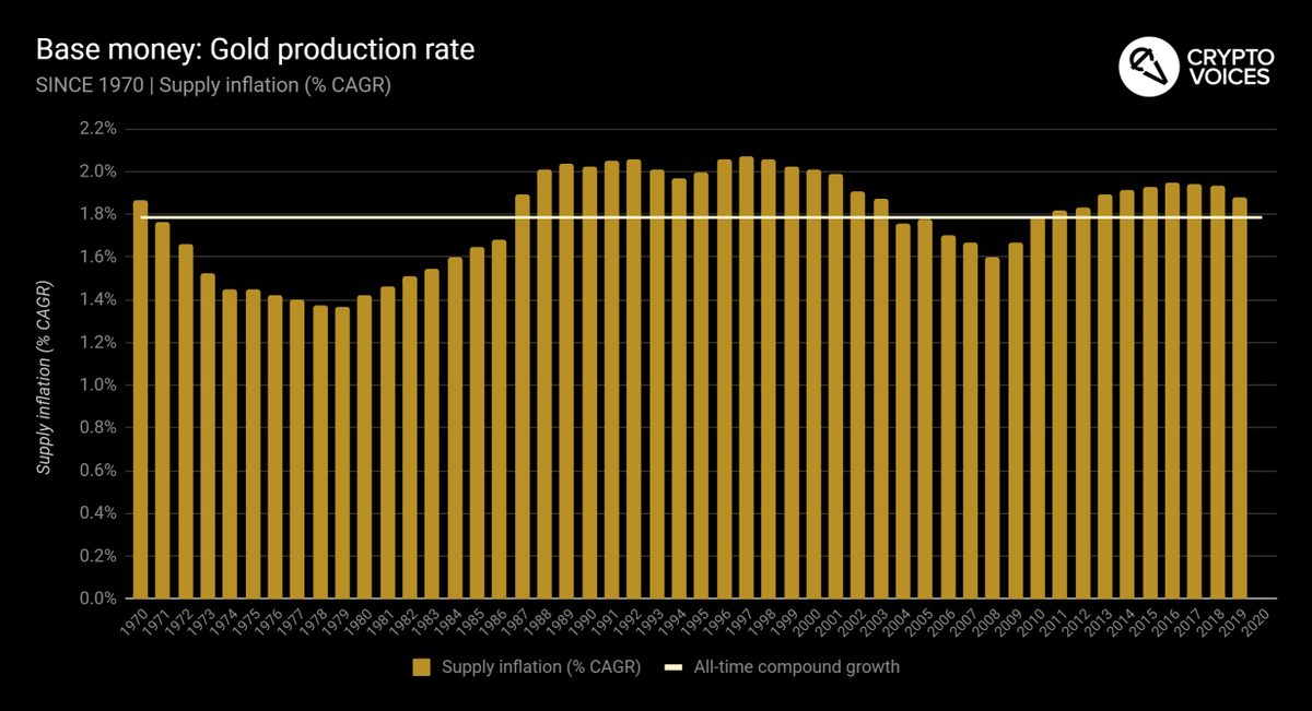
38/ Back to the 50 year time series again, and this is the big one. Here is the global fiat base money inflation rate, weighted averaged by each base money's equivalent in US$. Notice it matches the overall 12.3% CAGR (6 year doubling time) we've already seen.
39/ Quick note on prior slide. What happened in 1999? People were taking cash out like mad before Y2K. Interesting to note, 2018 and 2019's inflation rates are in fact the lowest rates of growth of basic money ever, besides 1999. And we should say a few more words on this…
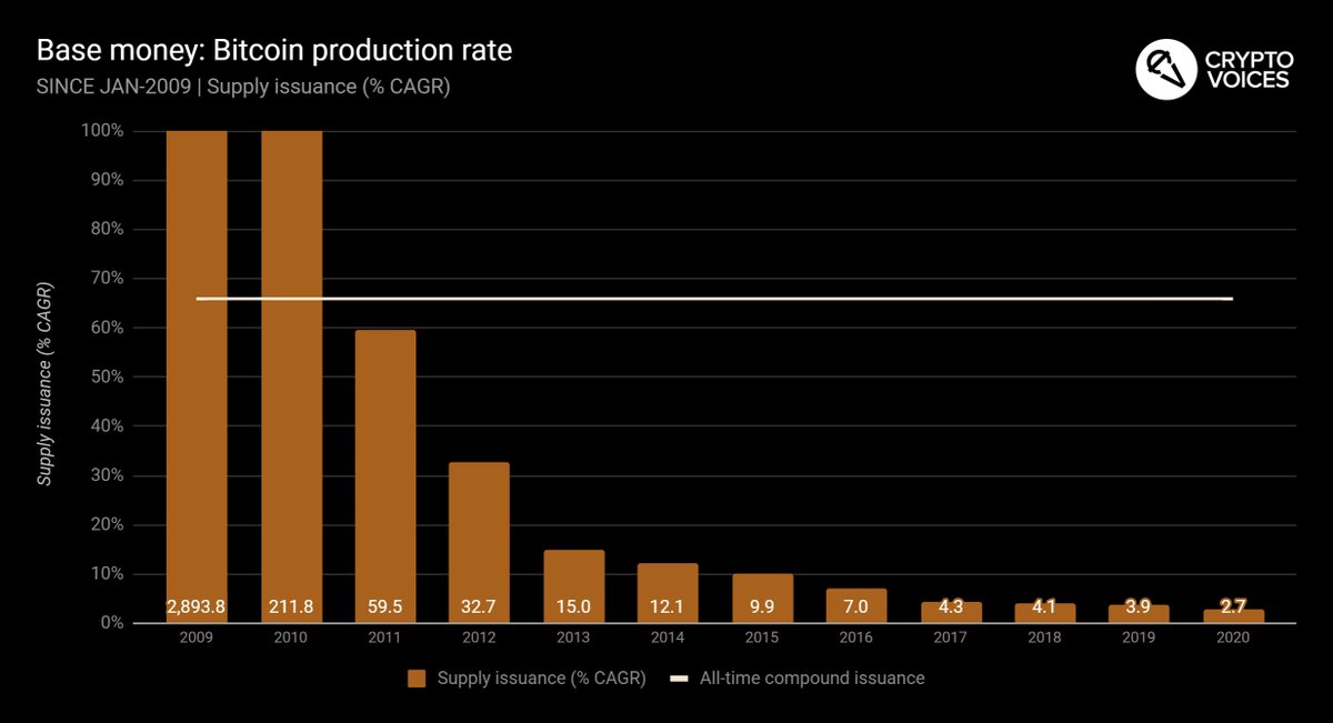
40/ For all 2019, central banks were actually on track to *deflate* their currencies. This would have been a first in the modern fiat era. So interestingly, no matter "why" one argues for money printing, 2019 still did finish off with positive inflation, weighted at 1.5%.
41/ Now here's the big one. How much money around the world is actually being printed? This exhibit is the one to answer that pivotal question: 2020 is now at historically record levels. Through Q3 2020, we're at 39% annualized. 2008 was highest ever at 41%. 💸
42/ Here's gold. Same concept. Notice again the overall series compounding will match the summaries we've already seen. Gold's rate of growth has, in fact, been around 1.8% per annum for the last 170 years.
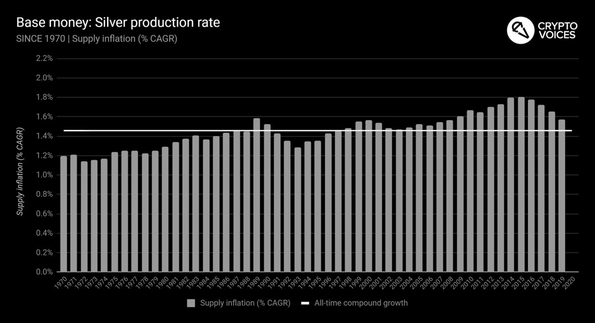
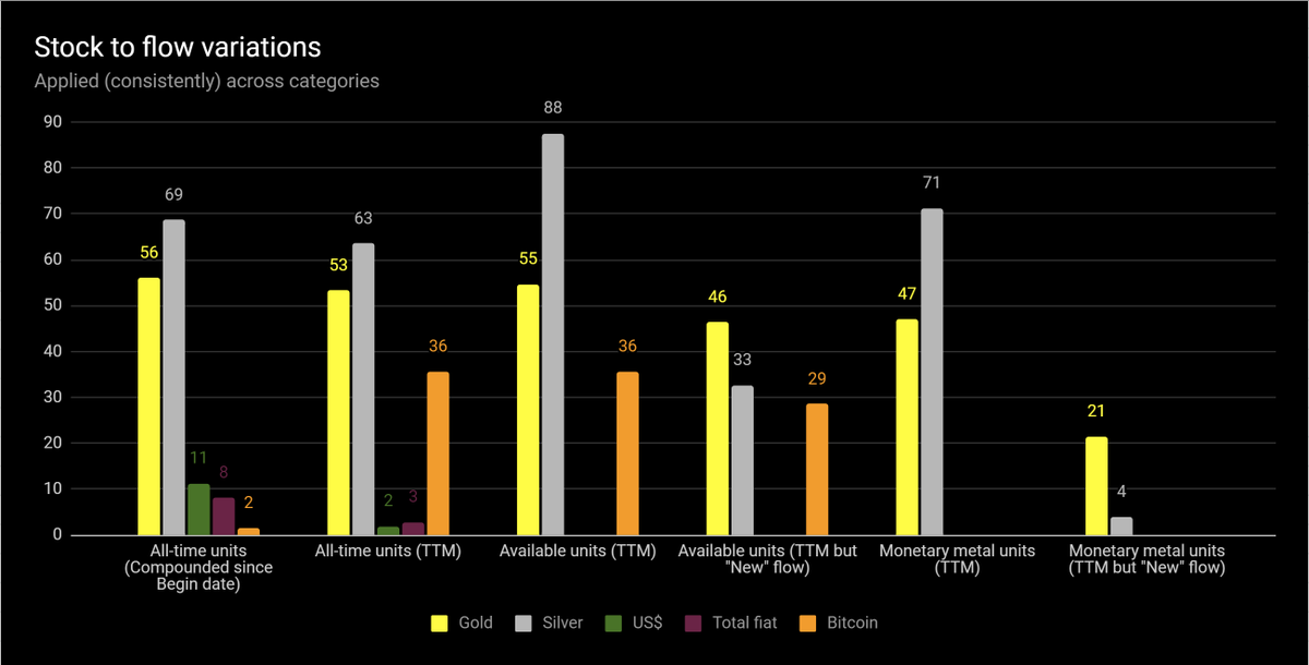
43/ And here's silver. Same deal.
44/ And now Bitcoin. Remember why the overall compound growth, thus far, is so high, and why it will never be that high again. And now is about the time for a clarification note on the Bitcoin system's compound annual growth rate, specifically.
45/ Also notice the phrase "supply issuance" for Bitcoin's chart titles, and not "inflation." Bitcoin's "inflation," economically, is already baked in. Everyone knows its max supply. As already demonstrated, its growth rate is known until 2141, per the protocol.
46/ So when it comes to bitcoins, "inflation" is not the best term. "Coin issuance" is more apropos, as its overall supply is fixed and known. As our first podcast guest George Selgin said, "We know it's 21 million, and that's that." This is uniquely unlike fiat, or even gold...
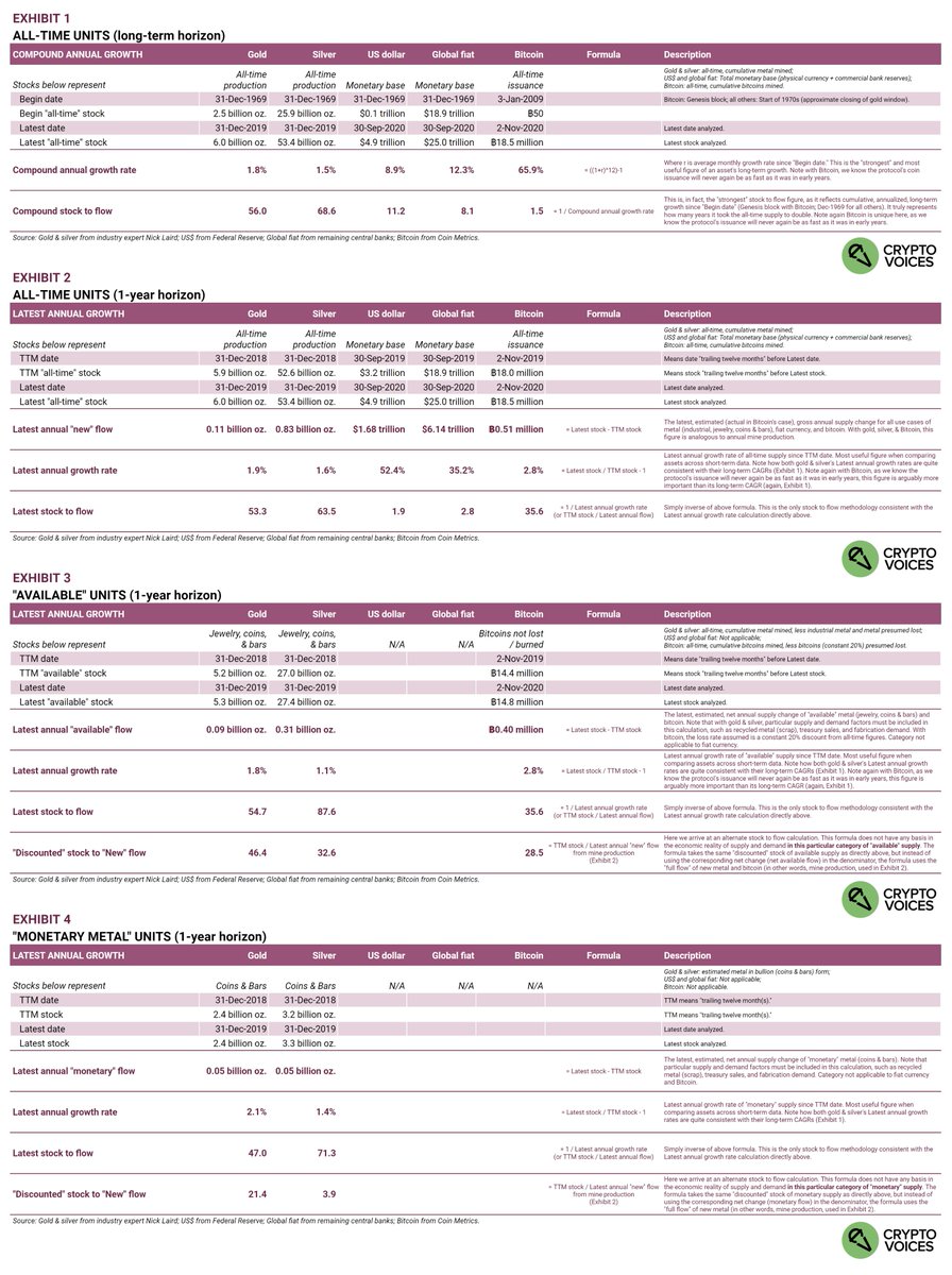
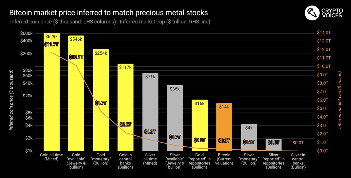
47/ Lets take another detour on supply growth, also on the concept of "stock to flow." The attached exhibits cover all the main stock categories: all-time production, "available" supply, and "monetary metal" supply. These categories are often quoted inconsistently.
48/ Remember, consistency. Gold bugs first: They often claim silver's S2F is 3 or 4. If you're a gold bug and really want to disparage silver with this (closer to 4) ratio, then you should in the same breath quote gold's comparable S2F in this (spurious) category: 21.
49/ Now for silver bugs. For years, as gold's price is ~80x silver's, they've claimed silver's price is due for at least a 5x move, to bring it back in line with the historical, natural ratio to gold (about 16 to 1). There are a few problems with this.
50/ First, it's impossible to predict price based on historical supply and demand ratios. Second, even if we assumed that historical ratio of 16 to 1 was gospel, silver is *already* at that level. You just need to view it through the correct lens…
51/ The all-time gold *stock* is $11.7T; silver is $1.3T. Ratio of 9. Holding gold constant, silver's price needs to *fall* 44% to get to the 16x ratio! Repeat this process across "available" metal ($10T gold and $0.7T silver), then it's only a -5% move in silver price.
Done.
52/ One more thing. Let's look bird's eye across all gold & silver groups. Of all the "transparent," reported repositories of bullion (calculated by Nick Laird) - all ETFs, the Perth mint, even
@PeterSchiff's GoldMoney, etc. - #bitcoin has passed silver & it's very close to gold.
53/ Alright. Now that we've seen all the data, let's finally take a quick look at some price chat, because even though I told you none of the above covers prices, I know you're thinking about how all of this monetary inflation has affected or will affect prices.
54/ Milton Friedman said, "Inflation is always and everywhere a monetary phenomenon." He meant price inflation (not graphed above) always and everywhere follows money inflation (very much graphed above).
55/ The rub is it is impossible to predict how and when price inflation will happen. Impossible to predict. Hyperinflations (of prices) or otherwise. The best we can do is measure the money supply and its growth, as we've done here.
56/ But we can say this: If the supply of base money increases, and if there is no or a lesser increase in the demand for that money, then ceteris paribus, prices will rise. Ceteris paribus, a growing base money supply will always undermine that money's purchasing power.
57/ These are some of the reasons why the market chose hard money like gold & silver. Always emergent in human action, unless there is monopoly intervention (fiat), the market will decide the best money. If aliens in a one-off whisked away our gold, we'd choose the next best...
58/ A few notes before the final summary. Almost done! Remember these are the top 30 currencies in the world over the past 50 years. Zimbabwe & Belarus don't make the cut; as their monetary base is so tiny, their hyperinflations would barely move the needle on what's presented.
59/ For the euro, its accounting creation began in 1999, and it started circulating in 2002. Prior to 2002, we are building a blended monetary base for the euro back to 1970, and as of now, include 3 of the very largest: the Deutsch mark, the French franc, and the Italian lira.
60/ To be absolutely clear on the global fiat blended inflation rate: it's calculated using a weighted factor of each country's base money supply, based on how large their US$ equivalent actually is, during that month. This weight evolves as more currencies are added.
61/ As we look back in time, for those currencies that weren't established, they didn't factor into that period's global inflation. For example, the US dollar's weight itself was 40% of the pie in 1970, and only 20% today, as (among others), data on China begins only in Dec-1999.
62/ Regarding compound annual growth rates: they're always calculated from monthly fiat unit growth, then compounded to annual (to the 12th exponent). This is necessary due to cases like Brazil and Argentina, which had 6 and 4 different currencies respectively, since 1970 alone.
63/ Continuing, a compound annual growth rate from a 1970 currency to 2020 currency doesn't make sense for Brazil. So the *monthly* rate must be taken across time and then compounded, ignoring those 6 months when the central bank reset (slashed zeroes) from the old currency.
64/ And finally, the mechanics of this method (compounding monthly growth rates to annual) were of course repeated across gold, silver, and bitcoin's supply curves, for consistency.
65/ On our podcast
@crypto_voices, @fernandoulrich and I explore the varying economic nuances of Bitcoin as a contender for the global monetary base, for global money.
66/ To sum up, this graphic includes all items. Print it out if you like. The base money of 113 nations is reflected inside the top 30 currencies, and it summarizes gold, silver, and the supply of bitcoins. It is a supply-side summary of essentially all basic money in the world.
67/ Head over to
https://t.co/I5lXV9MMM6 or
https://t.co/UgTHz0uQs1 to learn more. Fiat base money is sourced from central bank balance sheets, wonderful gold and silver history from industry expert Nick Laird, and bitcoin from
@coinmetrics.
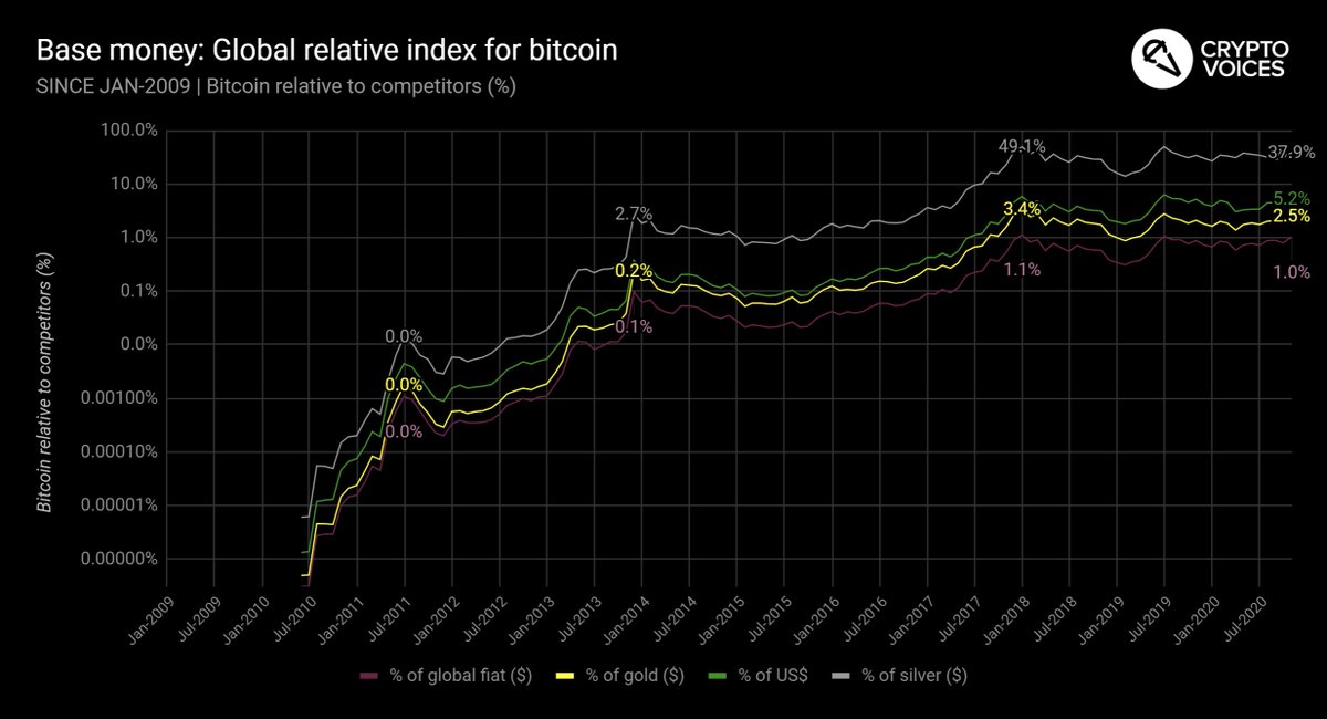
68/ These penultimate graphics illustrate how Bitcoin's supply (US$ equivalent) compares across all other basic monies, past and present. Bitcoin sits at 1%. The #RealBitcoinDominanceIndex.
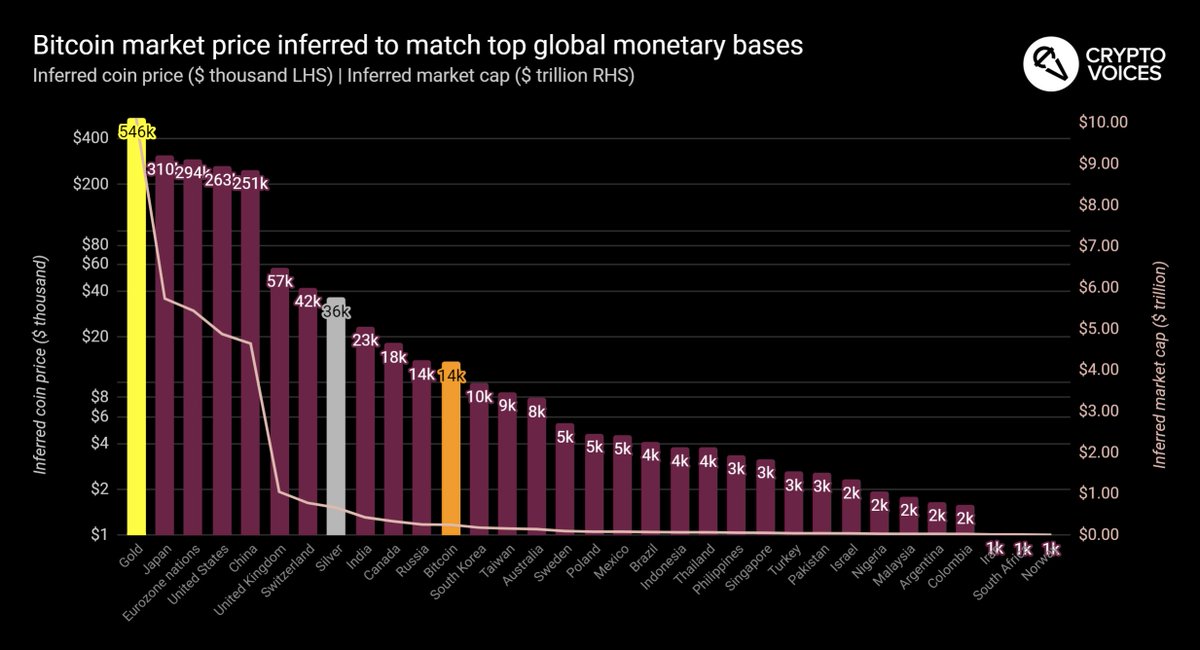
69/ And finally, one might be curious as to what price it will take for #bitcoin to surpass each nation's monetary base value (including the gold and silver "available" caps). Again with the definite caveat that these are calculations, not predictions… that chart is here.
70/ More to come in the future. We are continuing to work on this topic. Any sats you might spare to contribute are very much appreciated, and will help keep up the research!
Tips in $BTC preferred and can be made here:
https://t.co/xyvl2bjKIs /fin