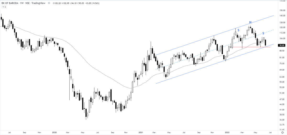
Must observe this chart very carefully for the reason that the price is at the confluence zone of 40 weeks MA, a bearish H&S top that has not been activated yet, and the lower boundary of the channel formation.
I call these zones critical areas.
Bank of Baroda
More from The_Chartist 📈
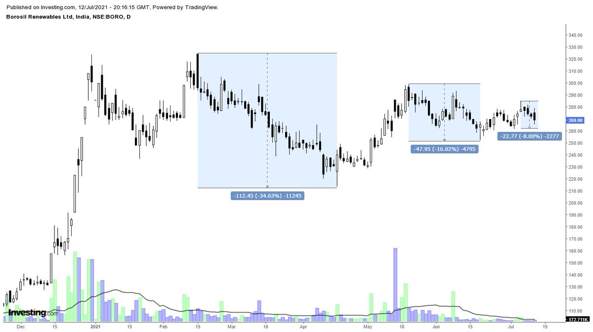
Borosil renewables - Enter if you can. Read the below tweet to understand the concept. The only way you can make money is to follow in the footsteps of smart money till you yourself become a smart operator. 👇👇 https://t.co/RN8sQYzdBg
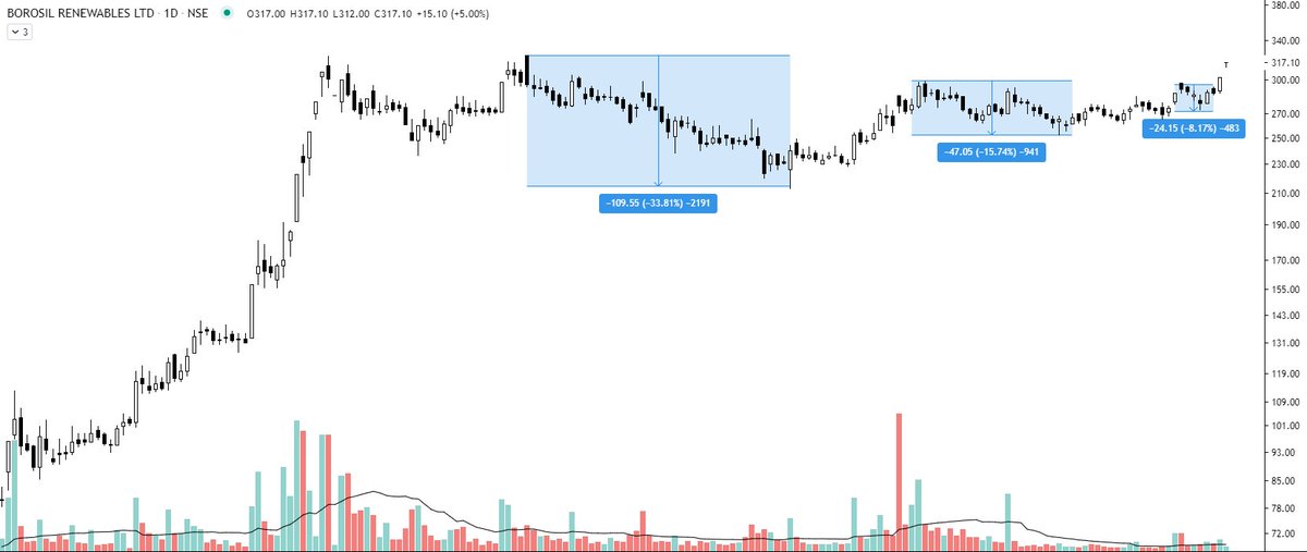
Borosil Renewables - Patterns like these must be looked at carefully and must be kept on the radar. Herein price is contracting which generally signifies shifting of hands (from weak to strong). If you go wrong, the risk is limited in these. pic.twitter.com/iqyoeslZjy
— Steve Nison (@nison_steve) July 12, 2021
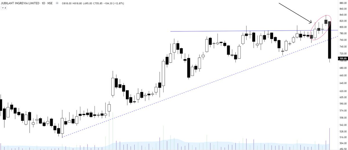
Jubilant Ingrevia - Key learning?
It is important to analyse the strength of the breakout. If the price does not continues the move in 1 or 2 sessions and candles show long upper wicks, it is better to bring the SL closer. Distribution sign.
Will be helpful in next breakouts. https://t.co/AtZOj4bKeT
It is important to analyse the strength of the breakout. If the price does not continues the move in 1 or 2 sessions and candles show long upper wicks, it is better to bring the SL closer. Distribution sign.
Will be helpful in next breakouts. https://t.co/AtZOj4bKeT
Learning: Strong breakout
— The_Chartist \U0001f4c8 (@nison_steve) July 2, 2021
1. Breakout candle will have no upper shadow or extremely less compared to the body
2. Volumes will be high (to avoid retailers to enter & also big hand absorbing all the selling)
3. Pullbacks will be rare/very less
4. Happens after a long consolidation pic.twitter.com/YTHDOnEdxo