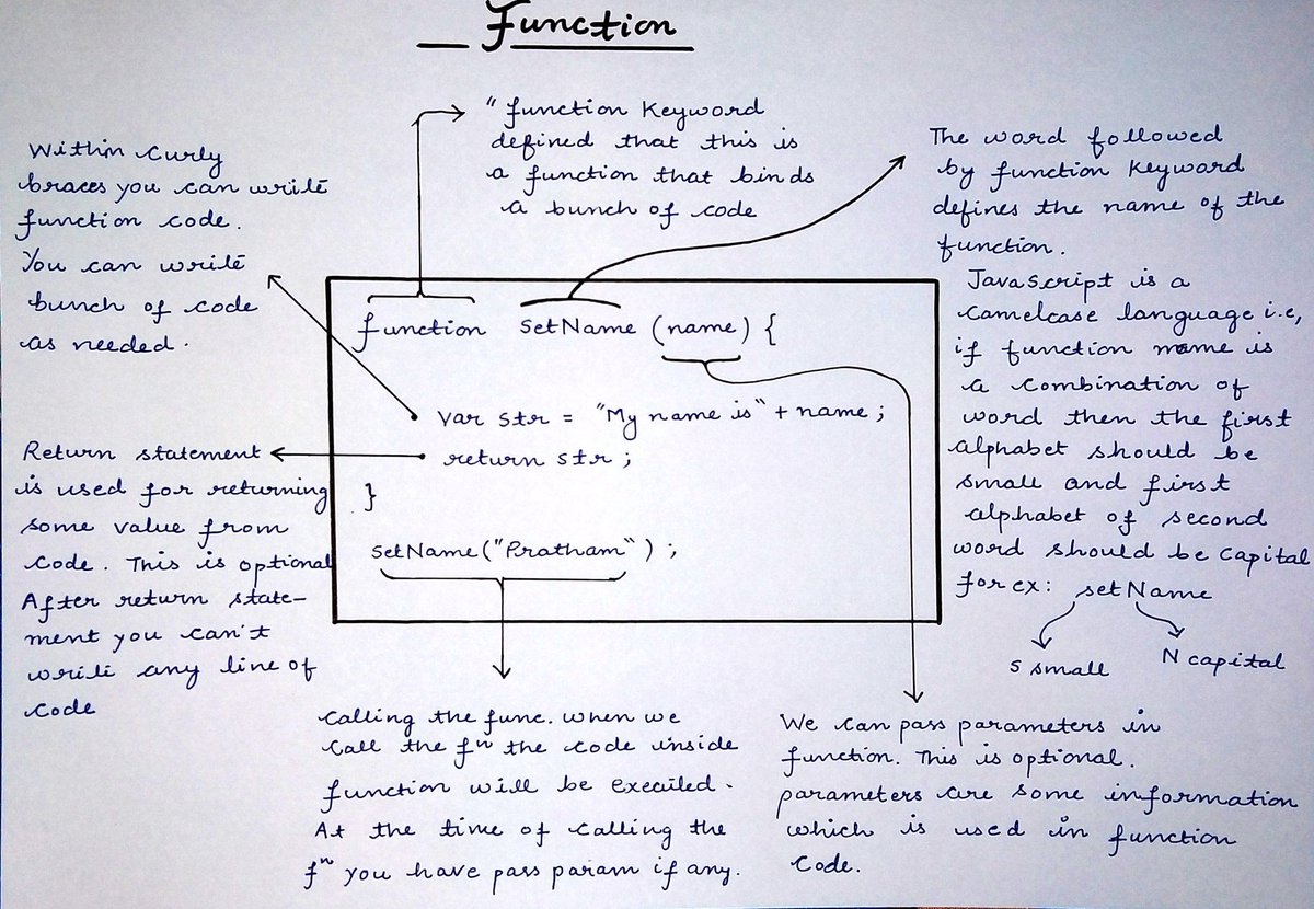
{ 2 / 27 }
A complete beginner's guide to styling your website with CSS.
Thread 🧵👇🏻
{ 2 / 27 }
The characterstic of a great website is it's color scheme. Forget about everything and learn about background and color properties initially.
The colors are something from which users interact first whenever they visit your webpage
{ 3 / 27 }
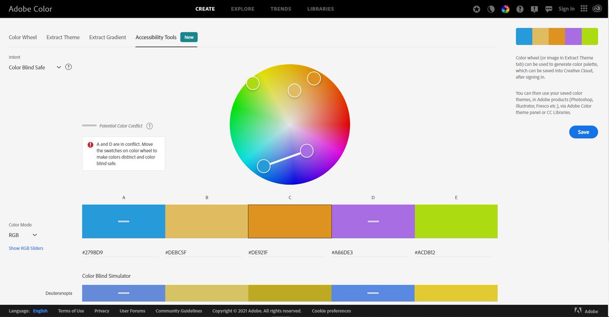
Check this great tool for generating accessible colors
https://t.co/ndsgBaMv2M
{ 4 / 27 }
{ 5 / 27 }
- Height
- Width
- Padding
- Border
- Margin
{ 6 / 27 }

I suggest to give a look at max, min-width and max, min-height properties as well (we will cover these further in this thread)
{ 7 / 27 }
Give this article a short read for Definitive guide of padding and margin
https://t.co/eEEHcxNNGq
{ 8 / 27 }
Some good border selection can give your element a good pleasant look
{ 9 / 27 }
You can add free fonts from Google's official site
{ 10 / 27 }
1. serif
2. sans serif
3. script
4. monospaced
5. display
Give this article a read for more detailed explanation
{ 11 / 27 }

You just need to look at few fonts properties. For ex,
🔹 font-family
🔹 font-weight
🔹 font-size
{ 12 / 27 }
From here, a bit tricky CSS starts. Using CSS positioning you can change the position of you element. This might seems bit tough but you can learn it in 2-3 days
{ 13 / 27 }
https://t.co/gyWq9czZbj
{ 14 / 27 }

Positioning in CSS allows you to display your element wherever you want on the screen
— Pratham (@Prathkum) January 31, 2021
But when I was learning it, I found it little bit confusing\U0001f605
So in this thread I'll try to explain it in easiest manner with practical implementation. Let's start
THREAD\U0001f9f5\U0001f447 pic.twitter.com/M3UnegtQUk
Flex and Grid
Grid is little bit tough to master but flex isn't
{ 15 / 27 }
Flex: https://t.co/VOErQbevp6
Grid: https://t.co/XtbgA0wxZP
{ 16 / 27 }
Everything you need to know about CSS Flex layout
— Pratham (@Prathkum) April 7, 2021
A Thread\U0001f9f5 pic.twitter.com/uYxYwgFevB
📌 Responsive Web Design
This is the most trickiest part let's cover it in detail 👇🏻
{ 17 / 27 }
"Ability of content to fit inside any device that look good and it will be for user to interact with that"
{ 18 / 27 }
1️⃣ Use meta viewport element
2️⃣ Don't use large fixed width
3️⃣ Use
4️⃣ Responsive text size
5️⃣ Try to use layouts
6️⃣ Media Queries are saviour
7️⃣ Use "auto" in media
{ 19 / 27 }
It forces page to follow the screen-width of the device.
{ 20 / 27 }

It can cause trouble. Let's say an element having width 500px but user is viewing on a device having width smaller than 500px
In such cases, use min-width or max-width
{ 21 / 27 }
The HTML
{ 22 / 27 }
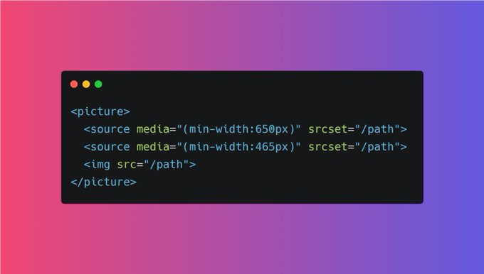
Although you can make text responsive using media queries but you can also use "viewpoet" width as well.
h1 {
font-size: 10vw;
}
{ 23 / 27 }
Using Grid or Flex layout always beneficial in order to make a web page responsive. Both these layout are not hard to learn. Try to use them
{ 24 / 27 }
Media query is a rule to include a block of CSS properties only if a certain condition is true. It is very useful in order to make a RWD.
{ 25 / 27 }

More from Pratham
6 beginner friendly websites that will boost your HTML and CSS learning process 🚀
🧵👇🏻
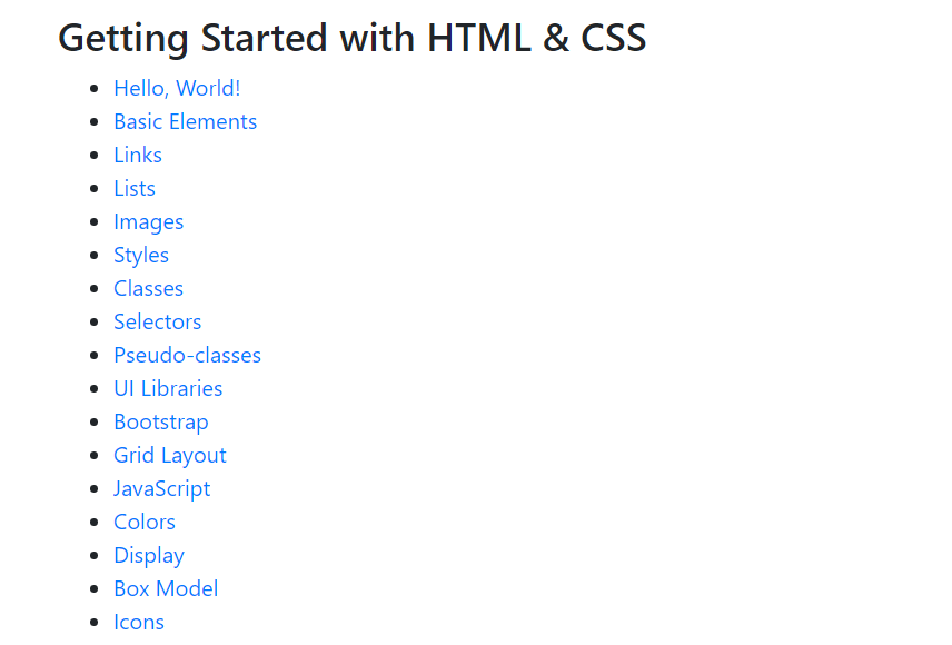
1️⃣ Learn HTML
- The easiest way to learn HTML & CSS. Learn HTML provides an interactive tutorial that explains how to build HTML & CSS websites step by step.
🔗 https://t.co/W1XytKL1MI
2️⃣ HTML best practice
- A very well written document on HTML best practice
🔗 https://t.co/6PTcY1U5Cw
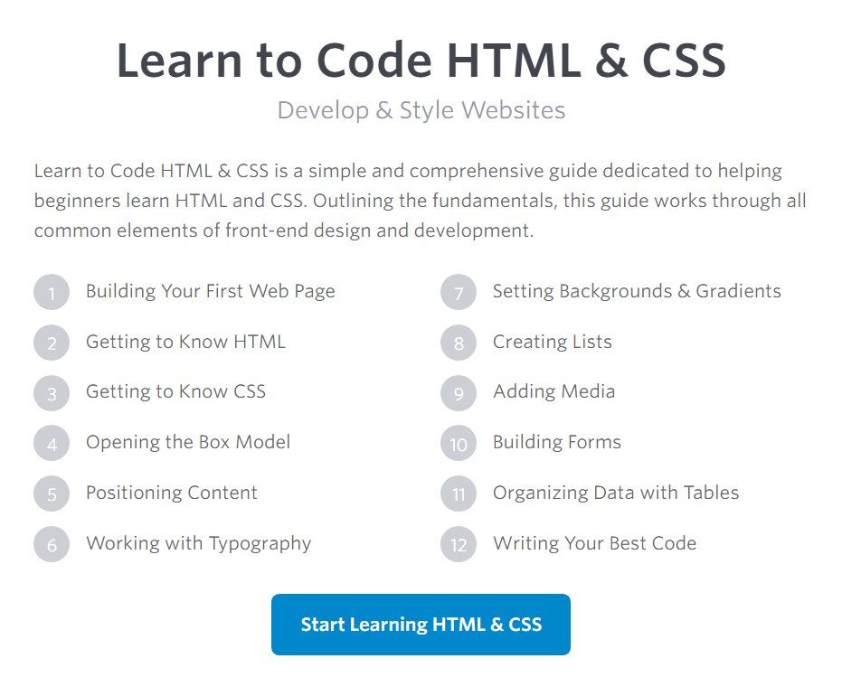
3️⃣ Learn to Code HTML & CSS
- Learn to Code HTML & CSS is a simple and comprehensive guide dedicated to helping beginners learn HTML and CSS
🔗 https://t.co/LwY9E2qUNS
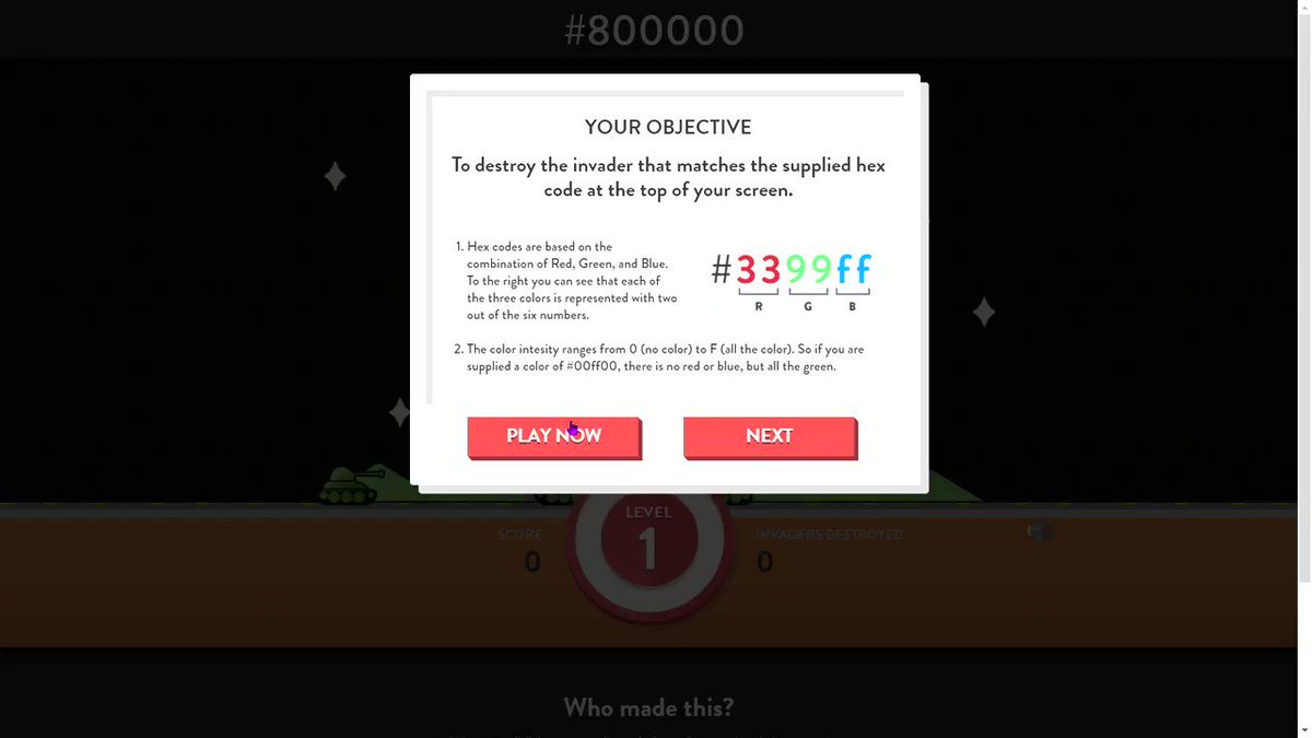
4️⃣ Hex Invaders
- Hex Invaders is a fun way to learn and understand what hex codes are and how they work
🔗 https://t.co/EpQyhlN7pv
🧵👇🏻
1️⃣ Learn HTML
- The easiest way to learn HTML & CSS. Learn HTML provides an interactive tutorial that explains how to build HTML & CSS websites step by step.
🔗 https://t.co/W1XytKL1MI
2️⃣ HTML best practice
- A very well written document on HTML best practice
🔗 https://t.co/6PTcY1U5Cw
3️⃣ Learn to Code HTML & CSS
- Learn to Code HTML & CSS is a simple and comprehensive guide dedicated to helping beginners learn HTML and CSS
🔗 https://t.co/LwY9E2qUNS
4️⃣ Hex Invaders
- Hex Invaders is a fun way to learn and understand what hex codes are and how they work
🔗 https://t.co/EpQyhlN7pv
5 great code snippet websites for every web developer and designer
🧵👇🏻
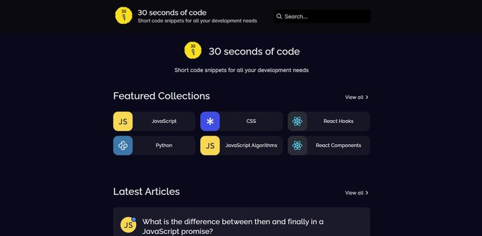
1️⃣ 30 Seconds of Code
- Short code snippets for all your development needs
🔗 https://t.co/91L4bAxkgF
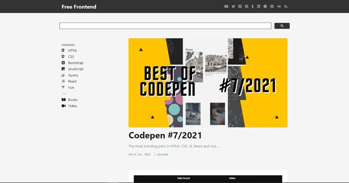
2️⃣ Free Frontend
- Free hand-picked HTML, CSS and JavaScript (jQuery, React, Vue) code examples, tutorials and articles
🔗 https://t.co/2sIAm73EdZ
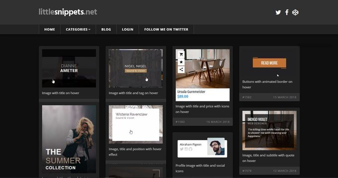
3️⃣ Little Snippets
- A free collection of HTML and CSS code snippets
🔗 https://t.co/qxAyA2wA6U
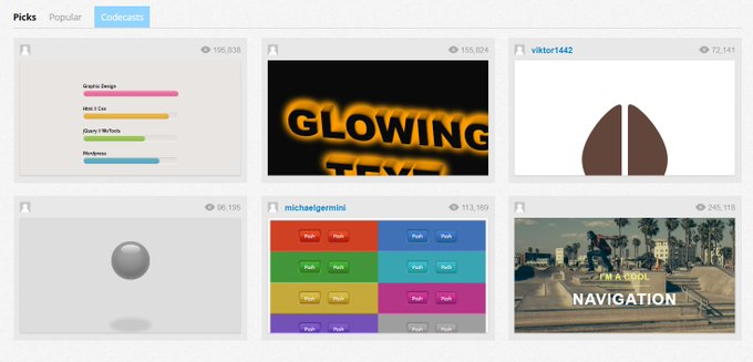
4️⃣ CSS Deck
- Collection of Awesome CSS and JS Creations to help out frontend developers and designers.
🔗 https://t.co/LcZYnipvCy
🧵👇🏻
1️⃣ 30 Seconds of Code
- Short code snippets for all your development needs
🔗 https://t.co/91L4bAxkgF
2️⃣ Free Frontend
- Free hand-picked HTML, CSS and JavaScript (jQuery, React, Vue) code examples, tutorials and articles
🔗 https://t.co/2sIAm73EdZ
3️⃣ Little Snippets
- A free collection of HTML and CSS code snippets
🔗 https://t.co/qxAyA2wA6U
4️⃣ CSS Deck
- Collection of Awesome CSS and JS Creations to help out frontend developers and designers.
🔗 https://t.co/LcZYnipvCy
If you start with the right course then the process becomes a little easier
I found some amazing YouTube videos and courses that will help you start your Web Development journey
🧵👇🏻
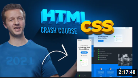
HTML and CSS
- A great way to arouse your web dev journey with Gary's (@designcoursecom) course on YouTube
🔗 https://t.co/xjm7nfV2L2
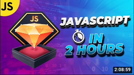
JavaScript
- Although it's impossible to learn JavaScript in 2 hours but JavaScript mastery is one the best YouTube chanel for JavaScript. This 2 hours long crash course will help you start your journey and gives you quick overview.
🔗 https://t.co/1zcSeu4zKE
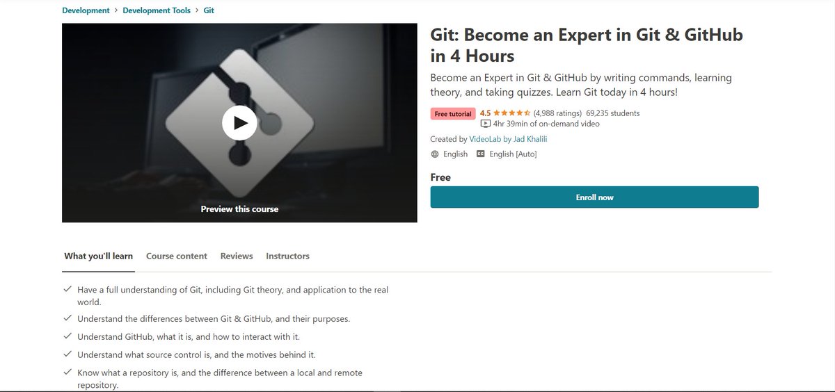
Git and GitHub
Git is an essential tool. And after learning JavaScript, I think one should go for Git and GitHub. Check out this free great course on Udemy
🔗 https://t.co/E14cibOLXb
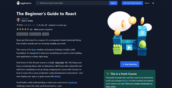
React
What you'll learn
- what problems React can solve
- how React solves those problems under the hood
- what JSX is and how it translates to regular JavaScript function calls and objects
- manage state with hooks
- build forms
🔗 https://t.co/3z22aeVQFc
I found some amazing YouTube videos and courses that will help you start your Web Development journey
🧵👇🏻
HTML and CSS
- A great way to arouse your web dev journey with Gary's (@designcoursecom) course on YouTube
🔗 https://t.co/xjm7nfV2L2
JavaScript
- Although it's impossible to learn JavaScript in 2 hours but JavaScript mastery is one the best YouTube chanel for JavaScript. This 2 hours long crash course will help you start your journey and gives you quick overview.
🔗 https://t.co/1zcSeu4zKE
Git and GitHub
Git is an essential tool. And after learning JavaScript, I think one should go for Git and GitHub. Check out this free great course on Udemy
🔗 https://t.co/E14cibOLXb
React
What you'll learn
- what problems React can solve
- how React solves those problems under the hood
- what JSX is and how it translates to regular JavaScript function calls and objects
- manage state with hooks
- build forms
🔗 https://t.co/3z22aeVQFc
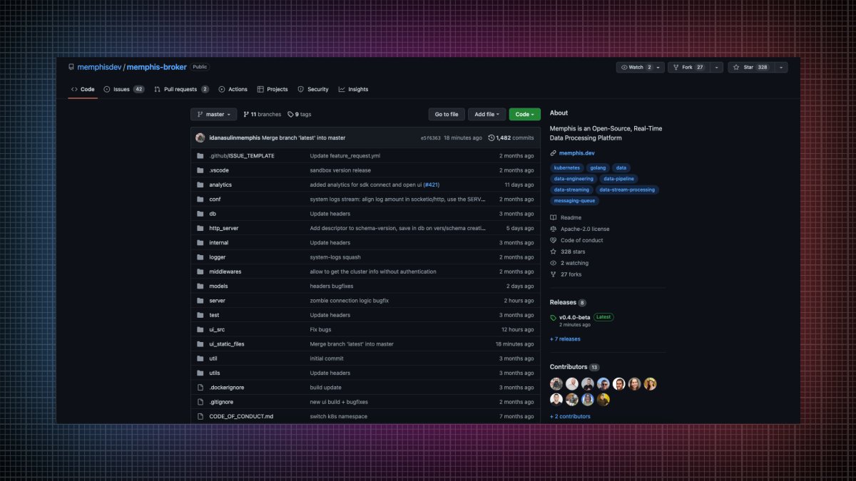
7 GitHub repositories will make you a standout developer from 99% of people:
1. Memphis
An open-source real-time data processing platform.
• Message broker
• Schema Management
• Zero ops
• Cloud-native
• Rapid development
• Significantly lower development time
🔗 https://t.co/w5L2aCM3do
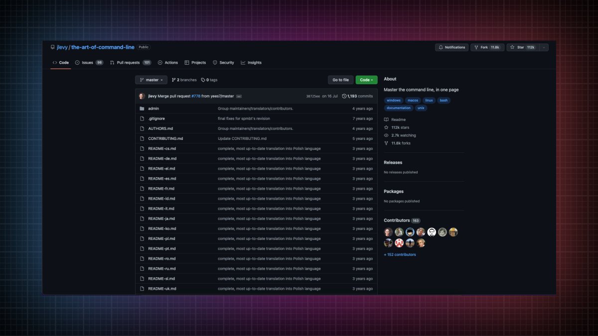
2. The art of command line
Master the command line, in one page.
🔗 https://t.co/uF2RlcUIxb
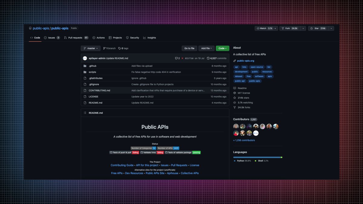
3. Public APIs
A collective list of free APIs for use in software and web development
🔗 https://t.co/vDRQKBf15V
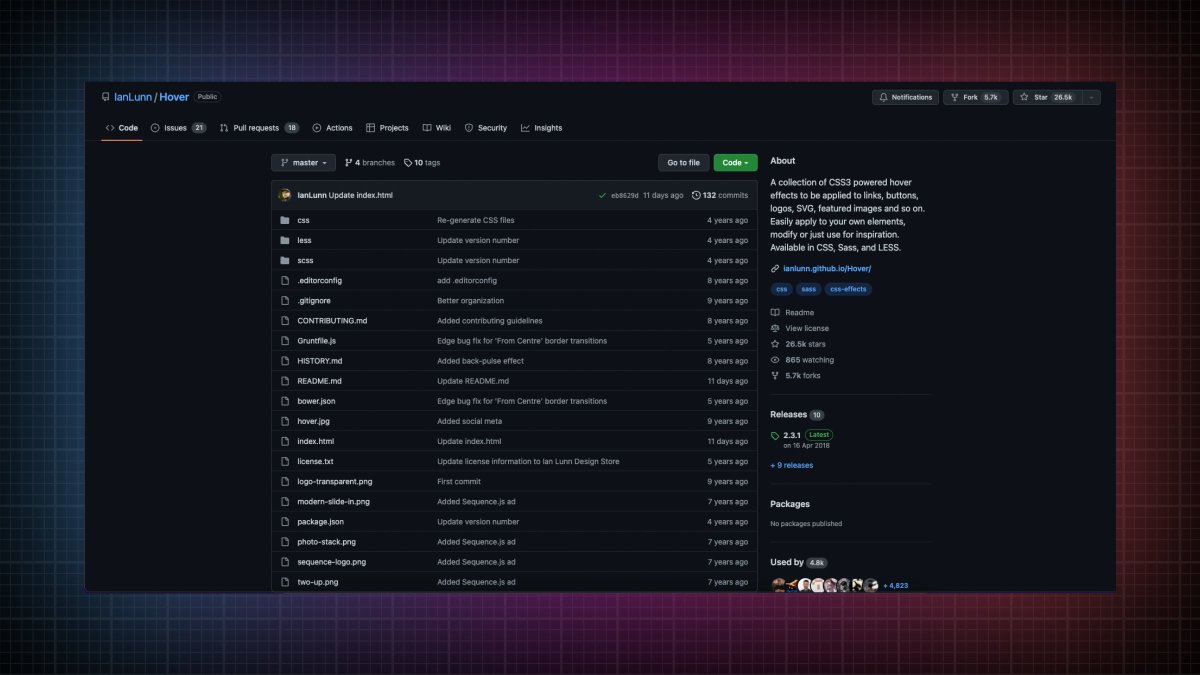
4. Hover
A collection of CSS3 powered hover effects to be applied to links, buttons, logos, SVG, featured images and so on.
🔗 https://t.co/bIGEEPcMkJ
1. Memphis
An open-source real-time data processing platform.
• Message broker
• Schema Management
• Zero ops
• Cloud-native
• Rapid development
• Significantly lower development time
🔗 https://t.co/w5L2aCM3do
2. The art of command line
Master the command line, in one page.
🔗 https://t.co/uF2RlcUIxb
3. Public APIs
A collective list of free APIs for use in software and web development
🔗 https://t.co/vDRQKBf15V
4. Hover
A collection of CSS3 powered hover effects to be applied to links, buttons, logos, SVG, featured images and so on.
🔗 https://t.co/bIGEEPcMkJ