We aren't doing this near enough.
Some of the things I've learned in more than 20 years in the tech industry.
You need to hear these.
🧵👇
We aren't doing this near enough.
No small improvement is too small.
Just aim for something new every day, and you'll be surprised at the end.
Be the person that pulls everyone out of the rabbit holes.
Great results will get you farther than processes, but good processes can help you achieve good results.
It's funny how everything you share finds a way to reward you back.
We all make mistakes. Move on from them and focus on what's coming.
Ask away!
(There are, however, stupid people with fragile egos that get bothered when others ask. Ignore them.)
Embrace change.
People fantasize about perfection, but perfectionism rarely wins.
Shipping more often will give you better odds than gilding the lily.
What you know today will be outdated tomorrow.
Make a plan to keep up and follow it... or you'll get behind.
(And it looks horrible in your resume.)
More from Santiago
Free machine learning education.
Many top universities are making their Machine Learning and Deep Learning programs publicly available. All of this information is now online and free for everyone!
Here are 6 of these programs. Pick one and get started!
↓
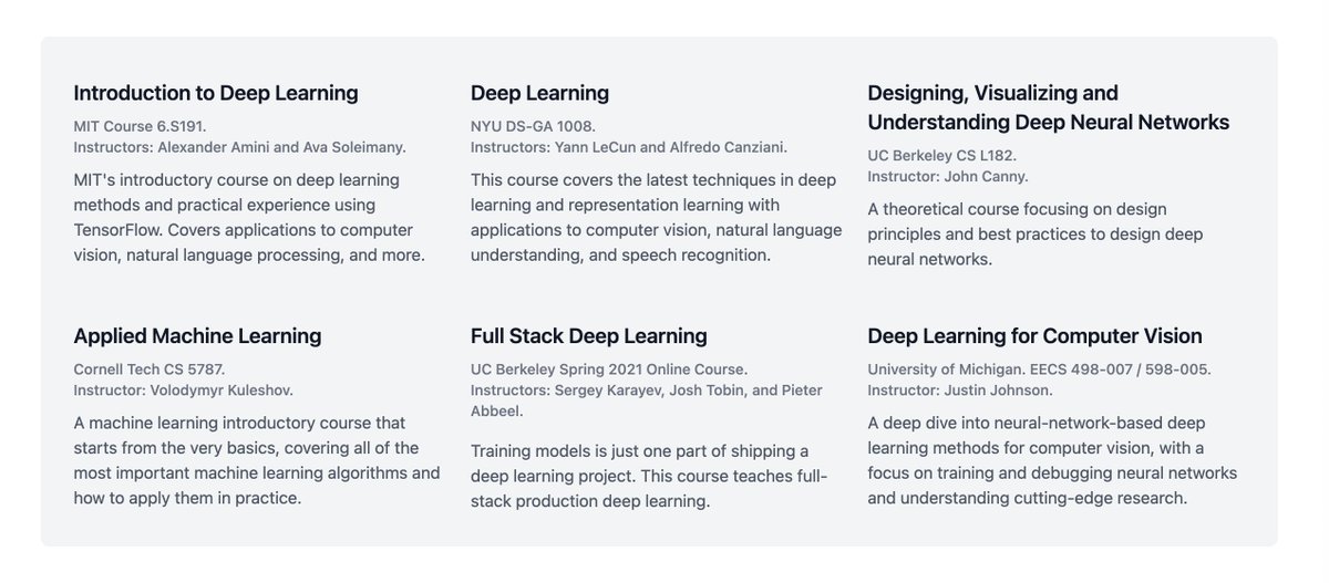
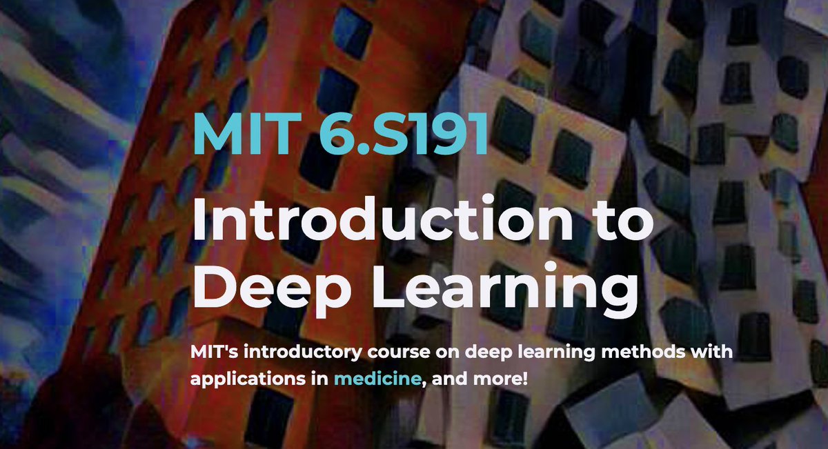
Introduction to Deep Learning
MIT Course 6.S191
Alexander Amini and Ava Soleimany
Introductory course on deep learning methods and practical experience using TensorFlow. Covers applications to computer vision, natural language processing, and more.
https://t.co/Uxx97WPCfR
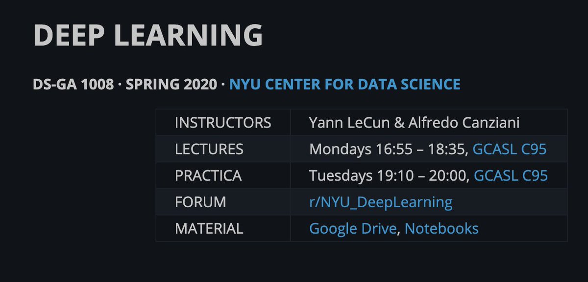
Deep Learning
NYU DS-GA 1008
Yann LeCun and Alfredo Canziani
This course covers the latest techniques in deep learning and representation learning with applications to computer vision, natural language understanding, and speech recognition.
https://t.co/cKzpDOBVl1
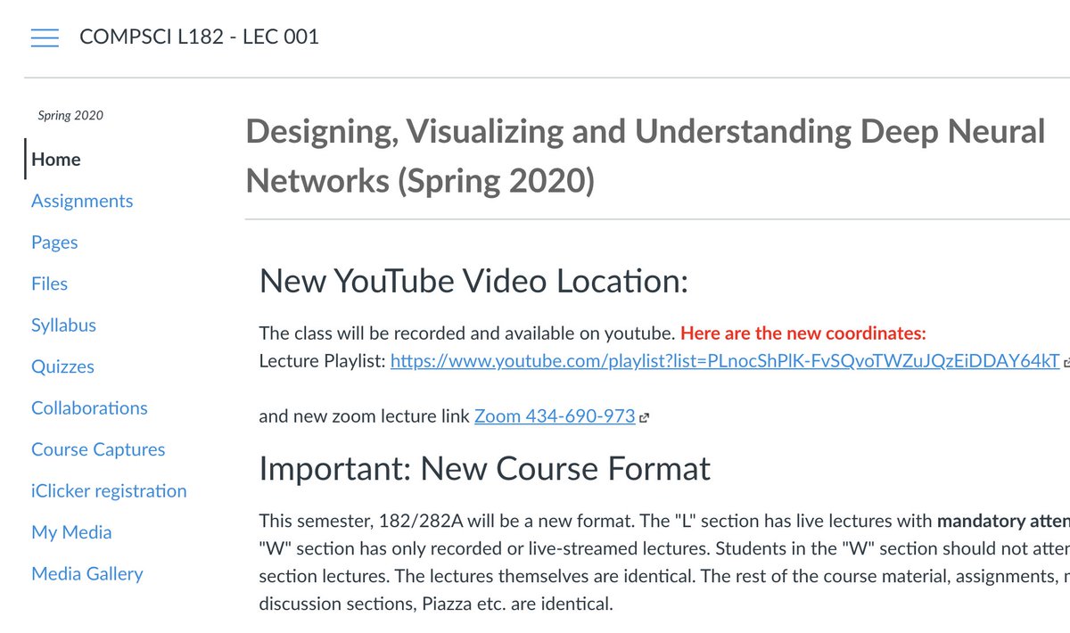
Designing, Visualizing, and Understanding Deep Neural Networks
UC Berkeley CS L182
John Canny
A theoretical course focusing on design principles and best practices to design deep neural networks.
https://t.co/1TFUAIrAKb
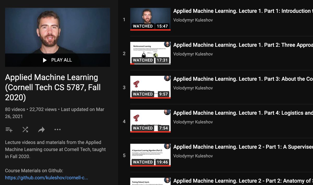
Applied Machine Learning
Cornell Tech CS 5787
Volodymyr Kuleshov
A machine learning introductory course that starts from the very basics, covering all of the most important machine learning algorithms and how to apply them in practice.
https://t.co/hD5no8Pdfa
Many top universities are making their Machine Learning and Deep Learning programs publicly available. All of this information is now online and free for everyone!
Here are 6 of these programs. Pick one and get started!
↓
Introduction to Deep Learning
MIT Course 6.S191
Alexander Amini and Ava Soleimany
Introductory course on deep learning methods and practical experience using TensorFlow. Covers applications to computer vision, natural language processing, and more.
https://t.co/Uxx97WPCfR
Deep Learning
NYU DS-GA 1008
Yann LeCun and Alfredo Canziani
This course covers the latest techniques in deep learning and representation learning with applications to computer vision, natural language understanding, and speech recognition.
https://t.co/cKzpDOBVl1
Designing, Visualizing, and Understanding Deep Neural Networks
UC Berkeley CS L182
John Canny
A theoretical course focusing on design principles and best practices to design deep neural networks.
https://t.co/1TFUAIrAKb
Applied Machine Learning
Cornell Tech CS 5787
Volodymyr Kuleshov
A machine learning introductory course that starts from the very basics, covering all of the most important machine learning algorithms and how to apply them in practice.
https://t.co/hD5no8Pdfa
More from Tech


Recently, the @CNIL issued a decision regarding the GDPR compliance of an unknown French adtech company named "Vectaury". It may seem like small fry, but the decision has potential wide-ranging impacts for Google, the IAB framework, and today's adtech. It's thread time! 👇
It's all in French, but if you're up for it you can read:
• Their blog post (lacks the most interesting details): https://t.co/PHkDcOT1hy
• Their high-level legal decision: https://t.co/hwpiEvjodt
• The full notification: https://t.co/QQB7rfynha
I've read it so you needn't!
Vectaury was collecting geolocation data in order to create profiles (eg. people who often go to this or that type of shop) so as to power ad targeting. They operate through embedded SDKs and ad bidding, making them invisible to users.
The @CNIL notes that profiling based off of geolocation presents particular risks since it reveals people's movements and habits. As risky, the processing requires consent — this will be the heart of their assessment.
Interesting point: they justify the decision in part because of how many people COULD be targeted in this way (rather than how many have — though they note that too). Because it's on a phone, and many have phones, it is considered large-scale processing no matter what.


You May Also Like

Krugman is, of course, right about this. BUT, note that universities can do a lot to revitalize declining and rural regions.
See this thing that @lymanstoneky wrote:
And see this thing that I wrote:
And see this book that @JamesFallows wrote:
And see this other thing that I wrote:
One thing I've been noticing about responses to today's column is that many people still don't get how strong the forces behind regional divergence are, and how hard to reverse 1/ https://t.co/Ft2aH1NcQt
— Paul Krugman (@paulkrugman) November 20, 2018
See this thing that @lymanstoneky wrote:
And see this thing that I wrote:
And see this book that @JamesFallows wrote:
And see this other thing that I wrote:


👨💻 Last resume I sent to a startup one year ago, sharing with you to get ideas:
- Forget what you don't have, make your strength bold
- Pick one work experience and explain what you did in detail w/ bullet points
- Write it towards the role you apply
- Give social proof
/thread
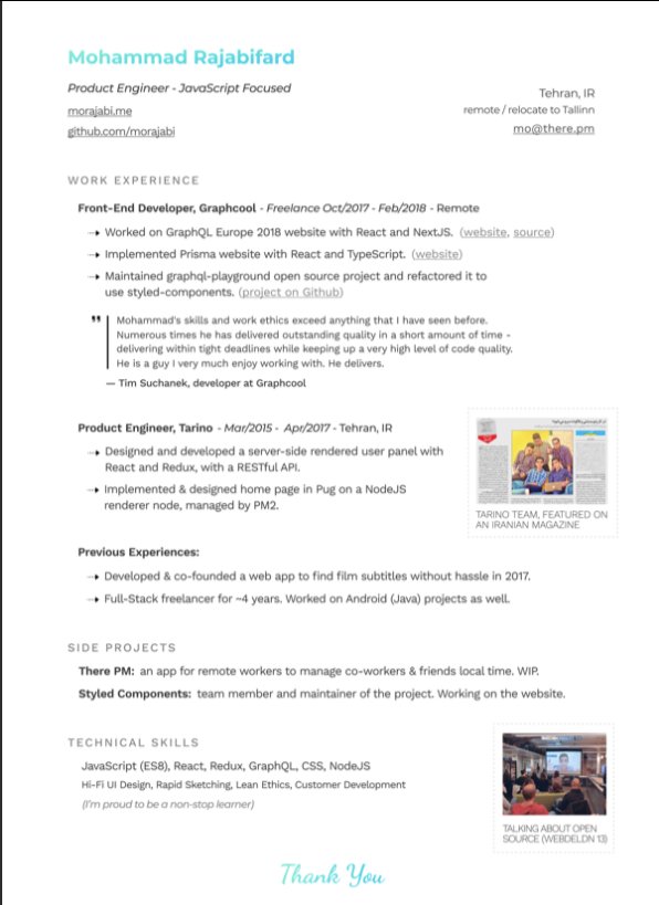
"But I got no work experience..."
Make a open source lib, make a small side project for yourself, do freelance work, ask friends to work with them, no friends? Find friends on Github, and Twitter.
Bonus points:
- Show you care about the company: I used the company's brand font and gradient for in the resume for my name and "Thank You" note.
- Don't list 15 things and libraries you worked with, pick the most related ones to the role you're applying.
-🙅♂️"copy cover letter"
"I got no firends, no work"
One practical way is to reach out to conferences and offer to make their website for free. But make sure to do it good. You'll get:
- a project for portfolio
- new friends
- work experience
- learnt new stuff
- new thing for Twitter bio
If you don't even have the skills yet, why not try your chance for @LambdaSchool? No? @freeCodeCamp. Still not? Pick something from here and learn https://t.co/7NPS1zbLTi
You'll feel very overwhelmed, no escape, just acknowledge it and keep pushing.
- Forget what you don't have, make your strength bold
- Pick one work experience and explain what you did in detail w/ bullet points
- Write it towards the role you apply
- Give social proof
/thread
"But I got no work experience..."
Make a open source lib, make a small side project for yourself, do freelance work, ask friends to work with them, no friends? Find friends on Github, and Twitter.
Bonus points:
- Show you care about the company: I used the company's brand font and gradient for in the resume for my name and "Thank You" note.
- Don't list 15 things and libraries you worked with, pick the most related ones to the role you're applying.
-🙅♂️"copy cover letter"
"I got no firends, no work"
One practical way is to reach out to conferences and offer to make their website for free. But make sure to do it good. You'll get:
- a project for portfolio
- new friends
- work experience
- learnt new stuff
- new thing for Twitter bio
If you don't even have the skills yet, why not try your chance for @LambdaSchool? No? @freeCodeCamp. Still not? Pick something from here and learn https://t.co/7NPS1zbLTi
You'll feel very overwhelmed, no escape, just acknowledge it and keep pushing.