The fact that these things are being expressed on social media is way more important than the undertone to me. Ofcourse I agree, the tone of the tweet I have quoted can be modified and be made less hard. But I don't agree with the part of not teaching sons about our experiences.
Which if taught to sons - gives them the right to be vile to women, invalidate their importance in man's life (which I'm not suggesting should be the *only* thing) but it is a little too, foolish. Not something I'd want "sons" to know.
— Saneeka Paradkar (@saneetarypad) October 17, 2020

Almost all men, that I know, including myself have learnt this through experience. Not all men become cold because of "emotional social barriers" created by patriarchy.
I only knew of what good is beyond these chains and one doesn't need to be tough when dealing with the good.
When humans possess knowledge only then they can use their reason to differentiate and make distinctions.
"It says what should be taught" & what should be taught can always be used in+
The point I'm willing to accept is that generalisations are a bad thing. And tone must be improved.
If we're taking it to that level, are we willing to voluntarily give in to regulations?
But what is seriously up with the outrage? It's alright some people are hardcore patriarchs, I agree.
But everytime someone bashes anyone who posts such things on social media+


More from Society





global health policy in 2020 has centered around NPI's (non-pharmaceutical interventions) like distancing, masks, school closures
these have been sold as a way to stop infection as though this were science.
this was never true and that fact was known and knowable.
let's look.
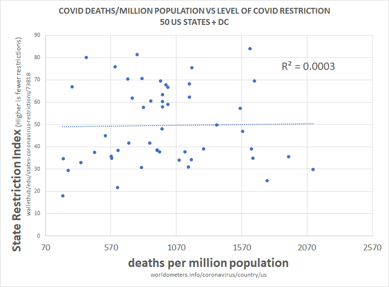
above is the plot of social restriction and NPI vs total death per million. there is 0 R2. this means that the variables play no role in explaining one another.
we can see this same relationship between NPI and all cause deaths.
this is devastating to the case for NPI.
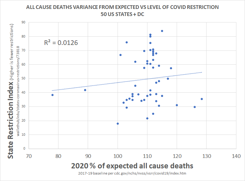
clearly, correlation is not proof of causality, but a total lack of correlation IS proof that there was no material causality.
barring massive and implausible coincidence, it's essentially impossible to cause something and not correlate to it, especially 51 times.
this would seem to pose some very serious questions for those claiming that lockdowns work, those basing policy upon them, and those claiming this is the side of science.
there is no science here nor any data. this is the febrile imaginings of discredited modelers.
this has been clear and obvious from all over the world since the beginning and had been proven so clearly by may that it's hard to imagine anyone who is actually conversant with the data still believing in these responses.
everyone got the same R
these have been sold as a way to stop infection as though this were science.
this was never true and that fact was known and knowable.
let's look.
above is the plot of social restriction and NPI vs total death per million. there is 0 R2. this means that the variables play no role in explaining one another.
we can see this same relationship between NPI and all cause deaths.
this is devastating to the case for NPI.
clearly, correlation is not proof of causality, but a total lack of correlation IS proof that there was no material causality.
barring massive and implausible coincidence, it's essentially impossible to cause something and not correlate to it, especially 51 times.
this would seem to pose some very serious questions for those claiming that lockdowns work, those basing policy upon them, and those claiming this is the side of science.
there is no science here nor any data. this is the febrile imaginings of discredited modelers.
this has been clear and obvious from all over the world since the beginning and had been proven so clearly by may that it's hard to imagine anyone who is actually conversant with the data still believing in these responses.
everyone got the same R
this methodology is a little complex, so let me explain what i did.
— el gato malo (@boriquagato) May 30, 2020
a few EU countries provide real day of death data. this lets us plot meaningful curves to show rate of disease change.
what struck me is how similar all the curves were.
everyone got the same shape. pic.twitter.com/bN0hILzoSl