We aren’t being shut out from sports but from unfairly competing with women. We should push for men’s sport to be inclusive & open with facilities/dignity for all. Yrs ago I played in women’s soccer. Thanks to the women’s movement I see today that it was wrong to have done so.
We\u2019re deeply disappointed in World Rugby\u2019s decision to move ahead with proposals to stop most trans women playing in competitions they govern.
— stonewalluk (@stonewalluk) October 9, 2020
We stand in solidarity with those who will feel shut out from the sport they love.https://t.co/Mm2hT5UCxO
Only by mutual respect for each groups’ right to sporting opportunity, safety, fairness & dignity can we replace rancour with empathy & division with understanding.
More from Society



global health policy in 2020 has centered around NPI's (non-pharmaceutical interventions) like distancing, masks, school closures
these have been sold as a way to stop infection as though this were science.
this was never true and that fact was known and knowable.
let's look.
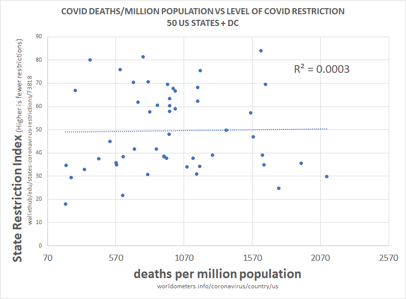
above is the plot of social restriction and NPI vs total death per million. there is 0 R2. this means that the variables play no role in explaining one another.
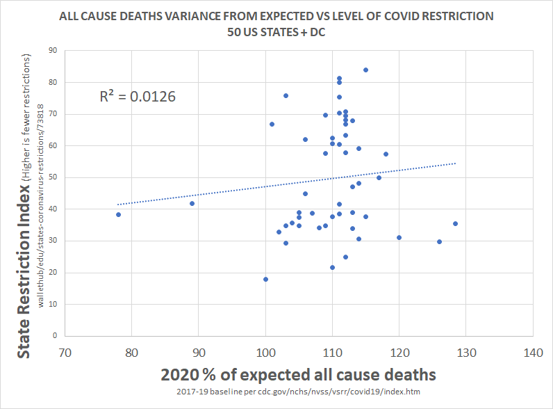
we can see this same relationship between NPI and all cause deaths.
this is devastating to the case for NPI.
clearly, correlation is not proof of causality, but a total lack of correlation IS proof that there was no material causality.
barring massive and implausible coincidence, it's essentially impossible to cause something and not correlate to it, especially 51 times.
this would seem to pose some very serious questions for those claiming that lockdowns work, those basing policy upon them, and those claiming this is the side of science.
there is no science here nor any data. this is the febrile imaginings of discredited modelers.
this has been clear and obvious from all over the world since the beginning and had been proven so clearly by may that it's hard to imagine anyone who is actually conversant with the data still believing in these responses.
everyone got the same R
these have been sold as a way to stop infection as though this were science.
this was never true and that fact was known and knowable.
let's look.
above is the plot of social restriction and NPI vs total death per million. there is 0 R2. this means that the variables play no role in explaining one another.
we can see this same relationship between NPI and all cause deaths.
this is devastating to the case for NPI.
clearly, correlation is not proof of causality, but a total lack of correlation IS proof that there was no material causality.
barring massive and implausible coincidence, it's essentially impossible to cause something and not correlate to it, especially 51 times.
this would seem to pose some very serious questions for those claiming that lockdowns work, those basing policy upon them, and those claiming this is the side of science.
there is no science here nor any data. this is the febrile imaginings of discredited modelers.
this has been clear and obvious from all over the world since the beginning and had been proven so clearly by may that it's hard to imagine anyone who is actually conversant with the data still believing in these responses.
everyone got the same R
this methodology is a little complex, so let me explain what i did.
— el gato malo (@boriquagato) May 30, 2020
a few EU countries provide real day of death data. this lets us plot meaningful curves to show rate of disease change.
what struck me is how similar all the curves were.
everyone got the same shape. pic.twitter.com/bN0hILzoSl


1/ A thread of comments & observations about the death of the cackling vampire Rush Limbaugh.
My first observations in the main thread are here, but this offshoot is needed because there's been so many wise & witty things I've
2/ First, re: those who in their wayward moral obtuseness feel we "can't speak ill of the dead." I've said that this is what abuse enablers say, but I hear that some religious traditions preach this. Oy.
So there's this: https://t.co/7Ky4RA3nkZ &
3/ Drucker is another great wit, and this carries the proper mood
4/ There's definitely a Jewish Tradition angle for how to treat evil people who die: the only respect is to justice, right & wrong, and above all compassion's existence necessitates condemning cruelty
5/ We're coming up on #Purim, and that's all about how to remember evil. There may be a reason, then, that I share the attitude of many other people committed to righting
My first observations in the main thread are here, but this offshoot is needed because there's been so many wise & witty things I've
37.90/ Limbaugh was a cruel hate-machine who made a fortune off hurting people. To say "don't speak ill of the dead" is the attitude of abuse enablers.
— Joshua Cypess (@JoshuaCypess) February 18, 2021
If you can't condemn a ghoul who dedicated his life to destroying society, you're part of the problem! https://t.co/ijvG2zDACH
2/ First, re: those who in their wayward moral obtuseness feel we "can't speak ill of the dead." I've said that this is what abuse enablers say, but I hear that some religious traditions preach this. Oy.
So there's this: https://t.co/7Ky4RA3nkZ &
This is how Rush's death should be honored. Let's not speak ill of the dead, let's quote Rush speaking ill of the dead.
— Sane English (@SaneEnglish) February 17, 2021
3/ Drucker is another great wit, and this carries the proper mood
It's easy to make fun of Rush Limbaugh right now, but it's important to remember that he also brought a lot of people a lot of joy by dying
— Mike Drucker (@MikeDrucker) February 17, 2021
4/ There's definitely a Jewish Tradition angle for how to treat evil people who die: the only respect is to justice, right & wrong, and above all compassion's existence necessitates condemning cruelty
It\u2019s ok\u2014essential, even\u2014to speak the truth about people who caused great harm.
— Rabbi Danya Ruttenberg (@TheRaDR) February 17, 2021
Even after their death.
5/ We're coming up on #Purim, and that's all about how to remember evil. There may be a reason, then, that I share the attitude of many other people committed to righting
today i said Jewish culture requires dancing on the graves of those who have wronged us and i picked up like 300 followers LMAO
— Erin Biba (@erinbiba) February 18, 2021
people love Jewish vengeance \U0001f923\U0001f923
wait till they hear about Purim

You May Also Like






Krugman is, of course, right about this. BUT, note that universities can do a lot to revitalize declining and rural regions.
See this thing that @lymanstoneky wrote:
And see this thing that I wrote:
And see this book that @JamesFallows wrote:
And see this other thing that I wrote:
One thing I've been noticing about responses to today's column is that many people still don't get how strong the forces behind regional divergence are, and how hard to reverse 1/ https://t.co/Ft2aH1NcQt
— Paul Krugman (@paulkrugman) November 20, 2018
See this thing that @lymanstoneky wrote:
And see this thing that I wrote:
And see this book that @JamesFallows wrote:
And see this other thing that I wrote: