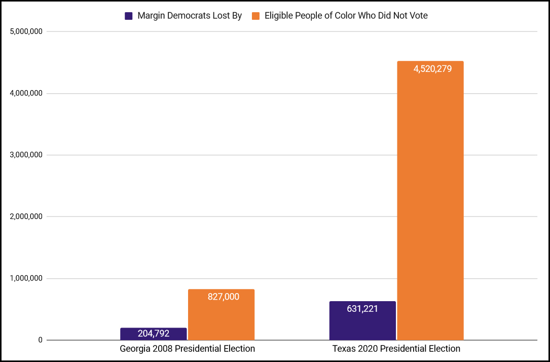
Texas has the second-largest pool of nonvoting people of color (after already blue CA), and the numbers of potential voters of color far exceeds the margin of difference in statewide elections. https://t.co/ynM1NNQZ8t
While @staceyabrams credits me & my wife w/ investing in GA "before it was logical," the signs were there if you knew what to look for. The question now is who's next?
In my latest for @thenation, I point to 4 factors for turning a red state blue. THREAD
Texas has the second-largest pool of nonvoting people of color (after already blue CA), and the numbers of potential voters of color far exceeds the margin of difference in statewide elections. https://t.co/ynM1NNQZ8t
Leaders who combine personal humility with indomitable will and are "infected with an incurable need to produce results" for the cause. https://t.co/8RPWCdy4VU
@OrganizeTexas has done comparable work to @NewGAProject for some time, w/ a membership of over 250K people.
In 2020, they turned out over 300K infrequent voters of color who didn't vote in 2016. https://t.co/ynM1NNQZ8t
As GA runoffs showed, w/o Trump & his cult-like following, R turnout is less visceral, making a TX gubernatorial win in 2022 a possibility.
In 2012, @staceyabrams's PAC GeorgiaNext raised $54K. In 2020, her org @fairfightaction raised $90 MILLION.
There are talented & effective POC orgs across country and with proper funding, they can change the world as we just saw in Georgia. https://t.co/ynM1NNQZ8t
But w/ a budget of $5 million, orgs like @OrganizeTexas are woefully underfunded.
Donors should see to it that they add a "0" to that number. https://t.co/ynM1NNQZ8t
At least $200 million of that should be flowing into Texas. https://t.co/ynM1NNQZ8t
Texas is poised to build on that model and continue the revolutionary work of transforming America into the multiracial democracy that it aspires to be." https://t.co/ynM1NNQZ8t
More from Society


global health policy in 2020 has centered around NPI's (non-pharmaceutical interventions) like distancing, masks, school closures
these have been sold as a way to stop infection as though this were science.
this was never true and that fact was known and knowable.
let's look.
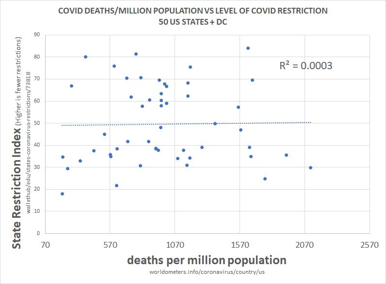
above is the plot of social restriction and NPI vs total death per million. there is 0 R2. this means that the variables play no role in explaining one another.
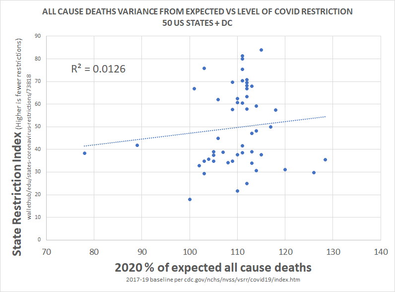
we can see this same relationship between NPI and all cause deaths.
this is devastating to the case for NPI.
clearly, correlation is not proof of causality, but a total lack of correlation IS proof that there was no material causality.
barring massive and implausible coincidence, it's essentially impossible to cause something and not correlate to it, especially 51 times.
this would seem to pose some very serious questions for those claiming that lockdowns work, those basing policy upon them, and those claiming this is the side of science.
there is no science here nor any data. this is the febrile imaginings of discredited modelers.
this has been clear and obvious from all over the world since the beginning and had been proven so clearly by may that it's hard to imagine anyone who is actually conversant with the data still believing in these responses.
everyone got the same R
these have been sold as a way to stop infection as though this were science.
this was never true and that fact was known and knowable.
let's look.
above is the plot of social restriction and NPI vs total death per million. there is 0 R2. this means that the variables play no role in explaining one another.
we can see this same relationship between NPI and all cause deaths.
this is devastating to the case for NPI.
clearly, correlation is not proof of causality, but a total lack of correlation IS proof that there was no material causality.
barring massive and implausible coincidence, it's essentially impossible to cause something and not correlate to it, especially 51 times.
this would seem to pose some very serious questions for those claiming that lockdowns work, those basing policy upon them, and those claiming this is the side of science.
there is no science here nor any data. this is the febrile imaginings of discredited modelers.
this has been clear and obvious from all over the world since the beginning and had been proven so clearly by may that it's hard to imagine anyone who is actually conversant with the data still believing in these responses.
everyone got the same R
this methodology is a little complex, so let me explain what i did.
— el gato malo (@boriquagato) May 30, 2020
a few EU countries provide real day of death data. this lets us plot meaningful curves to show rate of disease change.
what struck me is how similar all the curves were.
everyone got the same shape. pic.twitter.com/bN0hILzoSl