Open letter to journal editors: dynamite plots must die. Dynamite plots, also known as bar and line graphs, hide important information. Editors should require authors to show readers the data and avoid these plots. https://t.co/0GNKEIUCJL pic.twitter.com/OS9ytEFRZN
— Rafael Irizarry (@rafalab) February 22, 2019
"The new answer to a 77-year-old problem"
😭
The new answer to a 77-year-old problem in data analysis, published today in @naturemethods. Instead of significance tests, use estimation graphics. Our software suite DABEST makes it easy for everyone to visualize effect sizes.https://t.co/UzwXJ7EUC5 pic.twitter.com/VtxyY0xaRM
— Adam Claridge-Chang (@adamcchang) June 19, 2019
Couldn't find D3 code for grouped horisontal box plots that show data points so I made this @mbostock @thisisalfie https://t.co/cQjDPhyZdw pic.twitter.com/y6RNmDB2p3
— Ulrik Lyngs (@ulyngs) June 28, 2017
made a pkg for pirate plots in ggplot: add any of points/means/bars/CIs/violins \u2013 better than ye olde bar/box plotshttps://t.co/Z2m2kW3hsl pic.twitter.com/npAirPQexM
— Mika Braginsky (@mbraginsky) September 28, 2017
See the new #PowerBI visual awesomeness for data points & sources, box-&-whisker plots! https://t.co/dOmgoxWfDE pic.twitter.com/HAUOAMJEJW
— Microsoft Power BI (@MSPowerBI) February 1, 2016
On bar/line graphs, & data presentation. Need for strict data treatment https://t.co/8aqICdCX9K @PLOSBiology pic.twitter.com/KQkYKdmWq7
— Crisanto Gutierrez (@CG_ath) November 30, 2015
\U0001f62e pretty stoked on this PR in the pipeline\u2026
— Mara Averick (@dataandme) May 10, 2018
"Nonstandard aesthetics" by @ClausWilke {ggplot2} https://t.co/X9hkxX44jo #rstats #dataviz pic.twitter.com/gKlEU8Gxa3
Perceptions of probability https://t.co/9xsr6FUR2e shown by @amandacox #openvisconf pic.twitter.com/hJsYY7ggB3
— Rob Simmon (@rsimmon) April 25, 2017
Ok. https://t.co/ifP2RNpLIn
More from Science


JUST ONE PERSON—UK 🇬🇧 scientists think one immunocompromised person who cleared virus slowly & only partially wiped out an infection, leaving behind genetically-hardier viruses that rebound & learn how to survive better. That’s likely how #B117 started. 🧵 https://t.co/bMMjM8Hiuz
2) The leading hypothesis is that the new variant evolved within just one person, chronically infected with the virus for so long it was able to evolve into a new, more infectious form.
same thing happened in Boston in another immunocompromised person that was sick for 155 days.
3) What happened in Boston with one 45 year old man who was highly infectious for 155 days straight before he died... is exactly what scientists think happened in Kent, England that gave rise to #B117.
4) Doctors were shocked to find virus has evolved many different forms inside of this one immunocompromised man. 20 new mutations in one virus, akin to the #B117. This is possibly how #B1351 in South Africa 🇿🇦 and #P1 in Brazil 🇧🇷 also evolved.
5) “On its own, the appearance of a new variant in genomic databases doesn’t tell us much. “That’s just one genome amongst thousands every week. It wouldn’t necessarily stick out,” says Oliver Pybus, a professor of evolution and infectious disease at Oxford.
2) The leading hypothesis is that the new variant evolved within just one person, chronically infected with the virus for so long it was able to evolve into a new, more infectious form.
same thing happened in Boston in another immunocompromised person that was sick for 155 days.
3) What happened in Boston with one 45 year old man who was highly infectious for 155 days straight before he died... is exactly what scientists think happened in Kent, England that gave rise to #B117.
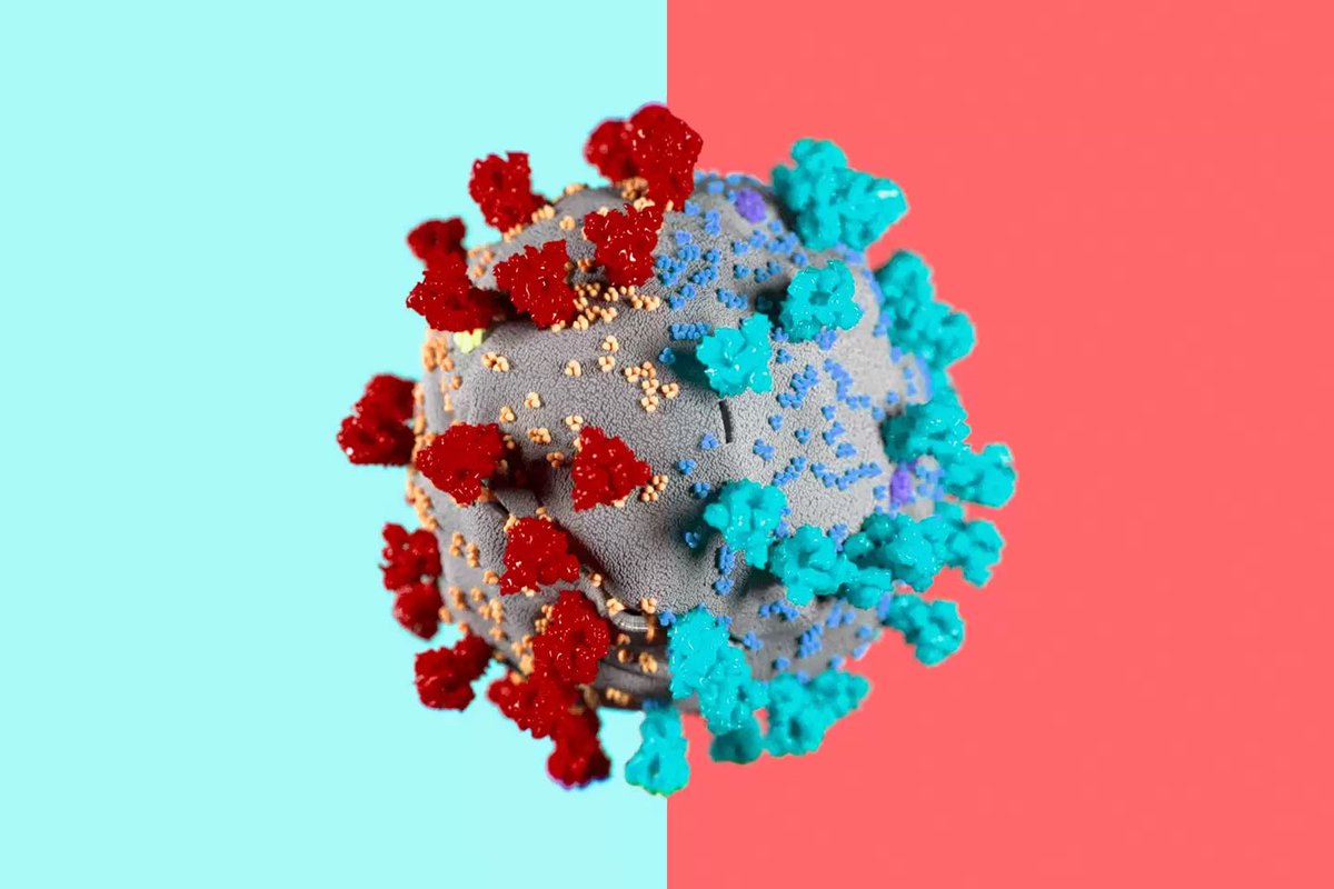
Immunocompromised 45 year old suffered from #COVID19 for 155 days before he died. The virus was changing very quickly inside the man's body\u2014it acquired a big cluster of >20 mutations\u2014resembled the same ones seen in #B117 & #B1351. (NPR audio Part 1 of 2)\U0001f9f5https://t.co/7kWiBZ1xGk pic.twitter.com/ZJ7AExB78Y
— Eric Feigl-Ding (@DrEricDing) February 8, 2021
4) Doctors were shocked to find virus has evolved many different forms inside of this one immunocompromised man. 20 new mutations in one virus, akin to the #B117. This is possibly how #B1351 in South Africa 🇿🇦 and #P1 in Brazil 🇧🇷 also evolved.
2) NPR report audio part 2 of 2:
— Eric Feigl-Ding (@DrEricDing) February 8, 2021
Dr. Li couldn't believe what they found. "I was shocked," he says. "When I saw the virus sequences, I knew that we were dealing with something completely different and potentially very important." pic.twitter.com/HT3Yt6djFd
5) “On its own, the appearance of a new variant in genomic databases doesn’t tell us much. “That’s just one genome amongst thousands every week. It wouldn’t necessarily stick out,” says Oliver Pybus, a professor of evolution and infectious disease at Oxford.