Announcing the 2021 Summer Institutes in Computational Social Science. #SICSS is for grad students, post-docs & beginning faculty. Free for participants. @chris_bail and I are happy to tell you about all 20 locations. https://t.co/wolhtZIMc5 [thread]


More from Science


What is going on at SWANSEA UNIVERSITY in Wales?
1.
https://t.co/d5NKtNlxxa
Sounds as if its connected to Bill Gates "LUCIFERASE" Vaccine?
2.
https://t.co/k0w1mjaPg0
"HILLARY RODHAM CLINTON SCHOOL OF LAW"
- AT SWANSEA UNIVERSITY!!!

3.
https://t.co/jifuWq6cGq
Remember all those FIRES, over the Summer!!!
4.
https://t.co/H3lstFyYx8
WUHAN PARTNERSHIP
"Links between Swansea & Wuhan date back to 1855 when Swansea missionary Griffith John founded the Wuhan Union Hospital.
This relationship was strengthened when representatives of the two cities signed an agreement".

5.
https://t.co/5b1JqiEQzi
Swansea University Strengthens Links with China

1.
https://t.co/d5NKtNlxxa
Sounds as if its connected to Bill Gates "LUCIFERASE" Vaccine?
2.
https://t.co/k0w1mjaPg0
"HILLARY RODHAM CLINTON SCHOOL OF LAW"
- AT SWANSEA UNIVERSITY!!!
3.
https://t.co/jifuWq6cGq
Remember all those FIRES, over the Summer!!!
4.
https://t.co/H3lstFyYx8
WUHAN PARTNERSHIP
"Links between Swansea & Wuhan date back to 1855 when Swansea missionary Griffith John founded the Wuhan Union Hospital.
This relationship was strengthened when representatives of the two cities signed an agreement".
5.
https://t.co/5b1JqiEQzi
Swansea University Strengthens Links with China

JUST ONE PERSON—UK 🇬🇧 scientists think one immunocompromised person who cleared virus slowly & only partially wiped out an infection, leaving behind genetically-hardier viruses that rebound & learn how to survive better. That’s likely how #B117 started. 🧵 https://t.co/bMMjM8Hiuz
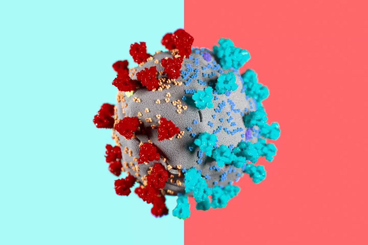
2) The leading hypothesis is that the new variant evolved within just one person, chronically infected with the virus for so long it was able to evolve into a new, more infectious form.
same thing happened in Boston in another immunocompromised person that was sick for 155 days.
3) What happened in Boston with one 45 year old man who was highly infectious for 155 days straight before he died... is exactly what scientists think happened in Kent, England that gave rise to #B117.
4) Doctors were shocked to find virus has evolved many different forms inside of this one immunocompromised man. 20 new mutations in one virus, akin to the #B117. This is possibly how #B1351 in South Africa 🇿🇦 and #P1 in Brazil 🇧🇷 also evolved.
5) “On its own, the appearance of a new variant in genomic databases doesn’t tell us much. “That’s just one genome amongst thousands every week. It wouldn’t necessarily stick out,” says Oliver Pybus, a professor of evolution and infectious disease at Oxford.
2) The leading hypothesis is that the new variant evolved within just one person, chronically infected with the virus for so long it was able to evolve into a new, more infectious form.
same thing happened in Boston in another immunocompromised person that was sick for 155 days.
3) What happened in Boston with one 45 year old man who was highly infectious for 155 days straight before he died... is exactly what scientists think happened in Kent, England that gave rise to #B117.
Immunocompromised 45 year old suffered from #COVID19 for 155 days before he died. The virus was changing very quickly inside the man's body\u2014it acquired a big cluster of >20 mutations\u2014resembled the same ones seen in #B117 & #B1351. (NPR audio Part 1 of 2)\U0001f9f5https://t.co/7kWiBZ1xGk pic.twitter.com/ZJ7AExB78Y
— Eric Feigl-Ding (@DrEricDing) February 8, 2021
4) Doctors were shocked to find virus has evolved many different forms inside of this one immunocompromised man. 20 new mutations in one virus, akin to the #B117. This is possibly how #B1351 in South Africa 🇿🇦 and #P1 in Brazil 🇧🇷 also evolved.
2) NPR report audio part 2 of 2:
— Eric Feigl-Ding (@DrEricDing) February 8, 2021
Dr. Li couldn't believe what they found. "I was shocked," he says. "When I saw the virus sequences, I knew that we were dealing with something completely different and potentially very important." pic.twitter.com/HT3Yt6djFd
5) “On its own, the appearance of a new variant in genomic databases doesn’t tell us much. “That’s just one genome amongst thousands every week. It wouldn’t necessarily stick out,” says Oliver Pybus, a professor of evolution and infectious disease at Oxford.