If we would monetize your manual labor by putting you on a rowing machine you would have produce approximately $0.30 of value per day.
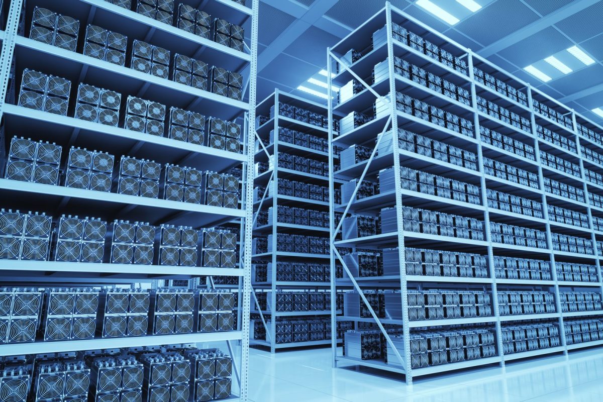
I often hear the argument: Bitcoin mining is wasting enormous amounts of energy.
Bitcoin mining uses about the same amount of energy as a small country and that is fine!
Time for a thread:
If we would monetize your manual labor by putting you on a rowing machine you would have produce approximately $0.30 of value per day.
This brings the need for balancing the network. Without it, the grid will become unstable.
Solar energy only creates energy when the sun shines. Wind energy only creates energy when the wind blows.
Producers have to produce at sub optimal levels which hurts their profitability and stability. Excess energy is dumped or even sold at a negative price!
Another example are hydroelectric dams, where because of their location, sometimes the energy created can simply not be transported far enough to meet demand.
Therefore miners will move to the edge of the grid where energy is cheapest and there simply is no other use case, if there was, they would be outcompeted.
It provides an opportunity to monetize excess capacity in situations with varying load and will even help our transition towards a more sustainable future by making those solutions more profitable.
@saifedean @johnkvallis @stephanlivera @Breedlove22 @wmiddelkoop
More from Crypto


1/ A thread on Nexgen’s Arrow & the #uranium cycle ($NXE)
2/ Given the scale and cost structure of Arrow, it makes sense that investors are intensely focused on its delivery timeline. This thread will discuss possible timelines, current market expectations (i.e., what’s “priced in”) & how different Arrow scenarios will impact the mkt.
3/ As you can see from the litany of responses to Michael’s tweet, there is great skepticism in the market regarding Arrow’s timeline. This is largely due to a bearish narrative conveyed by competing CEO’s whose assets only hold value if Arrow is substantially delayed.
4/ Those who played “King of the Hill” as a child would remember that it is the person at the top who is constantly attacked, not the kid sitting at the bottom of the hill in the mud. No one cares enough about that kid to attack them. This is a good parable for $NXE & Uranium.
5/ First a quick note on “this cycle” – Segra generally defines this cycle as the deficits forecasted from the mid-2020s to late-2030s. When people imply an asset producing in the mid-to-late 2020s will “miss the cycle”, they clearly have not done any real S/D modelling.
Can anyone tell me an estimated time frame that Nexgen could be permitted, start building their mine and be producing #uranium ??? @quakes99 @JekyllCapital @travmcph @NexGenEnergy $nxe
— Michael Pierce (@Big_U_Dawg) January 22, 2021
2/ Given the scale and cost structure of Arrow, it makes sense that investors are intensely focused on its delivery timeline. This thread will discuss possible timelines, current market expectations (i.e., what’s “priced in”) & how different Arrow scenarios will impact the mkt.
3/ As you can see from the litany of responses to Michael’s tweet, there is great skepticism in the market regarding Arrow’s timeline. This is largely due to a bearish narrative conveyed by competing CEO’s whose assets only hold value if Arrow is substantially delayed.
4/ Those who played “King of the Hill” as a child would remember that it is the person at the top who is constantly attacked, not the kid sitting at the bottom of the hill in the mud. No one cares enough about that kid to attack them. This is a good parable for $NXE & Uranium.
5/ First a quick note on “this cycle” – Segra generally defines this cycle as the deficits forecasted from the mid-2020s to late-2030s. When people imply an asset producing in the mid-to-late 2020s will “miss the cycle”, they clearly have not done any real S/D modelling.
You May Also Like

![Peter McCormack [Jan/3\u279e\u20bf \U0001f511\u220e]](https://pbs.twimg.com/profile_images/1524287442307723265/_59ITDbJ_normal.jpg)

Department List of UCAS-China PROFESSORs for ANSO, CSC and UCAS (fully or partial) Scholarship Acceptance
1) UCAS School of physical sciences Professor
https://t.co/9X8OheIvRw
2) UCAS School of mathematical sciences Professor
3) UCAS School of nuclear sciences and technology
https://t.co/nQH8JnewcJ
4) UCAS School of astronomy and space sciences
https://t.co/7Ikc6CuKHZ
5) UCAS School of engineering
6) Geotechnical Engineering Teaching and Research Office
https://t.co/jBCJW7UKlQ
7) Multi-scale Mechanics Teaching and Research Section
https://t.co/eqfQnX1LEQ
😎 Microgravity Science Teaching and Research
9) High temperature gas dynamics teaching and research section
https://t.co/tVIdKgTPl3
10) Department of Biomechanics and Medical Engineering
https://t.co/ubW4xhZY2R
11) Ocean Engineering Teaching and Research
12) Department of Dynamics and Advanced Manufacturing
https://t.co/42BKXEugGv
13) Refrigeration and Cryogenic Engineering Teaching and Research Office
https://t.co/pZdUXFTvw3
14) Power Machinery and Engineering Teaching and Research
1) UCAS School of physical sciences Professor
https://t.co/9X8OheIvRw
2) UCAS School of mathematical sciences Professor
3) UCAS School of nuclear sciences and technology
https://t.co/nQH8JnewcJ
4) UCAS School of astronomy and space sciences
https://t.co/7Ikc6CuKHZ
5) UCAS School of engineering
6) Geotechnical Engineering Teaching and Research Office
https://t.co/jBCJW7UKlQ
7) Multi-scale Mechanics Teaching and Research Section
https://t.co/eqfQnX1LEQ
😎 Microgravity Science Teaching and Research
9) High temperature gas dynamics teaching and research section
https://t.co/tVIdKgTPl3
10) Department of Biomechanics and Medical Engineering
https://t.co/ubW4xhZY2R
11) Ocean Engineering Teaching and Research
12) Department of Dynamics and Advanced Manufacturing
https://t.co/42BKXEugGv
13) Refrigeration and Cryogenic Engineering Teaching and Research Office
https://t.co/pZdUXFTvw3
14) Power Machinery and Engineering Teaching and Research