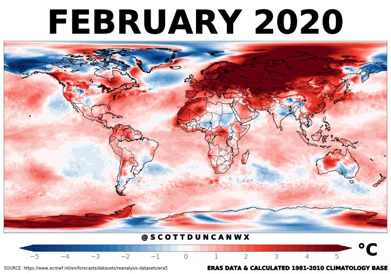
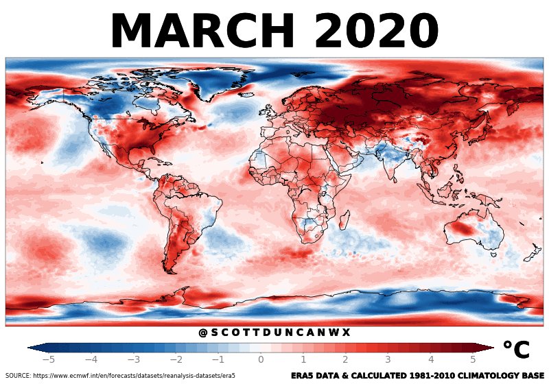
It's #FigureFriday, so let's chat about my favorite subject: color palettes 🎨 for climate science visualization! (1/12)


More from Climate change


1/ In reflecting on my work this year I have just realized that everything I published concerned climate change: here is a roundup of my 2020 writing on #climate #justice, climate #reparations, climate #debt, climate #displacement, climate #mobilities & #disaster #recovery
2/ My most recent online piece is on #Arctic #Mobilities, #climate #displacement and #Indigenous rights, originating from a great workshop @PennLaw_CERL
3/ Last month I also wrote about #climate #displacement and the case for #climate #reparations and #open #borders for those fleeing climate disasters
4/ Which originally appeared here
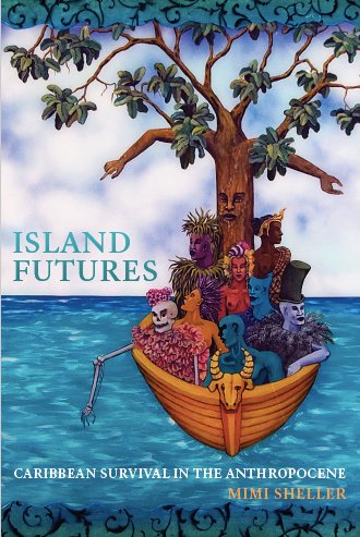
5/ Both of these came out of thinking about Caribbean #climate #colonialism and #climate #debt in my book Island Futures: Caribbean Survival in the Anthropocene @DukePress YOU CAN STILL GET IT for 50% off with the code E20SHELL https://t.co/i5DIaNAgsg
2/ My most recent online piece is on #Arctic #Mobilities, #climate #displacement and #Indigenous rights, originating from a great workshop @PennLaw_CERL
3/ Last month I also wrote about #climate #displacement and the case for #climate #reparations and #open #borders for those fleeing climate disasters
4/ Which originally appeared here
5/ Both of these came out of thinking about Caribbean #climate #colonialism and #climate #debt in my book Island Futures: Caribbean Survival in the Anthropocene @DukePress YOU CAN STILL GET IT for 50% off with the code E20SHELL https://t.co/i5DIaNAgsg