
Users glance around and catch loose cues. Multiple avenues increase the odds of successful conveyance.
✨✨✨
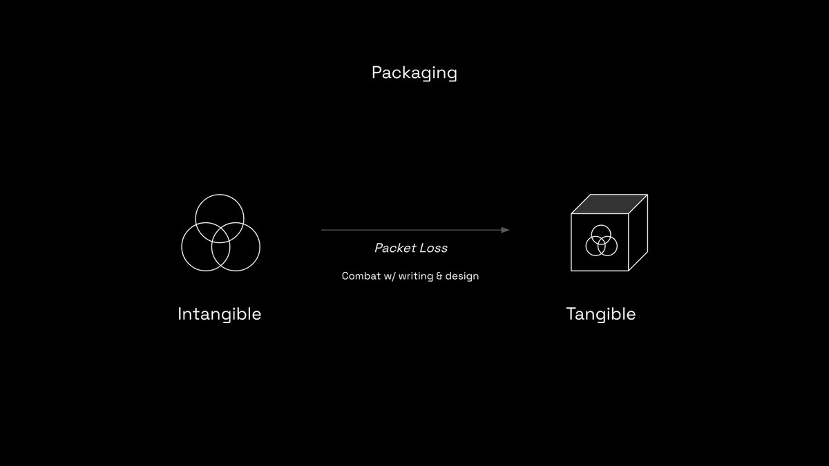
Sharing the learnings I've gathered over the years working in Design, as one-liners.
Starting here ↓
Users glance around and catch loose cues. Multiple avenues increase the odds of successful conveyance.
(break this rule sparingly)
Fresh pages put the burden of reorientation and of relearning a new screen layout on the user. Keep users on the same page as much as possible.
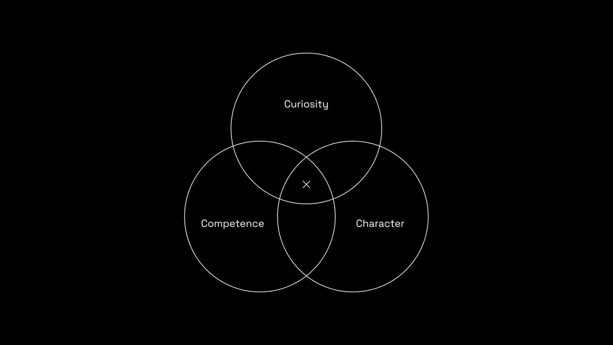
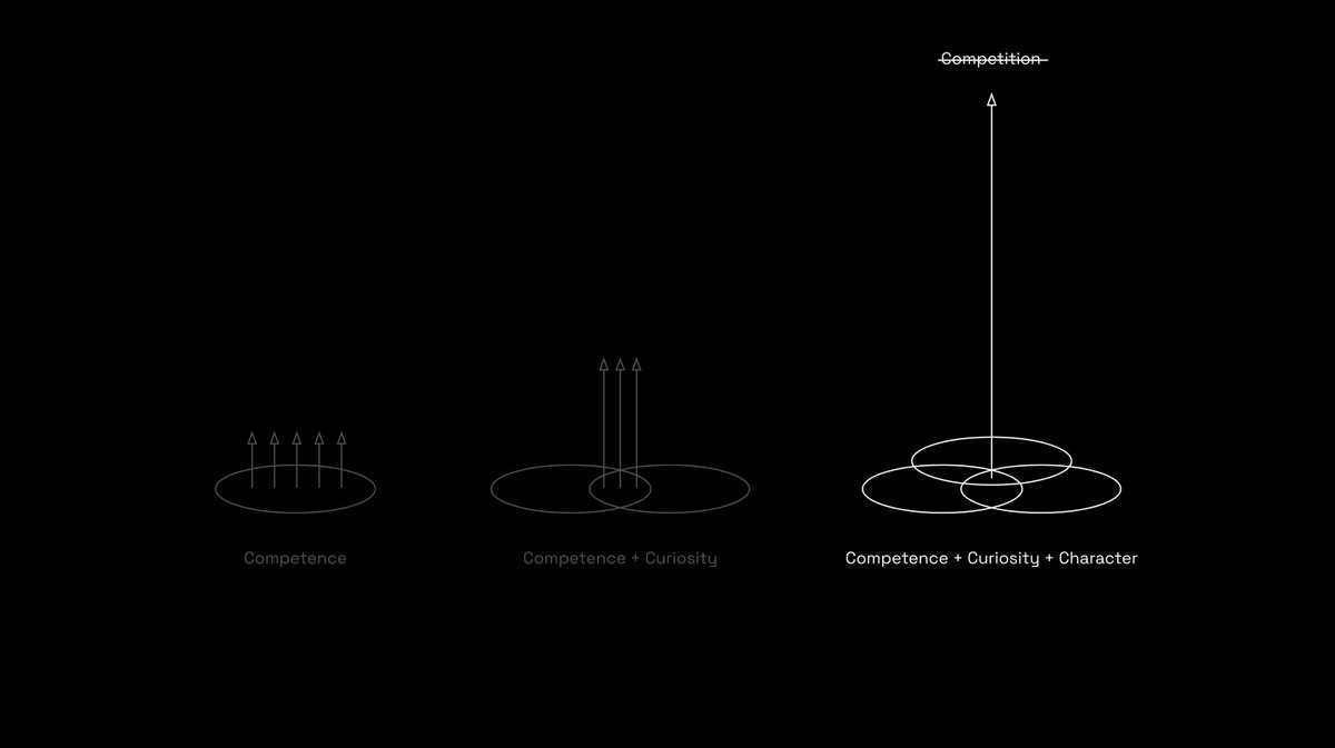
If you find yourself leaning to consistency while solving for a UI, know that there is most likely a better solution possible that you're oblivious to.
Your context is vastly different than the user's.
Do the extra work and simplify things for them.
It confuses the users and is often disrespectful to them.
Also, good copy isn't always the shortest.
Brevity is important but not at the cost of clarity.
If you see more than one 'attention blobs' when you squint, time to improve the UI.
Don't try and force-change it. Harness and use it to your advantage.
For all other colours, train the user gradually.
This is mostly non-negotiable and yet often ignored.
The user only sees 1 at a time with a causal memory of at most 2-3 screens prior.
(I think I said this already but worth repeating...)
Question everything, keep updating.
Design accordingly.
Keep the humility, solve their problem and get out of the way.
Build a great Happy Path experience first and then add edge-case handlers.
More from Art


You May Also Like


Great article from @AsheSchow. I lived thru the 'Satanic Panic' of the 1980's/early 1990's asking myself "Has eveyrbody lost their GODDAMN MINDS?!"
The 3 big things that made the 1980's/early 1990's surreal for me.
1) Satanic Panic - satanism in the day cares ahhhh!
2) "Repressed memory" syndrome
3) Facilitated Communication [FC]
All 3 led to massive abuse.
"Therapists" -and I use the term to describe these quacks loosely - would hypnotize people & convince they they were 'reliving' past memories of Mom & Dad killing babies in Satanic rituals in the basement while they were growing up.
Other 'therapists' would badger kids until they invented stories about watching alligators eat babies dropped into a lake from a hot air balloon. Kids would deny anything happened for hours until the therapist 'broke through' and 'found' the 'truth'.
FC was a movement that started with the claim severely handicapped individuals were able to 'type' legible sentences & communicate if a 'helper' guided their hands over a keyboard.
For three years I have wanted to write an article on moral panics. I have collected anecdotes and similarities between today\u2019s moral panic and those of the past - particularly the Satanic Panic of the 80s.
— Ashe Schow (@AsheSchow) September 29, 2018
This is my finished product: https://t.co/otcM1uuUDk
The 3 big things that made the 1980's/early 1990's surreal for me.
1) Satanic Panic - satanism in the day cares ahhhh!
2) "Repressed memory" syndrome
3) Facilitated Communication [FC]
All 3 led to massive abuse.
"Therapists" -and I use the term to describe these quacks loosely - would hypnotize people & convince they they were 'reliving' past memories of Mom & Dad killing babies in Satanic rituals in the basement while they were growing up.
Other 'therapists' would badger kids until they invented stories about watching alligators eat babies dropped into a lake from a hot air balloon. Kids would deny anything happened for hours until the therapist 'broke through' and 'found' the 'truth'.
FC was a movement that started with the claim severely handicapped individuals were able to 'type' legible sentences & communicate if a 'helper' guided their hands over a keyboard.