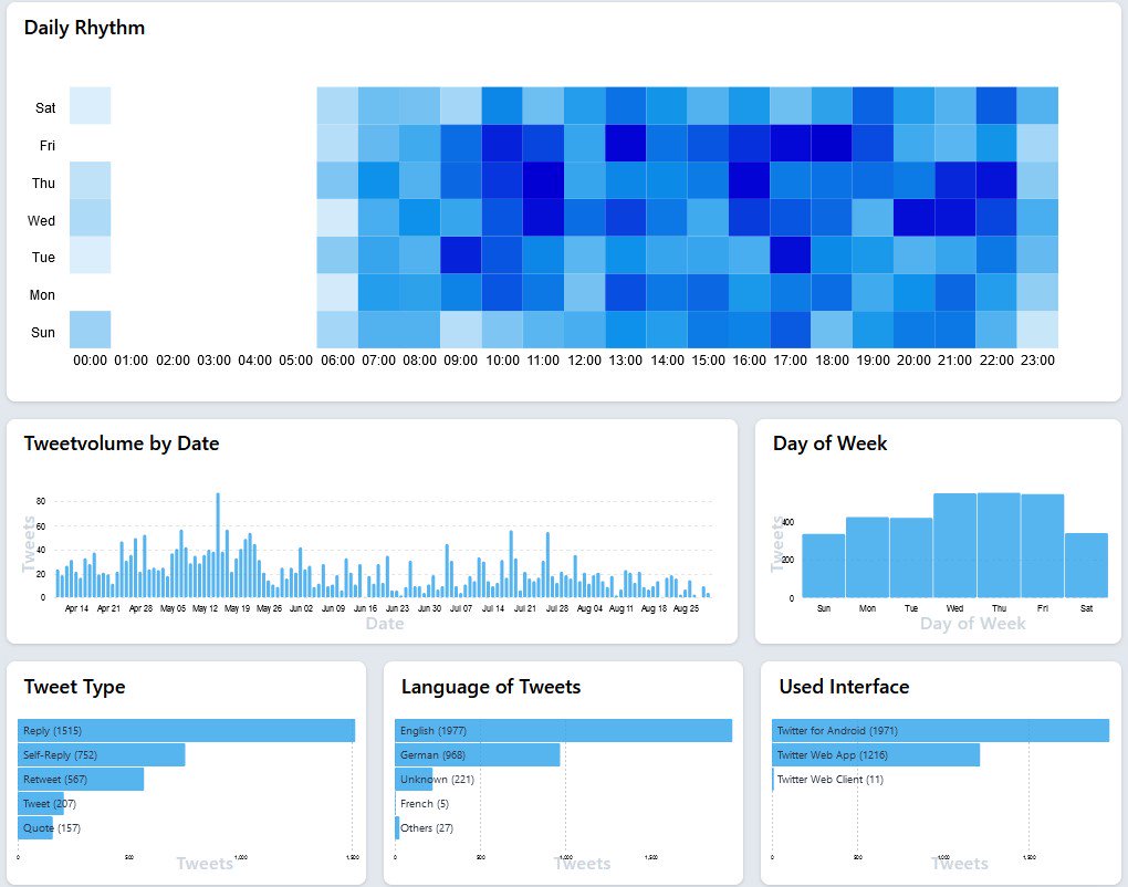
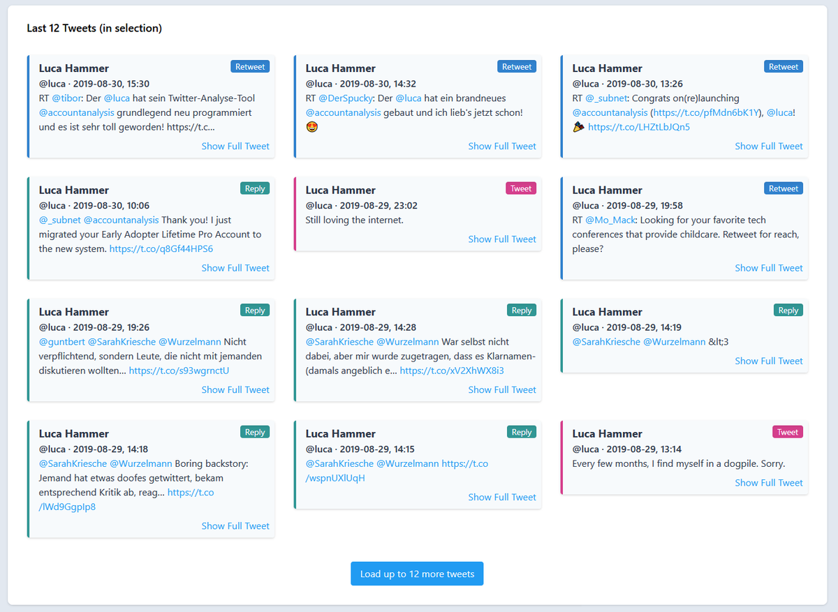
It visualizes the different features (date, time, type, app, etc.) of Tweets to make them interpretable. /1
Two years ago on a weekend, I built a tool to make it easier to evaluate Twitter accounts. Since then 36590 people used it to analyze 55390 different Twitter accounts.
Over the last months @mmkaradeniz and I made a new version. We launched it last night:
It visualizes the different features (date, time, type, app, etc.) of Tweets to make them interpretable. /1
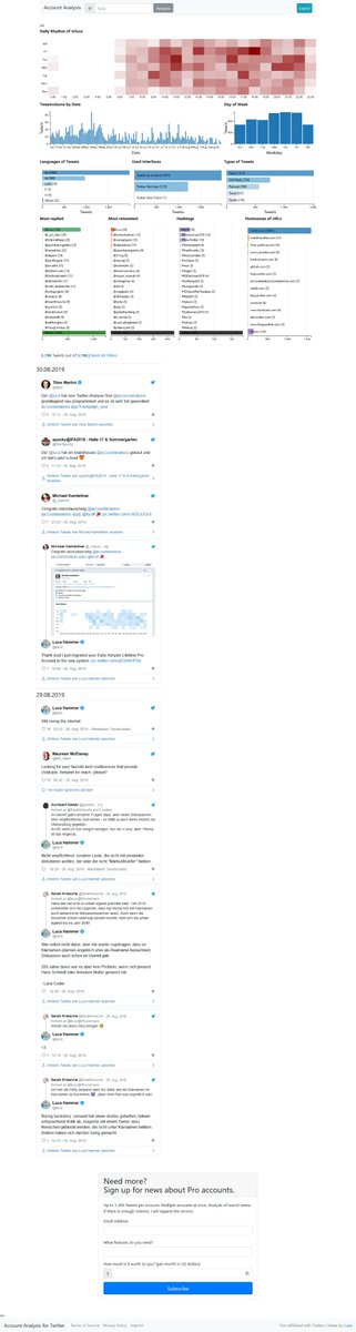
Side-by-side screenshots of the old and new version. /2
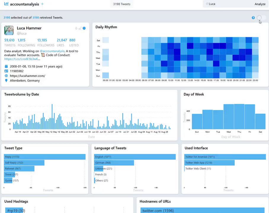
Additionally it shows the account ID. Useful when making screenshots and accounts change their screen name. /5
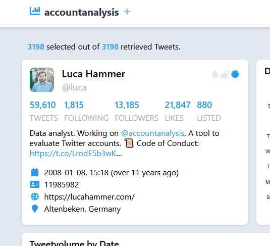
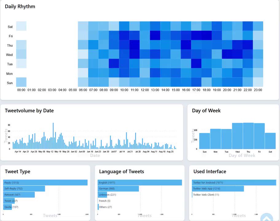
It gives a quick overview when an account is active and at the same time allows to drill deeper into the data. /6
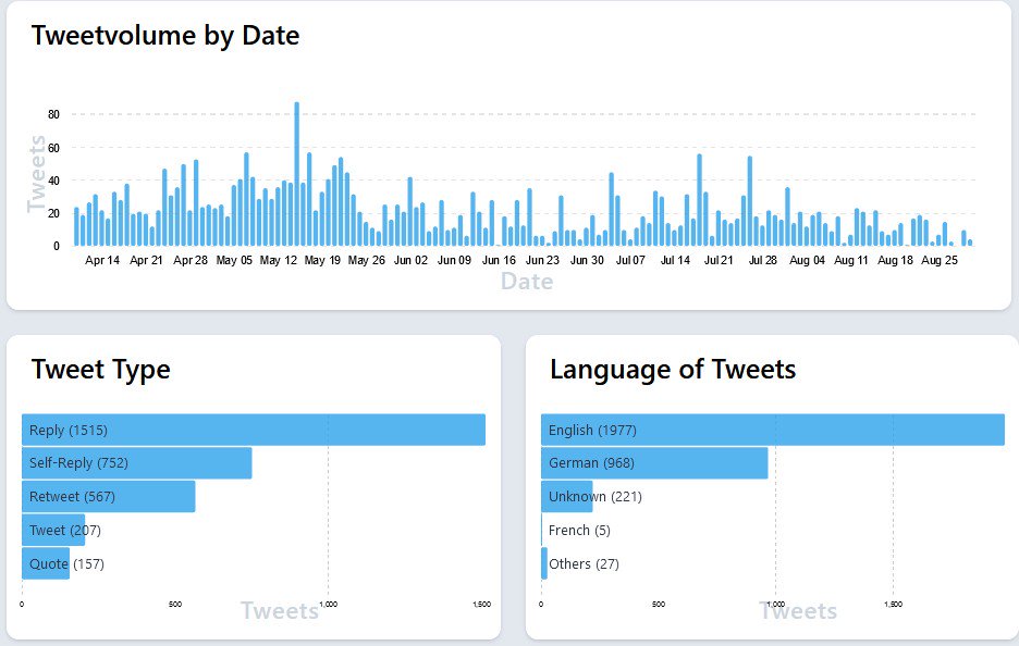
It seems like I don't link out of Twitter often any more. /9
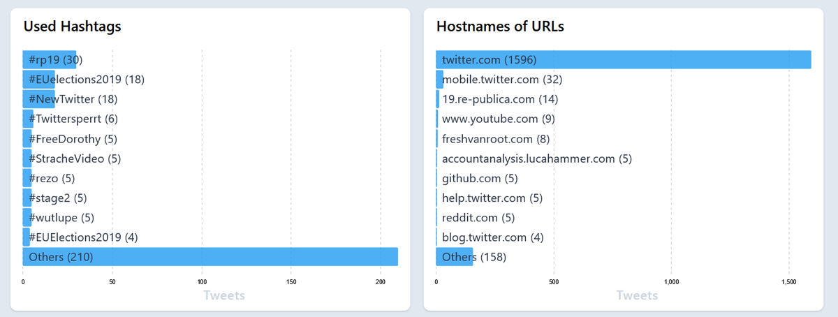
I love to reply to myself (threads!). But I also retweet myself often (Look at this awesome Tweet I made!). Finally, I mostly quote myself (Well.). /10
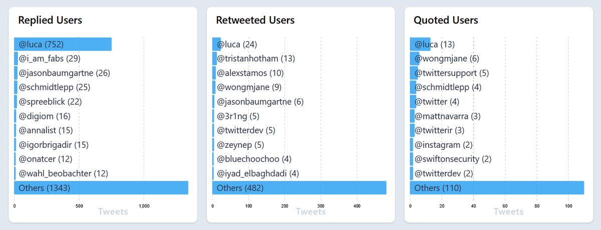
Much easier to understand things. /11
https://t.co/9CycLTc85m
More from Tech


On press call, Zuckerberg says FB users "naturally engage more with sensational content" that comes close to violating its rules. Compares it to cable TV and tabloids, and says, "This seems to be true regardless of where we set our policy lines."
Zuckerberg says FB is in the process of setting up a "new independent body" that users will be able to appeal content takedowns to. Sort of like the "Facebook Supreme Court" idea he previewed earlier this year.
Zuckerberg: "One of my biggest lessons from this year is that when you connect more than 2 billion people, you’re going to see the good and bad of humanity."
This is how Facebook says it's trying to change the engagement pattern on its services. https://t.co/3p0PGc912o

.@RebeccaJarvis asks Zuckerberg if anyone is going to lose their job over the revelations in the NYT story. He dodges, says that personnel issues aren't a public matter, and that employee performance is evaluated all the time.
Zuckerberg says FB is in the process of setting up a "new independent body" that users will be able to appeal content takedowns to. Sort of like the "Facebook Supreme Court" idea he previewed earlier this year.
Zuckerberg: "One of my biggest lessons from this year is that when you connect more than 2 billion people, you’re going to see the good and bad of humanity."
This is how Facebook says it's trying to change the engagement pattern on its services. https://t.co/3p0PGc912o
.@RebeccaJarvis asks Zuckerberg if anyone is going to lose their job over the revelations in the NYT story. He dodges, says that personnel issues aren't a public matter, and that employee performance is evaluated all the time.


THREAD: How is it possible to train a well-performing, advanced Computer Vision model 𝗼𝗻 𝘁𝗵𝗲 𝗖𝗣𝗨? 🤔
At the heart of this lies the most important technique in modern deep learning - transfer learning.
Let's analyze how it
2/ For starters, let's look at what a neural network (NN for short) does.
An NN is like a stack of pancakes, with computation flowing up when we make predictions.
How does it all work?
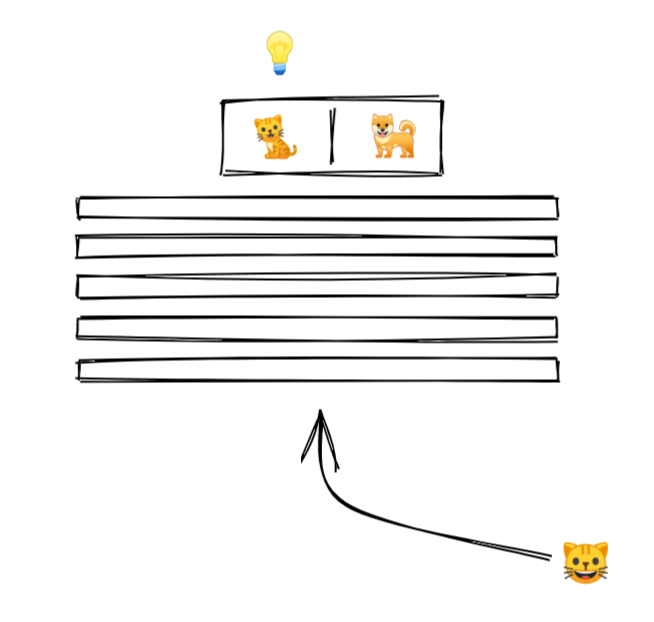
3/ We show an image to our model.
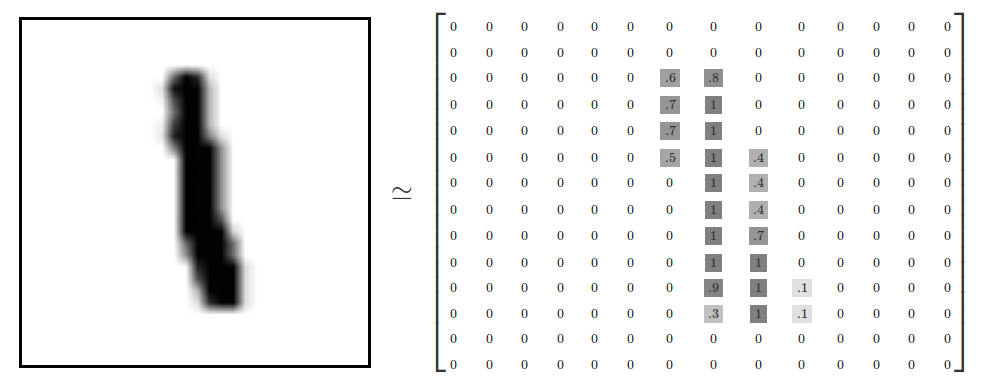
An image is a collection of pixels. Each pixel is just a bunch of numbers describing its color.
Here is what it might look like for a black and white image
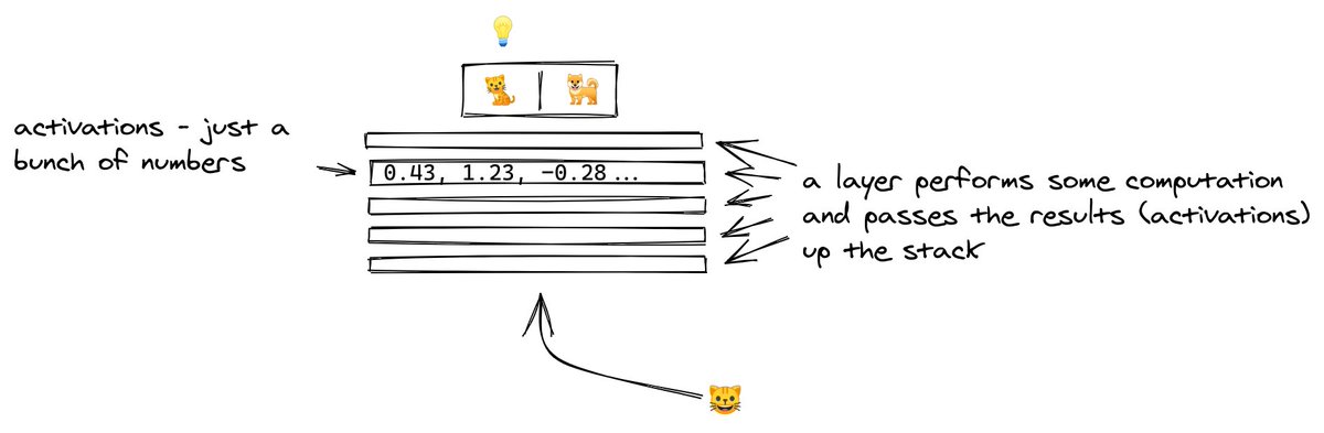
4/ The picture goes into the layer at the bottom.
Each layer performs computation on the image, transforming it and passing it upwards.
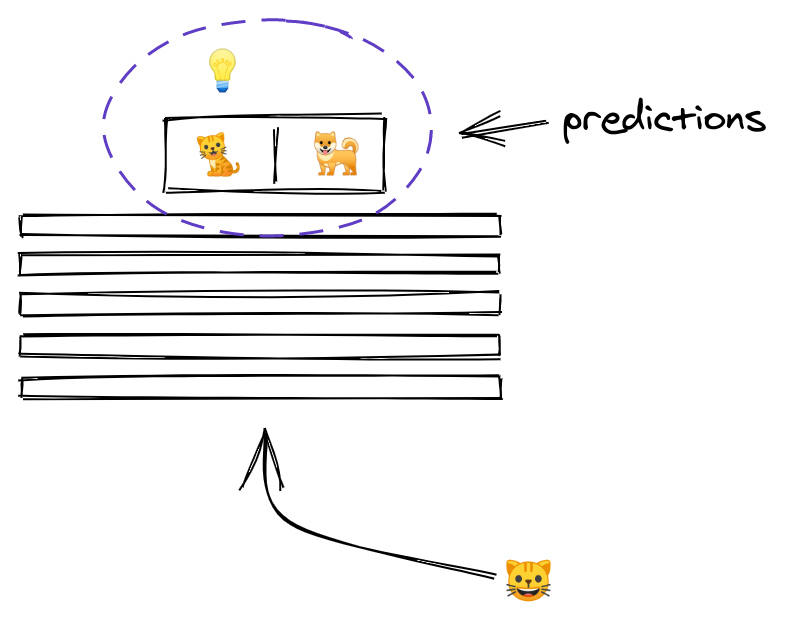
5/ By the time the image reaches the uppermost layer, it has been transformed to the point that it now consists of two numbers only.
The outputs of a layer are called activations, and the outputs of the last layer have a special meaning... they are the predictions!
At the heart of this lies the most important technique in modern deep learning - transfer learning.
Let's analyze how it
THREAD: Can you start learning cutting-edge deep learning without specialized hardware? \U0001f916
— Radek Osmulski (@radekosmulski) February 11, 2021
In this thread, we will train an advanced Computer Vision model on a challenging dataset. \U0001f415\U0001f408 Training completes in 25 minutes on my 3yrs old Ryzen 5 CPU.
Let me show you how...
2/ For starters, let's look at what a neural network (NN for short) does.
An NN is like a stack of pancakes, with computation flowing up when we make predictions.
How does it all work?
3/ We show an image to our model.
An image is a collection of pixels. Each pixel is just a bunch of numbers describing its color.
Here is what it might look like for a black and white image
4/ The picture goes into the layer at the bottom.
Each layer performs computation on the image, transforming it and passing it upwards.
5/ By the time the image reaches the uppermost layer, it has been transformed to the point that it now consists of two numbers only.
The outputs of a layer are called activations, and the outputs of the last layer have a special meaning... they are the predictions!


You May Also Like

I think a plausible explanation is that whatever Corbyn says or does, his critics will denounce - no matter how much hypocrisy it necessitates.
Corbyn opposes the exploitation of foreign sweatshop-workers - Labour MPs complain he's like Nigel
He speaks up in defence of migrants - Labour MPs whinge that he's not listening to the public's very real concerns about immigration:
He's wrong to prioritise Labour Party members over the public:
He's wrong to prioritise the public over Labour Party
One of the oddest features of the Labour tax row is how raising allowances, which the media allowed the LDs to describe as progressive (in spite of evidence to contrary) through the coalition years, is now seen by everyone as very right wing
— Tom Clark (@prospect_clark) November 2, 2018
Corbyn opposes the exploitation of foreign sweatshop-workers - Labour MPs complain he's like Nigel
He speaks up in defence of migrants - Labour MPs whinge that he's not listening to the public's very real concerns about immigration:
He's wrong to prioritise Labour Party members over the public:
He's wrong to prioritise the public over Labour Party