It would be a thrill to do this again this year, with your support of course.
Hi everyone, Welcome!
I am Claire Igwe. I would like to welcome everyone joining us to this tweet chat.
Our conversation today is a warm-up to the PAD PROJECT, an outreach planned by FIGURE (Feminist Inspiring Gender Unity, Respect and Equality)
It would be a thrill to do this again this year, with your support of course.
Please feel free to jump in with your contributions and retweet.
So, my first question for you would be;
Do you think sexual harassment and predation by educators is limited to tertiary institutions, or do you agree it exists in secondary schools?
You are right. Homophobia is really the only reason why anyone would think having a same sex secondary school would curb sexual harassment.
Question 3 for you;
Do you think that gender roles of patriarchy restricts career choices for girls, when they start to -
Another question;
Do you think that ageism and the privilege given to elderly people in our culture is a factor in the prevalence of sexual harassment of minors?
Another question;
Do you think there is a difference between minors giving consent to fellow minors and minors "giving consent" to an adult?
We are almost at the end of this chat, thanks for still being here.
What is your take on child marriage and the age of consent in Nigeria?
This is the final question for today.
Do you agree with the national assembly's recent suggestion that child brides should be allowed to vote?
Thanks once again @afrika_sisi for joining us this evening.
More from Society

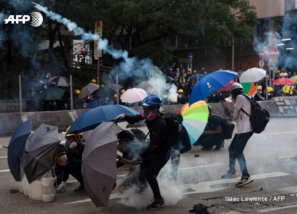
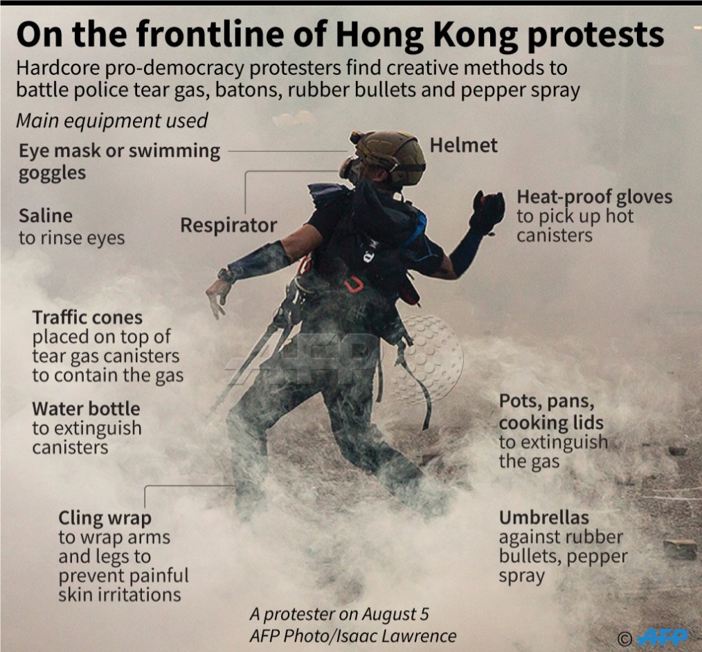
Hong Kong protester equipment list:
- respirator (dubbed "pig snouts" in Cantonese)
- helmet
- eye mask
- heat-proof gloves
- water bottle
- cling wrap
- saline
- traffic cones
- pots and pans
Demonstrators find creative methods to battle police tear gas
https://t.co/kPeUTu9iFh
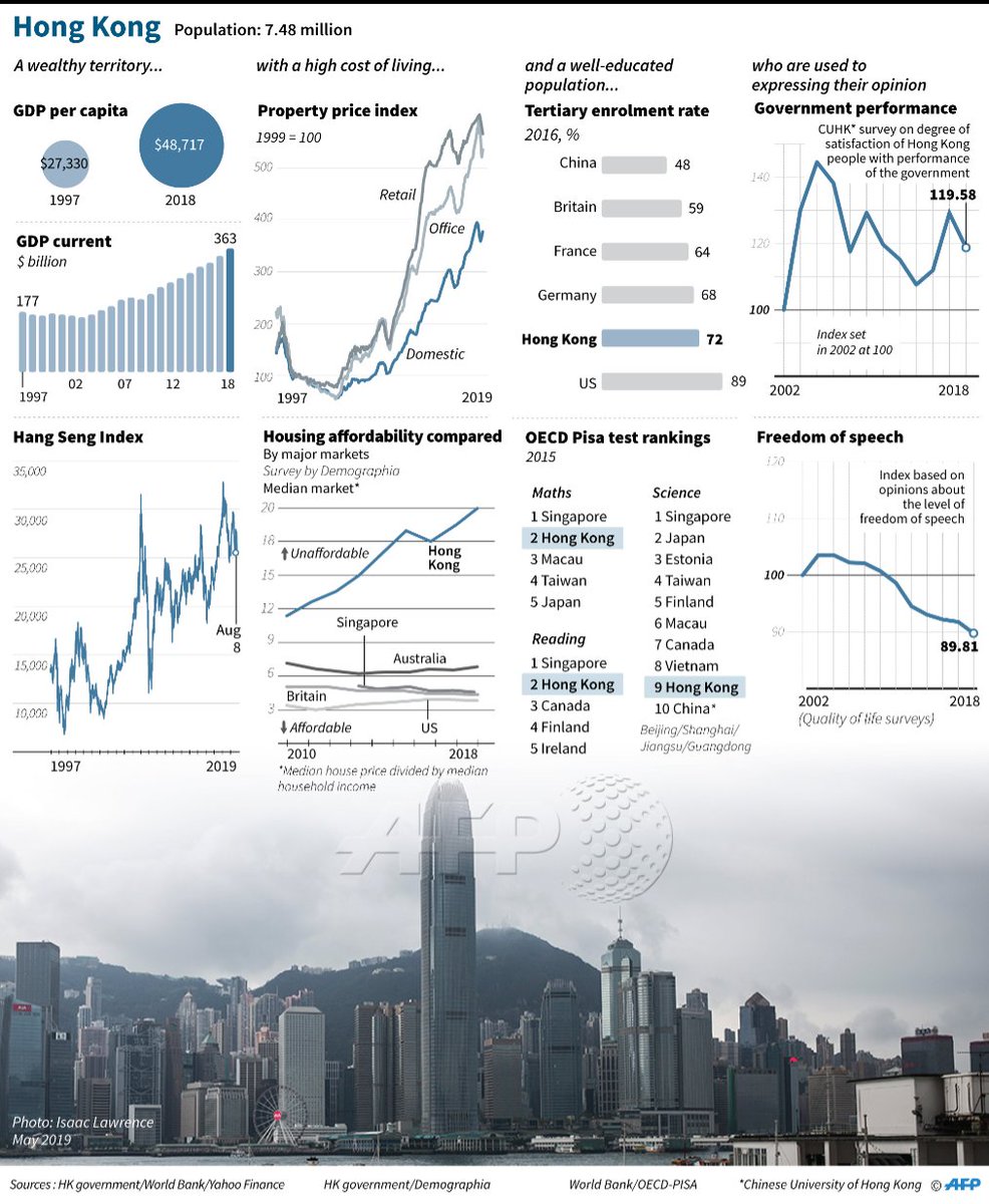
AFP graphic charting Hong Kong's main socio-economic indicators and opinion polls on press freedom and government performance
@AFPgraphics
AFP graphic showing the main equipment used by hardcore pro-democracy protesters in Hong Kong to battle police tear gas, pepper spray and rubber bullets
@AFPgraphics
Frontline first aid.
Nurses, doctors, medical students and ordinary citizens with first aid training have clamoured to join a small volunteer corps helping treat people involved in the Hong Kong protests
@AFP's Yan Zhao reports: https://t.co/uDfYkMeZJf
📸 Anthony Wallace

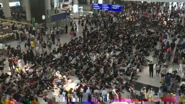
Pro-democracy activists kick off three days of rallies at Hong Kong airport.
Protesters hope to win international support from arriving passengers. The last demonstration at the airport on July 26 passed off peacefully without causing flight disruptions
https://t.co/jmVqtEd4M2
- respirator (dubbed "pig snouts" in Cantonese)
- helmet
- eye mask
- heat-proof gloves
- water bottle
- cling wrap
- saline
- traffic cones
- pots and pans
Demonstrators find creative methods to battle police tear gas
https://t.co/kPeUTu9iFh
AFP graphic charting Hong Kong's main socio-economic indicators and opinion polls on press freedom and government performance
@AFPgraphics
AFP graphic showing the main equipment used by hardcore pro-democracy protesters in Hong Kong to battle police tear gas, pepper spray and rubber bullets
@AFPgraphics
Frontline first aid.
Nurses, doctors, medical students and ordinary citizens with first aid training have clamoured to join a small volunteer corps helping treat people involved in the Hong Kong protests
@AFP's Yan Zhao reports: https://t.co/uDfYkMeZJf
📸 Anthony Wallace
Pro-democracy activists kick off three days of rallies at Hong Kong airport.
Protesters hope to win international support from arriving passengers. The last demonstration at the airport on July 26 passed off peacefully without causing flight disruptions
https://t.co/jmVqtEd4M2


This is a piece I've been thinking about for a long time. One of the most dominant policy ideas in Washington is that policy should, always and everywhere, move parents into paid labor. But what if that's wrong?
My reporting here convinced me that there's no large effect in either direction on labor force participation from child allowances. Canada has a bigger one than either Romney or Biden are considering, and more labor force participation among women.
But what if that wasn't true?
Forcing parents into low-wage, often exploitative, jobs by threatening them and their children with poverty may be counted as a success by some policymakers, but it’s a sign of a society that doesn’t value the most essential forms of labor.
The problem is in the very language we use. If I left my job as a New York Times columnist to care for my 2-year-old son, I’d be described as leaving the labor force. But as much as I adore him, there is no doubt I’d be working harder. I wouldn't have stopped working!
I tried to render conservative objections here fairly. I appreciate that @swinshi talked with me, and I'm sorry I couldn't include everything he said. I'll say I believe I used his strongest arguments, not more speculative ones, in the piece.
My reporting here convinced me that there's no large effect in either direction on labor force participation from child allowances. Canada has a bigger one than either Romney or Biden are considering, and more labor force participation among women.
But what if that wasn't true?
Forcing parents into low-wage, often exploitative, jobs by threatening them and their children with poverty may be counted as a success by some policymakers, but it’s a sign of a society that doesn’t value the most essential forms of labor.
The problem is in the very language we use. If I left my job as a New York Times columnist to care for my 2-year-old son, I’d be described as leaving the labor force. But as much as I adore him, there is no doubt I’d be working harder. I wouldn't have stopped working!
I tried to render conservative objections here fairly. I appreciate that @swinshi talked with me, and I'm sorry I couldn't include everything he said. I'll say I believe I used his strongest arguments, not more speculative ones, in the piece.
I appreciate his intellectual curiosity and effort. I have quibbles. But my big disappointment is there was no mention of unintended consequences, which we discussed and which are kind of THE core conservative concern on this issue.
— \U0001d682\U0001d68c\U0001d698\U0001d69d\U0001d69d \U0001d686\U0001d692\U0001d697\U0001d69c\U0001d691\U0001d692\U0001d699 (@swinshi) February 18, 2021