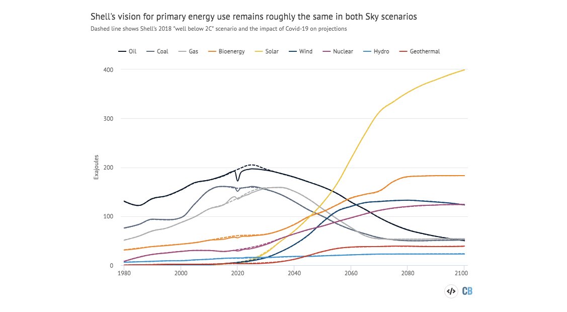
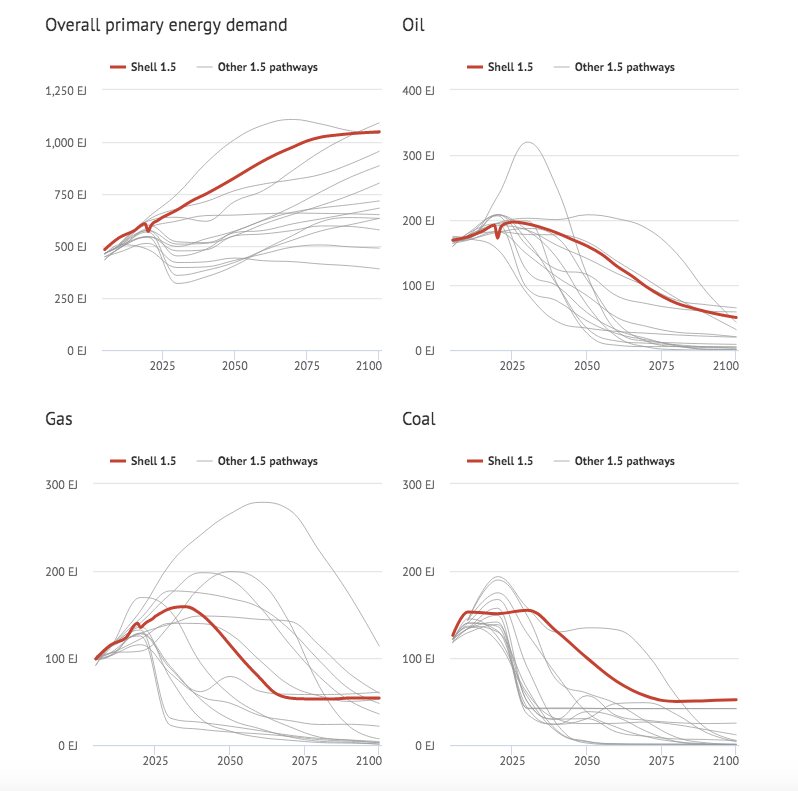
Without them their pathway for CO2 emissions is the same as the previous one.
(It's also towards the higher end of 1.5C emissions pathways.)

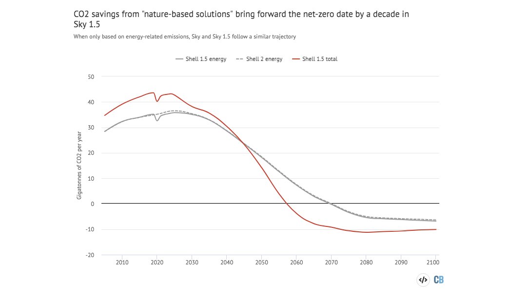
Shell plans to use forests to remove 120 Mt/yr of CO2 by 2030.
— Greg Muttitt (@FuelOnTheFire) February 12, 2021
Appropriate land for forestation is finite, and risks competition with food production and human rights of current land owners/users, esp Indigenous
Immunocompromised 45 year old suffered from #COVID19 for 155 days before he died. The virus was changing very quickly inside the man's body\u2014it acquired a big cluster of >20 mutations\u2014resembled the same ones seen in #B117 & #B1351. (NPR audio Part 1 of 2)\U0001f9f5https://t.co/7kWiBZ1xGk pic.twitter.com/ZJ7AExB78Y
— Eric Feigl-Ding (@DrEricDing) February 8, 2021
2) NPR report audio part 2 of 2:
— Eric Feigl-Ding (@DrEricDing) February 8, 2021
Dr. Li couldn't believe what they found. "I was shocked," he says. "When I saw the virus sequences, I knew that we were dealing with something completely different and potentially very important." pic.twitter.com/HT3Yt6djFd
Feels like the next thing we're going to need is a ranking system for how concerning "variants of concern\u201d actually are.
— Kai Kupferschmidt (@kakape) January 15, 2021
A lot of constellations of mutations are concerning, but people are lumping together variants with vastly different levels of evidence that we need to worry.
While looking at speculative pharmaceutical stocks I am reminded of why I am averse to these risky picks.#DDDD was compelling enough, though, to break this rule. The 10+ treatments under trial, industry-leading IP portfolio, and comparable undervaluation are inescapable.
— Shrey Srivastava (@BlogShrey) December 16, 2020
The new answer to a 77-year-old problem in data analysis, published today in @naturemethods. Instead of significance tests, use estimation graphics. Our software suite DABEST makes it easy for everyone to visualize effect sizes.https://t.co/UzwXJ7EUC5 pic.twitter.com/VtxyY0xaRM
— Adam Claridge-Chang (@adamcchang) June 19, 2019
Open letter to journal editors: dynamite plots must die. Dynamite plots, also known as bar and line graphs, hide important information. Editors should require authors to show readers the data and avoid these plots. https://t.co/0GNKEIUCJL pic.twitter.com/OS9ytEFRZN
— Rafael Irizarry (@rafalab) February 22, 2019
Couldn't find D3 code for grouped horisontal box plots that show data points so I made this @mbostock @thisisalfie https://t.co/cQjDPhyZdw pic.twitter.com/y6RNmDB2p3
— Ulrik Lyngs (@ulyngs) June 28, 2017
made a pkg for pirate plots in ggplot: add any of points/means/bars/CIs/violins \u2013 better than ye olde bar/box plotshttps://t.co/Z2m2kW3hsl pic.twitter.com/npAirPQexM
— Mika Braginsky (@mbraginsky) September 28, 2017
See the new #PowerBI visual awesomeness for data points & sources, box-&-whisker plots! https://t.co/dOmgoxWfDE pic.twitter.com/HAUOAMJEJW
— Microsoft Power BI (@MSPowerBI) February 1, 2016
Is moderate exercise enough to live as long as possible, or should you be doing vigorous exercise? And what proportion is best? This article has the answers. https://t.co/YJqpaaI0UR
— Sebastian Rushworth M.D. (@sebrushworth) January 24, 2021