

Wellll... A few weeks back I started working on a tutorial for our lab's Code Club on how to make shitty graphs. It was too dispiriting and I balked. A twitter workshop with figures and code:
When are you doing pie charts?
— #BlackLivesMatter (@surt_lab) October 13, 2020


More from Data science


1/ A ∞-wide NN of *any architecture* is a Gaussian process (GP) at init. The NN in fact evolves linearly in function space under SGD, so is a GP at *any time* during training. https://t.co/v1b6kndqCk With Tensor Programs, we can calculate this time-evolving GP w/o trainin any NN
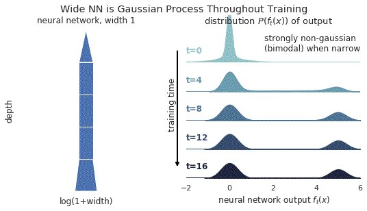
2/ In this gif, narrow relu networks have high probability of initializing near the 0 function (because of relu) and getting stuck. This causes the function distribution to become multi-modal over time. However, for wide relu networks this is not an issue.
3/ This time-evolving GP depends on two kernels: the kernel describing the GP at init, and the kernel describing the linear evolution of this GP. The former is the NNGP kernel, and the latter is the Neural Tangent Kernel (NTK).
4/ Once we have these two kernels, we can derive the GP mean and covariance at any time t via straightforward linear algebra.
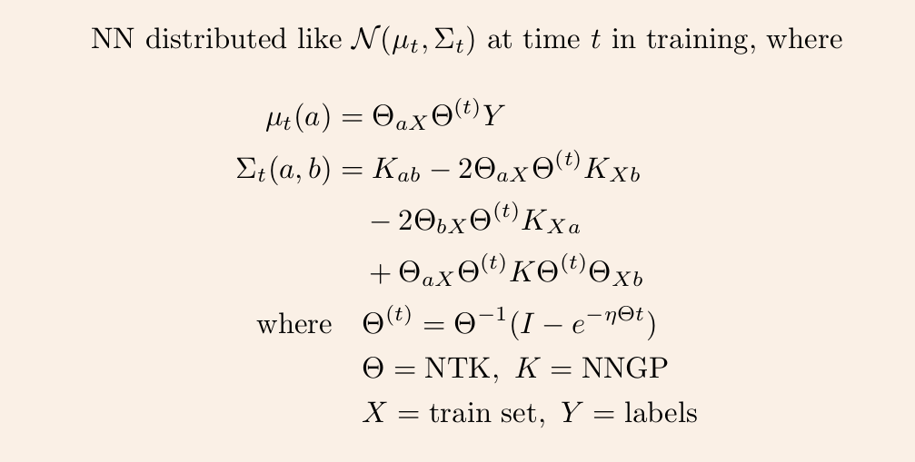
5/ So it remains to calculate the NNGP kernel and NT kernel for any given architecture. The first is described in https://t.co/cFWfNC5ALC and in this thread
2/ In this gif, narrow relu networks have high probability of initializing near the 0 function (because of relu) and getting stuck. This causes the function distribution to become multi-modal over time. However, for wide relu networks this is not an issue.
3/ This time-evolving GP depends on two kernels: the kernel describing the GP at init, and the kernel describing the linear evolution of this GP. The former is the NNGP kernel, and the latter is the Neural Tangent Kernel (NTK).
4/ Once we have these two kernels, we can derive the GP mean and covariance at any time t via straightforward linear algebra.
5/ So it remains to calculate the NNGP kernel and NT kernel for any given architecture. The first is described in https://t.co/cFWfNC5ALC and in this thread

I have always emphasized on the importance of mathematics in machine learning.
Here is a compilation of resources (books, videos & papers) to get you going.
(Note: It's not an exhaustive list but I have carefully curated it based on my experience and observations)
📘 Mathematics for Machine Learning
by Marc Peter Deisenroth, A. Aldo Faisal, and Cheng Soon Ong
https://t.co/zSpp67kJSg
Note: this is probably the place you want to start. Start slowly and work on some examples. Pay close attention to the notation and get comfortable with it.

📘 Pattern Recognition and Machine Learning
by Christopher Bishop
Note: Prior to the book above, this is the book that I used to recommend to get familiar with math-related concepts used in machine learning. A very solid book in my view and it's heavily referenced in academia.

📘 The Elements of Statistical Learning
by Jerome H. Friedman, Robert Tibshirani, and Trevor Hastie
Mote: machine learning deals with data and in turn uncertainty which is what statistics teach. Get comfortable with topics like estimators, statistical significance,...

📘 Probability Theory: The Logic of Science
by E. T. Jaynes
Note: In machine learning, we are interested in building probabilistic models and thus you will come across concepts from probability theory like conditional probability and different probability distributions.
Here is a compilation of resources (books, videos & papers) to get you going.
(Note: It's not an exhaustive list but I have carefully curated it based on my experience and observations)
📘 Mathematics for Machine Learning
by Marc Peter Deisenroth, A. Aldo Faisal, and Cheng Soon Ong
https://t.co/zSpp67kJSg
Note: this is probably the place you want to start. Start slowly and work on some examples. Pay close attention to the notation and get comfortable with it.
📘 Pattern Recognition and Machine Learning
by Christopher Bishop
Note: Prior to the book above, this is the book that I used to recommend to get familiar with math-related concepts used in machine learning. A very solid book in my view and it's heavily referenced in academia.
📘 The Elements of Statistical Learning
by Jerome H. Friedman, Robert Tibshirani, and Trevor Hastie
Mote: machine learning deals with data and in turn uncertainty which is what statistics teach. Get comfortable with topics like estimators, statistical significance,...
📘 Probability Theory: The Logic of Science
by E. T. Jaynes
Note: In machine learning, we are interested in building probabilistic models and thus you will come across concepts from probability theory like conditional probability and different probability distributions.
You May Also Like


To people who are under the impression that you can get rich quickly by working on an app, here are the stats for https://t.co/az8F12pf02
📈 ~12000 vistis
☑️ 109 transactions
💰 353€ profit (285 after tax)
I have spent 1.5 months on this app. You can make more $ in 2 days.
🤷♂️

I'm still happy that I launched a paid app bcs it involved extra work:
- backend for processing payments (+ permissions, webhooks, etc)
- integration with payment processor
- UI for license activation in Electron
- machine activation limit
- autoupdates
- mailgun emails
etc.
These things seemed super scary at first. I always thought it was way too much work and something would break. But I'm glad I persisted. So far the only problem I have is that mailgun is not delivering the license keys to certain domains like https://t.co/6Bqn0FUYXo etc. 👌
omg I just realized that me . com is an Apple domain, of course something wouldn't work with these dicks
📈 ~12000 vistis
☑️ 109 transactions
💰 353€ profit (285 after tax)
I have spent 1.5 months on this app. You can make more $ in 2 days.
🤷♂️
I'm still happy that I launched a paid app bcs it involved extra work:
- backend for processing payments (+ permissions, webhooks, etc)
- integration with payment processor
- UI for license activation in Electron
- machine activation limit
- autoupdates
- mailgun emails
etc.
These things seemed super scary at first. I always thought it was way too much work and something would break. But I'm glad I persisted. So far the only problem I have is that mailgun is not delivering the license keys to certain domains like https://t.co/6Bqn0FUYXo etc. 👌
omg I just realized that me . com is an Apple domain, of course something wouldn't work with these dicks


