⬇️⬇️⬇️ The "Math" of Fear
As it is Thursday, I have a post for you today in anticipation of Gov. DeWine's new Maps of Fear which he has tried to phase in. I have previously discussed both the new red and blue maps and their issues -
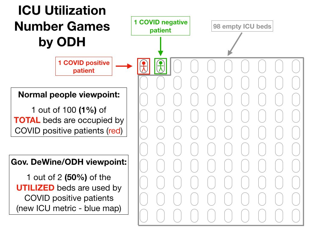
- but today I hope to illustrate even more clearly what level of manipulation is going on, particularly with the new blue 'ICU Utilization' map.
Attached I have two images.
The first is a hyper-simplistic (and unrealistic) but illustrative example of the calculations that the new blue map goes through to arrive at its numbers.
Instead of telling us the percent of beds occupied by COVID+ (not necessarily ill *with* COVID, but testing positive) - the governor and ODH only calculates the percentage of COVID+ out of just the *used* beds.
In the first image, I have an example of a 100 bed ICU with just two patients - one COVID positive (red) and one COVID negative (green). The other 98 beds are empty and able to accept new patients.