
If I share a sign up I get "free shares" and I can share as much as I want up to 500$ worth.
For fun I made a Robinhood account. It took me 5 minutes to sign up, get approved and transfer funds for trading...
Here's some details... Read on.
If I share a sign up I get "free shares" and I can share as much as I want up to 500$ worth.

Notice options is first, buy second.
Options took me to an approval process (which took about a minute) and now away I go trading Baba options.


And now the inducement for me to invite friends so I get more scratch card stock games is high. Seriously powerful psychology here.

Fascinating.


More from Trading


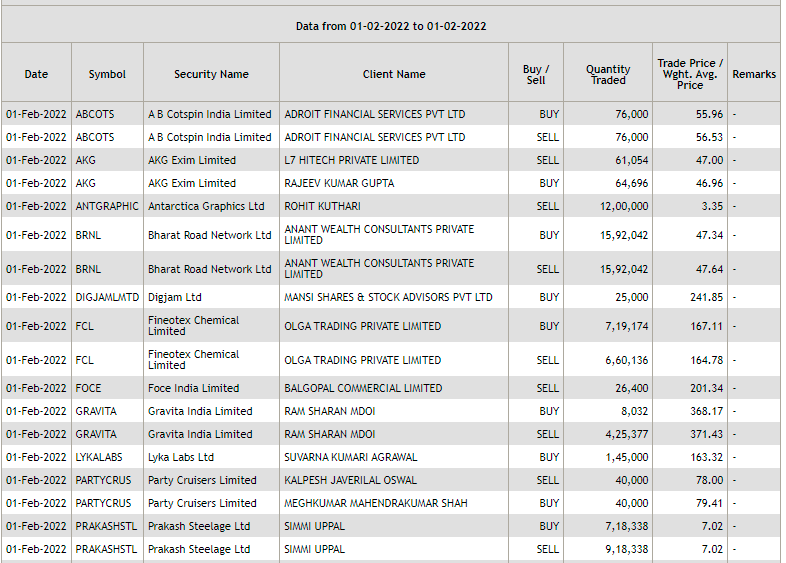
A 🧵on the basics of block and bulk deals.
Block and bulk deals are large purchases of stocks by investment banks, mutual funds, hedge funds, pension funds, FIIs, and promoters. Tracking block and bulk deals can help give you a sense of what these large players are thinking.
A single transaction where shares more than Rs 10 crores or the number of shares traded are more than 5 lakh is considered a block deal.
Block deals are carried out in separate trading windows. This trading window operates in two shifts of 15 minutes each:
Morning trading window from 8:45 AM to 9:00 AM.
Afternoon trading window from 2:05 PM to 2:20 PM
Block deals happen in different windows to reduce volatility and sudden price movements. Given that they are traded in a separate window, they do not show up on the volume charts.
Brokers facilitating the transaction are required to inform the exchange. You can track bulk and block deals on NSE & BSE:
https://t.co/pwTyzWTnUL
https://t.co/g9BbHiEag3


You May Also Like


Keep dwelling on this:
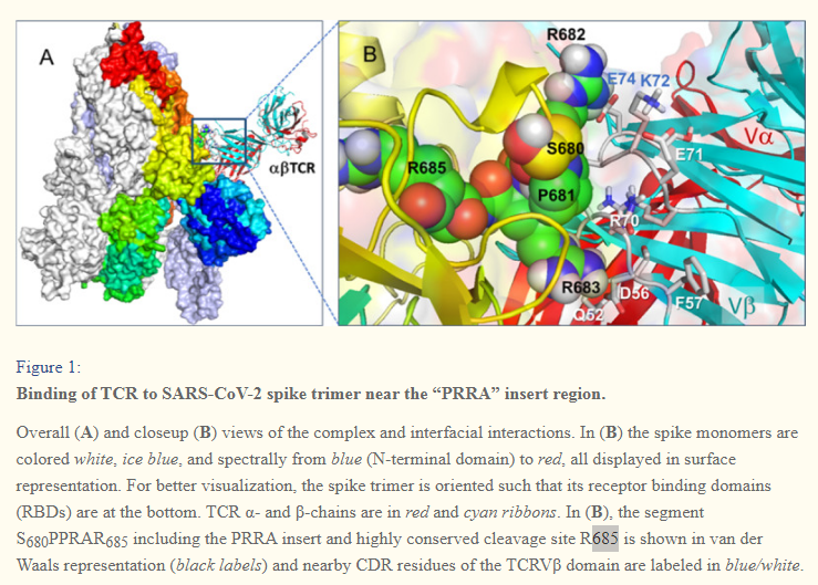
Further Examination of the Motif near PRRA Reveals Close Structural Similarity to the SEB Superantigen as well as Sequence Similarities to Neurotoxins and a Viral SAg.
The insertion PRRA together with 7 sequentially preceding residues & succeeding R685 (conserved in β-CoVs) form a motif, Y674QTQTNSPRRAR685, homologous to those of neurotoxins from Ophiophagus (cobra) and Bungarus genera, as well as neurotoxin-like regions from three RABV strains
(20) (Fig. 2D). We further noticed that the same segment bears close similarity to the HIV-1 glycoprotein gp120 SAg motif F164 to V174.
https://t.co/EwwJOSa8RK
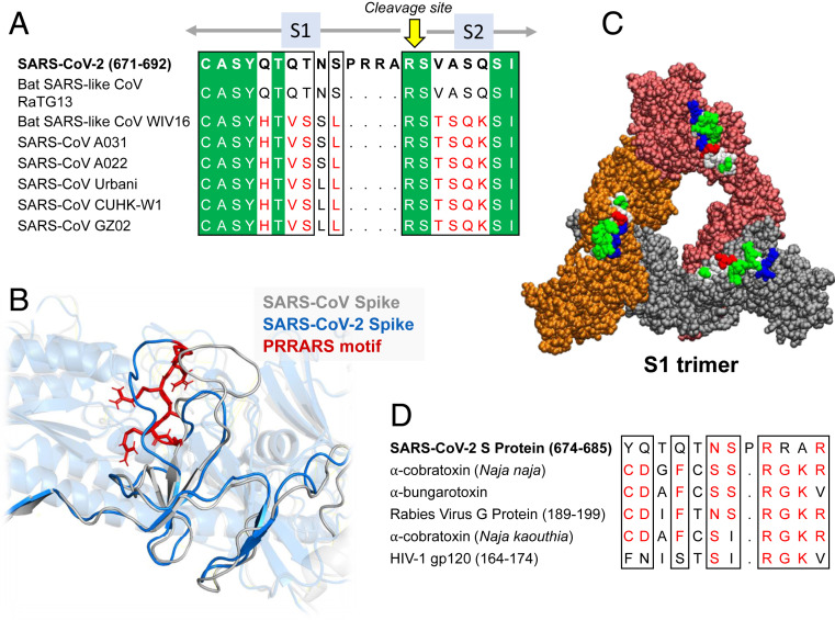
In (B), the segment S680PPRAR685 including the PRRA insert and highly conserved cleavage site *R685* is shown in van der Waals representation (black labels) and nearby CDR residues of the TCRVβ domain are labeled in blue/white
https://t.co/BsY8BAIzDa
Sequence Identity %
https://t.co/BsY8BAIzDa
Y674 - QTQTNSPRRA - R685
Similar to neurotoxins from Ophiophagus (cobra) & Bungarus genera & neurotoxin-like regions from three RABV strains
T678 - NSPRRA- R685
Superantigenic core, consistently aligned against bacterial or viral SAgs
Further Examination of the Motif near PRRA Reveals Close Structural Similarity to the SEB Superantigen as well as Sequence Similarities to Neurotoxins and a Viral SAg.
The insertion PRRA together with 7 sequentially preceding residues & succeeding R685 (conserved in β-CoVs) form a motif, Y674QTQTNSPRRAR685, homologous to those of neurotoxins from Ophiophagus (cobra) and Bungarus genera, as well as neurotoxin-like regions from three RABV strains
(20) (Fig. 2D). We further noticed that the same segment bears close similarity to the HIV-1 glycoprotein gp120 SAg motif F164 to V174.
https://t.co/EwwJOSa8RK
In (B), the segment S680PPRAR685 including the PRRA insert and highly conserved cleavage site *R685* is shown in van der Waals representation (black labels) and nearby CDR residues of the TCRVβ domain are labeled in blue/white
https://t.co/BsY8BAIzDa
Sequence Identity %
https://t.co/BsY8BAIzDa
Y674 - QTQTNSPRRA - R685
Similar to neurotoxins from Ophiophagus (cobra) & Bungarus genera & neurotoxin-like regions from three RABV strains
T678 - NSPRRA- R685
Superantigenic core, consistently aligned against bacterial or viral SAgs


