I've made some allusions to how embarrassingly smug and lazy Kyle "I went to Yale" Smith's series is. We're two (short) posts in and it's still difficult to find substantive criticisms underneath an onslaught of purple prose and obvious contempt for community colleges.
My first piece on Jill Biden\u2019s dissertation was just me getting warmed up. This gets into the substance and contains lots of direct quotation of her shockingly bad writing. https://t.co/VeA67VVhIf
— Kyle Smith (@rkylesmith) December 17, 2020


More from Society


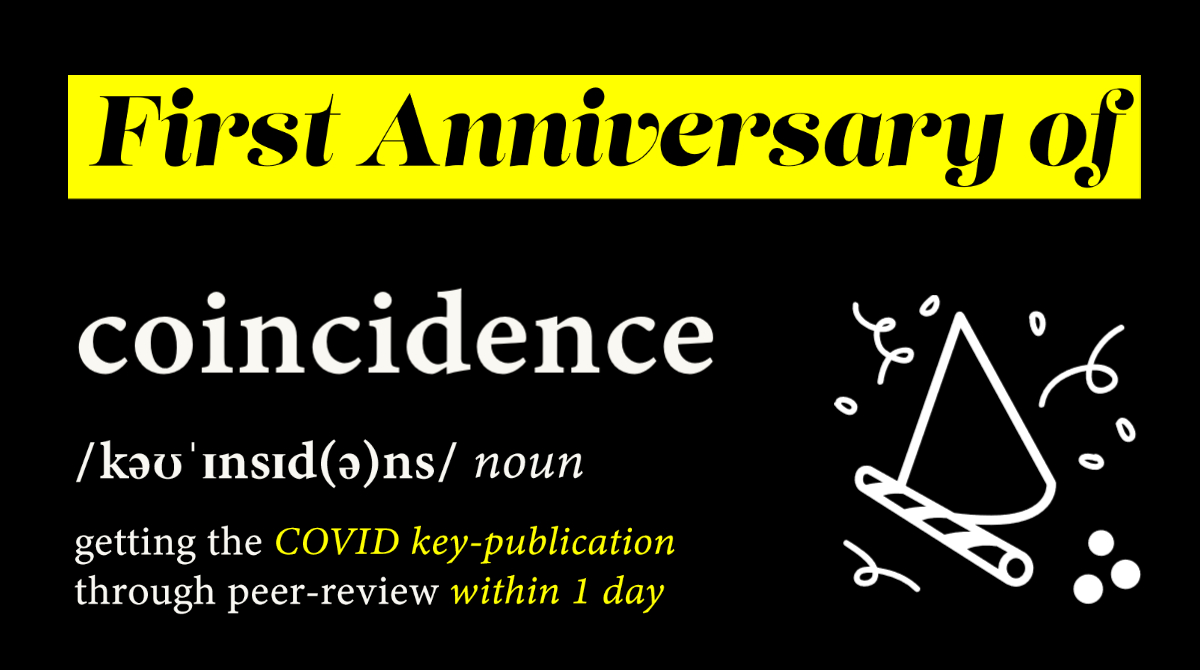
1/ One year of destroyed economies, social isolation & deep social splits calls for an anniversary ⬇️thread ⬇️ to celebrate the RT-qPCR manuscript by Christian Drosten (@c_drosten) & Victor Corman (@vmcorman), submitted on 21st Jan 2020 to @Eurosurveillanc. #UnbiasedScience
2/ Before this very publication, virologists were neither treated like superstars, nor were they considered icons or half-gods. In 2009, Drosten almost succeeded in installing the false premise virology could supersede holistic medical sciences as discussed in this thread.
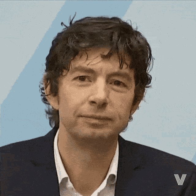
3/ Drosten is a virologist. He neither has any background in epidemiology, nor has he ever worked in the civil service. He also doesn’t have a background in public health. Yet he and his colleagues affect our daily lives to the level of whom to meet up or how to flush the toilet.
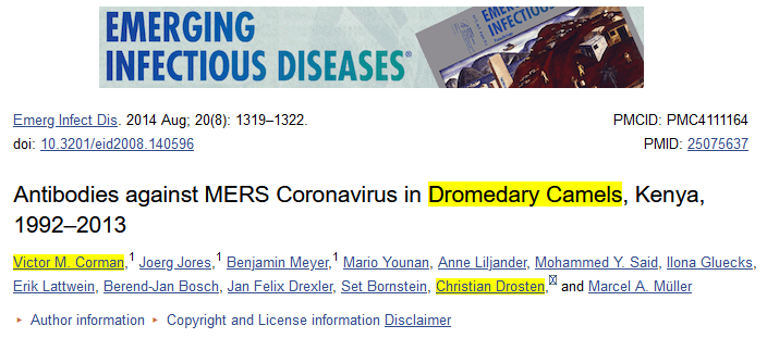
4/ Before January 2020, Drosten and Corman were common virologists at Charité Berlin, whenever they were not involved in economic implications (https://t.co/UTDwG8U7Du). Other than that, they looked at coronaviruses in dromedary calves in the Middle East or Africa. 😍 #cute
5/ Finally in Jan 2020, the published paper laid the theoretical grounds for the current pandemic, the RT-qPCR mass testing-religion, for which he was awarded his second German Federal Cross of Merit (he received the first one in 2005 for developing the SARS-CoV PCR test).
2/ Before this very publication, virologists were neither treated like superstars, nor were they considered icons or half-gods. In 2009, Drosten almost succeeded in installing the false premise virology could supersede holistic medical sciences as discussed in this thread.
3/ Drosten is a virologist. He neither has any background in epidemiology, nor has he ever worked in the civil service. He also doesn’t have a background in public health. Yet he and his colleagues affect our daily lives to the level of whom to meet up or how to flush the toilet.
4/ Before January 2020, Drosten and Corman were common virologists at Charité Berlin, whenever they were not involved in economic implications (https://t.co/UTDwG8U7Du). Other than that, they looked at coronaviruses in dromedary calves in the Middle East or Africa. 😍 #cute
5/ Finally in Jan 2020, the published paper laid the theoretical grounds for the current pandemic, the RT-qPCR mass testing-religion, for which he was awarded his second German Federal Cross of Merit (he received the first one in 2005 for developing the SARS-CoV PCR test).