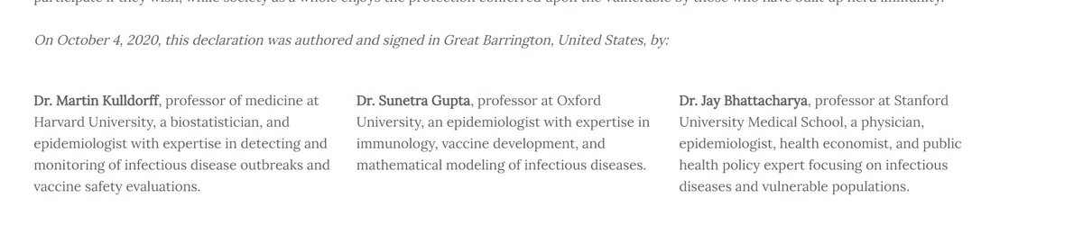
you can see the authors, kulldorf, gupta, bhattacharya's names and know this this was written by medical professors at harvard, stanford, and oxford.
there's no slant, not editorializing, it's primary source info.

OMG \U0001f62f
— Ivor Cummins (@FatEmperor) October 10, 2020
- reddit has censored discussion of The Great Barrington Declaration
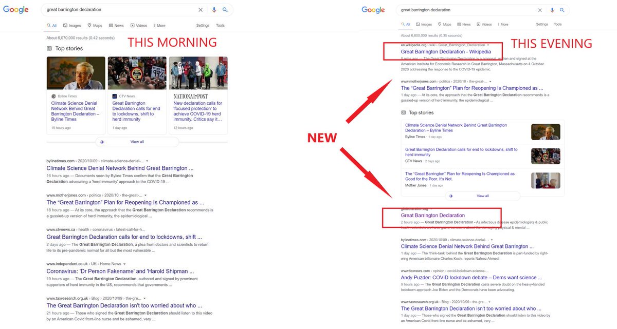
- and Google has removed it from their search engine results (can only see articles about it now, as they cannot censor those
1984 is here?
Sign up here: https://t.co/lBaMxnQD1xhttps://t.co/1decFrnoCs

When social media lies: @Facebook is throwing up a "fact check", saying that these COVID-19 survival rates are "false information":@Lyle_Genyk @FatEmperor @AlexBerenson pic.twitter.com/V6rVmqwFhc
— Tucker Goodrich (@TuckerGoodrich) October 9, 2020
CDC claims that masks stopped the spread of covid in kansas by comparing masked and non-masked counties.
— el gato malo (@boriquagato) November 23, 2020
counterpoint: this was a cherry pick in terms of date and seasonality.
they ended the "study" aug 23.
then, covid season hit and the masks look to have made no difference. https://t.co/LgyjqPodOC pic.twitter.com/P2cfuZRtDs
this is from the study that CDC head robert redfield showcased the other night to "prove masks work"
— el gato malo (@boriquagato) July 28, 2020
it it the epidemiological equivalent of doing a sun dance at 5.30 AM and claiming you made that ball of fire in the sky appear
it's assumptive, lacks a control, & proves nothing pic.twitter.com/yTdBa7UFit
back in the halcyon days of 2019, before the great politicization of epidemiology turned up into down and down into sideways, the WHO performed a survey of randomized, controlled trials on masks
— el gato malo (@boriquagato) September 28, 2020
1100 citations were winnowed to the 10 best for review.
masks looked ineffective. pic.twitter.com/A04MVVmXhu
this is a fascinating thread on possible physical properties of masks, viral spread, & infectivity
— el gato malo (@boriquagato) October 24, 2020
in essence, even if a mask stops large droplets, the force of expulsion may nebulize them into aerosols
so, it's possible that aerosol spread of cov is caused/accentuated by masks https://t.co/FiHfMU3NKD
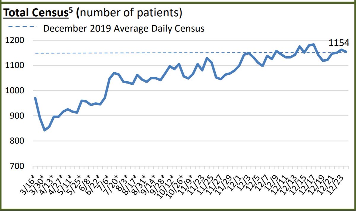
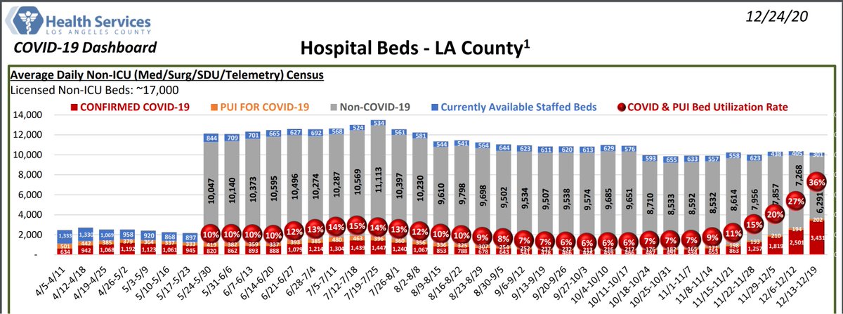
Overwhelmed LA hospitals brace for new wave as staff move gurneys into gift shops with a patient dying every 10 MINUTES. https://t.co/CW19DYzCn9
— John FitzGerald (@TheTweetOfJohn) December 27, 2020
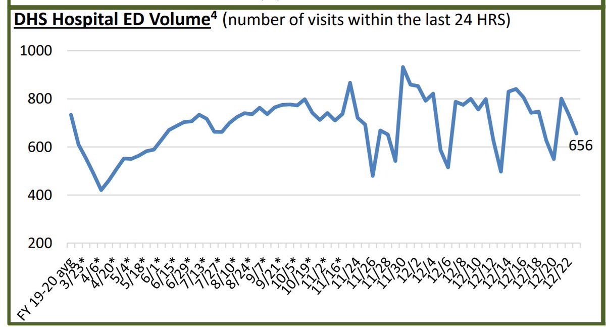
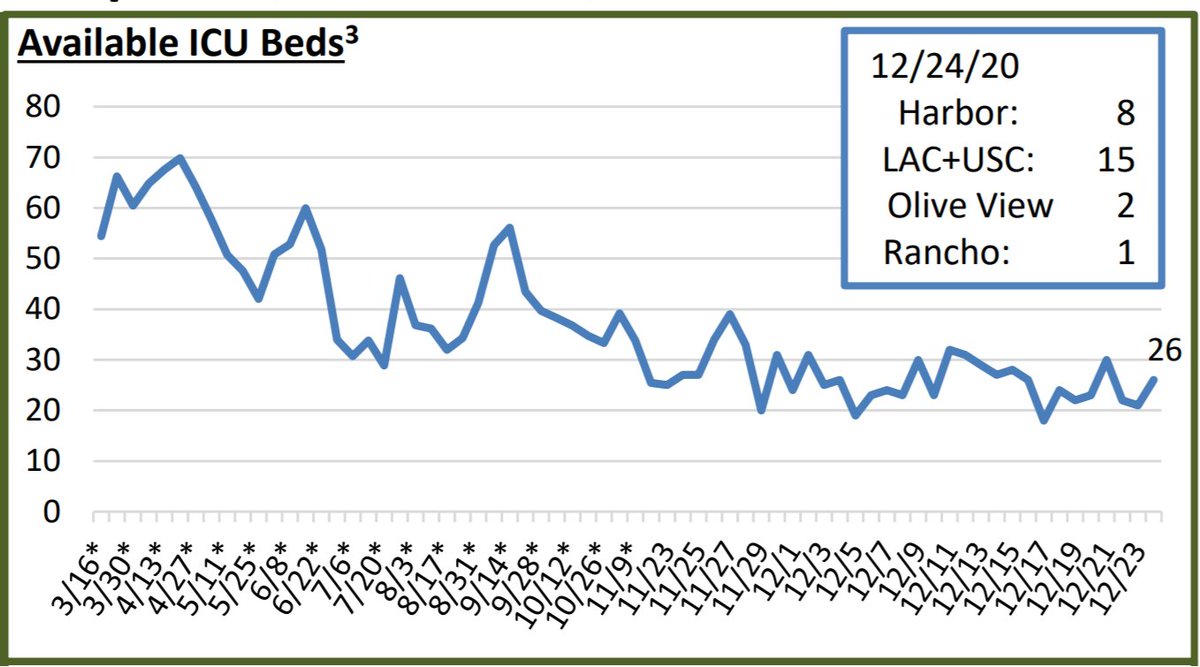
it's sort of interesting:
— el gato malo (@boriquagato) June 26, 2020
everyone is freaking out about texas hospitals except for the people who actually run texas hospitals.
this pretty much tells you everything you need to know about the panic patrol and their relationship to facts.https://t.co/4H4ocDFoCs
from the "make orwell fiction again" files:
— el gato malo (@boriquagato) October 10, 2020
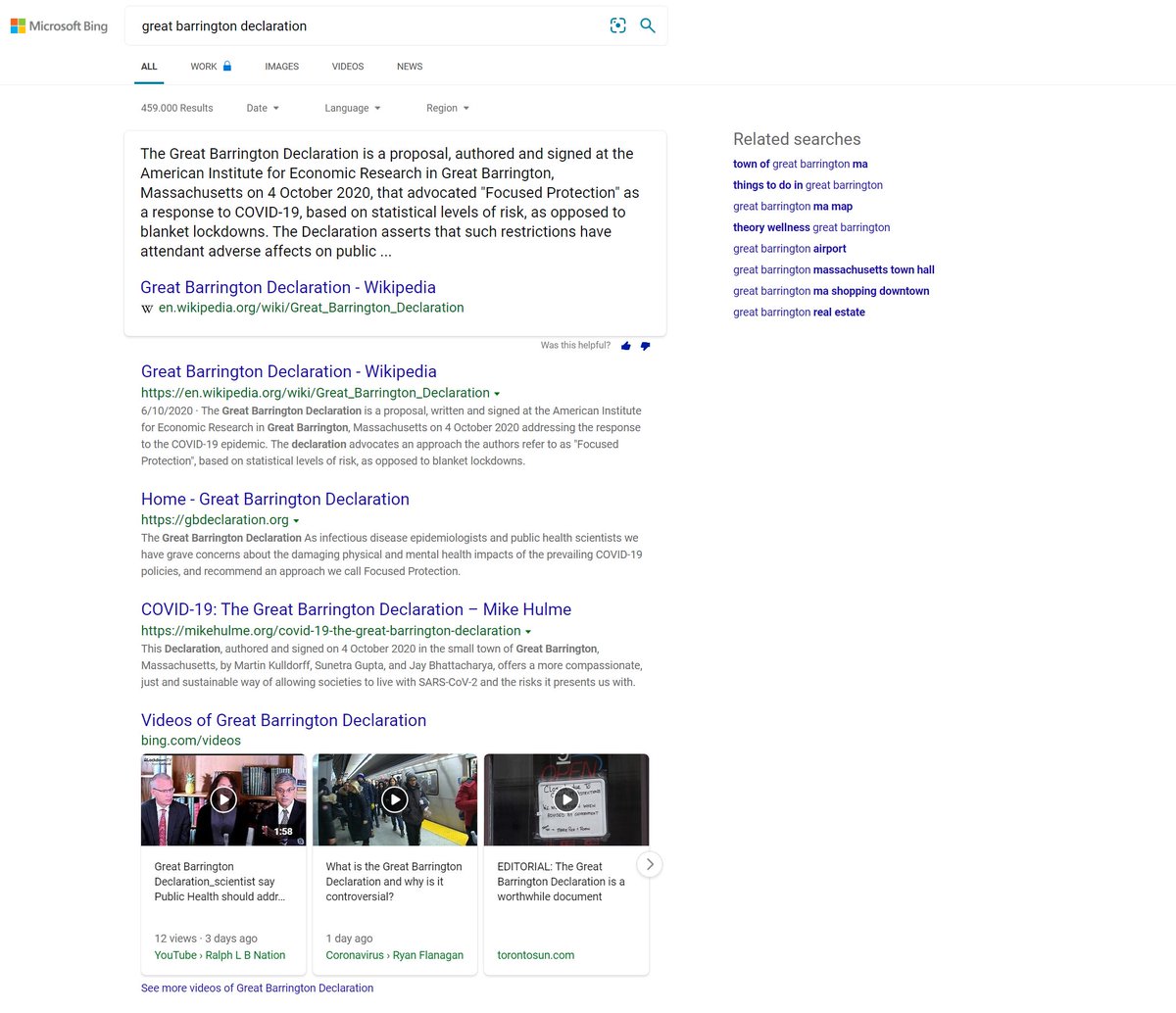
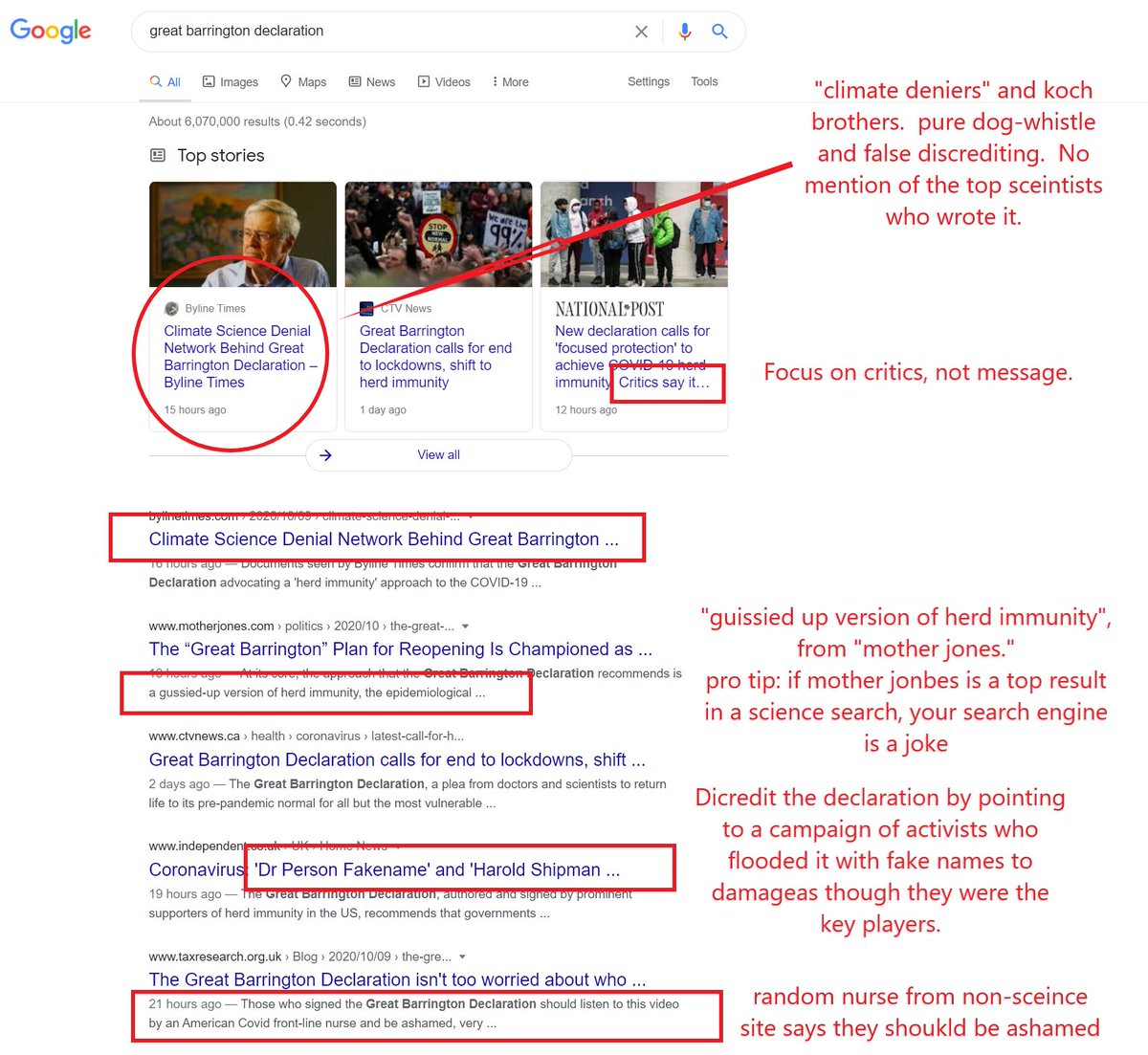
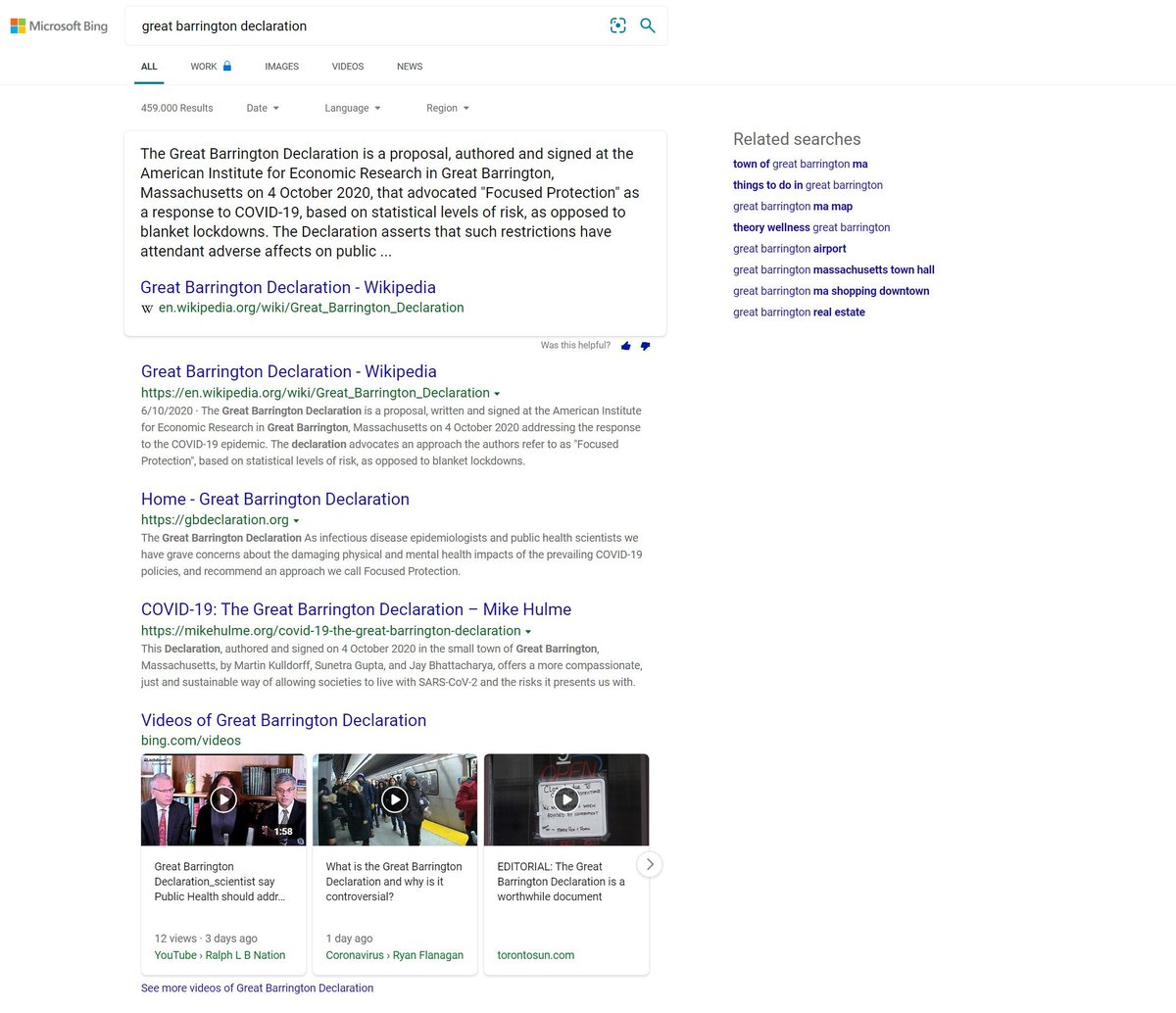
google has memory holed the great barrington declaration
not only have they wiped it from the top results, they have salted it with false claims about "climate denial"
it's pure, simple propaganda
here's bing (who plays it straight) pic.twitter.com/kTdhH8zXia
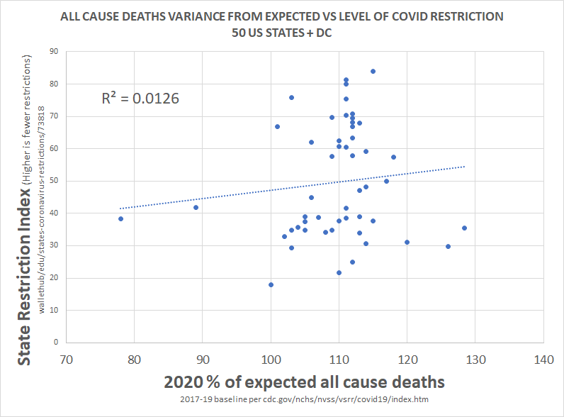
this methodology is a little complex, so let me explain what i did.
— el gato malo (@boriquagato) May 30, 2020
a few EU countries provide real day of death data. this lets us plot meaningful curves to show rate of disease change.
what struck me is how similar all the curves were.
everyone got the same shape. pic.twitter.com/bN0hILzoSl

The internet is forever. https://t.co/zxBV7rjskB
— Heidi Bachram (@HeidiBachram) February 2, 2021