
A reminder that the Texas power grid is run by the STATE. Stop blaming city or county officials for power outages.
ERCOT is the traffic manager of the electric grid which reports to the State. Neither the City nor the County controls or regulates ERCOT or the power generators. That is solely the responsibility of the State. st
— Sylvester Turner (@SylvesterTurner) February 15, 2021
Oh. Muh freedoms.
Additional sourcing: https://t.co/EmZPtl1gKq
Wind power is supplemental to help go green, not a substitute, and certainly not the core power resource.
To be fair: you can't really count on wind. But ERCOT also WASNT counting on wind much, assuming only ~6 GW would be available (currently theres 1.6 GW). They WERE counting on gas and coal plants (~70 GW of them), which have failed in a massive way: ~25-30 GW have been offline. https://t.co/fBsyhuQwC5
— JesseJenkins (@JesseJenkins) February 15, 2021
More from Society


The Nashville Operation - A Battle in the War
A thread exploring the Nashville bombing in the context of the 2020 Digital War (via SolarWinds) against the United States perpetrated by our enemies, likely China, Iran and/or Russia.

SolarWinds Hack
A digital "Pearl Harbor" moment for the United States, whoever was responsible had access to the keys to the kingdom for months during 2020, including sensitive military infrastructure. This is war!
SunGard + SolarWinds
SolarWinds software company is owned by same company that owns SunGard, which essentially provides data center services. A secure place to host internet servers with redundant power and "big pipe" data connections.
https://t.co/U3P3SrrkM1

SunGard Data Center
In Nashville, around the corner from their "big pipe" connection, AT&T. Like any data center, highly secure. Only authorized personnel can enter, and even fewer can access the actual server rooms. Backup generators are available in case of power failure.

If the SunGard hardware was being used to "host" critical command and control software related to SolarWinds, the US powers would be very interested in gaining special access keys that are stored on the hard-drives of specific servers.

A thread exploring the Nashville bombing in the context of the 2020 Digital War (via SolarWinds) against the United States perpetrated by our enemies, likely China, Iran and/or Russia.
SolarWinds Hack
A digital "Pearl Harbor" moment for the United States, whoever was responsible had access to the keys to the kingdom for months during 2020, including sensitive military infrastructure. This is war!
SunGard + SolarWinds
SolarWinds software company is owned by same company that owns SunGard, which essentially provides data center services. A secure place to host internet servers with redundant power and "big pipe" data connections.
https://t.co/U3P3SrrkM1
SunGard Data Center
In Nashville, around the corner from their "big pipe" connection, AT&T. Like any data center, highly secure. Only authorized personnel can enter, and even fewer can access the actual server rooms. Backup generators are available in case of power failure.
If the SunGard hardware was being used to "host" critical command and control software related to SolarWinds, the US powers would be very interested in gaining special access keys that are stored on the hard-drives of specific servers.


1/ A thread of comments & observations about the death of the cackling vampire Rush Limbaugh.
My first observations in the main thread are here, but this offshoot is needed because there's been so many wise & witty things I've
2/ First, re: those who in their wayward moral obtuseness feel we "can't speak ill of the dead." I've said that this is what abuse enablers say, but I hear that some religious traditions preach this. Oy.
So there's this: https://t.co/7Ky4RA3nkZ &
3/ Drucker is another great wit, and this carries the proper mood
4/ There's definitely a Jewish Tradition angle for how to treat evil people who die: the only respect is to justice, right & wrong, and above all compassion's existence necessitates condemning cruelty
5/ We're coming up on #Purim, and that's all about how to remember evil. There may be a reason, then, that I share the attitude of many other people committed to righting
My first observations in the main thread are here, but this offshoot is needed because there's been so many wise & witty things I've
37.90/ Limbaugh was a cruel hate-machine who made a fortune off hurting people. To say "don't speak ill of the dead" is the attitude of abuse enablers.
— Joshua Cypess (@JoshuaCypess) February 18, 2021
If you can't condemn a ghoul who dedicated his life to destroying society, you're part of the problem! https://t.co/ijvG2zDACH
2/ First, re: those who in their wayward moral obtuseness feel we "can't speak ill of the dead." I've said that this is what abuse enablers say, but I hear that some religious traditions preach this. Oy.
So there's this: https://t.co/7Ky4RA3nkZ &
This is how Rush's death should be honored. Let's not speak ill of the dead, let's quote Rush speaking ill of the dead.
— Sane English (@SaneEnglish) February 17, 2021
3/ Drucker is another great wit, and this carries the proper mood
It's easy to make fun of Rush Limbaugh right now, but it's important to remember that he also brought a lot of people a lot of joy by dying
— Mike Drucker (@MikeDrucker) February 17, 2021
4/ There's definitely a Jewish Tradition angle for how to treat evil people who die: the only respect is to justice, right & wrong, and above all compassion's existence necessitates condemning cruelty
It\u2019s ok\u2014essential, even\u2014to speak the truth about people who caused great harm.
— Rabbi Danya Ruttenberg (@TheRaDR) February 17, 2021
Even after their death.
5/ We're coming up on #Purim, and that's all about how to remember evil. There may be a reason, then, that I share the attitude of many other people committed to righting
today i said Jewish culture requires dancing on the graves of those who have wronged us and i picked up like 300 followers LMAO
— Erin Biba (@erinbiba) February 18, 2021
people love Jewish vengeance \U0001f923\U0001f923
wait till they hear about Purim



You May Also Like










Krugman is, of course, right about this. BUT, note that universities can do a lot to revitalize declining and rural regions.
See this thing that @lymanstoneky wrote:
And see this thing that I wrote:
And see this book that @JamesFallows wrote:
And see this other thing that I wrote:
One thing I've been noticing about responses to today's column is that many people still don't get how strong the forces behind regional divergence are, and how hard to reverse 1/ https://t.co/Ft2aH1NcQt
— Paul Krugman (@paulkrugman) November 20, 2018
See this thing that @lymanstoneky wrote:
And see this thing that I wrote:
And see this book that @JamesFallows wrote:
And see this other thing that I wrote:

The UN just voted to condemn Israel 9 times, and the rest of the world 0.
View the resolutions and voting results here:
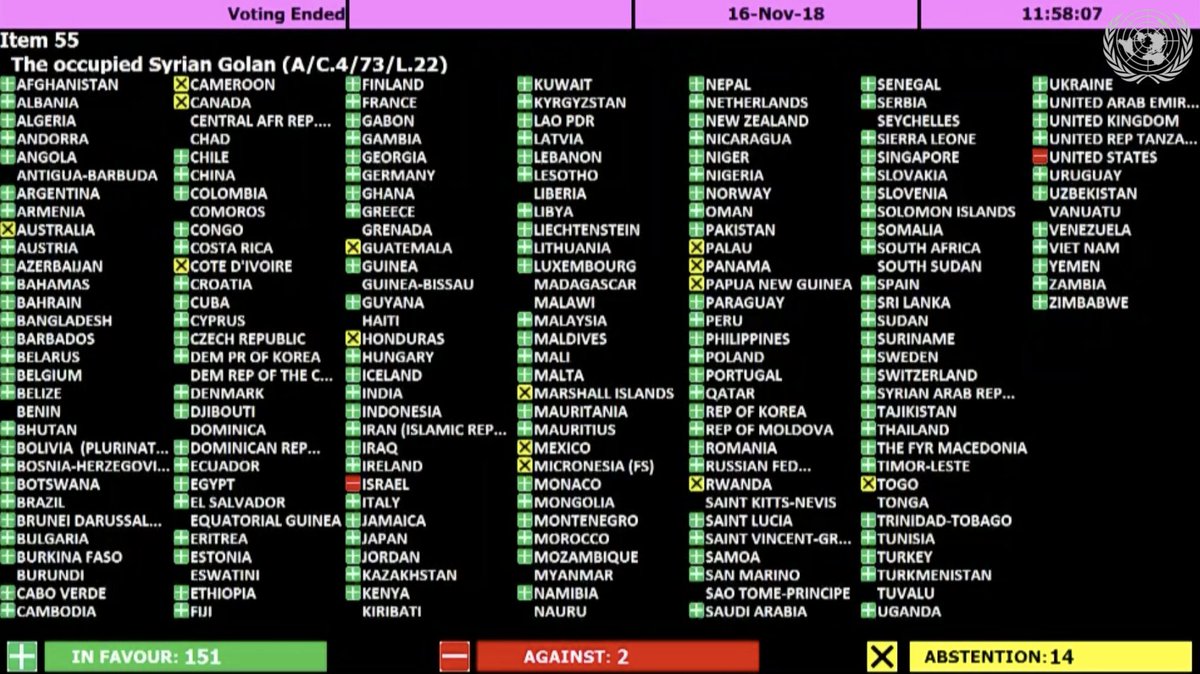
The resolution titled "The occupied Syrian Golan," which condemns Israel for "repressive measures" against Syrian citizens in the Golan Heights, was adopted by a vote of 151 - 2 - 14.
Israel and the U.S. voted 'No' https://t.co/HoO7oz0dwr
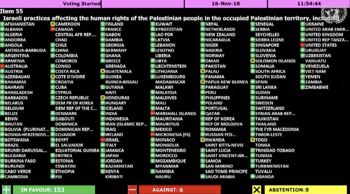
The resolution titled "Israeli practices affecting the human rights of the Palestinian people..." was adopted by a vote of 153 - 6 - 9.
Australia, Canada, Israel, Marshall Islands, Micronesia, and the U.S. voted 'No' https://t.co/1Ntpi7Vqab
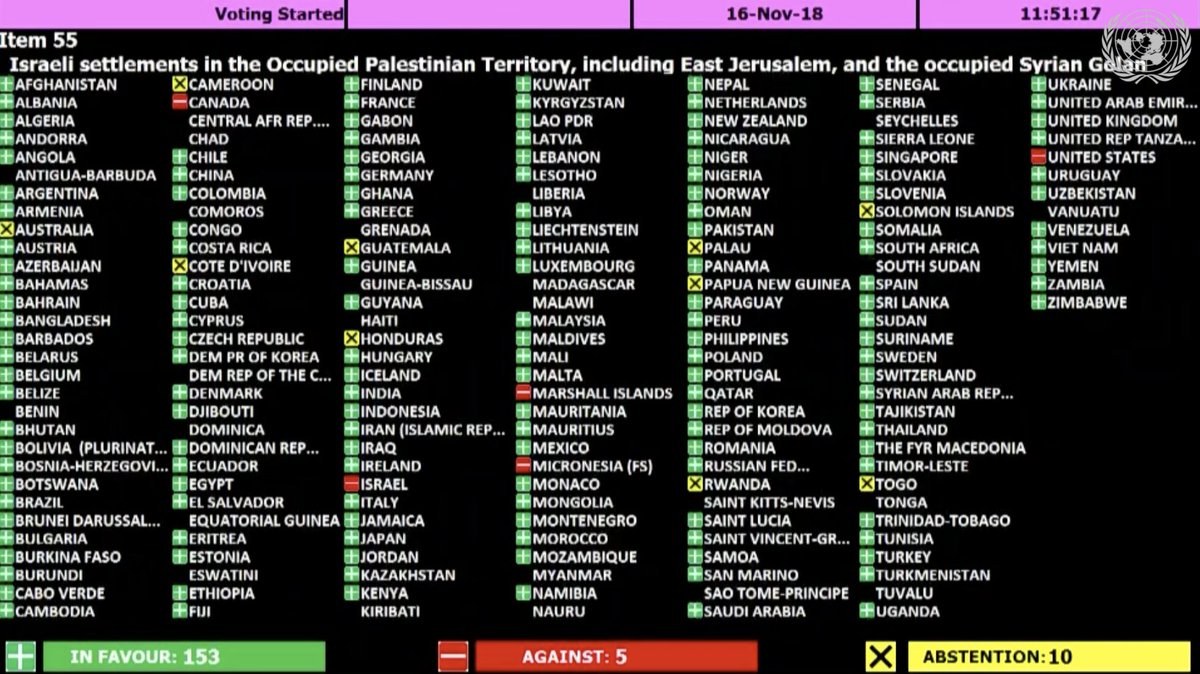
The resolution titled "Israeli settlements in the Occupied Palestinian Territory, including East Jerusalem, and the occupied Syrian Golan" was adopted by a vote of 153 – 5 – 10.
Canada, Israel, Marshall Islands, Micronesia, and the U.S. voted 'No'
https://t.co/REumYgyRuF
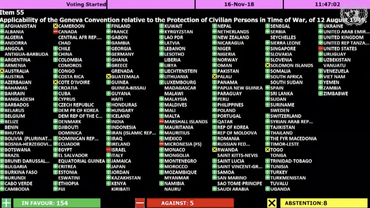
The resolution titled "Applicability of the Geneva Convention... to the
Occupied Palestinian Territory..." was adopted by a vote of 154 - 5 - 8.
Canada, Israel, Marshall Islands, Micronesia, and the U.S. voted 'No'
https://t.co/xDAeS9K1kW
View the resolutions and voting results here:
The resolution titled "The occupied Syrian Golan," which condemns Israel for "repressive measures" against Syrian citizens in the Golan Heights, was adopted by a vote of 151 - 2 - 14.
Israel and the U.S. voted 'No' https://t.co/HoO7oz0dwr
The resolution titled "Israeli practices affecting the human rights of the Palestinian people..." was adopted by a vote of 153 - 6 - 9.
Australia, Canada, Israel, Marshall Islands, Micronesia, and the U.S. voted 'No' https://t.co/1Ntpi7Vqab
The resolution titled "Israeli settlements in the Occupied Palestinian Territory, including East Jerusalem, and the occupied Syrian Golan" was adopted by a vote of 153 – 5 – 10.
Canada, Israel, Marshall Islands, Micronesia, and the U.S. voted 'No'
https://t.co/REumYgyRuF
The resolution titled "Applicability of the Geneva Convention... to the
Occupied Palestinian Territory..." was adopted by a vote of 154 - 5 - 8.
Canada, Israel, Marshall Islands, Micronesia, and the U.S. voted 'No'
https://t.co/xDAeS9K1kW