2/42 NHS trust leaders believe this disinformation is profoundly disrespectful to staff and risks reducing vital compliance with restrictions on social contact. Below is a long two part thread answering the main "NHS not unusually busy" and other NHS related disinformation.
3/42 Much of the disinformation comes from simplistic year on year percentage comparisons of data. Some types of NHS demand are flat or lower year on year. But it’s a huge distortion to argue that these individual statistics mean the NHS is not unusually busy.
4/42 For example, there ARE much lower levels of winter flu year - a global phenomenon. There ARE fewer elective operations - because of covid pressures. And there are many other examples. But there are five problems with cherry-picking/using these individual datasets.
5/42 1. They do not capture anything like the current total level of NHS demand which is very differently shaped due to COVID-19. Traditional, existing, NHS datasets were built to reflect “normal” levels of demand, “normal” operations and "normal" capacity. This isn’t normal.
6/42 2. Year on year comparisons of elements of NHS demand don't take account of NHS’s physical capacity to cope with that demand. The NHS has significantly fewer beds than it did last year (8% according to this week’s figures) due to the need to for tight infection control….
7/42 …For example, six bedded hospital bays are coming down to four bedded beds due to social distancing and infection control requirements. Wards with covid patients are unable to take non-covid patients even if they have a number of spare beds available for use.
8/42 3. Demand data also fails to take account of staff capacity. Trusts in the highest areas of covid infection have very high rates of absence – often double or triple normal rates. This means much higher levels of pressure/much greater difficulty in dealing with demand.
9/42 4. It is much more labour intensive and less "productive" to run NHS services in covid era – testing, infection control, bed management etc. BBC Hospital series captures this brilliantly. Should be viewed by anyone wanting to express public views:
https://t.co/UHHyQlRsIN.
10/42 5. Much of the data used by covid sceptics is national level data. The pressure on the NHS varies by region and individual hospital. The true scale of current “never seen it before” pressure in London, SE and East of England only fully shows up in data at these levels…
11/42 …And it's important to recognise that pressure is now rising significantly and rapidly beyond London, South East and East of England. This is no longer a story about these three regions. EG SW, NW and Midlands now under major, rapidly rising, pressure.
12/42 Even when you put demand and capacity data together and try to use traditional NHS datasets, you can often still get a very misleading picture. Three examples. Example 1. This week’s data shows total bed occupancy data for last week (87%) lower than last year’s (94%).
13/42 This bed occupancy data will include hastily created, temporary, extra beds, distorting figures. It also takes no account of staffing availability levels. For example any temporarily created extra beds will not have had extra staff attached, adding to staff pressure.
14/42 Year on year percentage comparisons in this context also rapidly become meaningless, not least because the baselines are so dissimilar. Last year's bed base & demand pattern different to this year's. Like trying to compare apples from one year with pears from the next.
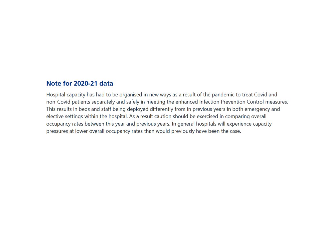
15/42 Hence this NHS England website warning on occupancy data: hospitals are organised in new ways and will experience capacity pressure at lower occupancy levels than before. Or as one CEO put it to me very recently: “last year’s 85% bed occupancy translates to 95%+ this year”.
16/42 Example 2. Intensive Care (ICU) capacity, which sceptics have continually quoted. This week’s data showed adult national ICU occupancy for early January at 79.5%, lower than last year’s 82.4%. But there are different ways of measuring critical care capacity.
17/42 If a hospital has 9 of its 10 ICU beds full, it’ll report 90% occupancy. If it temporarily doubles its ICU capacity to 20 beds (an amazing and highly unusual feat but happening a lot now) and has 3 of those beds to fill it’ll report 85% occupancy (17 beds from 20).
18/42 The key is to measure occupancy against baseline capacity which the traditional dataset doesn’t. See this helpful Intensive Care Society document:
https://t.co/t8IsZ7RMJe. Occupancy vs baseline is obviously a much more accurate assessment of how pressured ICU capacity is.
19/42 And surprise, surprise, this is what the evidence shows. See this
@HSJnews story -
https://t.co/cPQHdpgt7q. Table shows very large number of hospitals in the South East running at over 100% baseline capacity last week. A lot at/above 150% and some at/above 200%.
20/42 And there was huge pressure in the West Midlands too.
https://t.co/mJXGz6P5YW. Using lower year on year national level ICU bed occupancy figures to say that the NHS is not unusually busy compared to previous years is a huge distortion.....or just plain wrong.
21/42 Example 3. Ambulance service metrics are another example of these dangers. 9% fewer patients being conveyed to hospital by ambulance compared to last year. But given hospital pressures, ambulances currently doing all they can to minimise conveyances to hospital….
22/42 …And most other ambulance metrics, particularly operational real time statistics in areas of highest demand, are showing huge pressure. Despite amazing work from staff in really difficult circumstances. See this:
https://t.co/sPPRDHd91t and this:
https://t.co/qplRwRKP05.
23/42 Basic message: trying to use simplistic year on year comparisons with traditional NHS datasets to measure the current situation is fraught with danger. They will, as often as not, give a distorted and inaccurate under-estimate of how busy the NHS is.
24/42 Sceptics argue that the NHS should make more data available but this is impossible at this point. Nationally reported data rightly requires robust, audited, processes that we don’t have time to set up. Frontline staff/managers need to focus on treating patients.
25/42 Part one of this very long thread now complete. Part two can be found here:
https://t.co/QpKT3Ck3Zl