Let's review the ambitious labyrinthian design of Mothership's Gradient Descent, a 64-page mega-dungeon with a half-letter (5.5 × 8.5'') format.

This is gonna be a long one, so I'll experiment and break this review into multiple threads. This one will be about graphic design.

Mothership is a lived-in universe. No matter the particular brand of sci-fi you bring to your table, the books imply a grimy, sweat-soaked space made of pig iron and leaky hoses.

Of all the Mothership products, Gradient Descent is the truest expression of that.
Exhibit A: Textures

For example, the pages look like Sean McCoy didn't design the book so much as found it wedged behind IBM terminals tasked with MKUltra—and then faxed it to himself.

Every page has this weathered look deliberately placed where it would exist in real life.
Before I was a copywriter, I crawled inside furnaces in manufacturing, and strung from the catwalks over centrifuges and die toolings were books like this.

Cobbled together, photocopied, faxed, stomped out, squeegeed dry, and faxed-again manuals.

This design speaks to my soul.
If Gradient Descent were a handout, the graphic design would be perfect. Atmospheric. It feels more discovered than constructed.

But as a gm article, it fights itself on usability, economy, and storytelling, which I'll explain further in parts.
Exhibit B: Maps

I don't know why I haven't seen this before. These maps abstract like a point crawl but look like the schemata to machinery or electronics. They're incredibly evocative, and something I *will* steal.

And here's why I love this innovation: it scales.
An isometric mega-dungeon for GD would have been prohibitively expensive, but more importantly, it would have run headfirst into the gauntlet of mapping hard science fiction.

Disproportionate scales. Non-humanist architecture. And no "correct" orientation because of zero-g.
To create Gradient Descent's map of "The Deep" with its colossal factory chambers and claustrophobic human-scale rooms, the team was going to need a tool.

This is the invention of that necessity.

It's like a point-crawl + map + Melan diagram.
One of the highlights of Gradient Descent's mapping is how it uses graphic design to tell you more information at a glance. For example, bold boxes symbolize scale while color shows us how they're illuminated.
These schemata-maps are a lot easier to reference and comprehend for this genre than traditional isometric maps.

And yet, they're still hard to use. The world map of "The Deep" in Gradient Descent is more like a shock-and-awe visual than an actual place to go to for reference.
In the book, the Gradient Descent map is broken into different thematic sections (this is good), but those maps are small, and their placement within chapters inconsistent (not so good.)

Sometimes they're at the start of a spread. Sometimes they're at the end.
These abstracted maps are still arranged in the dungeon's general shape, too, which means Gradient Descent sometimes feels like it has 4D Rubik's cubes for maps on its pages.

Either further abstraction is necessary, or the written dungeon needs to be pared down.
To add to the usability problems, the mini-maps don't have a key. This means you'll have to do a lot of flipping to the "how to use this module" section before you're fluent.

It's not a deal-breaker, space is limited, after all, but it's another burden on the Warden
Exhibit C: Color

GD wields its color palette like a multitool to communicate important information on the page while trimming entire pages from its manuscript.

And because the palette is limited, it's not overwhelming to remember.
Dark backgrounds indicate rooms on the page are not lit. Light pages indicate the exact opposite. Different colors on the "rumor" table indicate its source.

And red almost always means danger. The only exception: the main villain—the physical manifestation of danger.
To conclude this thread about Gradient Descent's graphic design: it's complicated.

There are lots of great re-inventions here. I've seen some form of these scattered across hundreds of RPG products, but I rarely see them in one product.

The result is somewhat Icarus-ian.
In the next thread, we'll talk about the layout, typography, and the creative concept of Gradient Descent. All of it leads to a greater conversation about Mothership as a whole.

Until then, RPG graphic design nerds: buy it and learn from it. https://t.co/7SZ8iZGm1s

More from Culture

One of the authors of the Policy Exchange report on academic free speech thinks it is "ridiculous" to expect him to accurately portray an incident at Cardiff University in his study, both in the reporting and in a question put to a student sample.


Here is the incident Kaufmann incorporated into his study, as told by a Cardiff professor who was there. As you can see, the incident involved the university intervening to *uphold* free speech principles:


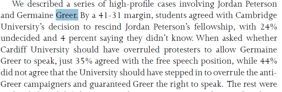
Here is the first mention of the Greer at Cardiff incident in Kaufmann's report. It refers to the "concrete case" of the "no-platforming of Germaine Greer". Any reasonable reader would assume that refers to an incident of no-platforming instead of its opposite.


Here is the next mention of Greer in the report. The text asks whether the University "should have overruled protestors" and "stepped in...and guaranteed Greer the right to speak". Again the strong implication is that this did not happen and Greer was "no platformed".


The authors could easily have added a footnote at this point explaining what actually happened in Cardiff. They did not.
Best books I read in 2020

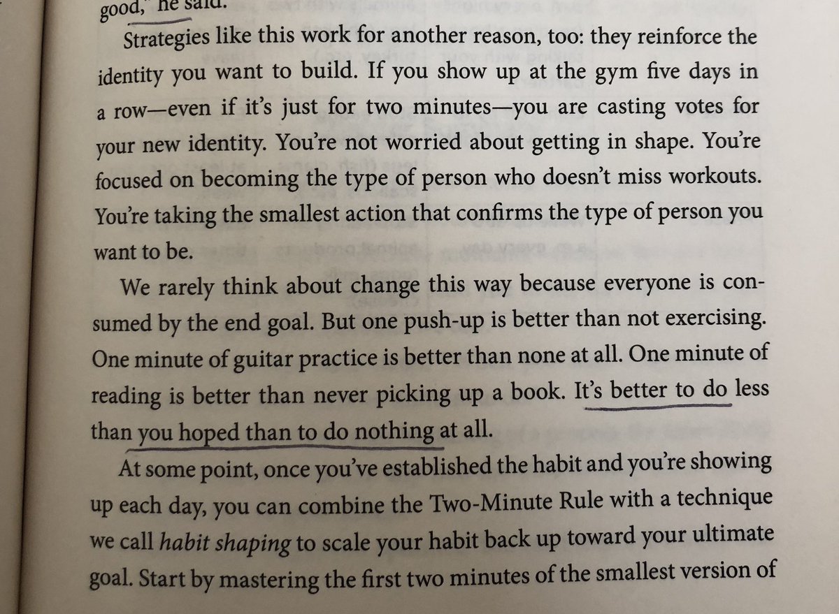
1. Atomic Habits by @JamesClear

“If you show up at the gym 5 days in a row—even for 2 minutes—you're casting votes for your new identity. You’re not worried about getting in shape. Youre focused on becoming the type of person who doesn’t miss workouts”


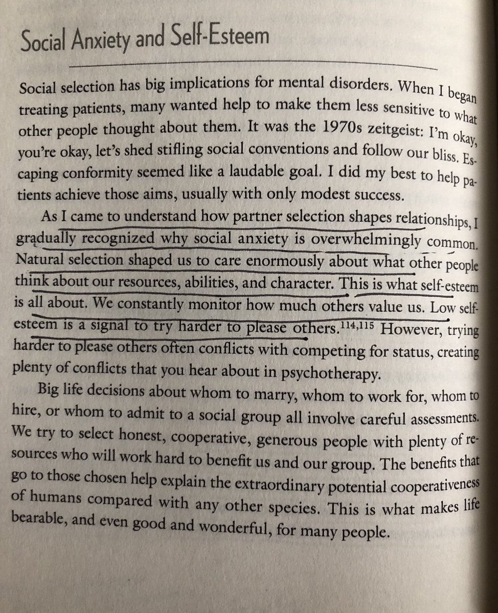
Good Reasons for Bad Feelings

https://t.co/KZDqte19nG

2. “social anxiety is overwhelmingly common. Natural selection shaped us to care enormously what other people think..We constantly monitor how much others value us..Low self-esteem is a signal to try harder to please others”


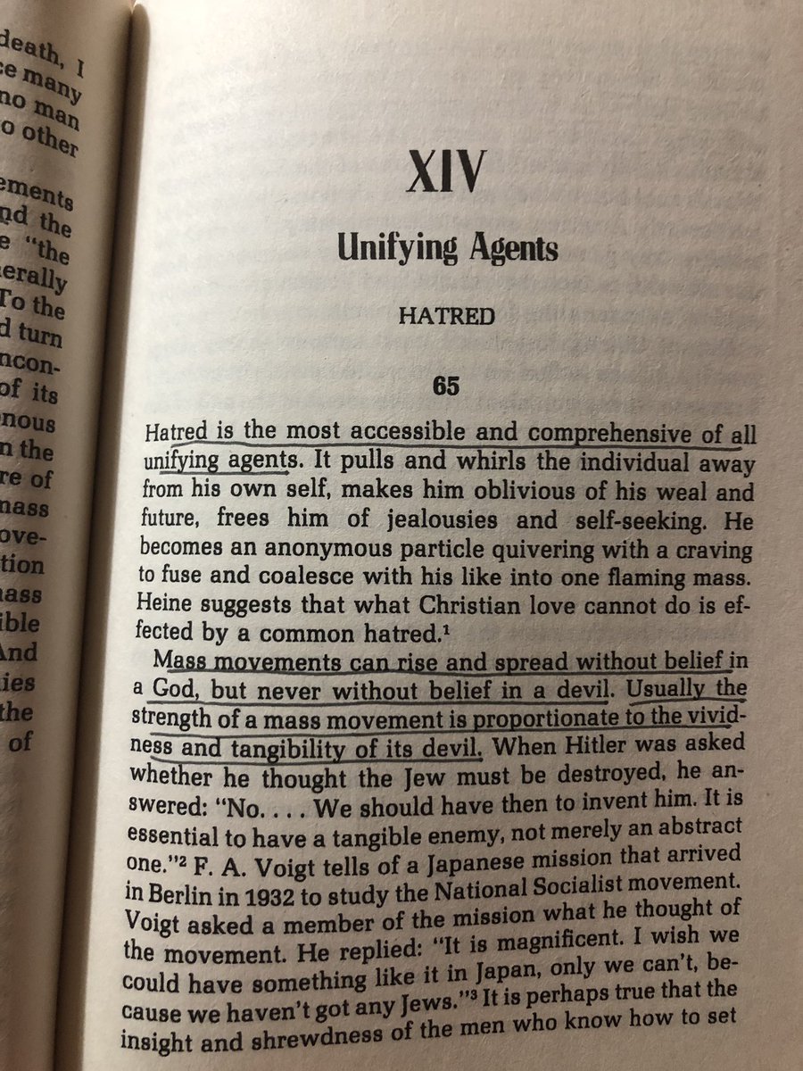
The True Believer by Eric Hoffer

https://t.co/uZT4kdhzvZ

“Hatred is the most accessible and comprehensive of all unifying agents...Mass movements can rise and spread without belief in a God, but never without a believe in a devil.”


Grandstanding

https://t.co/4Of58AZUj8

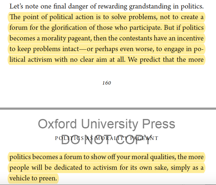
"if politics becomes a morality pageant, then the contestants have an incentive to keep problems intact...politics becomes a forum to show off moral qualities...people will be dedicated to activism for its own sake, as a vehicle to preen"


Warriors and Worriers by Joyce Benenson

https://t.co/yLC4eGHEd4

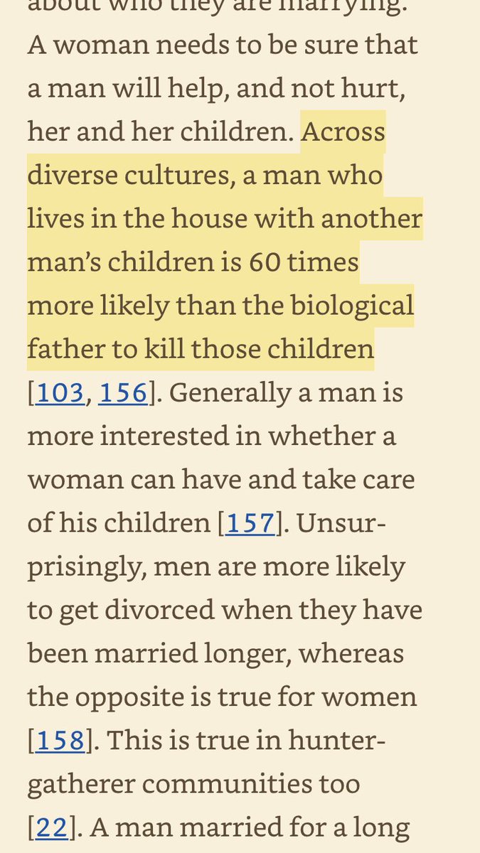
“Across diverse cultures, a man who lives in the house with another man’s children is about 60 times more likely than the biological father to kill those children.”

You May Also Like

🌿𝑻𝒉𝒆 𝒔𝒕𝒐𝒓𝒚 𝒐𝒇 𝒂 𝑺𝒕𝒂𝒓 : 𝑫𝒉𝒓𝒖𝒗𝒂 & 𝑽𝒊𝒔𝒉𝒏𝒖

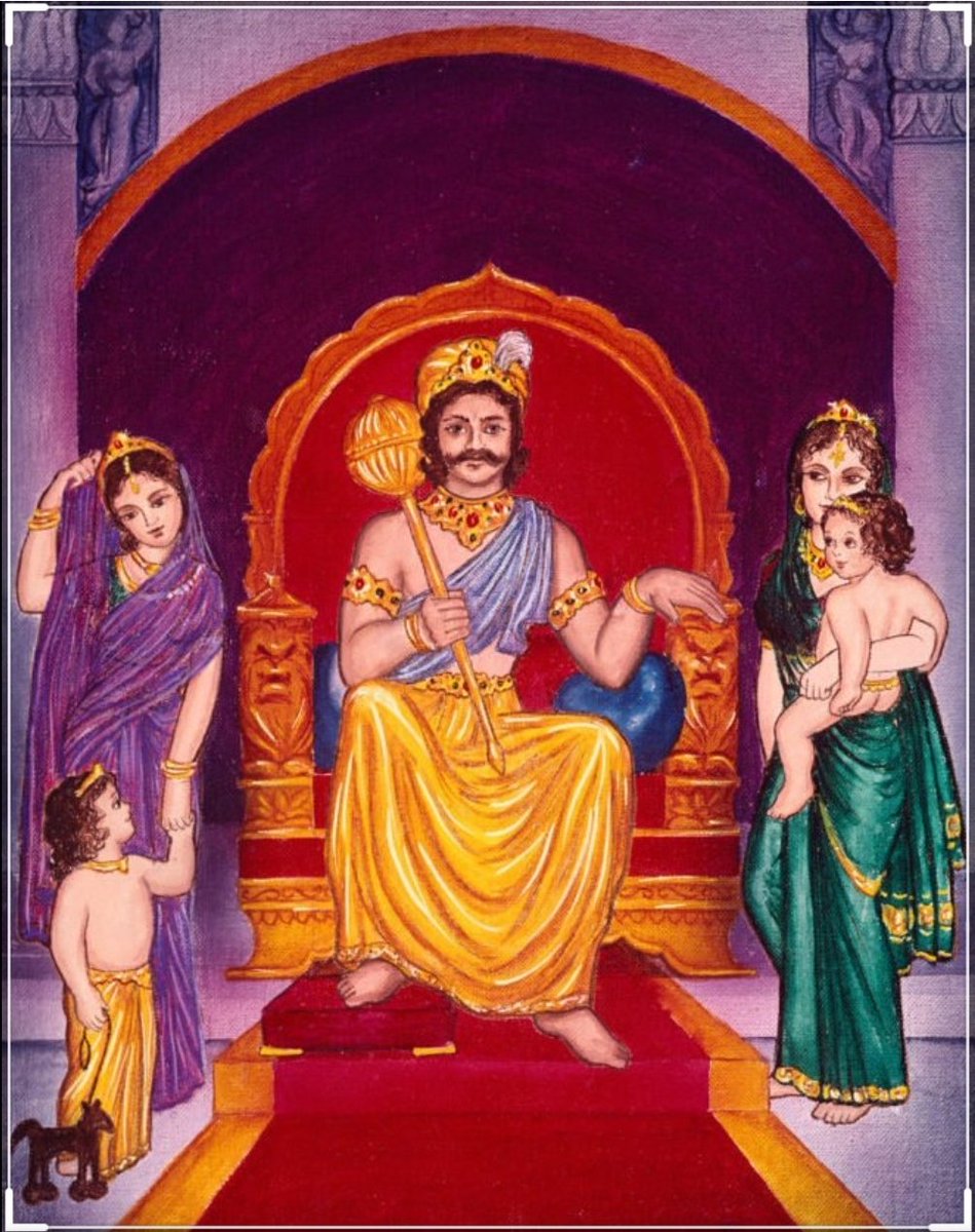
Once upon a time there was a Raja named Uttānapāda born of Svayambhuva Manu,1st man on earth.He had 2 beautiful wives - Suniti & Suruchi & two sons were born of them Dhruva & Uttama respectively.
#talesofkrishna https://t.co/E85MTPkF9W


Now Suniti was the daughter of a tribal chief while Suruchi was the daughter of a rich king. Hence Suruchi was always favored the most by Raja while Suniti was ignored. But while Suniti was gentle & kind hearted by nature Suruchi was venomous inside.
#KrishnaLeela


The story is of a time when ideally the eldest son of the king becomes the heir to the throne. Hence the sinhasan of the Raja belonged to Dhruva.This is why Suruchi who was the 2nd wife nourished poison in her heart for Dhruva as she knew her son will never get the throne.


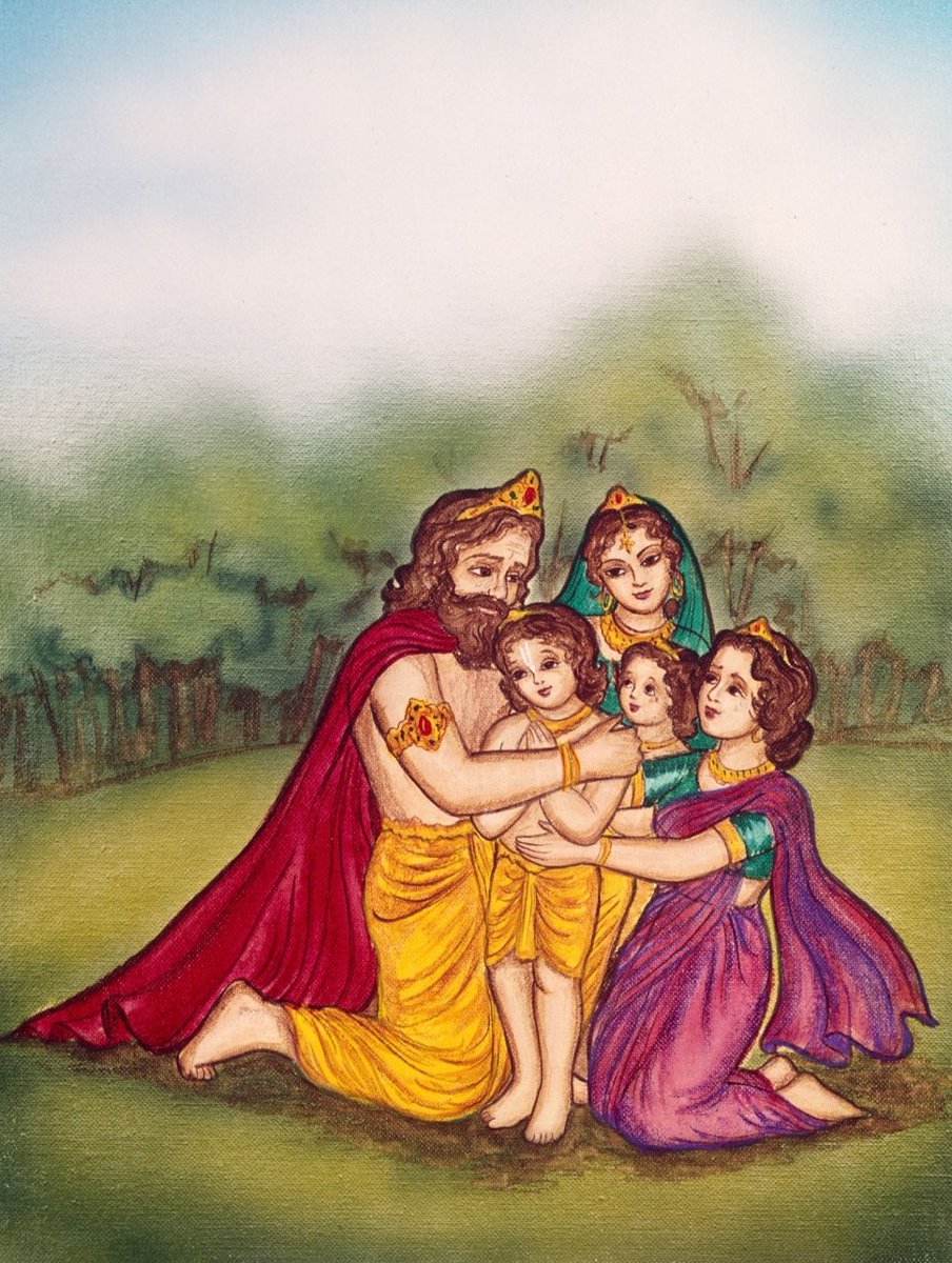
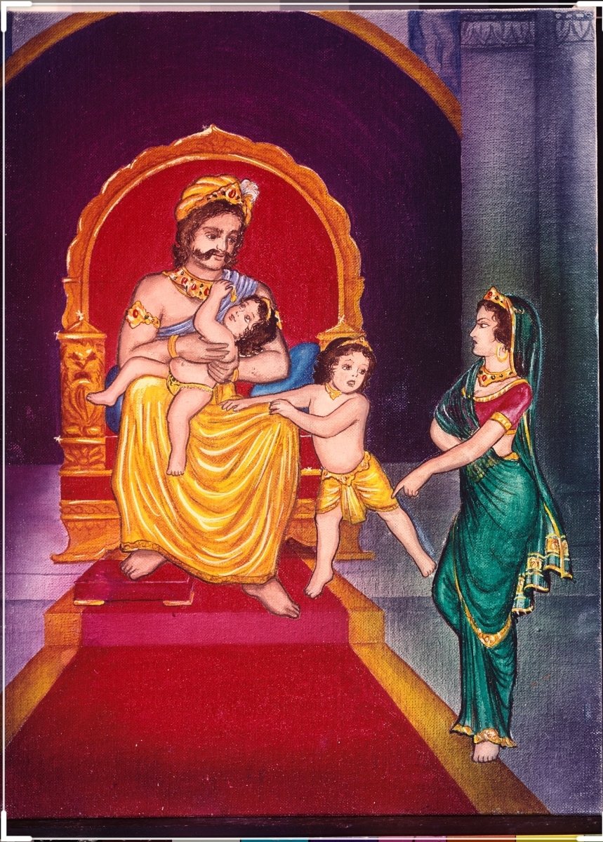
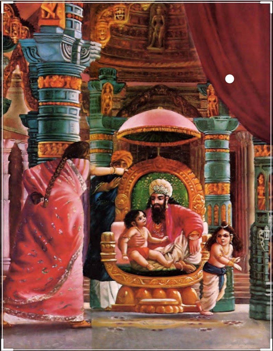
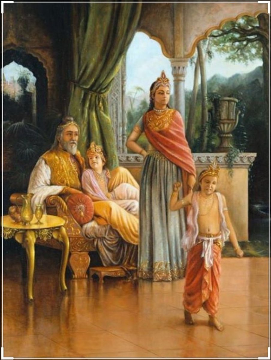
One day when Dhruva was just 5 years old he went on to sit on his father's lap. Suruchi, the jealous queen, got enraged and shoved him away from Raja as she never wanted Raja to shower Dhruva with his fatherly affection.


Dhruva protested questioning his step mother "why can't i sit on my own father's lap?" A furious Suruchi berated him saying "only God can allow him that privilege. Go ask him"
I just finished Eric Adler's The Battle of the Classics, and wanted to say something about Joel Christiansen's review linked below. I am not sure what motivates the review (I speculate a bit below), but it gives a very misleading impression of the book. 1/x


The meat of the criticism is that the history Adler gives is insufficiently critical. Adler describes a few figures who had a great influence on how the modern US university was formed. It's certainly critical: it focuses on the social Darwinism of these figures. 2/x

Other insinuations and suggestions in the review seem wildly off the mark, distorted, or inappropriate-- for example, that the book is clickbaity (it is scholarly) or conservative (hardly) or connected to the events at the Capitol (give me a break). 3/x

The core question: in what sense is classics inherently racist? Classics is old. On Adler's account, it begins in ancient Rome and is revived in the Renaissance. Slavery (Christiansen's primary concern) is also very old. Let's say classics is an education for slaveowners. 4/x

It's worth remembering that literacy itself is elite throughout most of this history. Literacy is, then, also the education of slaveowners. We can honor oral and musical traditions without denying that literacy is, generally, good. 5/x