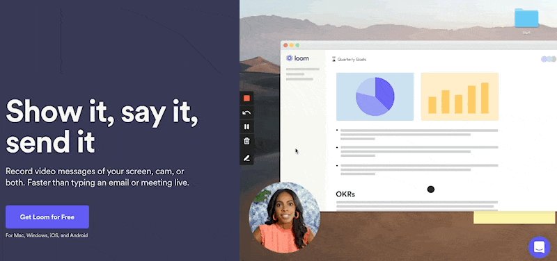
Tip:
Product GIFs are your best friend.
Explanation:
If you have a SaaS or DTC product, show don't tell. Give us action shots.
Example:
@loom
Tip:
Make the H1 count.
Explanation:
Your H1 is the first (and most prominent) element we see right away. That first line of text is the difference between hooking them and losing them.
Example:
@savvycal_
Tip:
Don’t be clever, be clear.
Explanation:
Those great puns you thought about for your headers? They probably won't convert well. Keep it super simple.
Example:
@veedstudio
Tip:
Inject social proof in your copy.
Explanation:
Social proof isn't just logos. Find ways to showcase your success in the page copy.
Example:
@ActiveCampaign
Tip:
Only use imagery that moves the story along.
Explanation:
If your product only needs words to describe it, don't use imagery "just because." Imagery should improve understanding.
Example:
@wynter_com
Tip:
Increase site speed ASAP.
Explanation:
Speed can make or break a web experience. Use Pagespeed Insights to find opportunities for your site.
Tip:
Video social proof wins.
Explanation:
Testimonials are good. Video testimonials are next-level. They up your credibility and boost buyer confidence.
Example:
https://t.co/8VglGBmqRc
Tip:
Make it about the user.
Explanation:
Don't talk about the brand. Talk about the user. Make the whole page copy and design cater to them.
Example:
@whereby
Tip:
1 CTA only (if possible.)
Explanation:
Limit CTAs to the bare minimum. The more actions you invite others to take, the fewer actions they will take.
Example:
@gumroad
Tip:
Make it interactive.
Explanation:
Interactive elements work wonders. Use the features of your app in the design of the page to increase understanding.
Example:
@JoinToucan
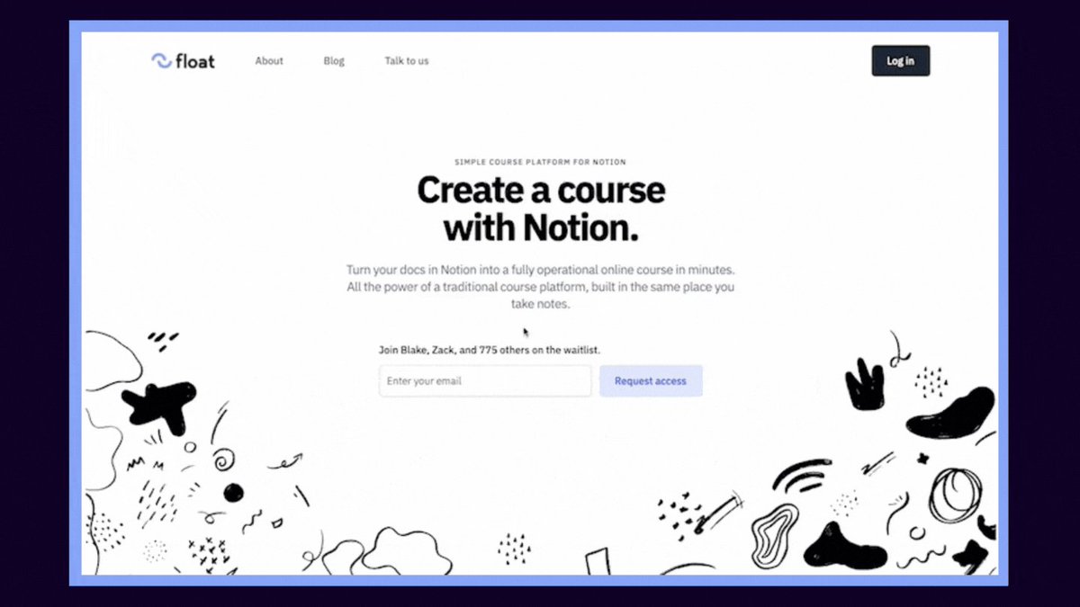
Tip:
Keep the home page focused.
Explanation:
Your home page is NOT your “everything” page. You shouldn't have all features, blogs, white papers, etc. on the home page.
Example:
@figmadesign
Tip:
Keep the overall design simple.
Explanation:
Extra elements distract from the core purpose. The more you have on a page, the harder it is to maintain focus.
Example:
@NotionHQ
Tip:
No buzzwords, just value props.
Explanation:
Avoid fluffy buzzwords. Get to the point. Explain the benefits early, often, and clearly.
Example:
@mailbrew
Tip:
Create an ideal above the fold (ATF.)
Explanation:
Menu, H1, Subheader, Button, and a tiny bit of social proof should all fit above the fold.
Example:
@CleanShot
Tip:
CTAs should do exactly what they say.
Explanation:
Don't get cute or clever with button copy. Don't be vague. Tell people exactly what happens when they click it.
Example:
@super_
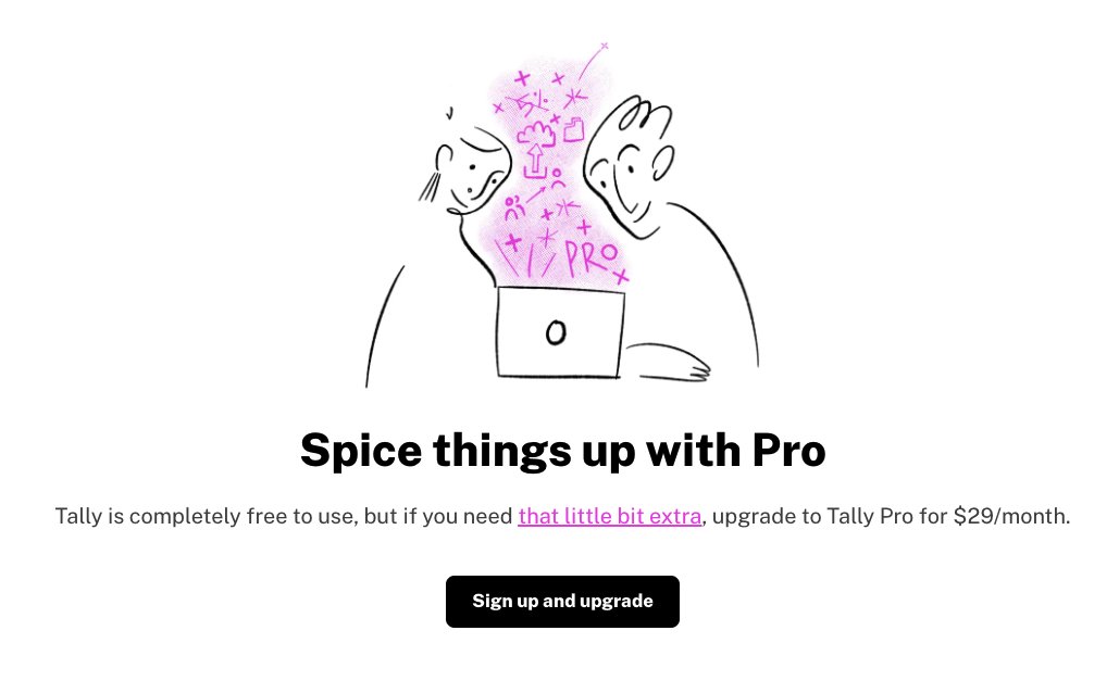
Tip:
Make your pricing easily accessible.
Explanation:
Don't hide pricing. Put it on a pricing page or the home page. Don't make people waste their time looking for valuable info.
Example:
@TallyForms
Tip:
Delight with micro-interactions.
Explanation:
Those subtle animations can make the experience of browsing a site more pleasant. It can put the user in a better mood and make them feel happier than before.
Example:
@sayfloat
That's all folks!
If you enjoyed this, please:
1. Retweet the first tweet
2. Follow me
@heyblake for more
P.S. I'm giving away 1 free year of
@copy_ai to a random person that retweets this!