Victory for journalists, press freedom after tribunal finds there is no reason to bar people from using the UK's freedom of information act simply because they are not in the UK. @SMaurizi @estelledehon @EmmanFre @benjameslucas
More from Government


The Government is making the same mistakes as it did in the first wave. Except with knowledge.
A thread.
The Government's strategy at the beginning of the pandemic was to 'cocoon' the vulnerable (e.g. those in care homes). This was a 'herd immunity' strategy. This interview is from
This strategy failed. It is impossible to 'cocoon' the vulnerable, as Covid is passed from younger people to older, more vulnerable people.
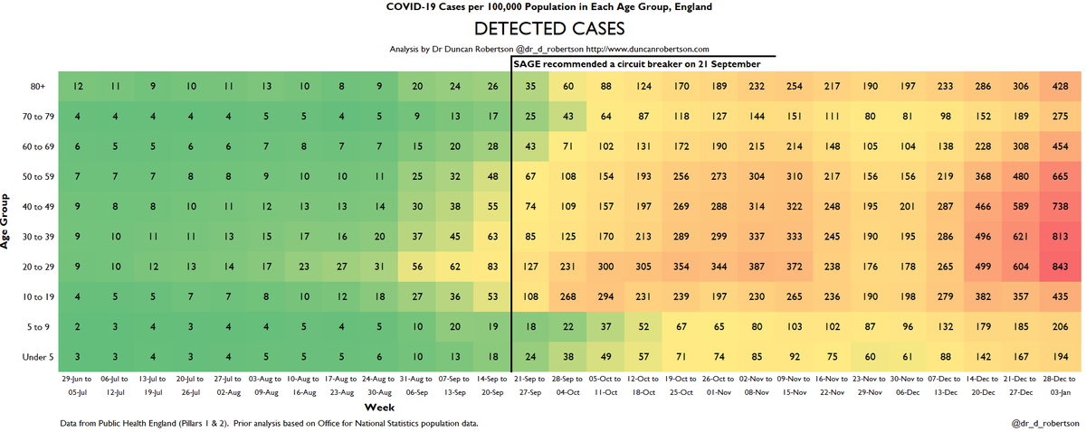
We can see this playing out through heatmaps. e.g. these heatmaps from the second
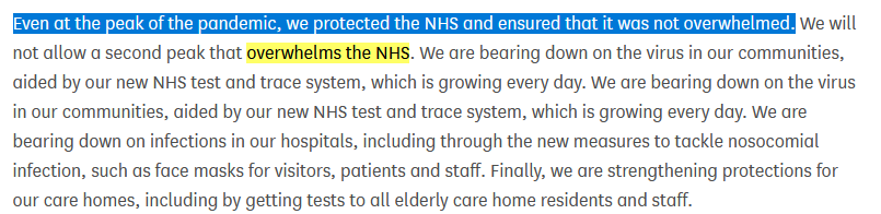
The Government then decided to change its strategy to 'preventing a second wave that overwhelms the NHS'. This was announced on 8 June in Parliament.
This is not the same as 'preventing a second wave'.
https://t.co/DPWiJbCKRm
The Academy of Medical Scientists published a report on 14 July 'Preparing for a Challenging Winter' commissioned by the Chief Scientific Adviser that set out what needed to be done in order to prevent a catastrophe over the winter
A thread.
The Government's strategy at the beginning of the pandemic was to 'cocoon' the vulnerable (e.g. those in care homes). This was a 'herd immunity' strategy. This interview is from
Government #coronavirus science advisor Dr David Halpern tells me of plans to \u2018cocoon\u2019 vulnerable groups. pic.twitter.com/dhECJNbmnI
— Mark Easton (@BBCMarkEaston) March 11, 2020
This strategy failed. It is impossible to 'cocoon' the vulnerable, as Covid is passed from younger people to older, more vulnerable people.
We can see this playing out through heatmaps. e.g. these heatmaps from the second
Here are the heatmaps for Covid detected cases, positivity, hospitalizations, and ICU admissions. This is for the week to 3 January 2021.
— Dr Duncan Robertson (@Dr_D_Robertson) January 7, 2021
I have marked a line on 21 September, when SAGE recommended a circuit breaker, so you can see how the situation has deteriorated since then. pic.twitter.com/SEEVgUVK4j
The Government then decided to change its strategy to 'preventing a second wave that overwhelms the NHS'. This was announced on 8 June in Parliament.
This is not the same as 'preventing a second wave'.
https://t.co/DPWiJbCKRm
The Academy of Medical Scientists published a report on 14 July 'Preparing for a Challenging Winter' commissioned by the Chief Scientific Adviser that set out what needed to be done in order to prevent a catastrophe over the winter
One thing civil servants learn is to write things down. Here is @acadmedsci's 14 July report commissioned by @uksciencechief. For the record.
— Dr Duncan Robertson (@Dr_D_Robertson) September 17, 2020



You May Also Like



1/Politics thread time.
To me, the most important aspect of the 2018 midterms wasn't even about partisan control, but about democracy and voting rights. That's the real battle.
2/The good news: It's now an issue that everyone's talking about, and that everyone cares about.
3/More good news: Florida's proposition to give felons voting rights won. But it didn't just win - it won with substantial support from Republican voters.
That suggests there is still SOME grassroots support for democracy that transcends
4/Yet more good news: Michigan made it easier to vote. Again, by plebiscite, showing broad support for voting rights as an
5/OK, now the bad news.
We seem to have accepted electoral dysfunction in Florida as a permanent thing. The 2000 election has never really
To me, the most important aspect of the 2018 midterms wasn't even about partisan control, but about democracy and voting rights. That's the real battle.
2/The good news: It's now an issue that everyone's talking about, and that everyone cares about.
3/More good news: Florida's proposition to give felons voting rights won. But it didn't just win - it won with substantial support from Republican voters.
That suggests there is still SOME grassroots support for democracy that transcends
4/Yet more good news: Michigan made it easier to vote. Again, by plebiscite, showing broad support for voting rights as an
5/OK, now the bad news.
We seem to have accepted electoral dysfunction in Florida as a permanent thing. The 2000 election has never really
Bad ballot design led to a lot of undervotes for Bill Nelson in Broward Co., possibly even enough to cost him his Senate seat. They do appear to be real undervotes, though, instead of tabulation errors. He doesn't really seem to have a path to victory. https://t.co/utUhY2KTaR
— Nate Silver (@NateSilver538) November 16, 2018