It was great to talk about reproducible workflows for @riotscienceclub @riotscience_wlv. You can watch the recording below, but if you don't want to listen to me talk for 40 minutes, I thought I would summarise my talk in a thread:
Thank you again @JamesEBartlett for a fantastic talk (with a really nice personal touch) on reproducible workflows!
— RIOT Science Club Wolverhampton (@riotscience_wlv) February 16, 2021
Thanks especially for the co-leads @IMLahart for co-hosting and @DrManiBhogal for nabbing James!
Slides: https://t.co/CNqxzOhch1
Video: https://t.co/YjHEHuRJlz

Why are lunch breaks important for #code?
— Dr Rebecca Hirst (@HirstRj) February 11, 2021
If you can't remember what your variable names refer to after lunch, you sure as hell won't remember in 3 months.


More from Science


"The new answer to a 77-year-old problem"
😭
https://t.co/hm9NoaU4nr
https://t.co/8fKDiKjSWc
https://t.co/jkaicC1F2x
https://t.co/PpxWT4Jef4
😭
The new answer to a 77-year-old problem in data analysis, published today in @naturemethods. Instead of significance tests, use estimation graphics. Our software suite DABEST makes it easy for everyone to visualize effect sizes.https://t.co/UzwXJ7EUC5 pic.twitter.com/VtxyY0xaRM
— Adam Claridge-Chang (@adamcchang) June 19, 2019
https://t.co/hm9NoaU4nr
Open letter to journal editors: dynamite plots must die. Dynamite plots, also known as bar and line graphs, hide important information. Editors should require authors to show readers the data and avoid these plots. https://t.co/0GNKEIUCJL pic.twitter.com/OS9ytEFRZN
— Rafael Irizarry (@rafalab) February 22, 2019
https://t.co/8fKDiKjSWc
Couldn't find D3 code for grouped horisontal box plots that show data points so I made this @mbostock @thisisalfie https://t.co/cQjDPhyZdw pic.twitter.com/y6RNmDB2p3
— Ulrik Lyngs (@ulyngs) June 28, 2017
https://t.co/jkaicC1F2x
made a pkg for pirate plots in ggplot: add any of points/means/bars/CIs/violins \u2013 better than ye olde bar/box plotshttps://t.co/Z2m2kW3hsl pic.twitter.com/npAirPQexM
— Mika Braginsky (@mbraginsky) September 28, 2017
https://t.co/PpxWT4Jef4
See the new #PowerBI visual awesomeness for data points & sources, box-&-whisker plots! https://t.co/dOmgoxWfDE pic.twitter.com/HAUOAMJEJW
— Microsoft Power BI (@MSPowerBI) February 1, 2016
You May Also Like


To people who are under the impression that you can get rich quickly by working on an app, here are the stats for https://t.co/az8F12pf02
📈 ~12000 vistis
☑️ 109 transactions
💰 353€ profit (285 after tax)
I have spent 1.5 months on this app. You can make more $ in 2 days.
🤷♂️

I'm still happy that I launched a paid app bcs it involved extra work:
- backend for processing payments (+ permissions, webhooks, etc)
- integration with payment processor
- UI for license activation in Electron
- machine activation limit
- autoupdates
- mailgun emails
etc.
These things seemed super scary at first. I always thought it was way too much work and something would break. But I'm glad I persisted. So far the only problem I have is that mailgun is not delivering the license keys to certain domains like https://t.co/6Bqn0FUYXo etc. 👌
omg I just realized that me . com is an Apple domain, of course something wouldn't work with these dicks
📈 ~12000 vistis
☑️ 109 transactions
💰 353€ profit (285 after tax)
I have spent 1.5 months on this app. You can make more $ in 2 days.
🤷♂️
I'm still happy that I launched a paid app bcs it involved extra work:
- backend for processing payments (+ permissions, webhooks, etc)
- integration with payment processor
- UI for license activation in Electron
- machine activation limit
- autoupdates
- mailgun emails
etc.
These things seemed super scary at first. I always thought it was way too much work and something would break. But I'm glad I persisted. So far the only problem I have is that mailgun is not delivering the license keys to certain domains like https://t.co/6Bqn0FUYXo etc. 👌
omg I just realized that me . com is an Apple domain, of course something wouldn't work with these dicks

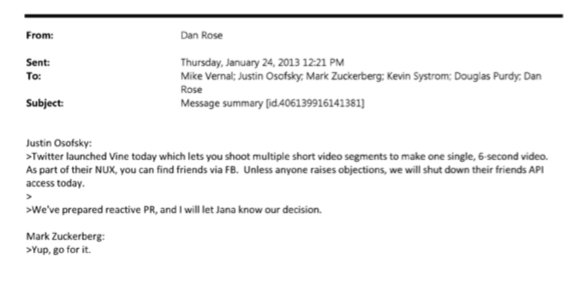
BREAKING: @CommonsCMS @DamianCollins just released previously sealed #Six4Three @Facebook documents:
Some random interesting tidbits:
1) Zuck approves shutting down platform API access for Twitter's when Vine is released #competition
2) Facebook engineered ways to access user's call history w/o alerting users:
Team considered access to call history considered 'high PR risk' but 'growth team will charge ahead'. @Facebook created upgrade path to access data w/o subjecting users to Android permissions dialogue.
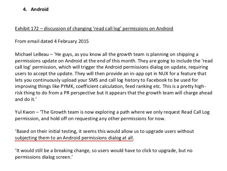
3) The above also confirms @kashhill and other's suspicion that call history was used to improve PYMK (People You May Know) suggestions and newsfeed rankings.
4) Docs also shed more light into @dseetharaman's story on @Facebook monitoring users' @Onavo VPN activity to determine what competitors to mimic or acquire in 2013.
https://t.co/PwiRIL3v9x
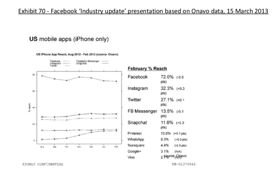
Some random interesting tidbits:
1) Zuck approves shutting down platform API access for Twitter's when Vine is released #competition
2) Facebook engineered ways to access user's call history w/o alerting users:
Team considered access to call history considered 'high PR risk' but 'growth team will charge ahead'. @Facebook created upgrade path to access data w/o subjecting users to Android permissions dialogue.
3) The above also confirms @kashhill and other's suspicion that call history was used to improve PYMK (People You May Know) suggestions and newsfeed rankings.
4) Docs also shed more light into @dseetharaman's story on @Facebook monitoring users' @Onavo VPN activity to determine what competitors to mimic or acquire in 2013.
https://t.co/PwiRIL3v9x